- Agency: Monga Design
- Client: Vogau
- Category: Print Design — Professional Services
- Location: Florianópolis, Brazil
- Project Brief: Design a print identity that celebrates typography, language, and handmade expression through a flexible visual system that balances creative experimentation with brand consistency.
Professional services print for a design studio faces one problem first: prove the work without a portfolio in hand. Vogau does it by making the identity out of the studio's own raw material, letters, so the print system is the sample.
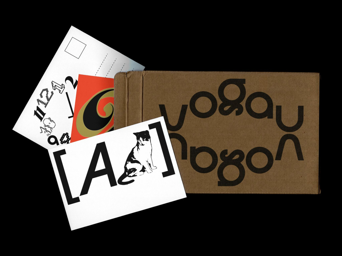
The name comes from vogal, the Portuguese word for vowel, so the whole identity treats type as subject rather than tool. The reversed, mirrored wordmark reads as a design experiment first and a name second, which tells you what the studio does before it says who it is.
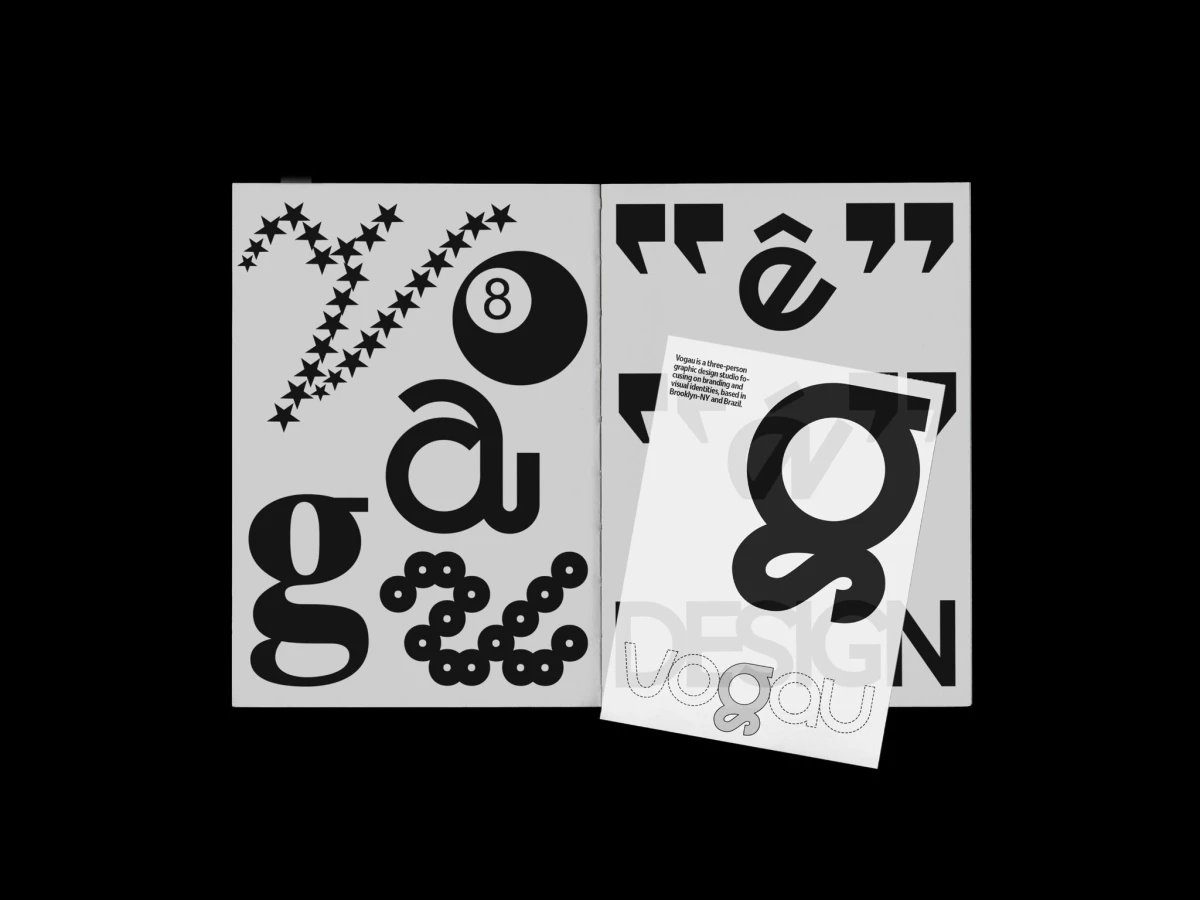
The system stays flexible on purpose, swinging between tight structure and loose play across posters, apparel, stickers, and a printed booklet. Monga Design let single glyphs blow up to poster scale, so an "a" or a "g" becomes an image on its own.
The palette holds mostly to black and white with occasional red and gold, which keeps the focus on letterform over color. That restraint is what lets the identity shift format to format and still read as one studio, expressive but never loose enough to lose the thread.