Brownie Points Charms the New Generation with Nostalgic Elements
Brownie Points is a company that caters to millennials and Gen Z consumers using vintage charms of the 70s and 80s as part of its brand identity.
The company’s candles and other products provide customers with nostalgia and modernity without these two clashing against each other. The goal is to present the products to be a living testament that these two very different concepts can come together and give that satisfying experience no one would have expected from them.
Given this, the product packaging brief is simple: make it clean, touch the charms of the late seventies to the eighties but add a contemporary flair to make it modern at the same time.
Thankfully, Monga Design understood the assignment and developed a product packaging design that looks like a perfect collaboration between these eras. (Check out some of the amazing packaging designs of 2023 here.)
Brownie Points Packaging Design Unites Design Elements of the Past and Present
The client wanted the final design to embody the past and present, showcasing a seamless collaboration of the times.
And the result? Monga Design's genius work: a balanced representation of varying eras, complementing the client's products. They have succeeded in delivering the vivacity of the present and the laidback yet lively energy of the past.
Admirably, neither era was too prominent. The agency created a design that was not too gloomy nor chaotic, and everyone loved it.
It’s a great example of how professional package designers can harmoniously blend different elements to create a captivating visual narrative and enhance the overall brand experience.
Check out some of the things you need to know about retail packaging design here to get started.

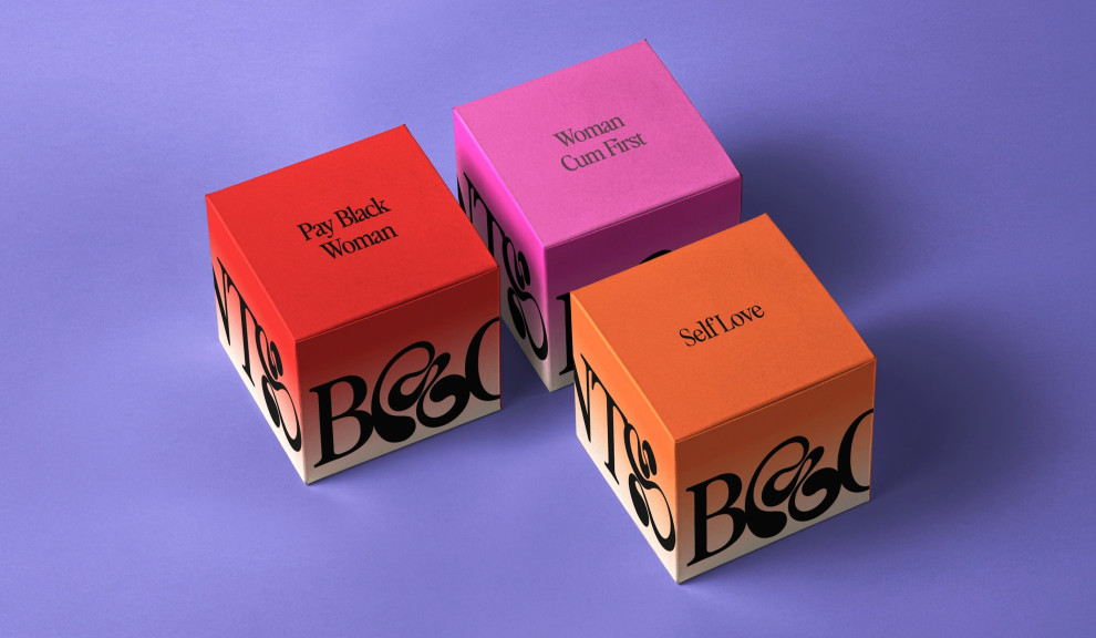
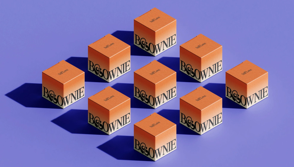
Monga Design Gave Layers of Character to Brownie Points Packaging Design Through Amazing Color Story
Most branding experts use gradients to add depth, visual interest, and a sense of dynamic movement to their designs. Here, the designers fused the 70s' colorful visuals with today's minimalistic approach, creating a vibrant color story with gradient patterns.
This gorgeous gradient pattern starts fiery and energetic, then mellows down to subtler hues until it ends in off-white.
In addition, this packaging design also reflects what a candle looks like when it melts while you are using them – the colors disappear, and all that’s left is this off-white wax that looks oddly therapeutic to most people.
The designers hit two birds with one stone with this design, which worked so well for them and the brand.
The Brownie Points Packaging Design Shows Artistry and Timelessness Through Stunning Font Styles
As some might know, font styles also significantly strengthen and define a company’s branding identity.
Font styles signify personalities, from formal and direct to striking and flashy. Designers love using fonts to convey important messages for the brand to its customers, with varying degrees of success.
In this case, Monga Design chose a font style reminiscent of the vintage years and relevant to the modern era. They incorporated a fun typeface inspired by 70s graffiti art. And often associated with the hippies of the late 70s, who love peace, harmony and calm.
The loops and swerves of this typeface are also noticeably bold at some point, which can be seen as a sign of how big these design movements were back then.

Paying Homage to Various Eras Boosts Brownie Points Packaging Design’s Selling Factor
From the rich and bold elements of Art Nouveau to the minimalist and streamlined assets of the Bauhaus era, paying homage to various times in history adds a degree of identity to a brand and its designs.
So, it's no surprise that brands get inspiration from various eras and incorporate it as part of their branding identity. With this, standing out can be challenging. Read this article and learn strategies for creating unique packaging designs.
Since Brownie Points wanted to bridge the gap between the old and the new, it is fitting to capture some aspects of the past and mesh them with the current assets.
This allowed them to have a timeless personality that transcends age and generations. Their packaging design appeals to everyone without looking like they are trying too hard.
Monga Design has done the impossible and created this everlasting bond between generations, and this is worth a commendation.