
In February 2026, the Pokémon Company celebrated the franchise's 30th birthday by handing nearly every creature in the series its own logo: more than 1,000 designs, one for each of the 1,025 known species plus regional and special forms. Most companies protect a single wordmark for decades. Pokémon cloned its wordmark a thousand times over in a matter of days, and the fans ate it up.
The trick is what sits underneath. The core Pokémon logo is simple enough, and loose enough, to throw off a thousand versions without a single one looking wrong.
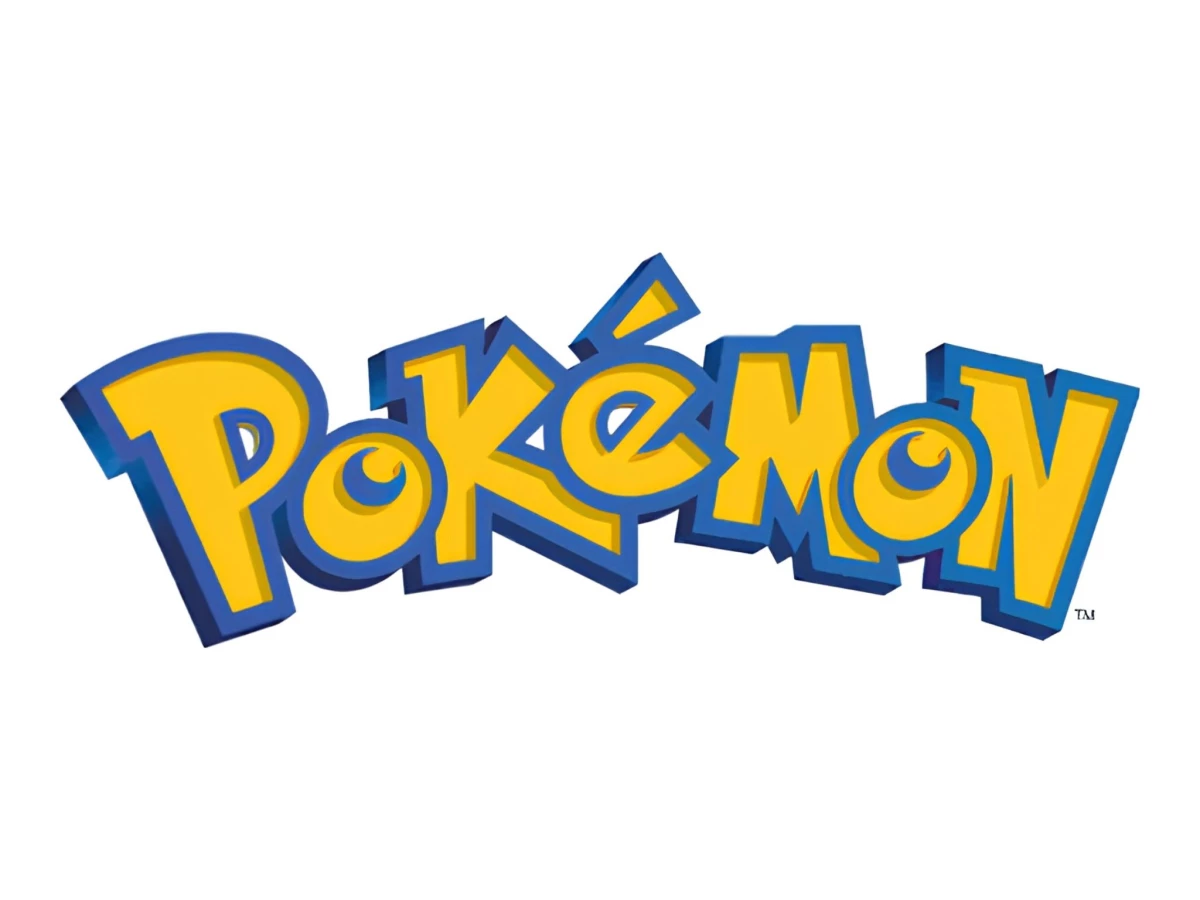
Look at it. Two colors and no mascot, with no real redesign since 1998. That plain little wordmark anchors the highest-grossing entertainment franchise in history, ahead of Star Wars, Marvel, and Harry Potter, with lifetime estimates north of $150 billion.
So how does something this basic carry something that big? The story starts a long way from Tokyo, with one designer and a one-month deadline.
The Seattle Story: Why the Logo Wasn't Made in Japan
Ask most people where the Pokémon logo came from and they will point to Nintendo's studios in Japan, to Ken Sugimori and the artists who drew the original creatures. Wrong country. The wordmark the English-speaking world grew up on came from Chris Maple, a Seattle designer who ran a small shop called Media Design and made his name on the rush jobs bigger agencies could not turn around in time.
In early 1998 his phone rang. Nintendo of America wanted him at its Redmond, Washington headquarters, where president Minoru Arakawa explained that Pokémon (still Pocket Monsters back then) was heading to the United States and Europe and needed a logo for the reveal of Pokémon Red and Blue at E3 that summer.
Then came the part that should have been impossible. Maple had one month. Work like this usually ran six, with rounds of back-and-forth, but the agencies before him had struck out and Nintendo was out of runway. He got the brief with barely any reference to go on: an early issue of Nintendo Power, a box of toys, and a Pikachu figurine.
So he drew. At a light table, Maple worked the letters by hand, again and again, reshaping each one until it looked right, then tucking that version away and chasing a better one. Nothing he made started from an existing typeface. He built every letterform from scratch, which is why the internet's most-searched Pokémon logo question has such a flat answer.
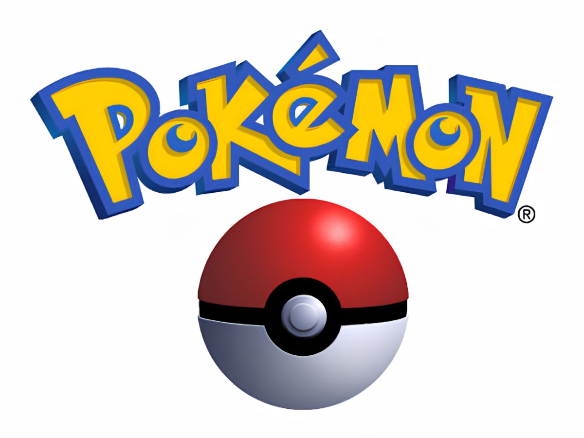
What font is the Pokémon logo? None. The mark is custom, hand-drawn artwork Chris Maple made in 1998, and no official downloadable version has ever existed. The fan files floating around, usually named something like Pokémon Solid or Pokémon Hollow, only copy the shapes.
The colors came the same way, by feel. So why is the Pokémon logo yellow and blue? Not to match the Pokémon Red and Blue games, whatever the internet tells you. Maple ran through a stack of palettes and landed on the fat yellow fill and blue outline because they suited the brand and popped off a toy shelf or a TV screen from across the room.
That last part is easy to skate past, so slow down on it. The design world runs on testing and slide decks full of rationale. The most recognized entertainment wordmark on the planet got picked because one guy looked at it and felt it click.
The Three Hidden Rules: What Makes the Logo Actually Work
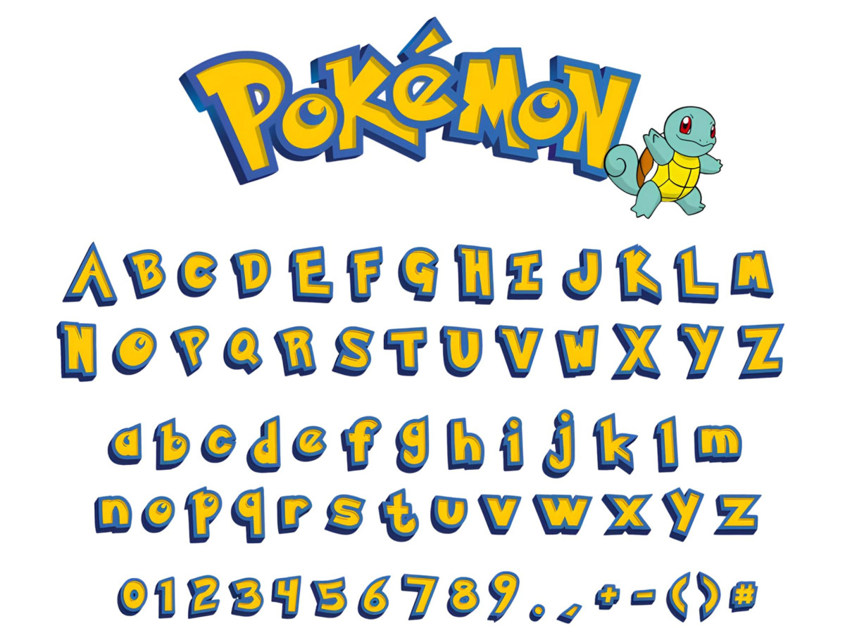
Pull the logo up on your phone and you can check all three of these in about ten seconds.
Consonants up, vowels down. Watch the case: P (upper), o (lower), K (upper), é (lower), M (upper), o (lower), N (upper). The consonants stand tall and capitalized, holding the structure. The vowels drop down small and let the word breathe. Size and case are doing the job that bold weights or extra colors usually do, steering your eye with nothing added.
The vowels come forward. Those two lowercase o's overlap the letters next to them and tilt toward you, which fakes depth and layering with no 3D and no drop shadow. Drop the blue crescent inside each O and the letter starts pulling double duty as an eye and a Poké Ball.
The arc is the whole trick. The letters never sit flat. They climb through the middle and drop back down at the ends, so the P and the N ride low while everything between them lifts. Your eye reads that as movement, a little upward bounce. The logo looks like you caught it mid-jump. That one move, a wordmark that springs, is most of why it still feels alive 28 years later.
Notice what is missing. No mascot and no illustrated scene. The whole identity lives in seven letters, and that is the reason the anniversary stunt worked.
The 30th Anniversary: What a Logo That Never Changed Can Still Do
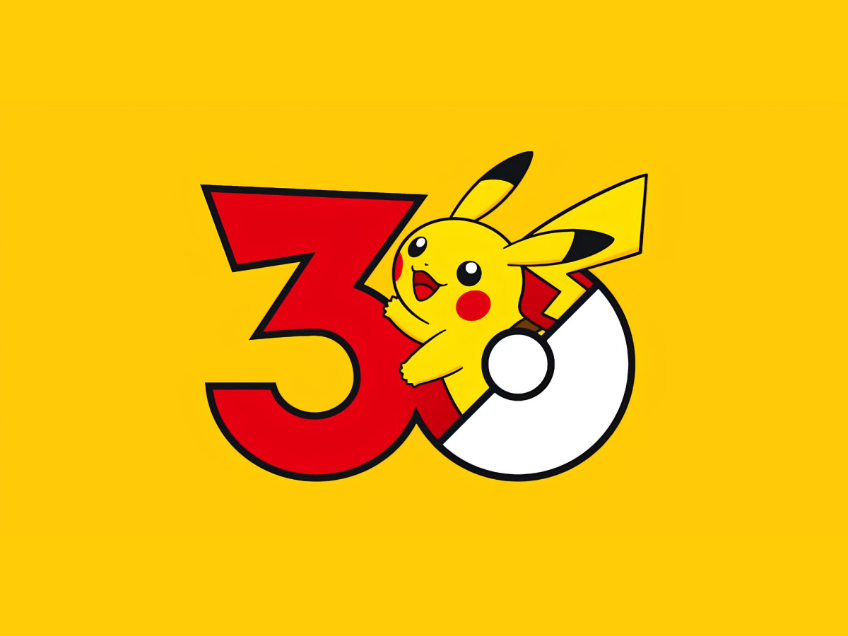
Back to February 2026. Ask what the Pokémon 30th anniversary logo is and there is no single answer, because the Pokémon Company made more than a thousand of them. For Pokémon Day on February 27, it gave nearly every creature in the series its own anniversary mark, one per species across all 1,025, plus regional and special forms.
They run on a single template. The "3" takes the color of each creature's primary type, the "0" turns into a classic Poké Ball, and the Pokémon itself springs off the mark above the line "Pokémon: Since 1996." Reshare a post and the account fired back a random one; the whole set went up online to browse. The date is not arbitrary either: it counts 30 years from the Japanese launch of Pokémon Red and Green in 1996.
And that is only possible because the parent logo refuses to break. Picture the same campaign built on a fussy, of-its-decade wordmark. Half the variations would fall apart. The Pokémon mark survives it because the anchor is so stripped down and so open (it reads as pure energy and play, tied to no particular place or era) that it wears a Bulbasaur just as happily as a Mewtwo.
You saw the same principle a few weeks earlier, on the biggest stage there is. Pokémon opened its "What's Your Favorite?" run with a Super Bowl LX spot where Lady Gaga picked Jigglypuff and duetted its lullaby with the little pink Pokémon in a studio, alongside Trevor Noah, Blackpink's Jisoo, and a handful of others.
The bit lands because Pokémon and Lady Gaga both live in that rare zone of culture nobody can quite fence in. And the animated logo is the anchor through all of it, the small fixed point that tells you, whatever is going on around it, that yes, this is still Pokémon.
Which is a lot to ask of a wordmark somebody sketched by hand in a Seattle studio in 1998. The plainness is the whole reason it scaled into what it is now, and the reason the logo has gone 28 years without a redesign.

Our team ranks agencies worldwide to help you find a qualified partner. Visit our Agency Directory for the Top Logo Design Companies as well as: