- Agency: MYCO Studio
- Client: Thrive Therapy & Wellness
- Category: Logo - Health & Wellness
- Location: Washington, DC, United States
- Project Brief: Create a health and wellness logo that moves beyond clinical aesthetics to express flow, inclusivity, and holistic healing while supporting future growth and scalability.
When I review health and wellness logo design, I often look for subtle cues that communicate trust and approachability.
The Thrive Therapy & Wellness mark embeds those values directly into its typography and composition.
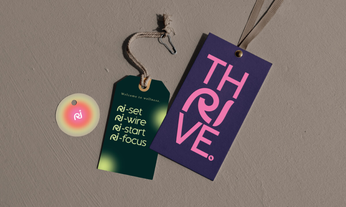
- Typography & Meaning: This brand sits in therapy and wellness, and I see that intent right away in the wordmark. Rounded sans-serif forms, tight tracking, and soft terminals create closeness, while the altered “ri” and open “r” quietly suggest return and continuity.
- Flow & Composition: Circular text layouts appear throughout the system. I like how the arcs stay open instead of resolving into full rings, which keeps the compositions feeling ongoing and unresolved in a calm way.
- Color System: The palette leans into warm gradients built from burgundy, clay red, coral, and soft peach. Accents of sage green and pale chartreuse show up in overlays and type. I like how these choices replace clinical cues with tones that feel bodily and grounded across print and space.
- Symbol System: Secondary marks pull directly from the letterforms, especially the curved “r” and the stacked TH / RI / VE lockup. I notice how these symbols repeat on tags, stickers, socks, and bags without drawing attention away from the wordmark. Their typographic roots keep them flexible across materials.
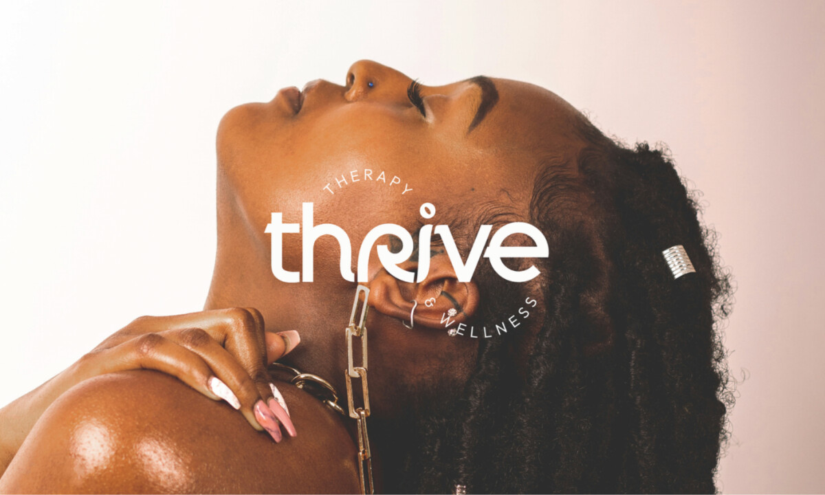
- Photography Integration: Photography stays central, with branding layered lightly through curved text and translucent color shapes. I see how overlays avoid faces and gestures, which keeps people present in the frame. That restraint supports the subject matter and keeps the visuals feeling human first.
What Brands & Agencies Can Learn from Thrive Therapy & Wellness
1. Design Can Hold Meaning Beyond Aesthetics
Embedding values directly into typography and form allows brands to communicate purpose without relying on explanatory messaging.
2. Flow Signals Care in Wellness Branding
Open shapes, movement, and warmth often resonate more deeply than rigid systems when designing for healing-centered audiences.
3. Build Identities With Growth in Mind
Flexible logo systems and derived symbols make it easier for wellness brands to scale into new spaces without losing emotional consistency.