- Designer: Sophie Hartl
- Client: Clover Playground & Café
- Category: Print Design — Hospitality
- Location: Amsterdam, Netherlands
- Project Brief: Create print assets for Clover Playground & Café that balance playful appeal for children with a welcoming, refined feel for parents through custom illustrations, branded patterns, and cohesive visual elements.
Hospitality print design for a family venue speaks to two audiences at once: kids who want color and parents who want a breather. Clover Playground & Café, founded by two local moms, answers with a soft pastel system that keeps the fun and turns down the noise.
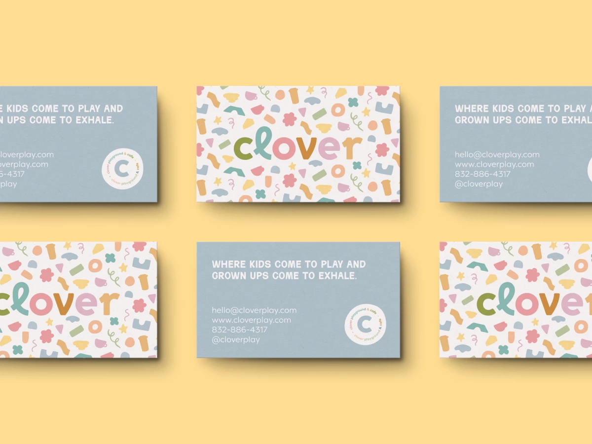
Hand-drawn coffee cups, stars, flowers, rings, and squiggles make up a custom pattern that covers the business cards, stickers, and wrapping paper. Every shape comes in muted pink, sage, butter yellow, terracotta, or dusty blue on warm off-white stock, so a dense layout still feels calm to the eye.
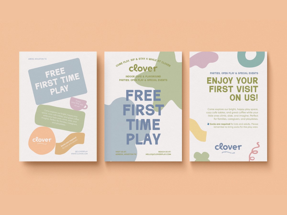
The lowercase wordmark gives each rounded letter its own pastel, and a tall looped “l” adds a hand-lettered bounce. Chunky all-caps headlines and a light geometric sans for contact details keep the copy easy to read against all that color.
Three flyers promote the free first visit in different layouts, from stacked blob shapes holding the copy to a giant slate-blue headline over overlapping sage and blue forms. Wavy die-cut stickers and a round “c” badge carry Clover’s tagline about kids who play and grown-ups who exhale.