
Early 2025. A designer at OpenAI zooms the ChatGPT logo to 400 percent and starts nudging points across the screen. The six curved strokes carry slightly different weights. The gap at the center sits a hair too tight. At that magnification the flaws jump out. Shrink the mark back to thumbnail size, where it actually lives, and almost nobody would ever catch them.
That gap is the tell. Around 300 million people opened ChatGPT every week in early 2025, and the symbol they tapped had never been drawn for the job it was doing. OpenAI cleaned it up anyway, then shipped the redraw so quietly that users kept scrolling past a brand-new logo as if nothing had changed.
The blossom became the default face of artificial intelligence by accident. This review asks whether the mark still earns that spot.
What the ChatGPT logo is
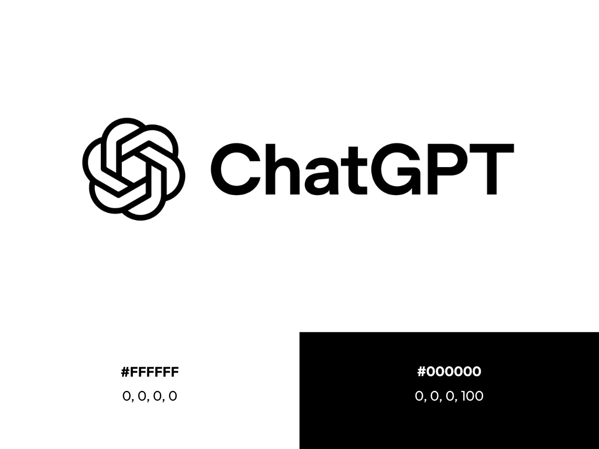
The ChatGPT logo is a combination mark. It pairs the "blossom" symbol, a knot of interlocking curved forms, with the OpenAI wordmark set in a custom typeface. ChatGPT borrowed the parent company's identity at launch in November 2022 and has carried it since, which is why the product and the company share one visual signature.
My verdict, stated plainly: the mark does its job at any size, and the February 2025 redraw made it cleaner and more balanced. That same polish also made it more anonymous inside a category the blossom helped invent.
Specs at a glance
- Mark type: Combination mark (blossom symbol plus wordmark)
- Symbol name: Blossom
- Original designers: Ludwig Pettersson and Ben Barry, with co-founder Greg Brockman, around 2016, per OpenAI's account to Wallpaper
- 2025 redraw: In-house team led by Veit Moeller and Shannon Jager, with type foundry ABC Dinamo and motion studio Studio Dumbar
- Typeface: OpenAI Sans, bespoke, developed with ABC Dinamo
- Colors: Black #000000 and white #FFFFFF for the current monochrome mark. The green long used in the ChatGPT interface is commonly cited as #10A37F, and the ChatGPT Plus accent runs to a purple near #AB68FF
- Current version: February 2025 redraw
Design analysis: construction
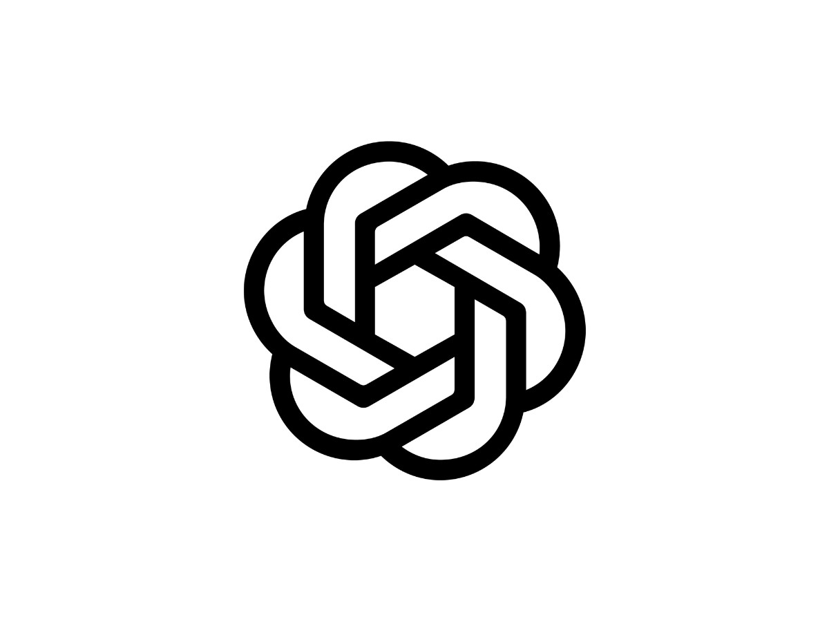
Look closely and the blossom resolves into a set of rules. Six curved segments rotate around a central opening, reading at once as a flower and as a hexagonal knot. OpenAI builds the whole shape on an underlying grid of six interlocking circles, a pattern the team calls the "seed of life."
The 2025 redraw changed three things. The stroke weight became uniform, so no line looks heavier than its neighbor. The center space grew, which lets the mark breathe at small sizes. The geometry got tightened into cleaner arcs, according to Fast Company.
OpenAI's stated logic pairs two ideas. Right angles carry precision and structure. Curves and circles carry warmth. The company describes the mark as capturing the "dynamic intersection between humanity and technology," and the geometry is meant to hold both at once.
The mark mostly delivers on that claim. The rounded segments do read as organic, and the balance is better than the old version that users had quietly griped about for years, as Creative Bloq noted. The claim strains only when you set the blossom beside its imitators, which is where this review is headed.
Design analysis: typography
The wordmark is now the load-bearing part of the identity. OpenAI set it in OpenAI Sans, a bespoke typeface built with Berlin foundry ABC Dinamo, and the company has said it will lean on the wordmark far more than the symbol going forward.
The typeface starts from a single idea the team calls "the point," a black dot that stands for the cursor. That dot seeds the round forms throughout the letters, most visibly in the capital O. The O has a perfectly circular outside and a deliberately imperfect inside, a small trick to soften any machine-made stiffness. Design director Shannon Jager told Wallpaper the goal was to "find the beauty in nothing," treating open space as part of the design.
One correction is worth making. Some write-ups describe the ChatGPT font as close to Arial Pro. That is wrong. OpenAI Sans is an original commission, and its circular dots over the lowercase i and j, plus that imperfect O, are choices you will not find in Arial's grotesque skeleton.
The wordmark matters because the symbol often disappears. In a browser tab, a citation, or a research paper, the word "ChatGPT" is doing the identifying, so the type has to hold the brand on its own.
What the ChatGPT logo means
OpenAI's own answer is direct. The blossom is meant to sit at the meeting point of people and machines, with circles standing for human warmth and right angles for technical precision. The company frames the mark as a statement of its mission to build AI for people, and the 2025 identity extends that idea into the "emotive point," a pulsing blue disc that represents the model's response to you, as reported by Fast Company and TechRadar.
Then there is the folklore. A recurring claim online says the blossom hides an Armenian infinity symbol, and searches for a "ChatGPT logo secret" keep the theory alive. No primary source supports it. OpenAI has never described the mark that way, and the company's own account traces the geometry to the seed-of-life grid, not to any national symbol. Treat the Armenian reading as internet myth, interesting as a Rorschach test and nothing more.
The history, in one section
The identity arrived in stages. OpenAI launched in December 2015 with a plain wordmark in light gray and no symbol. The blossom came next, drawn around 2016 by a team that OpenAI credits, through Wallpaper, to in-house designer Ludwig Pettersson and Ben Barry alongside co-founder Greg Brockman. Some secondary accounts also name co-founder Ilya Sutskever, so the exact credit list depends on the source.
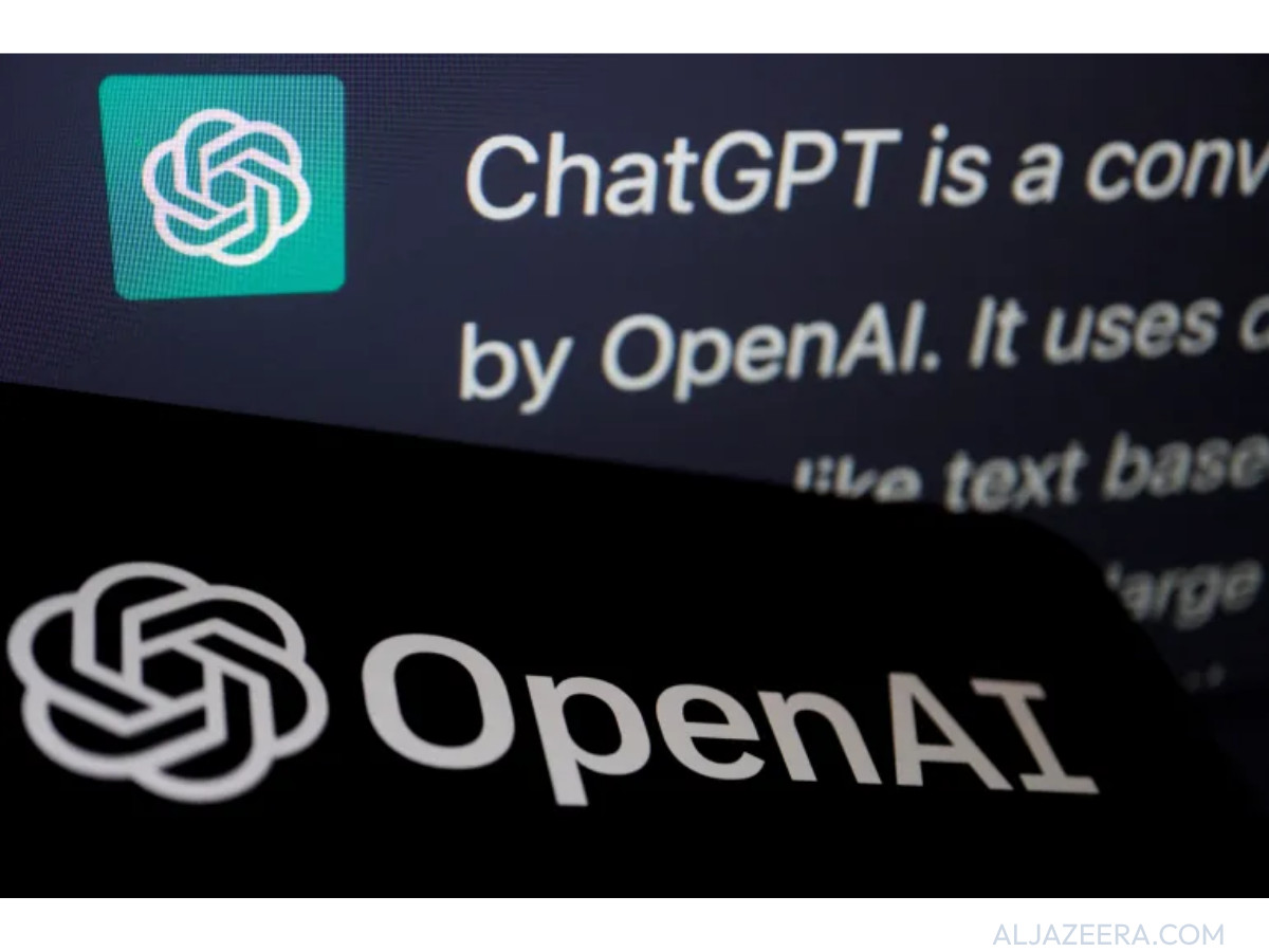
ChatGPT then launched in November 2022 wearing OpenAI's existing mark rather than one of its own. It was released as a research preview and picked up a million users in five days, which meant the borrowed logo became the public face of a product nobody had planned to ship.
The February 2025 rebrand was OpenAI's first. Head of Design Veit Moeller, whose past roles include Mercedes-Benz, WhatsApp, and Instagram, led an in-house team with Design Director Shannon Jager. They worked with ABC Dinamo on OpenAI Sans and Studio Dumbar in Rotterdam on motion, including the animated point. Fast Company reported the work took about nine months. DesignRush covered the launch in its own news report on the OpenAI refresh. For the fuller company timeline, see our forthcoming OpenAI logo history feature.
Critique: does it still differentiate?
Here is the problem the redraw could not fix. The blossom no longer stands out, because half the industry now looks like it.
When ChatGPT arrived, its rounded, monochrome mark set an unofficial template. Lisa Smith, global chief design officer at Uncommon Creative Studio, told Fast Company that OpenAI "set the standard for what 'serious AI' is supposed to look like," per Morning Brew. The numbers followed the trend. By 2023, hexagons were about 4.6 times more likely to appear in AI logos than in logos overall, according to Fast Company.
The copies piled up fast. One design studio, eBaqDesign, found 22 AI startups with near-identical swirling geometric marks in under ten minutes and figured it could reach 50 without much effort. Critics at Creative Bloq have argued you could swap one AI logo for another and few people outside the design team would catch it. The blossom's own geometry, the rounded knot around a central void, is exactly the shape that spread.
So test the mark on its two real jobs. At app-icon size, the monochrome blossom is legible and crisp, and its restraint reads as confident next to competitors leaning on purple-to-blue gradients. On distinctiveness, it fails. Strip the wordmark and the symbol could belong to a dozen other AI products.
That leaves an odd result. The blossom's biggest asset is no longer its design. It is its head start. The mark is recognizable because it got there first and got there everywhere, so ubiquity now does the work the geometry used to do. OpenAI seems to know this, which is why the 2025 system pushes the wordmark forward and promises to use the symbol more sparingly. For a look at marks that solve the distinctiveness problem the other way, see our best brand logos of 2026 and our guide to the main types of logos.
Verdict
The ChatGPT logo is a well-built mark and a weak differentiator. As craft, the 2025 redraw is a clear upgrade. The strokes now match in weight, and the wordmark is strong enough to carry the brand on its own. As identity, the blossom has been outrun by its own influence, and it now leans on familiarity to do what shape once did.
The original still reads as the original. It just no longer reads as the only one.
Our team ranks agencies worldwide to help you find a qualified partner. Visit our Agency Directory for the Top Logo Design Companies as well as: