Whether you’re a startup looking to make a bold first impression or an established company aiming for a fresh, modern look, your logo is the first thing people notice — it’s the face of your brand. A well-designed logo not only grabs attention but also communicates your brand’s identity, values, and personality at a glance.
But with so many styles, trends, and design elements to consider, how do you choose the right one? In this guide, we’ll walk you through the different types of logos, explore the latest design trends, and provide actionable tips to help you create a logo that truly represents your brand.
The 8 Main Types of Logos
There are eight main types of logo design. Each serves a unique purpose and can help tell your brand’s story differently. Let’s break them down:
- Wordmark (Logotype)
- Lettermark (Monogram)
- Pictorial Marks (Logo Symbols)
- Abstract Logo Marks
- Mascots
- Emblems (Badges)
- Combination Marks
- Letters Inside Shapes Logos
1. Wordmark (Logotype)
-content-large-webp.webp)
A wordmark is a logo made entirely of text. This type of logo is best for businesses with unique or recognizable names. A wordmark is a great choice if you want your brand name to be the focal point and easily remembered. It’s all about clarity, simplicity, and the power of words to convey meaning.
- Example: Google, Coca-Cola, Visa, FedEx
- Best for: Brands with strong names that are unique and recognizable
2. Lettermark (Monogram)
-content-large-webp.webp)
Lettermarks are logos made up of initials. These are ideal for brands with long or complex names that need to be simplified. The goal with a lettermark is to create an easy-to-remember abbreviation that still represents your brand well.
- Example: IBM, HBO, CNN
- Best for: Brands with longer names or those wanting to shorten their names for easier recall
3. Pictorial Marks (Logo Symbols)
-content-large-webp.webp)
A pictorial mark is a logo symbol or image representing your brand. These logos are simple but powerful, and they’re all about creating a visual that can stand alone and be instantly recognizable. They help connect your brand with a strong image that people can remember.
- Example: Apple, Twitter, Shell
- Best for: Brands that want to use a symbol to convey their values or industry
4. Abstract Logo Marks
![]()
An abstract logo mark is a geometric form or symbol that doesn’t directly represent anything specific but conveys a broader idea or value. Nike’s swoosh is a great example of this.
The best brand logos often use abstract illustrations to create an emotional connection with the audience without using words or obvious imagery. They are open to interpretation, allowing the brand to craft its story.
- Example: Nike, Adidas, Pepsi
- Best for: Brands that want a unique, open-ended symbol to represent their values
5. Mascots
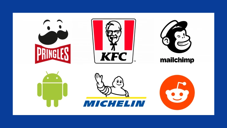
Mascot logos feature illustrated characters that embody a brand’s personality. These logos create a friendly, relatable image, making brands feel more engaging and approachable.
Mascot visuals are especially effective for family-friendly businesses, sports teams, and food brands that want to build a fun, memorable identity.
- Example: KFC, Michelin, Pringles
- Best for: Brands that want a personable, friendly identity and strong character association
6. Emblems (Badges)
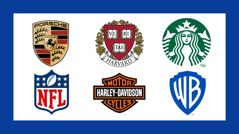
Emblem logos incorporate visuals within a symbol, badge, or crest. These logos have a classic and authoritative feel, often used by schools, government agencies, and luxury brands. The design elements in an emblem create a sense of tradition, trust, and prestige, making them ideal for institutions that want to establish credibility.
- Example: Harvard, Porsche, Starbucks
- Best for: Brands seeking a timeless, prestigious, or official look
7. Combination Marks
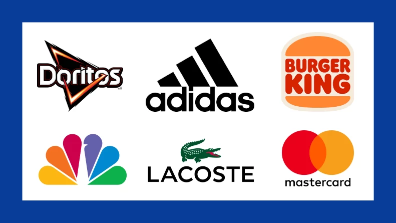
Combination marks merge text with a symbol, offering the best of both worlds. This logo type allows brands to use elements together and separately, making them highly versatile. By pairing a recognizable wordmark with a strong visual, combination marks reinforce brand identity while providing flexibility in marketing.
- Example: Adidas, Doritos, Burger King
- Best for: Brands wanting both a text and symbol for flexibility and strong brand recognition
8. Letters Inside Shapes Logos
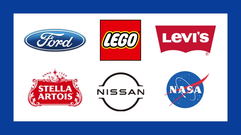
These logos place text inside distinctive shapes or borders, creating a strong, recognizable framework for a brand name. While they can be considered a type of combination mark, they deserve their own category since many high-end logo designs embrace this structured approach. Instead of a visual icon, the shape itself — whether a rectangle, shield, or circle — becomes a defining feature, offering a bold and contained design.
- Example: Levi’s, Ford, Lego
- Best for: Brands that want a structured, contained logo without additional imagery
Current Logo Design Trends
Logo design is evolving, and staying on top of the latest trends is essential to ensure your logo stays relevant. Let’s dive into the most notable logo trends in 2026:
1. Dynamic and Animated Logos
Logos are set to become more interactive this year. With the rise of augmented reality (AR) and digital experiences, logos are changing based on the user’s environment or actions. This creates a memorable, engaging experience that connects people to your brand in a new, innovative way.
Studies reveal that 71% of Gen Zs appreciate when logos change for special events or occasions like Christmas. This shows the power of dynamic logos to capture attention, especially for younger audiences.
If you want to stand out and engage your audience, consider making your logo dynamic or animated to interact with users.
2. Bold, Vibrant Colors
Color is a signal of what your brand represents. Bright, bold colors are making a comeback because they symbolize strength, energy, and optimism. Research shows that 43% of Fortune 500 companies use two colors in their logos. Further, nearly 40% of Fortune 500 companies lean on blue as the star color in their logos — it’s the go-to for trust, dependability, and professionalism.
If your brand aims to inspire or stand out, use vibrant colors to create a logo that leaves a lasting impression.
3. Minimalism
Simplicity is still a powerful design tool. Minimalist logos, which focus on clean, clear design, continue to dominate. These logos are easier to recognize across all media types — whether on a website, billboard, or social media.
Keep in mind not to overcomplicate things. The simpler, the better. A minimal logo design ensures clarity and versatility, making it more effective across digital platforms.
When to Refresh Your Logo
Logos are not meant to last forever. In fact, 28% of people believe brands should refresh their logos every decade. A logo refresh doesn’t have to be drastic, but a little update can help keep your brand fresh and relevant.
Take a lesson from Jaguar’s controversial “Copy Nothing” rebrand, as analyzed by DigitalSilk. Their attempt to symbolize a shift to an all-electric lineup faced backlash for straying too far from their heritage. Critics felt the rebrand alienated loyal customers while aiming to attract new ones.
According to Gabriel Shaoolian, CEO and founder of Digital Silk, Jaguar’s rebranding drew criticism for its modernized design because many saw the brand abandoning its heritage.
“Agencies can use this as a case study to balance innovation with legacy. This will help ensure that any rebranding project resonates with both new and loyal audiences through audience research and stakeholder alignment.”
The takeaway? Modernization must balance innovation with familiarity. Transparent communication and audience testing are key to ensuring your updated logo resonates with both new and loyal audiences.
Refreshing your logo can be a way to modernize your image, stay on top of design trends, and ensure it resonates with new generations of consumers. However, be mindful not to stray too far from the essence of your brand. A logo should evolve, not completely change.
AI and Automation in Logo Design
Artificial intelligence (AI) is revolutionizing the way logos are created. With advanced design tools, AI can help speed up the process, give you logo design inspiration, and create multiple variations of logos in minutes.
However, while AI is efficient, it can’t replace the creativity and personal touch that a human designer brings. A great logo is still about finding that perfect balance between technology and creative expression. Use AI to streamline the design process, but always ensure your logo is thoughtfully crafted to represent your brand’s identity.
How to Choose the Right Logo
Choosing a logo for your business is about selecting one that aligns with your brand, resonates with your audience, and works across all platforms. Here are some tips on how to pick the perfect logo for your brand:
1. Know Your Audience
Your logo should speak to your target market. For example, if you’re targeting Gen Z, interactive logos and bright, vibrant colors can help capture their attention. If your audience is more mature, you might want to lean toward a minimalist or classic design that exudes trust and professionalism.
Take the time to understand who your audience is and choose a logo that resonates with them.
2. Reflect Your Brand
Your logo should reflect the personality of your brand. If your brand is playful and casual, choose a fun and creative logo. On the other hand, if you’re a more formal brand in a corporate industry, a simple and clean design will likely be more appropriate.
Ensure that your logo aligns with your brand's core values and personality. It’s a direct reflection of who you are.
3. Think About Scalability
Your logo should work across all mediums, from social media profiles to billboards. Make sure it’s legible and looks great in any size. A great logo should work well in any situation — on a tiny mobile screen or a large banner.
Most importantly, choose a versatile and scalable logo, making sure it looks sharp on any platform, large or small.
Logo Types Takeaways: What’s Next for Logos?
In the coming years, all the different logo types will become even more interactive, especially with the rise of AR and digital experiences. This shift gives brands a unique opportunity to connect with their audience on a deeper level through engaging, personalized visuals.
At the same time, as consumers become more eco-conscious, logos reflecting sustainability and social responsibility are gaining importance. If sustainability is a core part of your brand’s identity, your logo should reinforce those values.
Creating a logo that captures your brand’s essence while staying future-proof isn’t easy. Outsourcing to a professional logo design agency ensures you get a high-quality, versatile design that aligns with your brand’s mission and resonates with your audience.
Consumers care about the world your brand impacts — make sure your logo reflects that.
Types of Logos FAQs
1. What is the logo trend for 2026?
In 2026, logo design trends are embracing both innovation and nostalgia:
- Bold minimalism: Designs are becoming simpler yet striking, with clean lines and strong typography to ensure clarity and adaptability across various platforms.
- Artistic typography: Custom and expressive fonts are gaining popularity, allowing brands to convey unique personalities through distinctive lettering.
- Retro elements: There's a resurgence of vintage-inspired designs, incorporating nostalgic motifs and color schemes to evoke familiarity and trust.
- Geometric and 3D shapes: Logos featuring geometric patterns and three-dimensional effects are adding depth and modernity, making them more engaging and memorable.
- Dynamic and responsive logos: Brands are adopting adaptable logos that can change in appearance based on context, enhancing versatility and user engagement.
These trends reflect a balance between simplicity and creativity, aiming to create memorable and versatile brand identities.
2. Which type of logo is most popular in 2026?
In 2026, wordmark logos are among the most popular as brands embrace minimalism and clean typography-driven designs. Wordmarks offer clarity and adaptability, ensuring strong brand recognition across digital and physical platforms without the need for extra visual elements.
Additionally, many companies adopt eco-conscious branding, often reflected in nature-inspired typography and earthy color palettes. Playful and chunky typefaces are also gaining traction, making wordmarks feel more dynamic and approachable.
This trend highlights a shift toward simplicity, sustainability, and personality in branding, reinforcing the power of a well-crafted wordmark in modern brand identity.
3. What makes a logo more attractive?
An attractive logo in 2026 hinges on several key factors:
- Simplicity: Clean, minimalist designs are favored for their versatility and timeless appeal.
- Relevance: The logo should reflect the brand's identity and resonate with its target audience.
- Memorability: Unique and distinctive elements make a logo stand out and be easily recalled.
- Timelessness: Avoiding overly trendy elements ensures the logo remains effective long-term.
- Versatility: The design should be adaptable across various mediums and sizes without losing clarity.
Incorporating these principles results in a logo that is not only visually appealing but also effectively communicates the brand's essence.


-preview-webp.webp)