- Agency: Graphéine
- Client: Demain C'est Nous
- Category: Logo Design — Non-Profit
- Location: Paris, France
- Project Brief: Create a logo and visual identity that reflects Demain C'est Nous' mission of environmental education, cooperation, and youth empowerment through a symbolic, adaptable identity that resonates with students, educators, parents, and institutional partners.
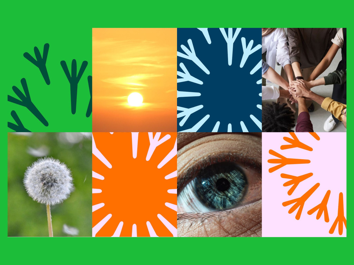
A single mark that reads four ways at once is the rare thing a non-profit logo can build a whole identity on. Demain C'est Nous pulls it off, its emblem shifting between a dandelion, a ring of people, an eye, and a globe depending on how you look.
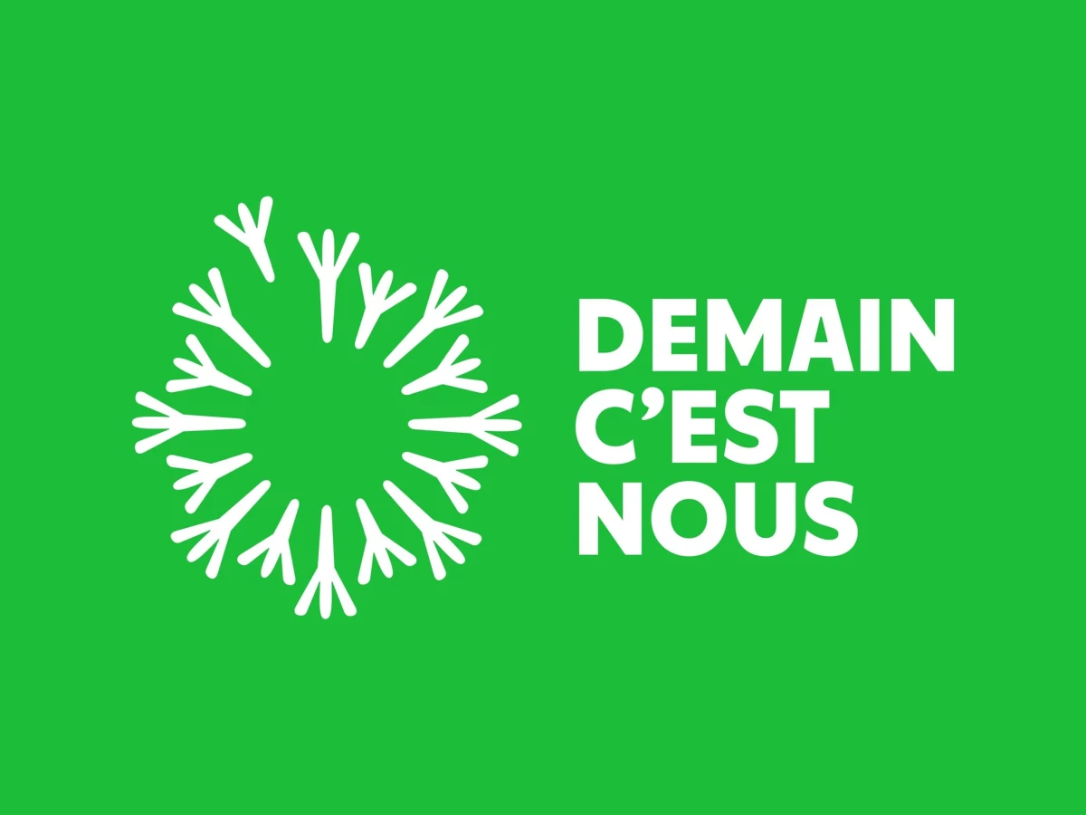
The radiant symbol builds from small forked strokes arranged in a circle. Each stroke works as a stem, a raised figure, or an eyelash, so the mark folds community, cooperation, attention, and the planet into one shape without spelling any of it out.
The wordmark solves a length problem head-on. Graphéine set the long name in a tight three-line block, bold and compact, so it anchors the airy emblem without crowding it.
The palette pulls straight from nature, forest green with sunrise orange, sky blue, and dandelion white. Graphéine let the emblem run solo, cluster into patterns, or shrink onto a cap and tote, which gives a growing charity one flexible mark that reads to students and institutions alike.