- Agency: Graphéine
- Client: CapAtlantique La Baule-Guérande Agglo
- Category: Logo Design — Lettermark
- Location: Paris, France
- Project Brief: Design a modern lettermark logo that reflects CapAtlantique’s regional identity, public service mission, and connection to the Atlantic coastline and salt marshes.
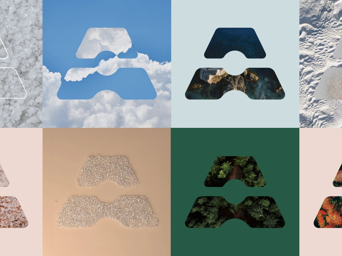
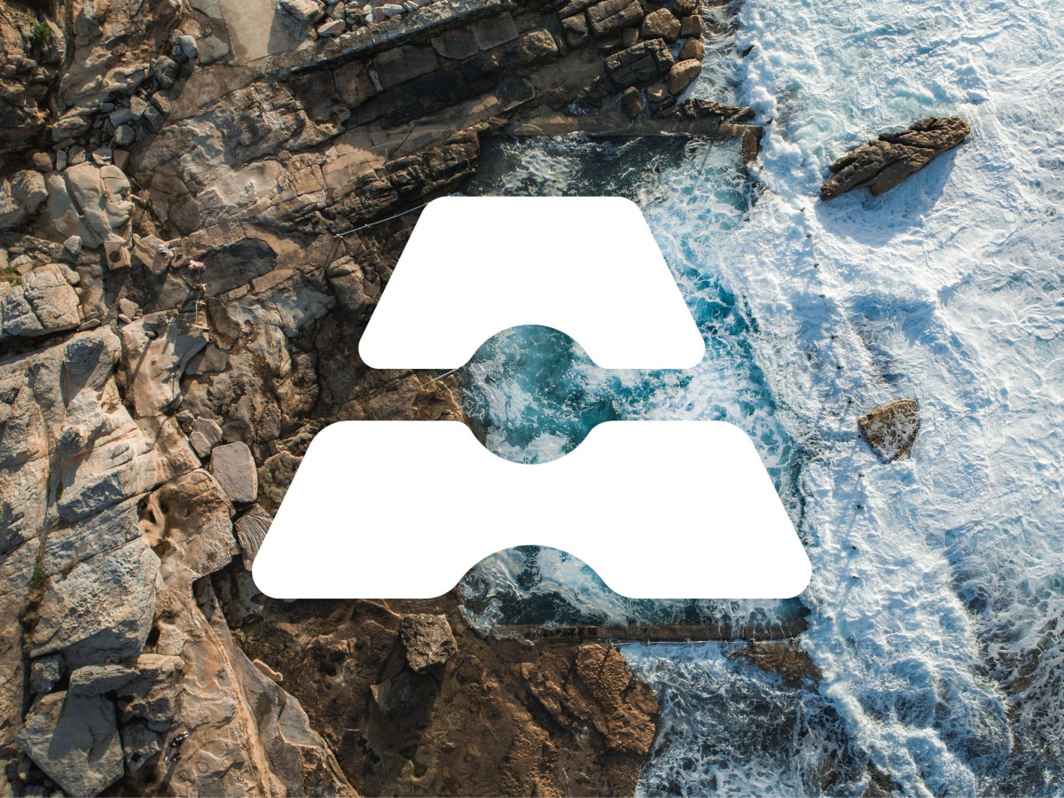
A lettermark logo has to do two jobs at once, read as a letter and carry a story. CapAtlantique's mark pulls that off, building an A out of two salt pans in perspective with a pile of salt at the center, so the form ties straight back to the region's salt-marsh landscape.
The double meaning is the clever part. That A stands for both the Atlantic Ocean and the Agglomeration itself, so one shape covers the place and the public body that serves it.
The custom type backs it up. Condensed letterforms keep the wordmark tight next to the emblem, and the whole thing stays clean enough to work small without losing the salt-pan read.
Color is where it opens up. A dark blue anchors it to the Atlantic, then a set of brighter, modern tones lets the mark flex across totes, tees, and aerial backdrops while still holding together. For a regional identity built on real geography, a lettermark this rooted is a smart pick.