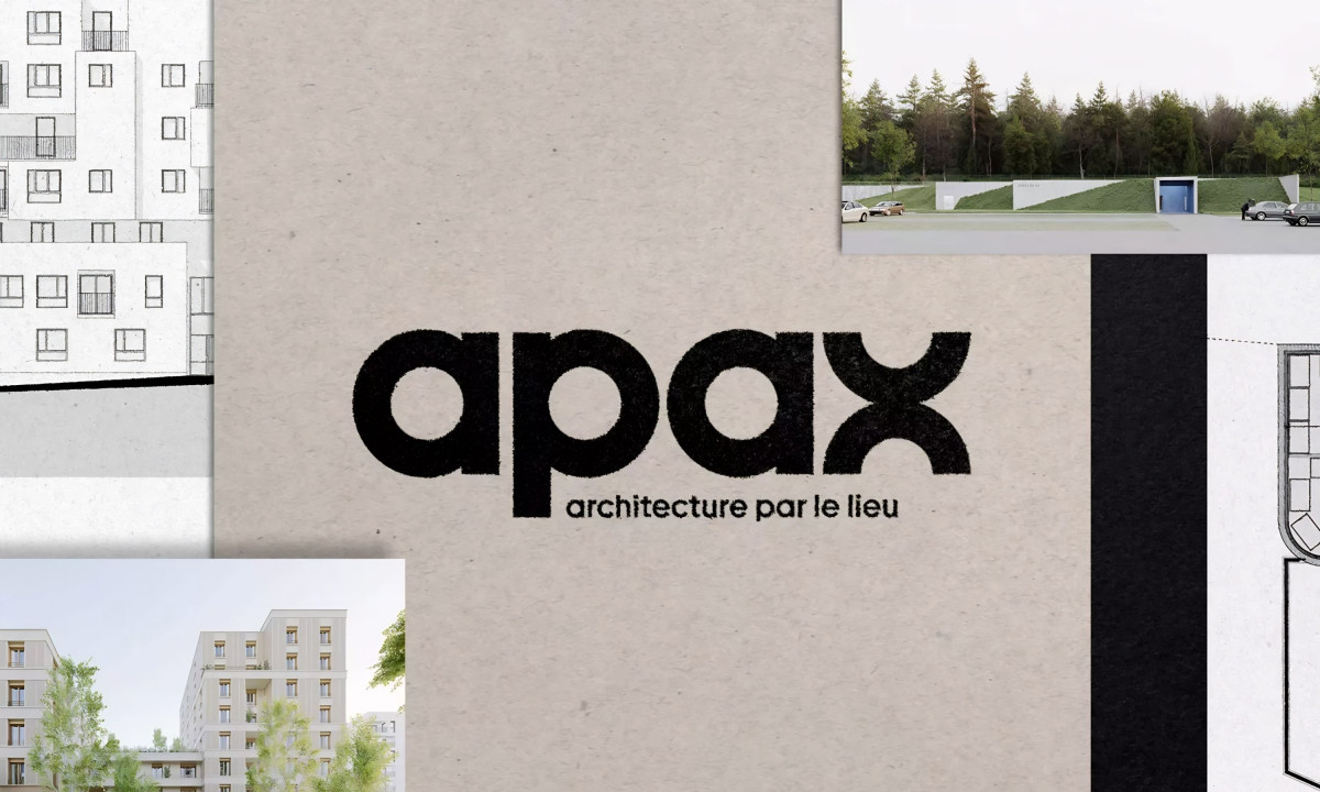
- Agency: Graphéine
- Client: Apax Architecture
- Category: Logo Design — Architecture
- Location: Paris, France
- Project Brief: Create a logo identity that reflects Apax Architecture’s philosophy of designing buildings shaped by place, context, and local character.
An architecture logo design should do conceptual work, not just look like a blueprint. Graphéine's mark for Apax embeds the firm's entire philosophy, "architecture through place," directly into the letterforms.
The name derives from the Greek hapax, a linguistic term for a word that appears only once. The wordmark also encodes the agency’s former A+A identity; by reading as "A plus A" transitioned into "Apax," the firm’s evolution is embedded within the name itself.
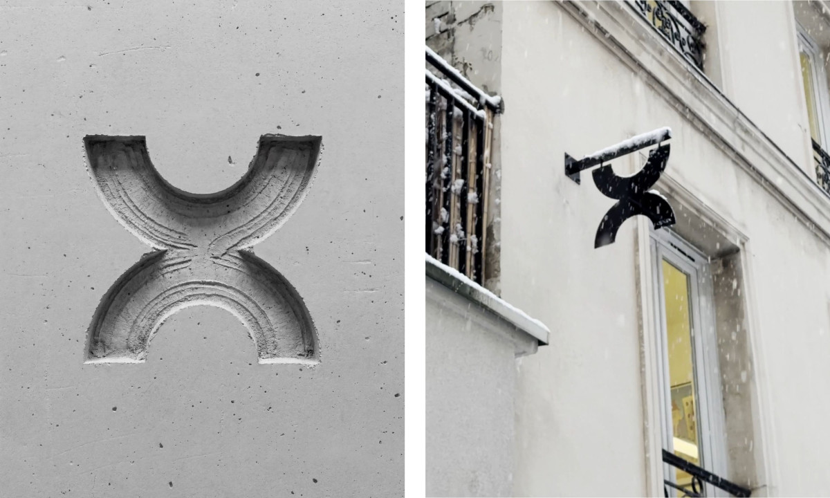
The letterforms run on a single module: a circle. The "a" and "p" repeat that geometry, then the "x" recomposes the same arcs into something new, mirroring how the firm starts with context and extracts a singular intervention from it.
The X carries the concept beyond the logo. It appears as a carved relief on plaster facades and as a black blade sign mounted above doorways, turning the typographic mark into actual architectural detail.