
Demon Slayer Logo: Two Marks, One Name, And A Font Swap Most People Miss
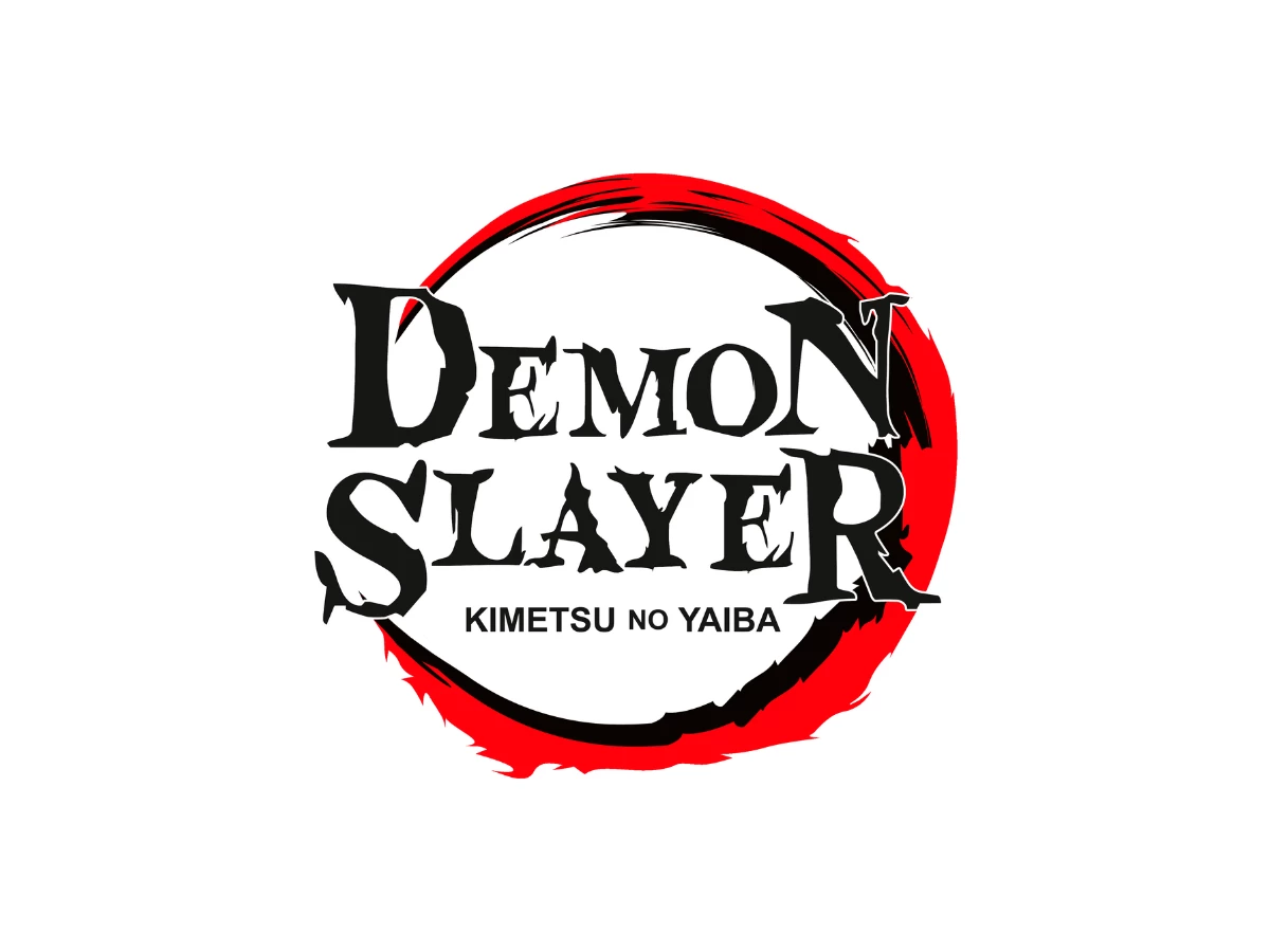
Everyone praises the Demon Slayer logo for its brush calligraphy. The English version does not have any.
"DEMON SLAYER" is set in Blood Crow, a free American horror font you could grab for a Halloween flyer, with no tie to Japan.
The real brushwork is all on the Japanese side: the 鬼滅の刃 mark is hand-drawn calligraphy, and the anime's title type was brushed by an 85-year-old signboard calligrapher in a Kagoshima town of fewer than 20,000 people.
The Short Version
- The Demon Slayer logo exists in two versions that share a layout but not a typeface.
- The Japanese wordmark 鬼滅の刃 is brush calligraphy, and the anime's on-screen title cards used real brush fonts from the Kagoshima foundry Shōwa Shotai, written by calligrapher Tsunanori Eisen.
- The English "DEMON SLAYER" is set in a reworked Blood Crow Condensed, a free horror display face by Daniel Zadorozny of Iconian Fonts in the United States.
- The title 鬼滅の刃 (Kimetsu no Yaiba) translates literally as "Blade of Demon Destruction," the palette is black and red on white, both marks share a brushed ensō ring, and 滅 (metsu) reads as a standalone symbol.
- One mark is hand-brushed by an 85-year-old craftsman, the other is a download that was free for personal use. That gap is the whole story.
What Is The Demon Slayer Logo?
The Demon Slayer logo is the title lockup for Koyoharu Gotouge's manga and its Ufotable anime, published by Shueisha. You have seen it on covers, posters, and Crunchyroll thumbnails. It carries two names at once, because the series ships under two titles in two scripts.
The Japanese title reads 鬼滅の刃, romanized as Kimetsu no Yaiba. The English title is simply "Demon Slayer," the name Viz Media uses for the localized release. Both titles usually appear in the same artwork, with the Japanese characters stacked near a black-and-red wordmark.
Here is the part that gets skipped. The two versions are drawn in completely different type. The Japanese characters are brush calligraphy. The English word is a Western horror font. They were never meant to match, and they do not.
What Font Is The Demon Slayer Logo?

Start with the English mark, because that is the one people ask about. "DEMON SLAYER" is set in Blood Crow Condensed, a horror display face by Daniel Zadorozny, who runs the American foundry Iconian Fonts.
He released the Blood Crow family in 2009. It ships in 11 styles and is free for personal use, with commercial use handled as donationware through his site.
Iconian classes Blood Crow under horror, and the font's own metadata files it as a freeform serif. The wordmark keeps the family's tall condensed caps, blade-like cuts, and weathered edges.
Whoever built the logo reworked the terminals into longer torn, tapering points, clearest on the N of DEMON and the R of SLAYER, which spill past the ring. So the English mark is a customized version of an off-the-shelf font, not custom lettering. Picking a ready-made display font for a logo is ordinary practice, and often a smart one.
The smaller subtitle, "KIMETSU NO YAIBA," sits under it in a plain bold sans that has nothing to do with either brush type or Blood Crow.
The Japanese side is a different craft entirely. The 鬼滅の刃 wordmark is brush lettering, and the anime's title typography drew on genuine brush fonts from Shōwa Shotai, a small foundry in Satsuma, Kagoshima Prefecture, run through Koei Sign Works.
Those brush faces were written by hand by Tsunanori Eisen (綱紀栄泉), a signboard calligrapher born in 1935 who wrote most of the foundry's catalog one character at a time before his death in March 2022. His son now continues the work as the second-generation Eisen.
The documented anime usage is specific. In the episode where the nine Hashira are introduced, the pillar titles use Eisen's Kagerō face (陽炎, "heat haze") and the names use Tōryū (闘龍, "fighting dragon").
In the season one finale, Tōryū returns, the possessive の is set in Ginryū (銀龍, "silver dragon"), and the closing 完 uses Kokuryū (黒龍, "black dragon"). These are real, licensable brush typefaces, sold through the Design Pocket storefront that Image Navi operates. Shōwa Shotai holds the rights; Image Navi is the shop.
One honest caveat. The main 鬼滅の刃 title wordmark reads as custom brush lettering rather than any single released font, so treat it as calligraphy in the same tradition rather than a font you can buy.
What you can verify is the pairing: authentic Japanese brushwork on one side, a free American horror font on the other.
What Does The Demon Slayer Logo Mean?

The literal meaning of Kimetsu no Yaiba is "Blade of Demon Destruction." The characters break down cleanly. 鬼 (ki) means demon or oni, 滅 (metsu) means destruction or annihilation, の is a possessive particle, and 刃 (yaiba) is a poetic word for a blade.
Kimetsu itself is a coined compound, which is why the title has always been hard to translate and why Viz landed on the looser "Demon Slayer."
The palette runs three values. The white ground is pure #FFFFFF, CMYK 0, 0, 0, 0. The black reads as pure black, so spec it as #000000, CMYK 0, 0, 0, 100, though the brush-textured fill in these assets samples as a warm near-black around #0F0C08 (CMYK 0, 20, 47, 94). The red is a hot vermilion. It samples at #E30613 (CMYK about 0, 97, 92, 11) in the Japanese lockup and a more screen-blown #FF010B in the English one, both close to CMYK 0, 100, 95, 0. Read #E30613 as the safer print value.
Black and red against a white ground read as danger and blood, which suits a story about a boy hunting demons to save his sister.
Both lockups sit inside the same element, a rough brushed ring drawn in the manner of an ensō, the single-stroke Zen circle. It is laid down twice, one black arc over one red arc, with frayed, splattered ends that break the circle open at the seams.
That ring, not a crescent, is the round shape people picture when they think of this logo. Two colors and one repeated shape carry the whole mark.
The single character 滅 also lives on its own as a mark. It appears on the backs of the Demon Slayer Corps uniforms, and fans tattoo it and print it on merchandise.
Its written form stacks a water element over a fire element, so the character itself pictures something being put out. As a standalone symbol it is doing more cultural work than the entire English wordmark.
Brushwork Against A Horror Serif
Put the two marks side by side and the difference is not subtle. The Japanese characters carry the physical record of a brush. You can read the kasure, the dry scrape where the brush ran low on ink, and the harai, the sweeping release at the end of a stroke. Thick and thin lines alternate inside a single character because a loaded brush thins as it moves.
Tōryū was drawn to feel like a young dragon in flight, and Kagerō to feel like heat shimmer crawling along the ground. Those are design intentions from the foundry, executed by hand.
The English mark carries none of that. Blood Crow Condensed builds menace from geometry instead of gesture. The edges are cut rather than brushed, and the roughness is a texture baked into a digital outline that repeats identically on every use. The strokes have no ink logic, because there was no ink. It is a competent horror font doing a competent horror-font job.
So the pairing sets a hand against a machine. One mark is a single artist's brush preserved as type, the other a shape pulled from a free download and reworked for a poster. A typeface sets tone before anyone reads a word, and these two set opposite ones.
The tell is the ensō ring, which both versions share and which is the one genuinely brushed thing left in the English lockup. The English contribution is the swap itself: brush kanji out, horror font in, ring untouched.
What Localization Traded Away

Here is where a review has to stop admiring and make a call. The Japanese mark is excellent, and saying so is easy. The English mark needs to be judged on its own terms, and the judgment is mixed.
Read generously, the English "DEMON SLAYER" is a fair reading of what a Western audience recognizes as "dark anime." A jagged horror serif signals genre in a quarter second on a crowded shelf.
It is legible and bold, and it does not pretend to be Japanese, which is more honest than a fake-brush knockoff would have been. The logos that win on a crowded shelf tend to signal genre fast, and this one does its job.
Read strictly, it is a shortcut. The Japanese wordmark ties a specific story to a specific craft lineage, down to a named 85-year-old calligrapher in a town of fewer than 20,000 people.
The English side reaches for a font that was free for personal use and already sitting on thousands of hard drives, then sands off its edges. That is selection rather than design. The care visible in the brushwork has no counterpart in the substitution.
The most telling detail is how the two marks get discussed. English coverage keeps praising the "brushstroke" quality of a logo while showing you Blood Crow, which has no brush in it at all.
The craft everyone admires belongs to the version most of those writers are not looking at.
The Verdict
The Demon Slayer logo is really two logos, and only one of them was designed with intent.
The Japanese mark earns the praise it gets, because a named calligrapher's brush stands behind every stroke and the anime backed it with real typefaces from a real foundry. The English mark earns less.
It works as market shorthand, and it is honest about being Western, but it is a lightly reworked free horror font standing in for a tradition it has no link to.
If you want the meaning, read the Japanese. "Blade of Demon Destruction," brushed by hand, with 滅 carrying its own weight.
The English wordmark will tell you the genre and sell you the ticket. It will not tell you the story, because it was never drawn to.

Our team ranks agencies worldwide to help you find a qualified partner. Visit our Agency Directory for the Top Logo Design Companies as well as: