-details-webp.webp)
A logo lives or dies by its font. That might sound dramatic, but it’s true. In 2026, the best fonts for logos blend aesthetic appeal with functionality, ensuring versatility across various mediums and platforms. This year, trends emphasize minimalism, adaptability, and bold character, offering typefaces that cater to diverse branding needs.
To make choosing the best fonts for logos easier, explore Monotype Fonts — a huge database of typefaces. Plans start at $199/yr and a 14-day free trial, giving designers room to test and refine. Their AI-enhanced font pairing tool also helps build clean, cohesive designs faster.
And to help start you off, below is a curated list of logo fonts worth considering, along with where to find them.
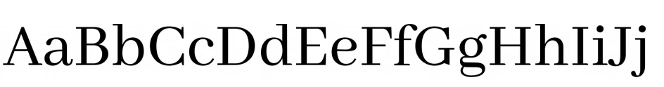
1. Playfair Display: Best Font for High-End and Fashion Branding
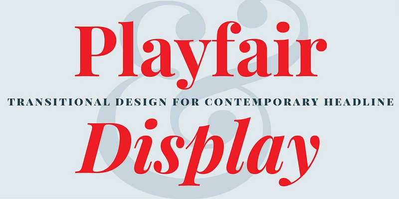
Elegant and high-contrast, Playfair Display is a serif font rooted in the transition between quill and steel pen writing of the late 18th century. Its polished style gained modern popularity in the 2010s, especially among fashion and editorial brands seeking sophistication.
Playfair Display is a classic for a reason. It adds sophistication and gravitas to any logo, making it a go-to for luxury brands and editorial layouts.
Best For: Playfair Display is best for brands who want to exude sophistication and elegance of luxury, similar to that of Chanel, Harper's Bazaar, and The Row.
2. Salsiccia: Best Font for Whimsical and Fun Branding
Playful and rounded, Salsiccia was designed for brands targeting a youthful or whimsical audience. Its bubble-like forms gained traction in the children’s and creative markets, particularly in the 2010s when bold, quirky branding became trendy.
Salsiccia is fun, whimsical, and full of personality. It’s great for brands that want to stand out by embracing their lighter side.
Best For: Fun and quirky branding of creative and children-focused brands like LEGO, Crayola, and Nickelodeon.
3. Youth Line: Best Font for Casual and Lifestyle Logos
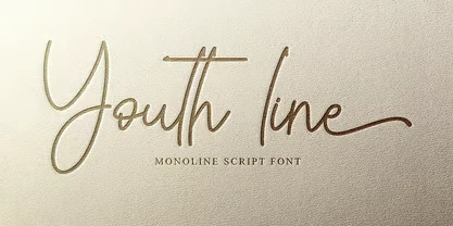
Loose and relaxed, Youth Line leans casual but not careless. This script font emerged during the handwritten font boom of the early 2010s, coinciding with the demand for authenticity in branding. It’s a favorite for lifestyle and personal brands looking to humanize their logos.
Best For: Brands that prioritize approachability and a personal connection — ideal for lifestyle and creative industries like Forever 21 and Glossier.
4. Skay: Best Font for Playful and Creative Logos
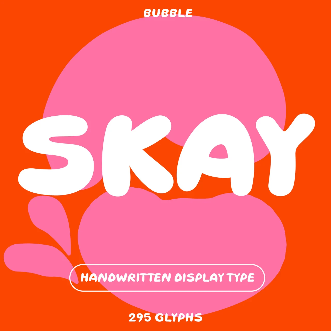
Skay is a handwritten bubble font designed to bring a playful and contemporary edge to branding. Its quirky, rounded strokes and hand-drawn style make it a standout choice for brands seeking an approachable yet modern personality. Developed for versatility, Skay thrives in both fun-loving and creative contexts, offering a balance of whimsy and professionalism.
Best For: Creative industries, lifestyle brands, and products aimed at younger or fun-loving audiences.
Pro tip: Bubble fonts like Skay are an emerging trend for logos in 2026, as brands increasingly prioritize warmth and individuality in their visual identity to connect with modern audiences.
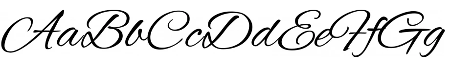
5. Des Montilles: Best Script Font for Artisanal and Luxury Products
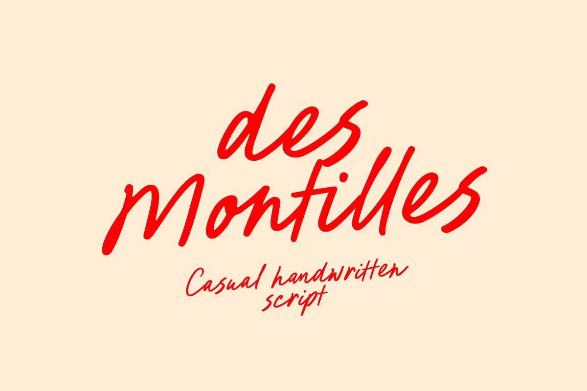
This refined calligraphic script gives off artisanal energy. This style rose to popularity among luxury and boutique brands in the early 2000s as the market for bespoke aesthetics grew and it remains just as relevant in 2026.
Best For: Perfect for upscale cafés, boutique labels, or any brand that wants to hint at tradition without going full vintage. Think of the premium, indulgent vibe of brands like Ladurée or Godiva.
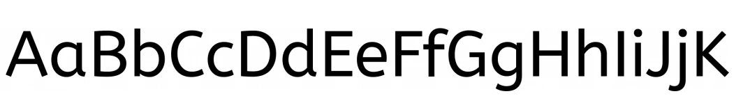
6. Gamuth Sans: Best Font for Global and Multilingual Branding
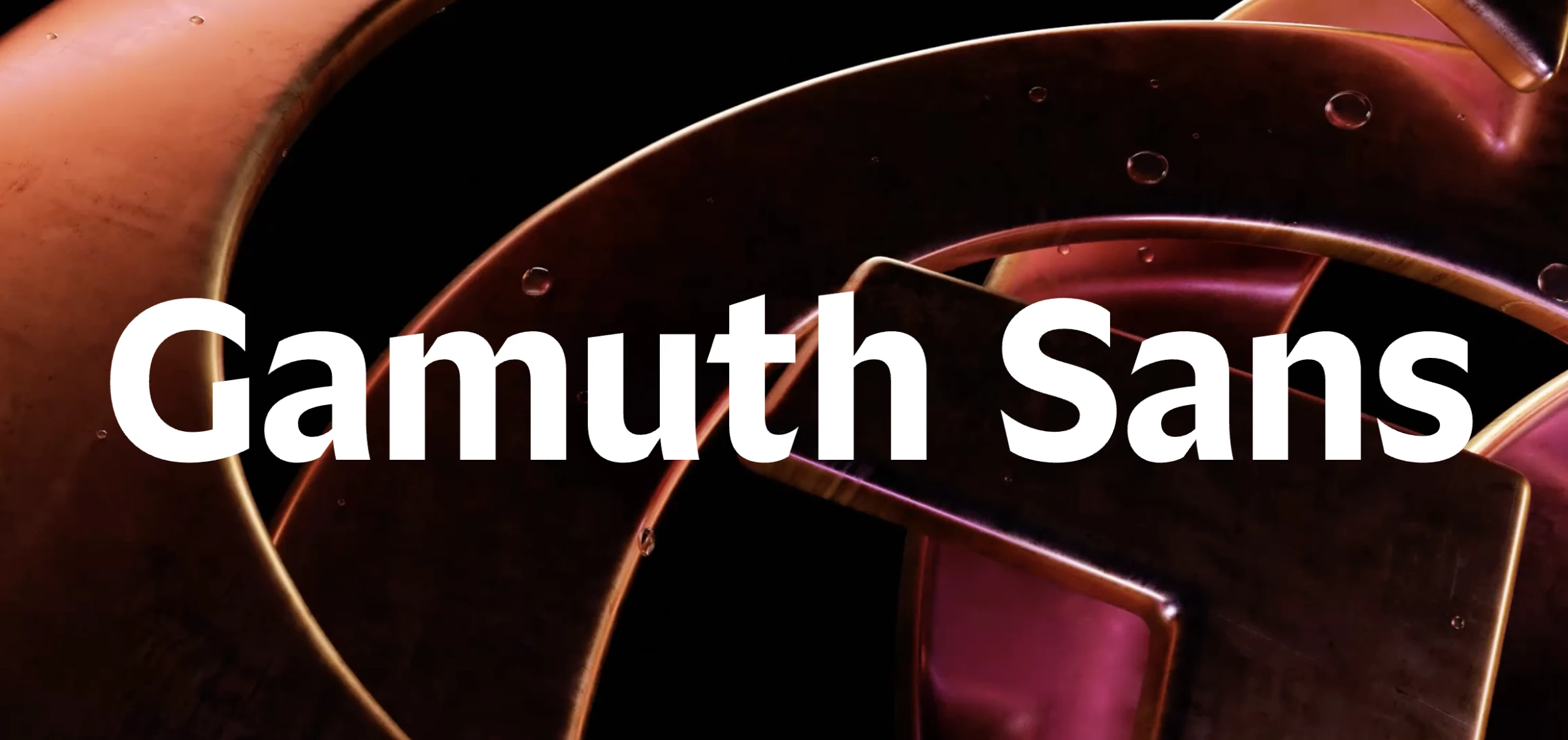
Gamuth Sans is a versatile, multilingual font that gained traction in the late 2010s as brands sought designs that worked across global platforms. It’s a workhorse with range. Gamuth Sans supports over 250 languages and holds its own in dense text or standalone logos.
Best For: Brands that share the same vibes as Google Workspace, Microsoft Teams, and Duolingo. It’s clean, neutral, and global — built for scalability.
7. Montserrat®: Best Font for Startups and Storytelling-Driven Brands
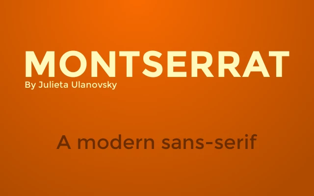
Familiar, friendly, and easy to use. Montserrat® is a go-to for tech companies, eCommerce brands, and anything that lives mostly on screens.
Designed by Julieta Ulanovsky in 2011, it is a font inspired by old urban signage in the Montserrat neighborhood of Buenos Aires. Its geometric simplicity and nostalgic charm quickly made it a hit among creatives seeking a balance between history and modernity.
Best For: Startups, creative agencies, and businesses rooted in storytelling or heritage. Montserrat’s geometric forms and urban-inspired design align with brands such as Etsy, Squarespace, and Airbnb.
8. Bricolage Grotesque: Best Font for Editorial and Creative Projects
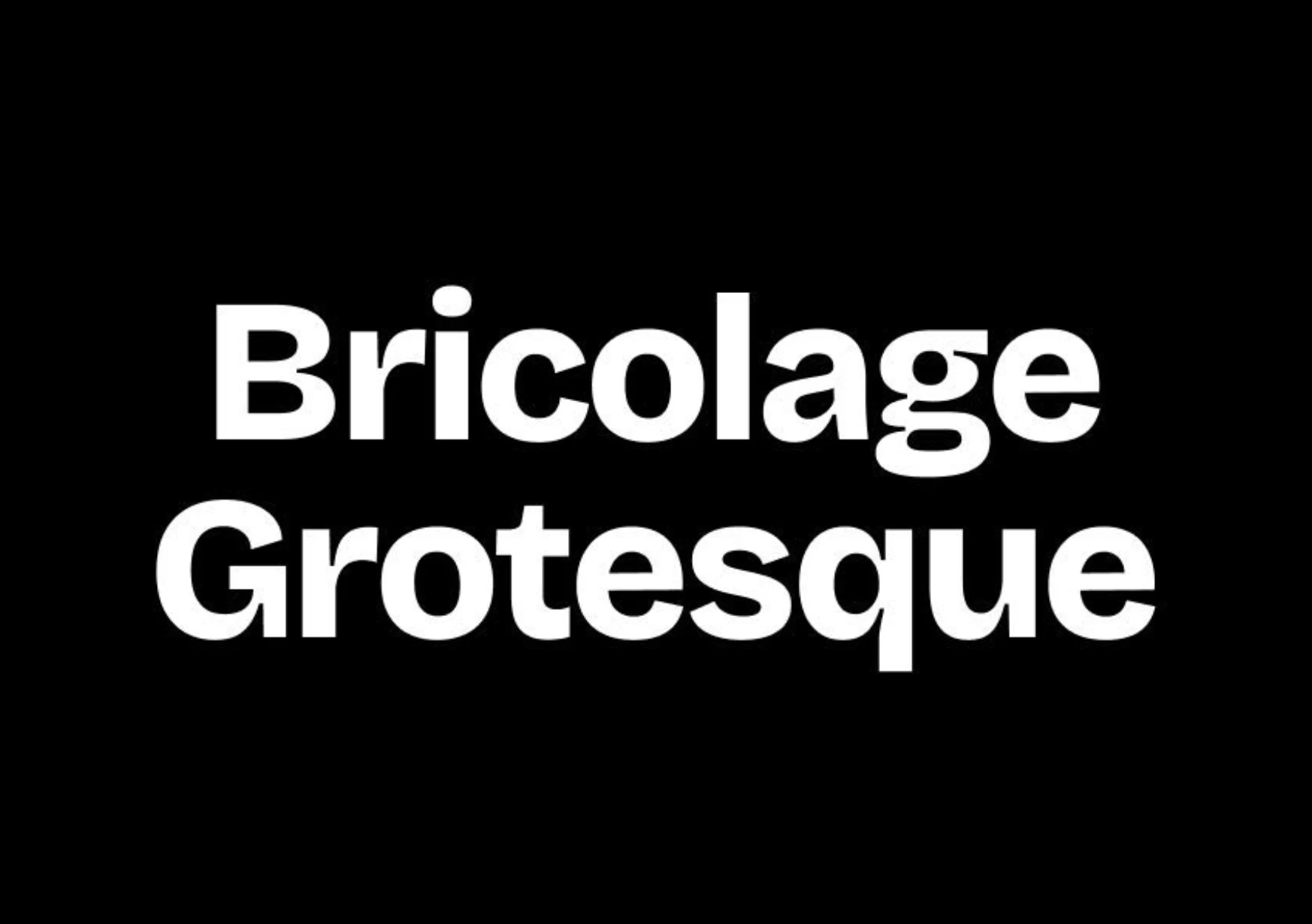
An offbeat sans-serif with character, Bricolage Grotesque adds a subtle twist to classic grotesques. It’s a geometric sans-serif font with distinctive details that make it stand out from the usual suspects.
Best For: Creative brands that don’t play it too safe. Think Vogue Italia, Complex Magazine, and Balenciaga. While Bricolage Grotesque isn’t directly tied to these brands, its quirky yet modern details mirror their creative and editorial-driven identities.
9. Gotham: Best Font for Urban and Modern Lifestyle Brands
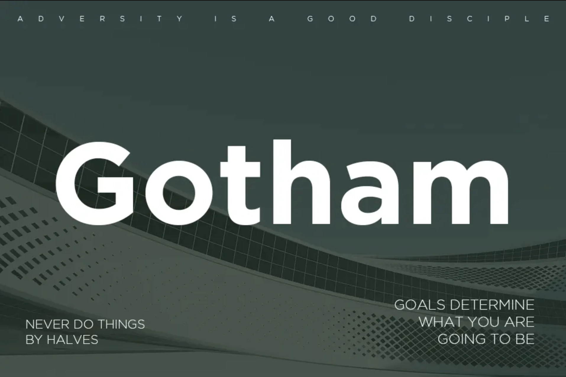
Gotham’s geometry is strong and straightforward, which makes it still one of the most dependable font choices for modern brands. Designed by Tobias Frere-Jones in 2000, Gotham was inspired by mid-20th-century New York signage.
Its rise to fame came with Barack Obama’s 2008 campaign, where its bold, geometric design symbolized hope and progress. Today, it’s synonymous with approachable professionalism.
Best For: Brands that are in the urban lifestyle and tech-forward industries. It's ideal for logos that need to feel grounded and professional.
10. Helvetica Now®: Best for Minimalist and Corporate Logos
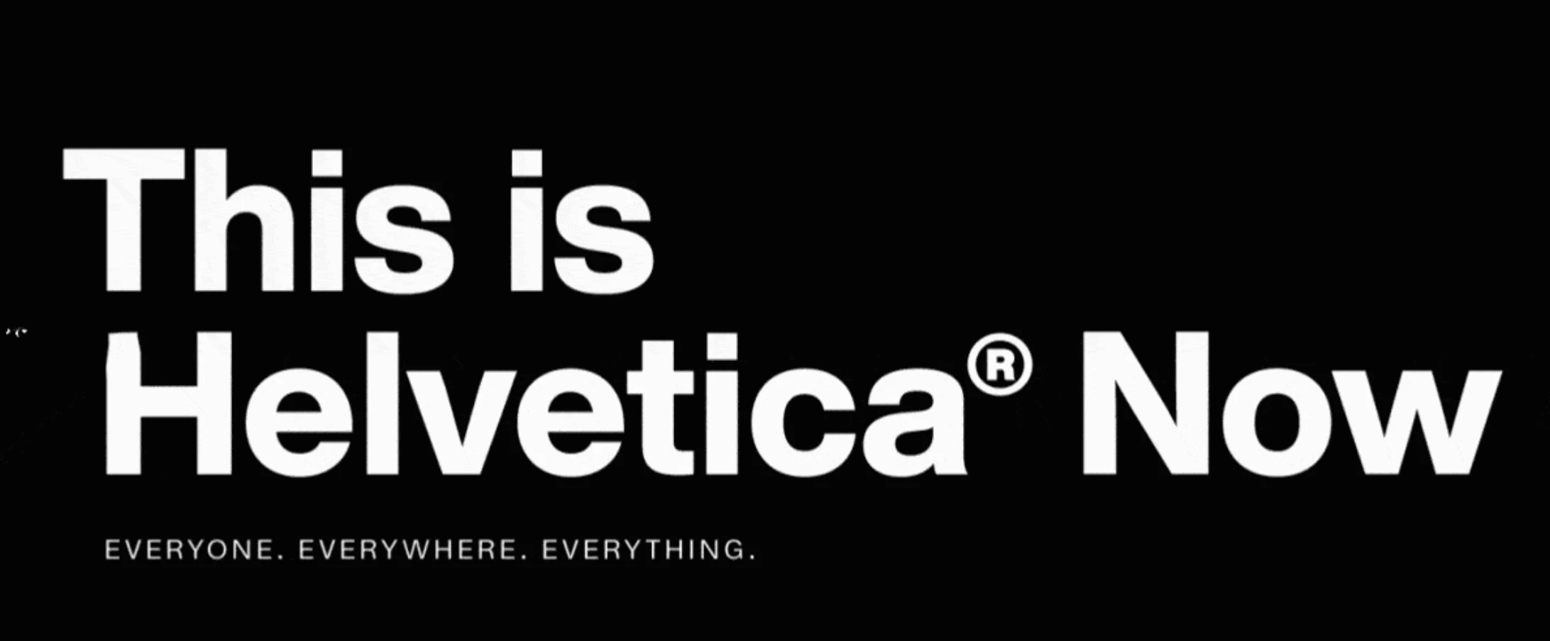
The Helvetica Now® is a refined take on its classic namesake by adding a dose of modern adaptability. Created in 1957 by Max Miedinger, the original font was a response to the need for clean, modern typography in post-war Europe.
Its "Now" iteration modernizes this classic with enhanced legibility and expanded weights, making it the default for corporate minimalism.
Best For: Minimalist and corporate logos, especially in tech and finance. Some notable examples include BMW, Panasonic, and Jeep, or really, any brand that thinks a straight line is a power move.
Four Types of Professional Fonts for Logos
Fonts are the foundation of your logo’s personality — choose wrong, and your brand sends mixed signals. Here are the four heavy hitters in the world of logo fonts:
1. Serif Fonts
The suit-and-tie of typography. Serifs scream tradition, authority, and class. Think high-end law firms, luxury brands, or heritage companies. They say, “We’ve been around, and we’re not going anywhere.”
2. Sans Serif Fonts
Clean, modern, and no-nonsense. Sans serifs dominate in tech, startups, and any industry that values innovation over frills. If you want your brand to feel sleek and forward-thinking, this is your go-to.
3. Script Fonts
Calligraphy with a creative edge. Script fonts are all about personality, making them perfect for lifestyle brands, boutique businesses, or anything artisanal. But tread lightly — they can go from elegant to unreadable fast.
4. Display Fonts
These are the show-offs. Bold, creative, and designed to grab attention, display fonts are perfect for brands that want to stand out. Think quirky cafes, trendy products, or edgy startups. Just don’t overuse them — they’re statement pieces, not staples.
If picking the best font feels overwhelming, lean on professional logo design agencies to ensure you get it right.
Professional Tips on Pairing Fonts
Pairing two or multiple types of fonts together is a very delicate step that can make or break a design.
Regarding the importance of pairing fonts in design elements such as logos, Monotype’s Creative Type Director, Terrance Weinzierl, says:
“Pairing typefaces expands your typographic palette by offering more hierarchy choices, more texture, and weight options, as well as an opportunity to fine-tune tone of voice."
Typeface pairing ranges from harmonious to contrasting. Harmonious fonts mean that things look similar, can blend well, or are related by formal qualities, while contrast emphasizes the differences.
Weinzierlsay observes that "pairing a sans-serif with another sans-serif might result in insufficient distinction because there is too much harmony and not enough contrast. For example, a blue shirt with blue denim might appear very dull, offering up too much harmony, but an orange shirt might have too much contrast.
“That’s when a compromise to use an analogous color would work best, such as green or violet which are neighbors to blue on the color wheel. A little bit of contrast, but mostly in harmony. The spectrum of typeface pairing works much like a color wheel in this way.”
Monotype Studio understands that hand-picked selections are tailored and that hiring a typographic consultant can be costly and time-consuming. That is why the studio developed its AI font pairing tool.
The studio started by focusing on the harmony between typefaces. As discussed, harmony demands certain similarities, which reduce dramatically as the design of the fonts moves towards contrasting pairs.
When developing the tool, they also focused their pairings on harmonious sans and serif designs that could both be used for smaller text. The typographic attributes were considered and prioritized when feeding the AI algorithm.
“This tool provides inspiration and insight into the art of font pairing while aiding the speed and quality of your font choices,” concludes Weinzierl.
How to Choose a Font for Your Logo: Factors to Consider
Fonts tell your audience who you are before you’ve said a word. Here’s what you need to nail it:
1. Design Accessibility
If people can’t read it, it doesn’t work. It’s as simple as that. Your font needs to be legible on a billboard, a smartphone, and everything in between. Accessibility isn’t just a bonus, but the baseline. A readable font ensures quick retention of your brand while staying inclusive to diverse audiences. The best fonts adapt to every medium without losing impact.
2. Brand Alignment
Your font is the handshake of your brand. A serif can say "heritage," while a sans-serif screams "modern." The best logo design don't just focus on the look, they also stay versatile. Whether your logo is on a product label, a website, or a business card, the font should reinforce your identity, align with your values, and adapt to every touchpoint.
Explore some of the best fonts for websites.
3. Market Appeal
Timeless or trendy? That’s the tightrope. A classic font gives your logo staying power, but a trendy one can inject immediate relevance — just don’t let it age out too soon. Fonts should also resonate culturally. Choose something that speaks the language of your audience and industry to ensure your message lands where it matters.
4. Technicalities
Not all fonts are created equal, and using the wrong one can cost you — legally and creatively. Stick to licensed production fonts like those from Monotype to guarantee quality and avoid headaches. These fonts are built for professional use, ensuring consistency in both print and digital formats while meeting industry standards for a polished, professional look.
Where To Find the Best Fonts for Logos
The logo-friendly typography we just listed may be scattered across different online resources, so collecting them all could be very time-consuming.
With a massive library of versatile fonts, Monotype Fonts is a one-stop shop providing typography solutions for creative agencies, as well as small teams, individuals, and large enterprises.
Monotype’s three base pricing plans are all customizable based on the designer’s or company’s needs and requirements, including production fonts and fonts for printing and commercial use.
Meanwhile, the $199-a-year plan for individuals and small teams comes with 150,000 fonts, instant font syncing, live chat support, and the ability to create logos containing fonts, among other features.
All that said, choosing a great font is one step, but building a full logo that captures your brand is another. You don’t have to figure it out alone. DesignRush connects you with professional logo design agencies that can do both. Just send in a brief and get tailored proposals from top-tier teams.
Best Fonts for Logos: The Bottom Line
The fonts that dominate 2025 are those that meet the moment: versatile, impactful, and unapologetically aligned with brand identities. Whether you aim to convey heritage, innovation, playfulness, or elegance, the typefaces on this list offer the tools to visually articulate your brand’s purpose with precision and flair.
As brands face the challenge of standing out in increasingly saturated markets, the right font becomes a competitive edge, shaping how your story is told and remembered.
When in doubt, enlist professional logo design agencies to elevate your font choices and ensure your logo isn’t just seen. Make sure it’s unforgettable, too. After all, the right typeface is more than just a detail. It’s the cornerstone of a memorable brand.
DesignRush users can exclusively access Monotype’s massive font library at 10% off the Create+Deploy $199/yrplan using the code DesignRush10.
Best Fonts for Logos FAQs
1. What are the most popular fonts for logo design in 2026?
Some of the most popular fonts for logo design in 2026 include Helvetica Now for its timeless clarity, Gotham for its modern versatility, and Playfair Display for its elegant, high-contrast design. These fonts cater to diverse industries, from tech startups to luxury fashion, and are favored for their adaptability across digital and print platforms.
2. How do I choose the right font for my logo?
To choose the right font for your logo, focus on three key factors: your brand's personality, your target audience, and the industry you operate in.
Serif fonts work well for traditional and heritage-driven brands, while sans-serif fonts are ideal for modern and minimalist designs. If you’re unsure, consulting with professional logo design agencies can help you align your font choice with your overall branding strategy.
3. Are free fonts good for professional logo design?
Free fonts can be a great starting point for logo design, but they come with limitations. Many free fonts lack the licensing required for commercial use, and their design quality may not match that of premium or production fonts.
For a professional and polished look, investing in a licensed font ensures consistency, reliability, and legal compliance.
Pro tip: For fonts with unspecified licensing details, it's advisable to contact the respective designers or foundries directly to obtain accurate and up-to-date information before use.


