Led Zeppelin Logo Design
In 1971, Led Zeppelin sent its fourth album into record stores without its own name on the cover. The Led Zeppelin logo grew out of that refusal into four hand-drawn sigils, a custom Art Nouveau revival wordmark, and a winged figure Hipgnosis adapted from a 19th-century painting. No master trademark ties them together, and that gap became the brand.
What To Know
- Hipgnosis, the London studio of Storm Thorgerson and Aubrey Powell, drew the classic wordmark in 1973 for the Houses of the Holy artwork.
- The 1971 fourth album ran with no band name or title on its front cover.
- Two of the four sigils came straight from Rudolf Koch's 1930 Book of Signs.
- The Swan Song label mark adapts William Rimmer's Evening (The Fall of Day), a canvas he worked on from 1869 to 1870.
- No commercial typeface reproduces the wordmark, though the 1965 face Davida shares its Victorian vocabulary.
- Planning a mark of your own? Compare these vetted logo design companies.
The Evolution Of The Led Zeppelin Logo In 1970s Branding
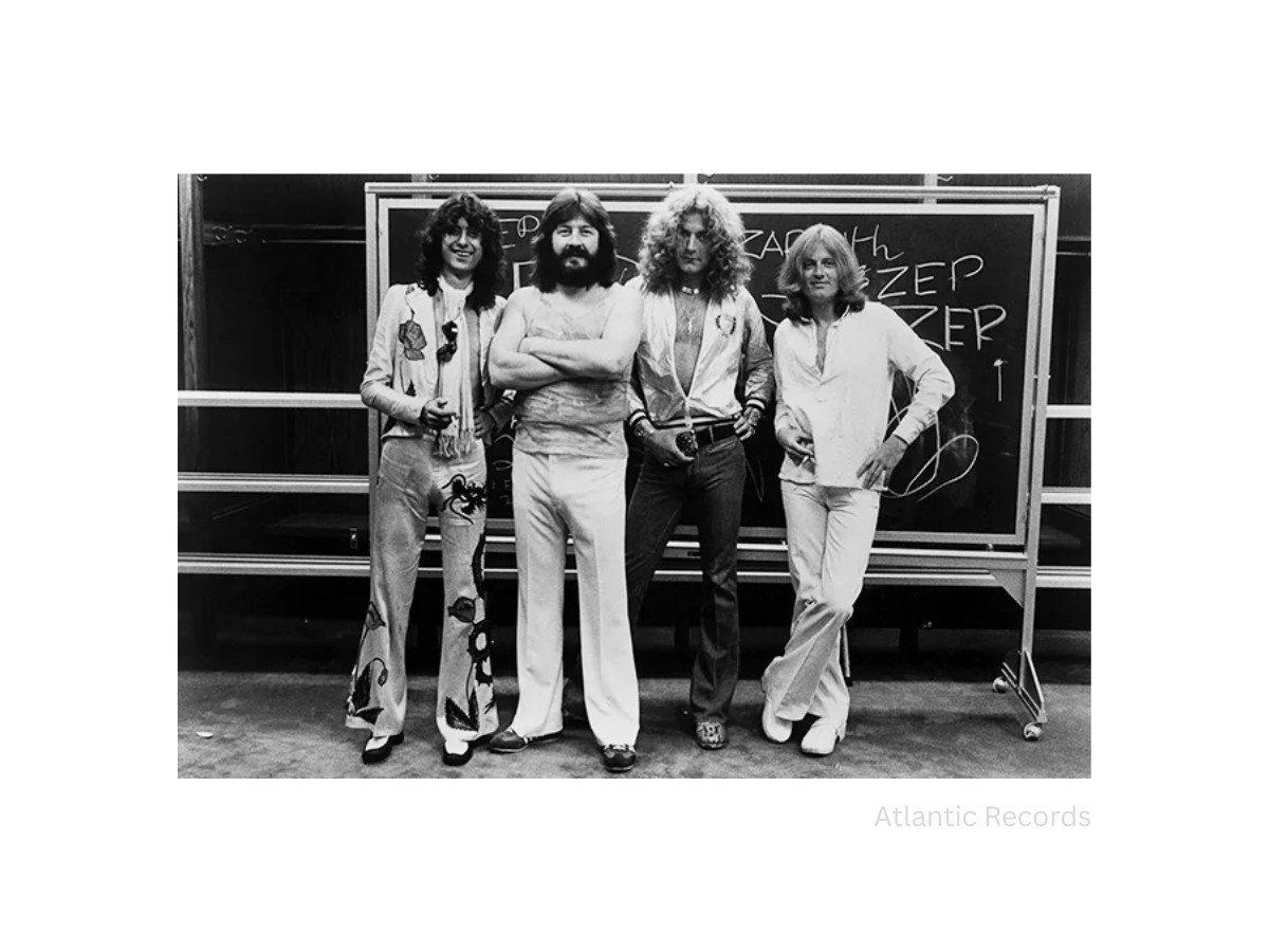
The Led Zeppelin logo broke from corporate trademark practice by working as an adaptive identity system instead of a fixed brand mark. The band rejected the grid-built trademarks of the late 1960s and rotated typographic and symbolic motifs from album to album, with no single wordmark until 1973.
The 1968 Corporate Standard
In 1968, American corporate identity ran on reduction. Paul Rand had drawn the IBM brand mark in 1956 and the Westinghouse circle in 1960, and Chermayeff & Geismar gave Chase its octagon in 1961. Each came with a manual that fixed clear space, color, and proportion.
Max Miedinger's Helvetica arrived in 1957 and supplied the neutral grotesque voice. Today's branding agencies still build systems on the same logic.
Three Sleeves, Three Identities
The band's first three sleeves ran the other way. The 1969 debut used George Hardie's stippled ink drawing of the Hindenburg, Led Zeppelin II used a hand-tinted photo collage by David Juniper, and Led Zeppelin III hid its imagery on a rotating card wheel by the artist Zacron.
No two covers shared a type treatment or lockup, which rock logo history shows was rare for a major act.
Withholding The Name
The refusal reached its logical end in 1971. The fourth album shipped with neither band name nor title on the front, which made visual iconography the only identifier. That authored decision set a template for anti-corporate branding in rock.
Swan Song Records then launched in May 1974 with a winged mascot of its own, so the band name, the label, and each album answered to separate marks.
Typographic Anatomy And The Led Zeppelin Logo Font
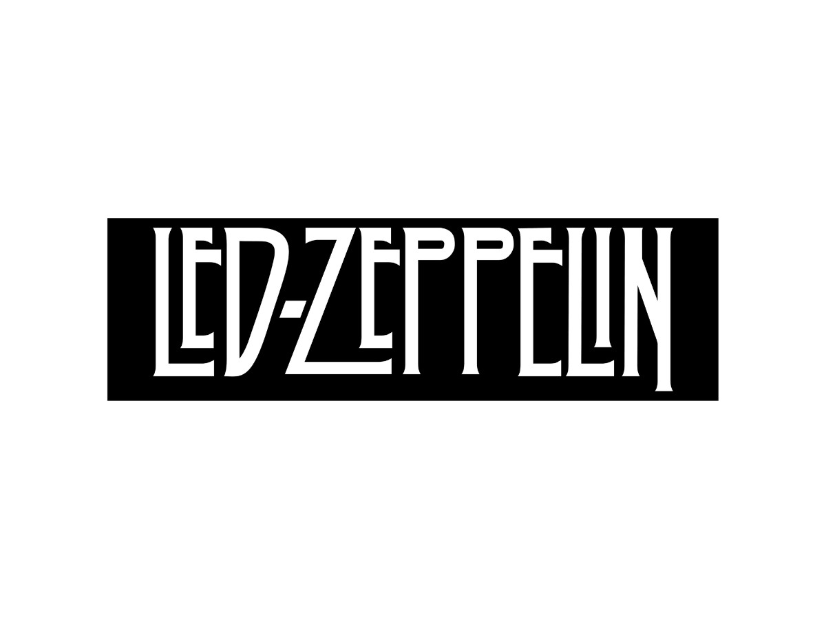
The Led Zeppelin logo font is custom lettering that borrows from Victorian display type and the Art Nouveau revival, with no commercial typeface behind it. The 1973 letterforms pair high-contrast strokes with swelling, flared terminals and long tails on the L and Z, so the word reads as one composed shape.
A Victorian Revival Lineage
The nearest relative is Davida, a Victorian revival face Louis Minott drew for a 1965 Visual Graphics Corporation competition. The Zeppelin letters borrow its vocabulary of bulbous stems and tight counters.
That revival has a clear lineage. Milton Glaser and Seymour Chwast founded Push Pin Studios in 1954 and reopened Art Nouveau and Victorian sources as a rebuke to Swiss Style grids. By 1966, Victor Moscoso's posters for San Francisco's Avalon Ballroom pushed the same curves into optical vibration.
Weight, Color, And Spacing
The Zeppelin wordmark keeps the ornament and drops the vibration. It sits in solid black (#000000; CMYK 0, 0, 0, 100) on white (#FFFFFF), with heavy downstrokes that carry the weight of hard rock without the bubble letters of hippie poster art.
Spatial balance comes from the outer letters: the extended strokes of the L and Z act as built-in underlines that cradle the lowercase, and the kerning closes each pair until the counters nearly touch. The two lowercase e's differ in size, a hand-lettering decision no font file would make.
Current print design and vintage logos that borrow period type show the same restraint.
Why Fan Fonts Fall Short
Digital adaptations miss this. Fan fonts such as Kashmir or Typodermic's Carouselambra force the letters into fixed glyphs with default sidebearings, which flattens the custom pairings.
Hand-letter a wordmark for 11 letters and you can keep quirks a full alphabet can't. Raise that point with any team commissioning custom wordmarks, and study how film marks such as the Jurassic Park logo pair title lettering with a symbol.
The Four Symbols: Deconstructing The 1971 Runes Identity System
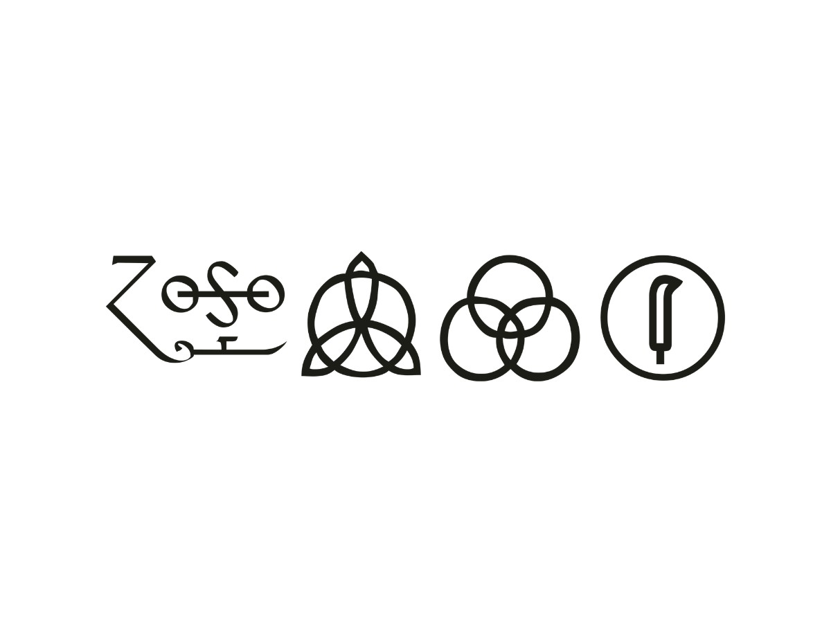
The Led Zeppelin logo became a nonverbal sigil system on the untitled 1971 fourth album. Each of the four members contributed one custom mark, and the set replaced text on the inner sleeve and labels, which forced buyers to read esoteric iconography in place of a commercial name.
Four Marks, Four Authors
Jimmy Page drew his own mark, a calligraphic, asymmetric sigil with letter-like strokes. Robert Plant also designed his, a single upright feather inside a heavy ring.
John Paul Jones chose a triquetra of three interlocked vesica shapes over a circle, and John Bonham chose three interlocking Borromean rings in an even monoline weight.
A Modular Sub-Identity
As branding, the set works like a modular sub-identity. Each sigil names one person, and together they act as the master brand. Three of the four sit inside or form a circle, so Page's script becomes the focal mark by contrast alone, a principle you can still trace across modern logo symbols.
Koch's presence matters to typographers. Jones and Bonham took their marks from The Book of Signs, the 1930 catalog of historical symbols that the German designer behind Kabel and Neuland compiled. In other words, the band sampled half its system.
Where The System Bent
The structure also scaled. A fifth mark, three small triangles, credits guest vocalist Sandy Denny on "The Battle of Evermore," proof the logic could absorb a new contributor.
Live use exposed its limits: after the winter 1971 UK tour, stage gear kept only Page's and Bonham's marks. Studios pitching packaging design with member-level marks face the same pressure once a system leaves the album sleeve.
Comparing The Led Zeppelin Logo With 1970s Rock Competitors
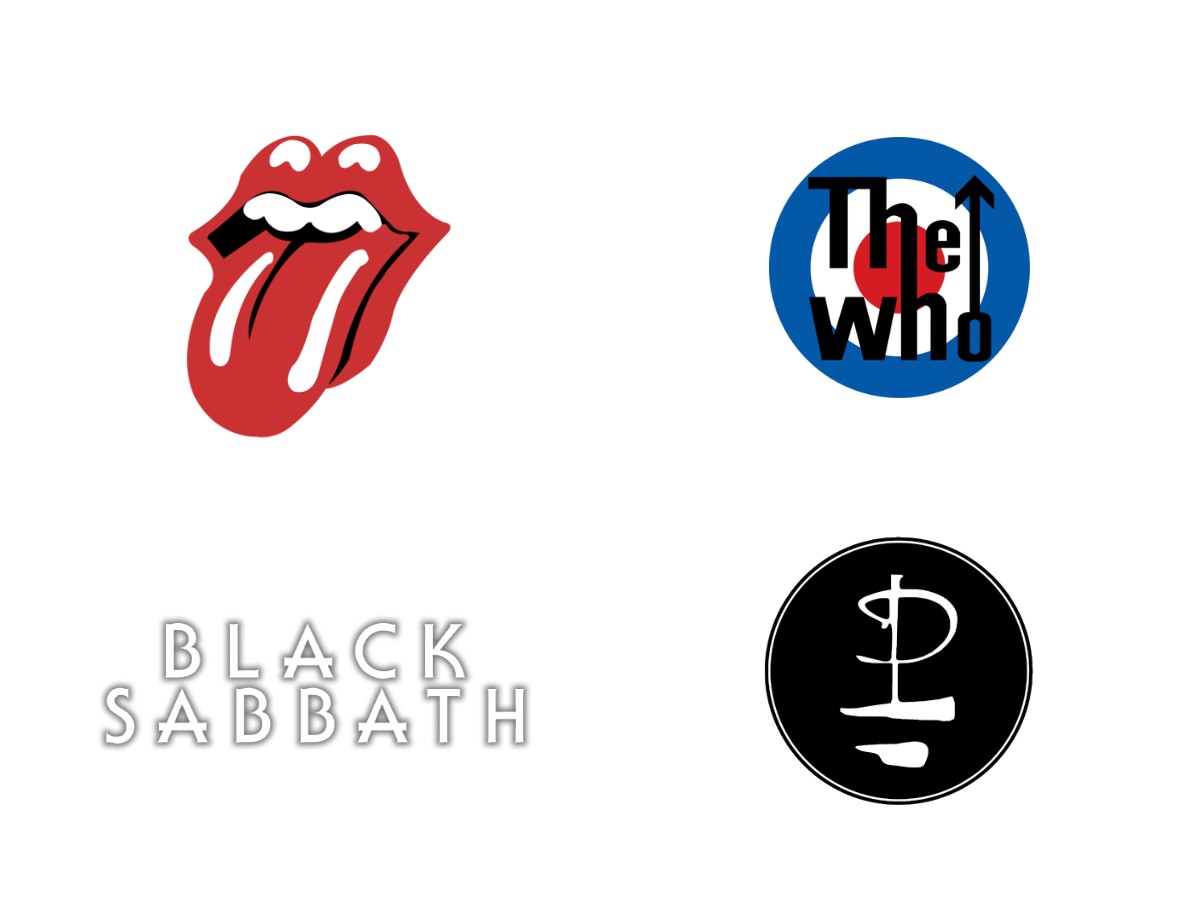
The Led Zeppelin logo chose esoteric visual storytelling while its rivals chose instant recognition. The Rolling Stones and The Who relied on pop-art icons and clean geometric type, and Led Zeppelin spread its identity across sigils, ornamental lettering, and fine art that resisted merchandising standardization.
Single-Symbol Icons
The Stones make the sharpest contrast. John Pasche's "Tongue and Lips" arrived in 1971, the same year as the four sigils. It is an irreverent, hyper-commercialized icon you can read at thumbnail size, and Nike's Jumpman silhouette works on the same logic.
The Who sat closest to Swiss logic. Its 1965 target and arrow typography borrows from mod culture and Royal Air Force roundels and reduces identity to concentric circles and one stroke. Many of today's best logo designs follow that single-shape discipline, including the folded Netflix N.
Looser Systems
Black Sabbath shows what Led Zeppelin avoided. Its wavy psychedelic and gothic types sent a raw, genre-specific signal, but the lettering never settled into a refined typographic structure. Fictional metal marks such as the Hellfire Club logo still borrow that rough energy.
Pink Floyd is the closest cousin. Storm Thorgerson's atmospheric photomontages let surreal imagery carry the brand in place of a persistent typography system. Its identity lives almost entirely on the sleeves, a pattern critics of rock and roll graphic design trace across the decade.
Design Longevity: Is The Led Zeppelin Logo A Classic?
The Led Zeppelin logo earns classic status through a mix of typographic craft and cultural mythos, and the two carry unequal weight. The wordmark stands on its own construction, while the sigils lean on the music. Together they form an early model for anti-corporate brand positioning.
The Indie Band Test
Put this system on an unknown pop act's debut today, and the wordmark would hold up: a confident silhouette, tight kerning, and an Art Nouveau revival voice that reads as a deliberate choice. Hand it to any of today's graphic design agencies and it would survive the critique.
The sigils fare worse under the same test. Two come almost unaltered from Koch's catalog, so their forms owe little to the band, and much of their charge comes from more than 50 years of association.
The Swan Song figure sits in between. Rimmer's painting does most of the visual work, and Hipgnosis and illustrator Joe Petagno cut it into a label emblem with a clean silhouette.
A Lesson For Brand Architects
What survives the separation is the architecture: a withheld name, member-level sub-marks, and a label with its own mascot. The band authored those brand decisions, and they would read as sharp thinking for a band nobody has heard of.
Hipgnosis drew the wordmark as part of a cover, and the strongest packaging designs still treat identity as something the product carries in context. Borrow the system and draw your own marks, because a sampled symbol only works once the audience has already decided to care.
Our team ranks agencies worldwide to help you find a qualified partner. Visit our Agency Directory for the Top Logo Design Companies as well as: