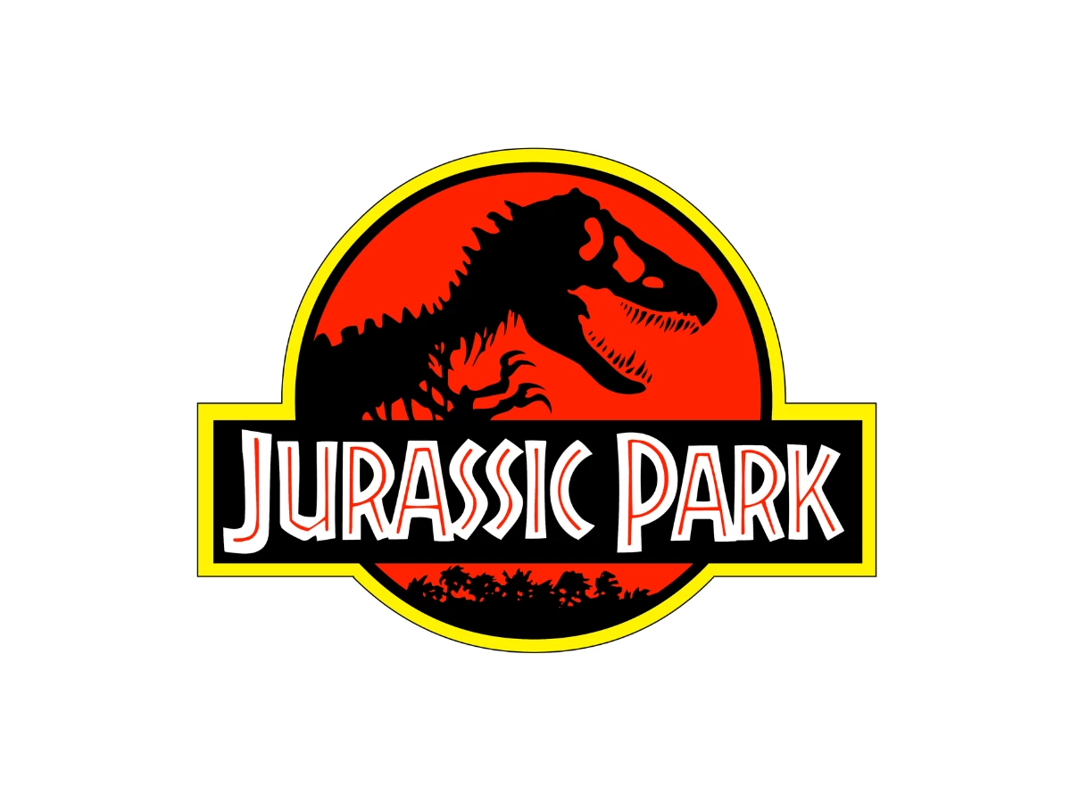

In 1993, Steven Spielberg refused to show a single dinosaur in his marketing. So the face of that summer was a black skeleton in a red circle, and more than 35 years later, the Jurassic Park logo still sells the franchise better than any creature on screen.
Chip Kidd traced that skeleton from a paleontology textbook in 1989 for Michael Crichton's book jacket, and no film has redrawn it since. The circle, lettering, colors, and finish around it change with every release. That split between a fixed core and a flexible container is why the mark lasts, and it's the lesson for any logo meant to outlive its first job.
Our verdict: a near-perfect core in a slightly dated container, and Kidd has admitted his design teacher would not have approved of what the studio added. We side with the teacher on the extras and with the studio on the system, and we score the logo 4.3 out of 5.
What To Know
- Chip Kidd drew the T. rex skeleton in 1989 for the first-edition jacket of Michael Crichton's novel.
- Most accounts credit Sandy Collora with the film logo's circle, lettering, and colors, while Mike Salisbury's studio ran the logo search.
- Every sequel kept the skeleton and changed its container, from cracked rock to steel to amber.
- Kidd traced the skeleton from a paleontology textbook, then edited it into a silhouette.
- We score the logo 4.3 out of 5.
Anatomy Of The Jurassic Park Logo
The logo is an emblem, one of the core types of logos, and it has five parts. The black T. rex skeleton runs across the center. A red circle sits behind it, and a yellow ring frames the whole badge.
Below the animal, a strip of jungle silhouette gives the skeleton scale. A black bar carries the "Jurassic Park" title in a chunky inline display face, and the bar's yellow edge ties it to the ring.
Those parts sort into two layers. The skeleton is the core, the one element every version keeps. The circle, jungle, lettering, and colors form the container, and the studio can rework all of them without touching the drawing.
Kidd confirms the split from his side. When he first saw the film logo in a full-page ad, he noticed they hadn't altered his dinosaur at all, and everything around it looked new. That clean handoff is the system the rest of this review tests.
Where The Skeleton Really Came From
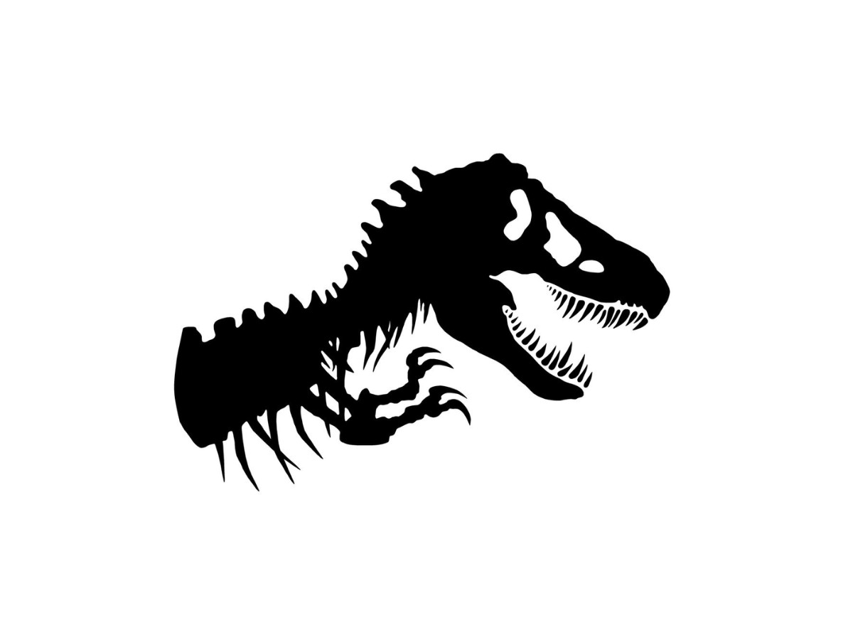
Kidd drew the skeleton in 1989 as a 25-year-old junior designer at Alfred A. Knopf, long before he joined lists of the most famous graphic designers. Crichton's novel came out in 1990, and Spielberg had already optioned it, so Kidd knew the jacket had to land as hard as Jaws.
For reference, he visited the American Museum of Natural History and bought a thick scholarly textbook in the gift shop: Robert L. Carroll's "Vertebrate Paleontology and Evolution." He photocopied a T. rex skeletal diagram, traced it by hand, and drew a silhouette that made the bones look alive.
The tracing gave him correct anatomy. The edits made the design. He filled the form solid, dropped every interior line the diagram needed for science, and printed it in a dark green he later linked to primordial ooze.
Put the small, plain source diagram next to the jacket, and you can see how far the final image traveled. The skeleton looks so hungry that your eye needs a moment to register bones.
That leaves a credit question nobody has settled: someone drew the original textbook diagram, and that person rarely appears in accounts of the logo. Some histories trace it back to Henry Fairfield Osborn's 1917 reconstruction, but we couldn't confirm which drawing Carroll's book reproduced, so we report what Kidd did and leave the judgment to you.
One Drawing, Two Jobs
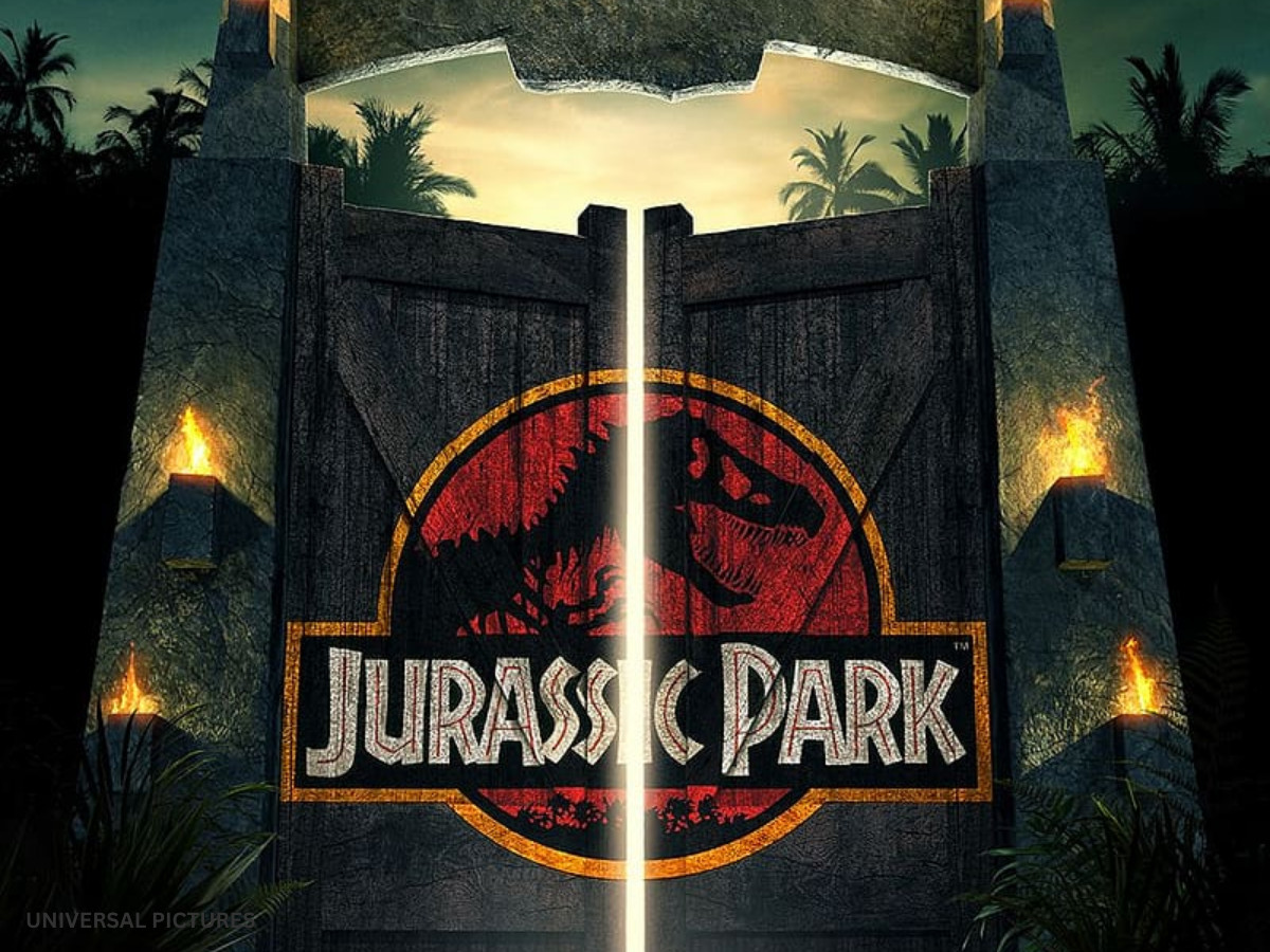
The skeleton had to sell a film and brand a fictional park at once. Spielberg kept the film's dinosaurs out of the marketing, so the poster couldn't lean on creature effects. A single graphic had to carry the whole campaign.
The second job happened inside the story. The logo needed to pass as the real brand of Hammond's park on jeeps, gates, uniforms, and gift-shop goods. Salisbury says Spielberg asked for a badge from day one, a shaped logo that could go on any prop cheaply.
His team tested other dinosaur images and then went back to the skeleton from Crichton's jacket, which already had recall. Licensing pressure pushed the same way. More than 80 companies reportedly bought rights to the logo before the final version existed.
That double duty explains why the mark feels real on screen. A theme park would brand itself with something bold, flat, and easy to stamp on a door. The film borrowed that credibility, and the skeleton became the park's own logo inside the movie as well as the film's title treatment.
Fans then bought the same merchandise the characters wore. Few film marks get to live in the story and on the store shelf with zero changes between the two, and that run put it among the most famous logos of the 90s.
How The Sequels Changed The Container
Every sequel kept the badge format and reworked the container. Set this run beside other logo redesigns, and the discipline stands out: the skeleton stayed the anchor, with one exception that proves the rule.
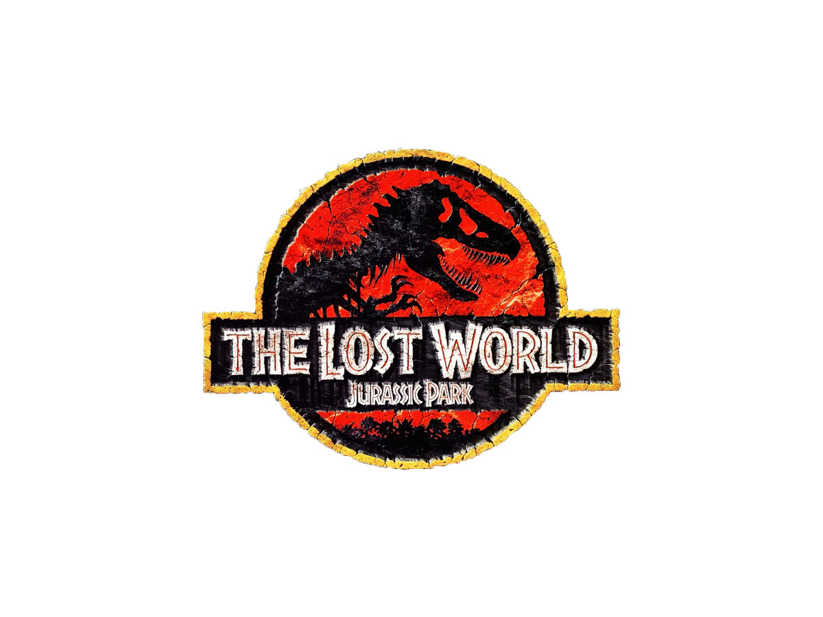
The Lost World (1997) set the logo in cracked-rock relief and stretched the badge slightly to fit the subtitle. The change felt like a sequel without losing the original.
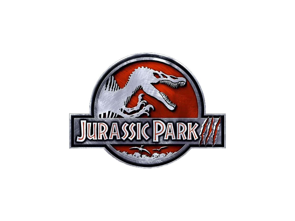
Jurassic Park III (2001) swapped the T. rex for a Spinosaurus and added a Pteranodon shadow. The drawing works on its own, yet the badge stopped feeling like the badge. In our view, this is the weakest entry because it touched the core.

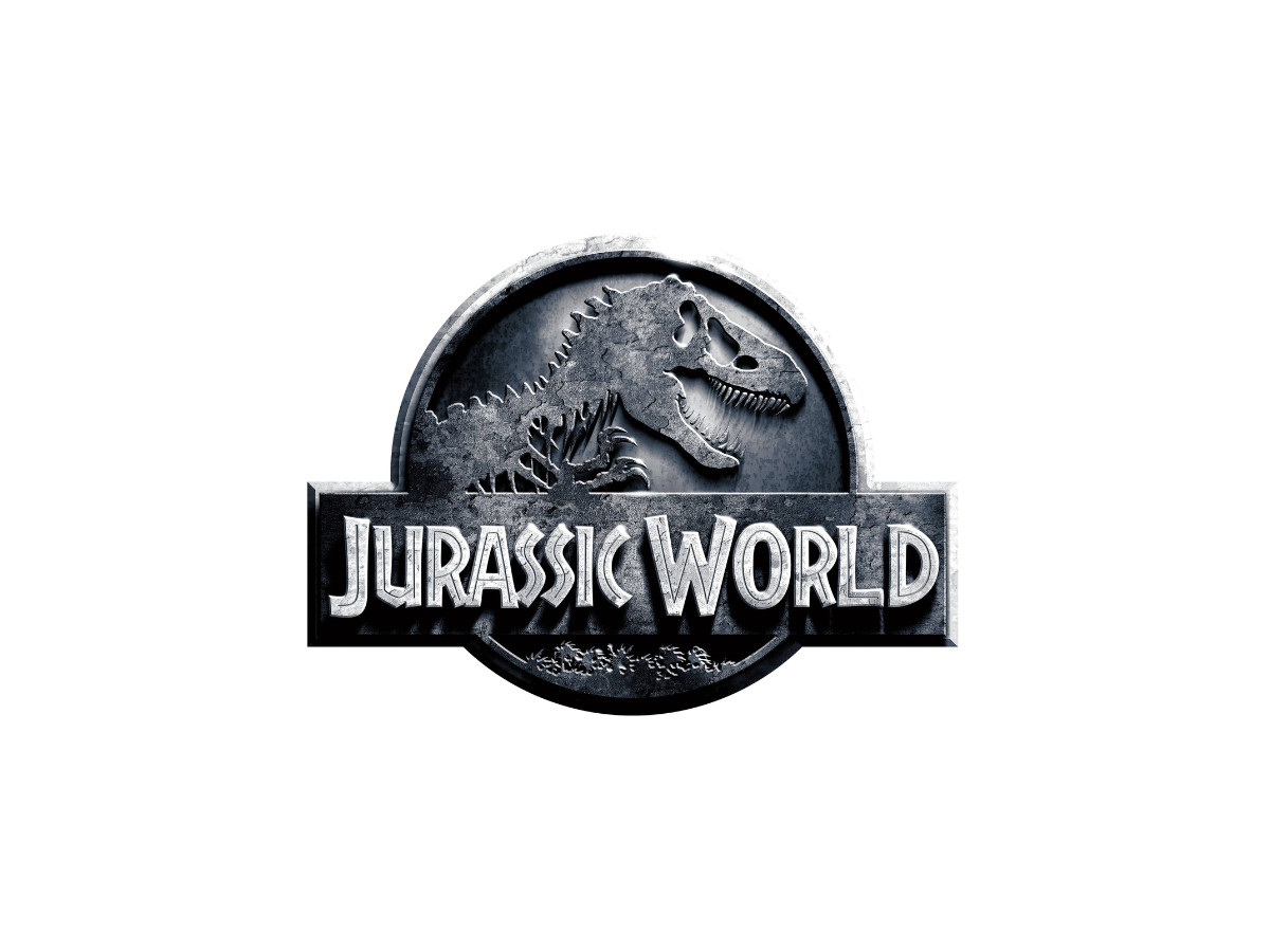
Jurassic World (2015) brought the T. rex back and cast the badge in steel with a new title. That return did more for the franchise's identity than any finish since.
Fallen Kingdom (2018) cracked and scorched the surface. The fire damage matches a film about a park falling apart, and the skeleton still reads through the wreckage.
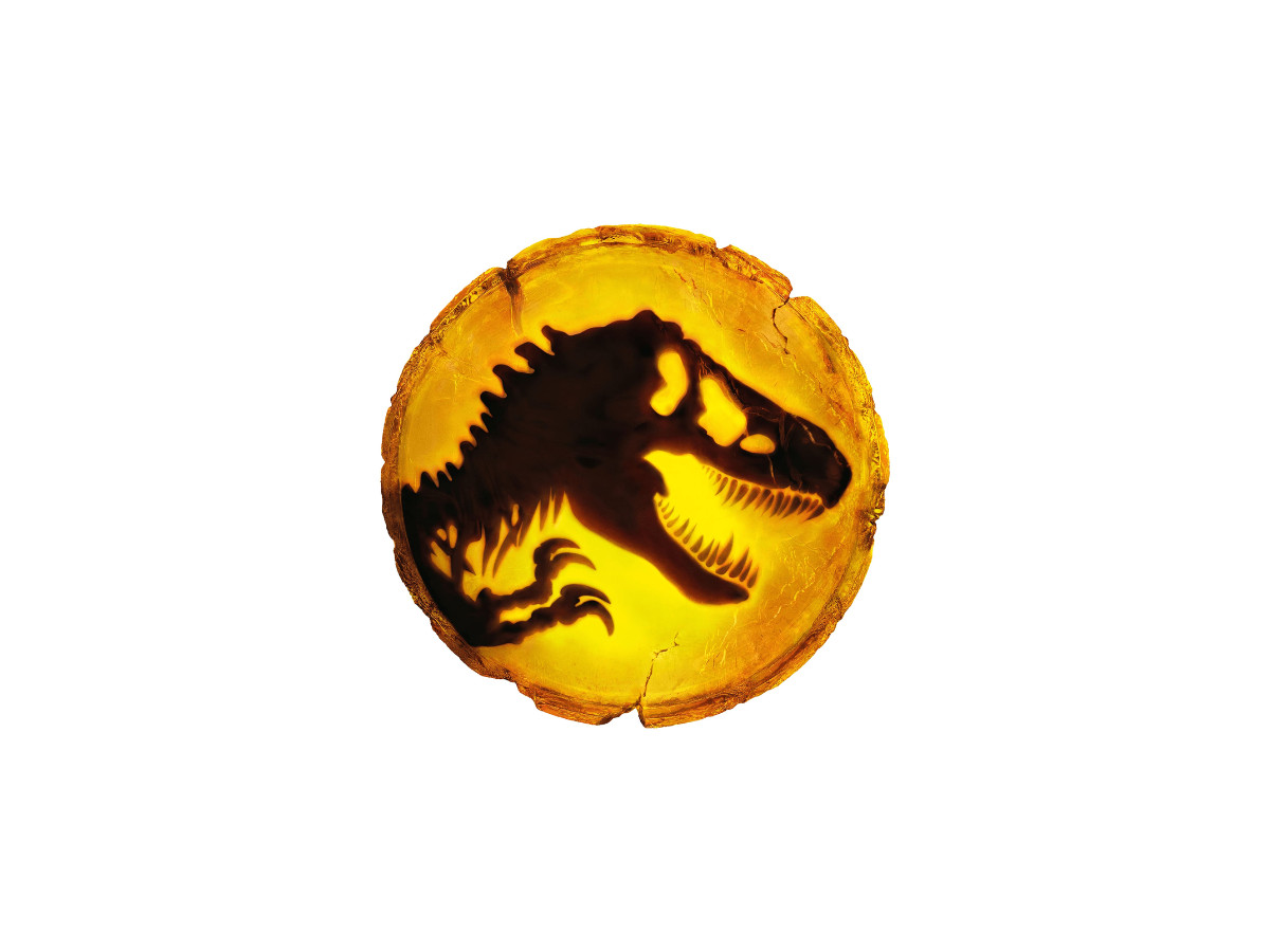
Dominion (2022) sealed the original skeleton in amber. The story pulls its dinosaur DNA from insects trapped in amber, so the material and the plot finally point at the same idea. We rate it the strongest container of the set.
What To Use For Your Own Logo
The Jurassic Park logo gives three kinds of readers something to use this week. Each section below comes with a test you can run on your own work.
For Working Designers And Design Students
Use our six criteria as a template the next time you critique a famous mark. Score concept, small-size legibility, typography, color, flexibility, and longevity, and force yourself to write one line of reasoning per score.
Then apply the reference test from Kidd's story: put your source next to your final mark, and list every change you made. If the list is short, you traced, and you haven't designed yet. Building a logo design process around that list keeps you honest, and it gives you a clear story when you present the logo to a client.
For Founders And Small-Business Owners
You don't need a franchise to borrow this logic. Run your mark through four checks before you print anything:
- Strip away color and type, and ask a stranger to describe what's left. If they can't, you don't have a core yet.
- Shrink the logo to the size of a favicon, and check that the main shape still reads.
- Picture your logo on three different products or surfaces, and confirm one shape could carry all of them.
- Ask which single element you'd keep if a future redesign could only keep one. That element is your core, so protect it.
If your logo fails two or more, a logo design company can rebuild it around a stronger core.
For In-House Brand And Marketing Leads
Treat the sequels as your evidence. Four sequels reworked only the container, and the brand held each time. The one sequel that touched the core, Jurassic Park III, produced the weakest badge in the series.
Name your core in writing, and fix it in your brand guidelines. Test: strip away color, type, and framing, and ask whether customers still know the mark, then run the same test before any rebrand. A rebrand that drops the core can wipe out years of recognition overnight.
Quick Answers
Who Designed The Jurassic Park Logo?
Chip Kidd drew the T. rex skeleton for the 1990 jacket of Michael Crichton's novel. Sandy Collora and Mike Salisbury's studio turned it into the 1993 film logo with the circle, lettering, and colors.
What Font Is The Jurassic Park Logo?
The title lettering probably derives from Neuland Inline, a digital version of the 1920s Neuland typeface. Nobody has confirmed the exact source, so treat Neuland Inline as the closest match until someone does.
Can I Use The Jurassic Park Logo In My Own Work?
Only with a license from Universal, which owns the mark, so we don't offer or link to PNG or vector downloads. If you want a badge of your own, start with a shortlist of top branding agencies.

Our team ranks agencies worldwide to help you find a qualified partner. Visit our Agency Directory for the Top Logo Design Companies as well as:

-preview.jpg)