
The Netflix logo is a red ribbon folded twice, and that one fold carries the whole brand. Shrink it to a 48-pixel app tile and it still reads as an N. Blow it up on a theater screen and the same strip bursts into color as the tudum lands.
Few marks hold up at both sizes. Netflix pairs this one with two knocks and a guitar swell you can hear from the kitchen, and the catch is that almost all of it rests on one shade of red. Here is why the system works and which ideas are worth stealing.
What To Know
- The flat red wordmark replaced Netflix's drop-shadow logo on its website in June 2014.
- Netflix added the standalone N icon in June 2016 as a companion for apps and small screens. The wordmark stayed.
- Netflix's primary red is #E50914.
- Sound designer Lon Bender built the tudum, which debuted in 2015.
- Imaginary Forces and the Netflix brand team made the ribbon ident that has opened Netflix originals since Feb. 1, 2019.
Flattening The 2014 Wordmark Traded Popcorn For Pixels
Netflix flattened its wordmark in 2014 so it would read cleanly on any screen. The old logo had a red background, dimensional letters, and an oversized drop shadow, a marquee look that suited a company mailing DVDs in red envelopes.
A flat version showed up in Netflix trailers in May 2014. By mid-June it had replaced the old mark on the website with no announcement, and early reaction called it generic.
The trade was worth it. A flat red wordmark on black keeps its edges everywhere from a smart TV menu to a 300-pixel banner ad, and the letters still sit on a shallow arc with the N and the X taller than the middle letters.
You can read that arc as a curved cinema screen, though Netflix hasn't explained it, so the reading is ours. The curve did travel into the type. When Netflix swapped Gotham for Netflix Sans in 2018 with the foundry Dalton Maag, the lowercase t picked up a curved stroke that echoes the logo.
Two Reds And A Shadow Fake A Folded Ribbon
The N icon fakes a folded ribbon with two reds and a little shading. Netflix added it in June 2016 for mobile apps and kept the wordmark, and the symbol now anchors the brand system the studio Gretel built for Netflix.
Look at how Netflix built the letter. The uprights sit in a deeper red while the diagonal crosses in front in the brighter brand red, so you read one strip folded at the top left and bottom right.
That illusion costs almost nothing in detail, since there are no outlines or hairlines to break apart. Shrink it to a 48-pixel thumbnail and the fold still reads.
Netflix drew the N from scratch instead of cropping the wordmark, so the letter fills the app tile edge to edge. Set it beside the Spotify logo or the Instagram logo and the pattern repeats: a mark that lives at thumb size needs its own proportions.
Color does the rest. Netflix sets its primary red, #E50914, against black. On a dark tile the N looks lit from within, while on white the darker uprights lose some of that glow.
Netflix Logo Meaning: What The Ribbon N Stands For
The Netflix logo meaning, as its makers state it, is about stories. Gretel says the N stands for "connection and a never-ending stream of stories" for members. Netflix says the ribbon's 2019 burst of color represents its range of stories, emotions, languages, fans, and creators.
That is where the official record stops. Netflix has not published a meaning for the red itself or for the shape of the fold. Readings that tie the red to cinema curtains, or the fold to a strip of film, are interpretation, and this review's own reading of the wordmark's arc falls in the same bucket.
The Ribbon Does The Work The Wordmark Can't
The 2019 ribbon ident turns the N into a doorway into the show. It replaced the old intro, a wordmark on a white screen, on Feb. 1, 2019.
Imaginary Forces developed it with the Netflix brand team, starting with a longer theatrical cut. That version premiered at the Venice Film Festival ahead of Alfonso Cuarón's "Roma." The studio then adapted it for the streaming service, and Netflix said the work took about two years.
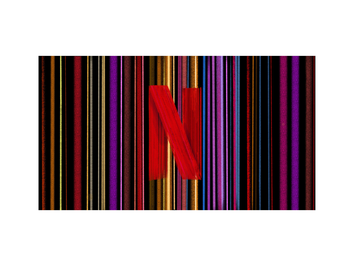
Watch the motion and you see why the folded construction matters. A red ribbon draws itself on black and settles into the N. Then the camera pushes into the letter, and the ribbon splits into thin colored bands that rush past you.
A Netflix spokesperson said those bands came from turning show thumbnails sideways, like records on a shelf. So the ident ends inside the catalog, and the logo works as the door you walk through to reach the show.
The velvety black background matters too. Netflix chose it to set the mood, and it borrows the dark of a theater before the film starts. On a white screen, the same motion would feel like a software update.
The Tudum Belongs In A Logo Review Because It Outlasted The Visuals
The tudum belongs in a logo review because it is the one part of the Netflix identity that has never changed. You also hear it from the kitchen before you see the screen.
The sound debuted in 2015. Todd Yellin, who led product experience at Netflix, wanted it short and cinematic, with tension and release in about three seconds.
Oscar-winning sound designer Lon Bender built the two knocks from his wedding ring tapping a bedroom cabinet, and he layered in a slowed anvil. The swell that follows, which his team called the blossom, is a decades-old reversed guitar loop by sound designer Charlie Campagna.
Netflix then tested finalists in a blind survey. Listeners didn't know the sounds were for Netflix, and the word they linked most with the tudum was "movie."
When Netflix rebuilt the ident in 2019, it left the sound untouched, and Yellin said visual idents go out of style faster than sounds do. For the theatrical cut, Netflix asked Hans Zimmer to stretch the tudum into a longer piece for theaters.
Where The System Earns Its Keep And Where It Strains
Restraint is the best decision in the Netflix identity, since one shape and one sound cover every screen. Gretel built the system on guiding principles instead of a thick rulebook, which leaves partners very little to get wrong.
The cost of that restraint is dependence on a single color. Take the red away and you get a folded letter on a black field. Red on a dark tile is also crowded territory on a phone, where several entertainment and social apps lean on the same family of reds.
Localization is the second soft spot. Gretel calls the N a symbol that transcends language, but an N is still a Latin letter, so viewers who read Hindi, Arabic, Korean, or Japanese learn it as a red shape with no sound attached.
The ident has a narrower problem, since it plays the same way before a horror film and a preschool cartoon. Bender built the tudum to fit any genre while the color burst carries one fixed mood, and a brand this disciplined could afford a few genre-tuned endings.
Takeaways For Brand And Motion Designers
Netflix's system is easy to admire and harder to copy, since most brands start with a wordmark and bolt the rest on later. Three habits from this one transfer well to smaller budgets.
- Draw the icon as a new letter. Cropping a wordmark's first character gives you a shape tuned for a line of text. Netflix drew a separate N that fills a square tile. Check yours at 48 pixels and at 1,024 pixels before you sign off.
- Build motion into the mark's construction. The ribbon fold gave Imaginary Forces a story to animate: draw the strip, fold it, then fly through it. If your logo implies no movement, your ident will sit on top as decoration.
- Lock the sound first and keep it under four seconds. Netflix changed its ident in 2019 and left the tudum alone. Brief your sound designer with feelings, such as tension and release, instead of genres. Then test finalists with listeners who don't know the brand.
Our team ranks agencies worldwide to help you find a qualified partner. Visit our Agency Directory for the Top Logo Design Companies as well as: