
What To Know
- Toyota's logo has moved through nine distinct marks since the Toyoda-era badge of the mid-1930s.
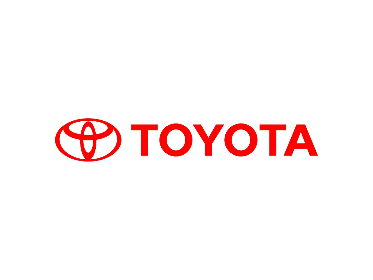
- Toyota's official emblem page reads the two inner ovals as the heart of the customer and the heart of the company, overlapping to form a T inside a larger outer oval that represents the world embracing Toyota.
- Toyota's in-house team spent about five years developing the three-oval emblem, which debuted on the Celsior in October 1989 for the company's 50th anniversary.
- Horizontal symmetry lets the emblem read correctly head-on and reversed in a rear-view mirror, a point Toyota UK makes directly.
- Toyota has not redrawn the three-oval geometry since 1989, so the chrome version of 2005, the red container of 2019, and the flat wordless version of 2020 are rendering and packaging choices rather than a new logo.
What Does The Toyota Logo Mean?
Toyota's official emblem page gives the meaning in plain terms. The two inner ovals represent the heart of the customer and the heart of the company. They overlap to show a relationship of trust between the two, and together they form a T for Toyota. The large outer oval represents the world that embraces Toyota. The open background space is meant to carry the values Toyota wants customers to feel.
That last part is more specific than most retellings admit. Toyota lists those values on the same page: quality, value beyond expectation, the joy of driving, innovation, and integrity in safety, the environment, and social responsibility.
Toyota's own account adds one more detail. Each oval is drawn with a different stroke thickness, a nod to the brushwork of Japanese calligraphy. Toyota UK repeats the same reading and adds the mirror point covered above. For how the mark holds up next to other marques, see our roundup of car company logos.
The Toyota Logo History
Nine marks, each anchored to its year. Where the sources disagree on a date, the article says so.
1935: The Toyoda Badge
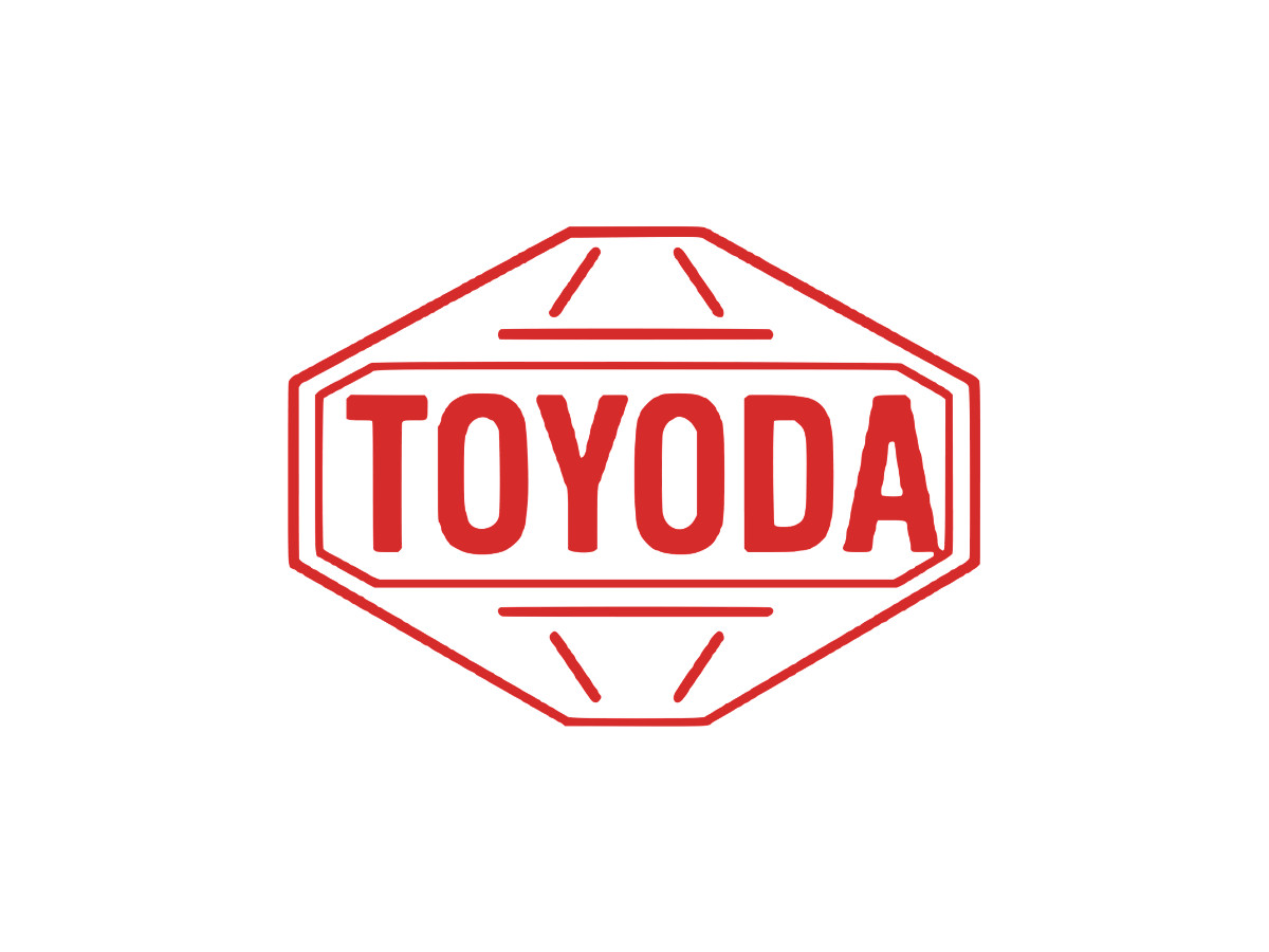
The first mark carried the founder's family name, Toyoda, in red inside a bordered emblem. The sources split on the year. Many logo histories date this first badge to 1935, while Toyota's own emblem timeline refers to a 1936 Toyoda mark. What happened next is not in dispute.
In 1936 Toyota ran a public design contest and drew roughly 27,000 entries. The winning entry set the name in Japanese katakana inside a circle. Around this point the company shifted the spelling from Toyoda to Toyota. Written in katakana, Toyota takes eight strokes, a number tied to good fortune in Japan, and the change also pulled the car business away from the founder's family name. The corporate name Toyota Motor Co. became official in 1937.
1949: The Katakana Circle
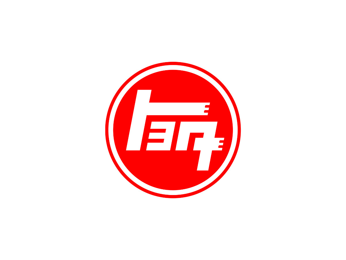
The 1949 mark set stylized white katakana inside a solid red disc with a ring border. It is the only Toyota mark before 1989 that is a true emblem rather than a wordmark, and the only one written in Japanese script. Toyota built a symbol here, set it aside for about 30 years, then came back to the idea in 1989.
1958: Toyota In Serif
The late-1950s wordmark set TOYOTA in black serif capitals, the first version in Latin letters. Export was the reason. Serif capitals read as formal and established to Western buyers, which suited a company trying to look like a known quantity in markets that had never heard of it.
1969: The Grotesque Redraw
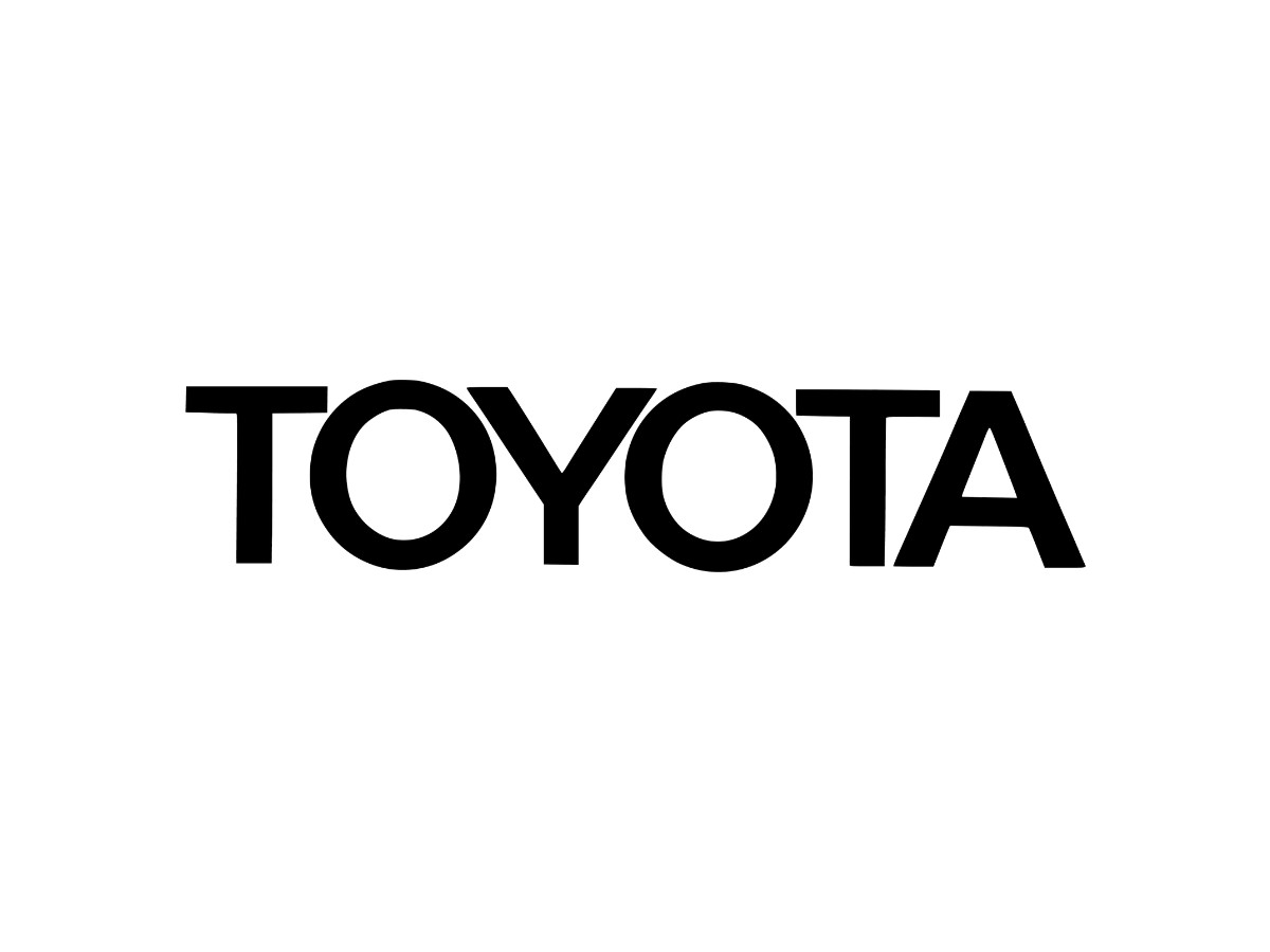
The 1969 wordmark kept the Latin capitals and redrew them in a sans-serif, heavier and wider than before, close to a Helvetica-style grotesque. The letters lost their serifs and sat tighter together, which helped the wordmark hold up at small sizes and from a distance.
1978: Red Arrives

The 1978 wordmark kept the same sans-serif structure and changed the color to red. This is the moment the red-on-white palette locks in. Red has stayed with the brand since.
1989: The Three Ovals
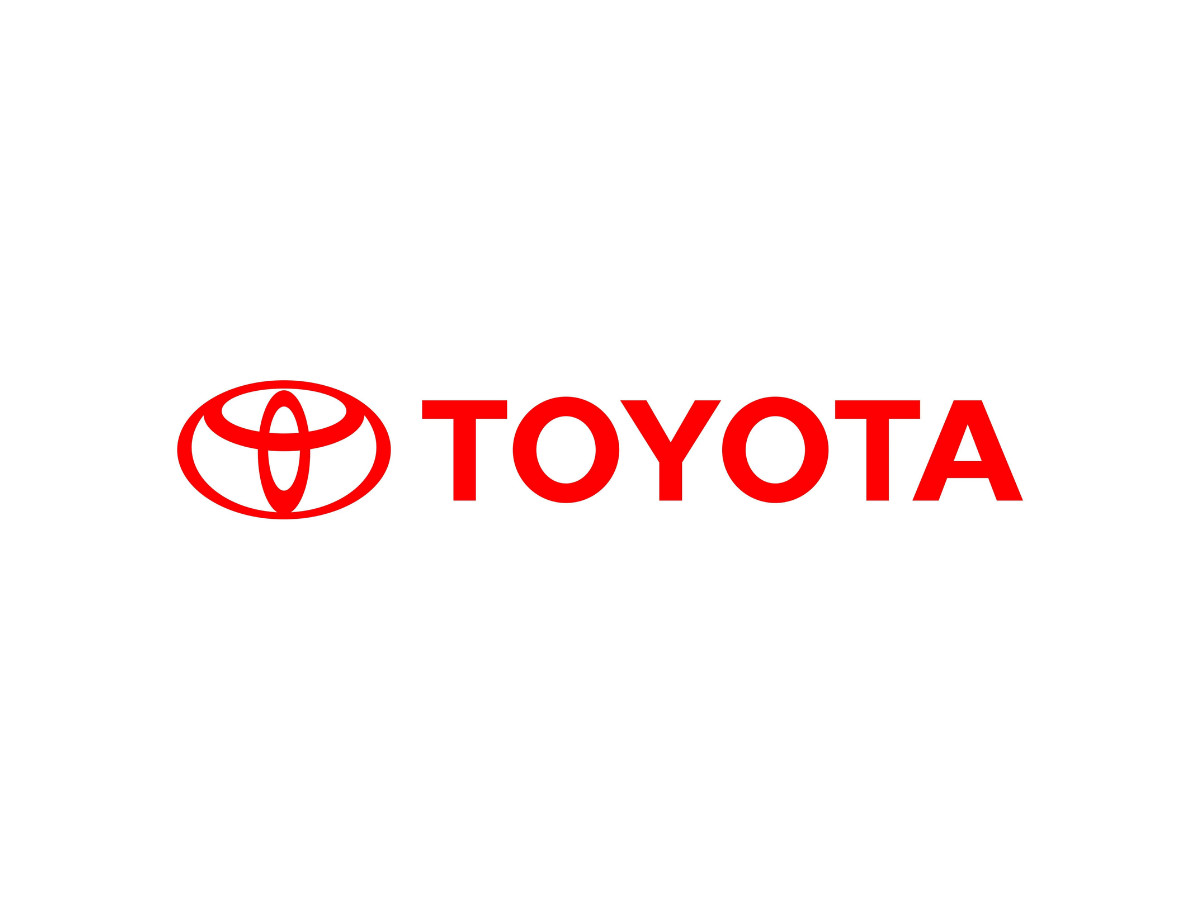
The 1989 emblem is the one you know. Toyota's in-house team spent about five years on it, and it debuted on the Celsior, the luxury sedan sold elsewhere as the Lexus LS, in October 1989, the company's 50th year.
The geometry is exact. Three ovals: two narrow inner ellipses set perpendicular to each other, one vertical and one horizontal, overlapping to form a T, all sitting inside a wider outer oval. The whole figure is symmetrical from left to right. That symmetry is the point Toyota UK stresses, because it lets the badge read the same way head-on and flipped in a mirror.
Toyota gave the emblem two design goals: recognition from a distance, so a driver could pick out the arrival of a Toyota, and enough visual weight to stand apart from other cars. The varied stroke thicknesses on the ovals carry over from that Japanese brushwork idea.
The red has a documented spec. Brand-color references list Toyota Red as hex #EB0A1E and RGB (235, 10, 30) for screens, Pantone 186 C as the spot-ink reference, and CMYK 0, 100, 90, 0 for four-color process printing. Toyota's brand guidelines direct CMYK for standard print work, so the red on a brochure or a dealership banner is built from cyan, magenta, yellow, and black inks rather than a screen's RGB light. Toyota's emblem product page does not itself publish a hex, so treat the exact digital value as the common reference rather than a figure lifted from that page.
At launch the emblem sat next to the red TOYOTA wordmark rather than replacing it. The folklore attaches here too. This is the mark people claim spells TOYOTA and the one some tie to a needle and thread, both taken up in the section below and neither confirmed by Toyota.
2005: The Chrome Era

The 2005 update kept the 1989 geometry and changed how it was rendered. The flat red emblem became a three-dimensional silver badge, with a gradient running across the metal and darker shading along the edges to fake depth. The wordmark moved below the emblem. The oval shapes did not change, only the finish.
2019: The Red Tile
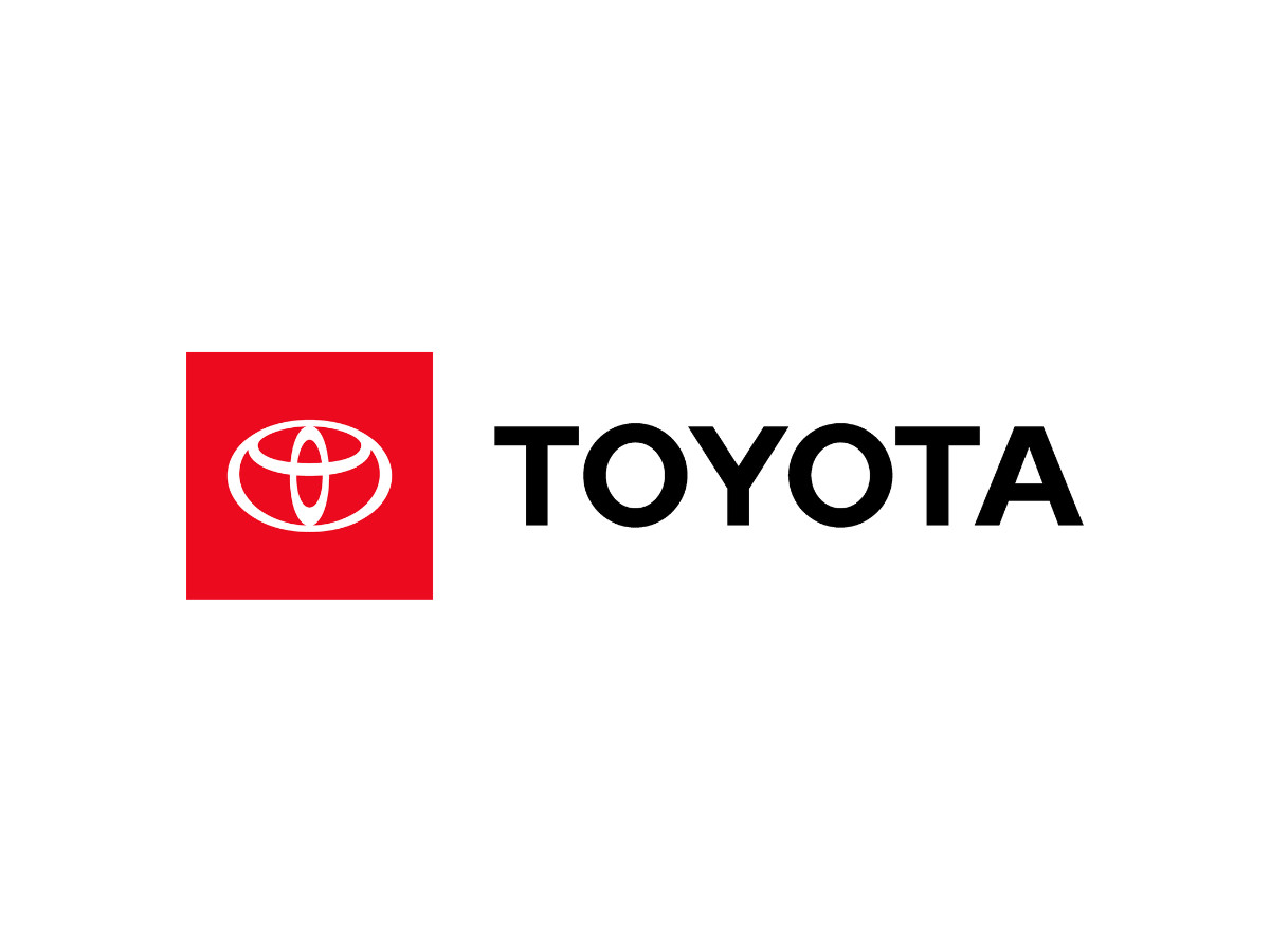
The 2019 version, used heavily in the United States, reversed a white emblem out of a solid red square and set the black TOYOTA wordmark beside it. This is a container decision, not a redraw. The ovals are the same 1989 ovals. The change is the red square holding them, plus the switch to a flat white fill, which gives the lockup a stronger block of color for digital and signage use.
2020: Flat And Wordless
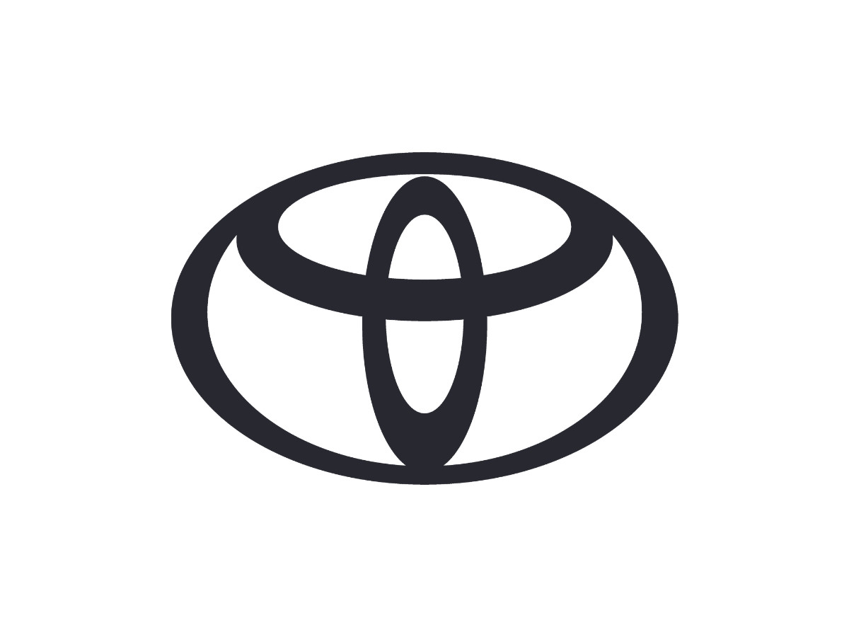
In July 2020 Toyota's European arm launched a flat, two-dimensional version of the emblem, drawn as a thin dark outline. Toyota stripped the fill and color out and dropped the wordmark, leaving only the shape of the three ovals. The agency The&Partnership handled the work, on the reasoning that the ovals alone were recognizable enough to carry the brand. It was Toyota's first logo change since 2005 and its first full identity refresh since 2009, as Design Week reported. The flat mark spread to Toyota's other markets from 2021, and a flat physical badge appeared on the bZ4X electric model in 2022.
One finding matters for the timeline. The 2005 chrome badge, the 2019 red tile, and the 2020 flat mark all still read as current, because Toyota runs them in parallel rather than retiring one for the next. Vehicles kept the dimensional badge, some markets kept the red square, and communications moved to the flat version. Toyota layers its logo by context instead of replacing it.
What Is The Toyota Logo Supposed To Be?
Two claims travel further than any others. The first says the overlapping ovals hide every letter of T-O-Y-O-T-A. The second says the shapes nod to a needle and thread, a callback to the loom business the company grew out of. Toyota's official emblem page states neither. It does back one reading that people assume is a fan theory: the inner ovals also stand for a steering wheel.
The useful split for anyone citing this is short. Toyota's page documents the customer-and-company hearts, the T, the outer world oval, the steering wheel, and the different stroke thicknesses. It does not mention the spells-TOYOTA reading or the needle-and-thread loom idea, both of which circulate across design blogs and even turned up in some coverage of the 2020 rebrand.
The color invites its own theories. People often read the red as passion or energy and the white as clarity, though Toyota's emblem page attaches meaning to the shapes and stays quiet on the palette. What Toyota does pin down is the production recipe: the red prints as CMYK 0, 100, 90, 0, matches Pantone 186 C, and shows on screens as hex #EB0A1E. That spec tells a printer how to reproduce the red, not what it is supposed to signify.
The order is the reverse of what you would expect. The theory people forward most, the hidden T-O-Y-O-T-A, is the one Toyota keeps out of print. The reading people treat as a fan guess, the steering wheel, is the one Toyota puts on its own page.
37 Years Without A Redesign
Has Toyota actually redesigned its logo since 1989? Not really. The core three-oval geometry from 1989 is still the geometry today, 37 years on. Everything after that changed the surface, not the shape. The ovals went chrome in 2005, dropped into a red square in 2019, and flattened to an outline in 2020, but the drawing underneath never moved.
Compare Nissan. In July 2020, within days of Toyota's European rollout, Nissan replaced its chrome 3D badge with a flat, thin-line logo on the Ariya, its first real identity change in about two decades, and it redrew the mark to get there. BMW, Volkswagen, and MINI made similar moves around the same time, a wave you can trace across DesignRush's best automotive logo designs and its wider list of the 35 best brand logos. Toyota joined the flat-design trend for its communications, but it would not redraw the ovals to do it.
That refusal is the whole story. A mark drawn to survive a glance in the mirror came out symmetrical, and symmetry is hard to improve on, so Toyota keeps leaving it alone.

Our team ranks agencies worldwide to help you find a qualified partner. Visit our Agency Directory for the Top Logo Design Companies as well as: