From family sedans to sleek convertibles, cars are branded machines that advertise their manufacturers wherever they go. Car company logos are particularly effective in increasing brand awareness and embodying a company’s mission, heritage, tradition, and values to consumers.
Their success lies in striking a balance between subtle elegance and eye-catching design. Whether it’s a classic emblem or a modern badge, the best car logos effectively signify strength, power, luxury, prestige — and everything else that resonates to car manufacturers and customers. With that said, let’s shift gears and explore the best automotive logo designs in 2026.
1. Toyota
Standout features:
- Allegorical 2D “T” emblem
- Soft and rounded vehicle-inspired lines
- Black-and-white color palette
Toyota, a dominant player in the small-to-medium-sized car market, has a logo that stands out for its simplicity and recognizability. The three oval shapes that form a stylized "T" also carry deep allegorical significance to the brand's origins and values, which vary between Eastern and Western perspectives.
For Japan and its neighboring countries, the smaller oval represents the client’s heart, the second, the core of a Toyota vehicle, and the largest, the brand's limitless possibilities for both client and vehicle. In the West, the emblem is often seen as a straightforward representation of the letter "T " that simultaneously portrays a steering wheel.
To mirror the aesthetic of Toyota's cars, which are known for their sleek and curvy designs, the logo utilizes soft and rounded lines. The absence of aggressive lines or sharp edges in the logo reflects Toyota’s commitment to creating vehicles that are stylish and comfortable.
The monochromatic, black-and-white color palette also adds a touch of modern elegance and sophistication. This color choice ensures the logo's versatility across various mediums and backgrounds and enhances its contemporary appeal, aligning with Toyota's forward-thinking approach in the automotive industry.
2. Saab

Standout features:
- Interconnected letters
- Monochromatic gray color palette
- Bold sans-serif typography
Saab, a renowned Swedish brand and a respected name in the European car manufacturing industry, has a visual identity that emphasizes simplicity and modesty. Over the years, the Saab logo has maintained a minimalist design and restrained tones, reflecting the brand's commitment to elegance and functionality.
One of the most distinctive features of the Saab logo is the interconnected letters, symbolizing the brand’s seamless integration of innovation and tradition. The flowing connection between the letters conveys continuity, aligning with Saab’s consistent quality in car manufacturing.
To reinforce the brand's understated elegance, the logo employs a monochromatic gray color palette. This color scheme exudes modernity while maintaining a timeless appeal. The gray tones are subtle yet impactful, mirroring Saab’s reputation for producing vehicles that balance style with substance.
Lastly, the bold, sans-serif typography enhances its modern, straightforward aesthetic as well as its overall clarity and readability. It conveys strength and reliability — qualities that Saab vehicles are known for.
3. Abarth
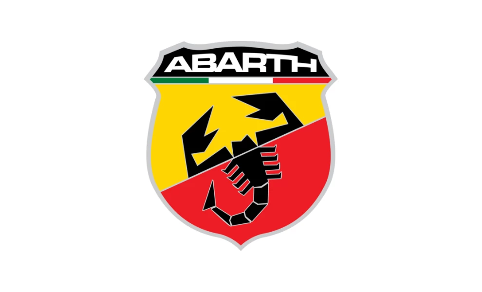
Standout features:
- Powerful sharp shield frame
- Intriguing scorpion illustration
- Heritage-inspired color palette
Abarth's logo stands out as one of the most intricate in the automotive world, blending multiple elements into a visually captivating design. Rooted in personal significance and heritage, it captures the essence of the brand's bold and thrilling identity.
The shield frame in the Abarth logo symbolizes strength, honor, protection, passion, and victory — qualities that resonate deeply with the world of racing. It reassures drivers of the superior craftsmanship behind every Abarth vehicle.
At the heart of the logo is the scorpion, a distinctive and unexpected choice. This symbol was personally chosen by Carlo Abarth, whose zodiac sign was Scorpio. Unlike the more common horse symbols used by other car brands, the scorpion embodies a unique sense of wildness and resilience.
Like some of the best logo designs, Abarth pays homage to its roots through a thoughtful color palette. The vibrant green, white, and red colors represent the Italian flag, grounding the brand in its national identity. The additional yellow and red in the shield's halves symbolize the racing industry, emphasizing Abarth's deep connection to motorsport.
4. Maserati
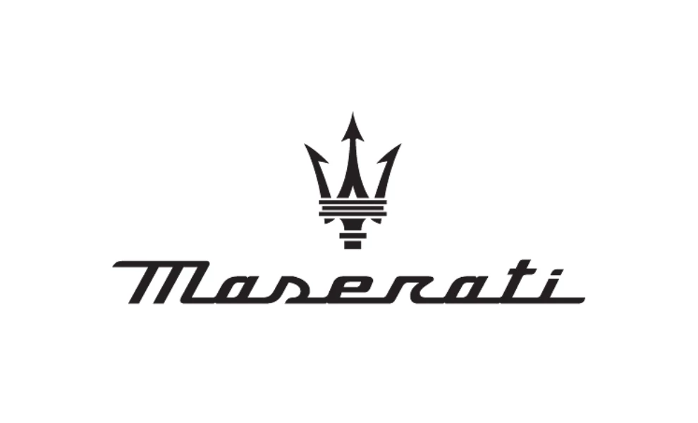
Standout features:
- Authoritative sharp trident emblem
- Adaptable monochromatic palette
- An interconnected custom cursive typeface
Powerful, bold, and prestigious — Maserati’s logo perfectly mirrors the qualities of its luxury sports cars. From its inception as a family business, the Maserati brand has been synonymous with elegance and cutting-edge performance, all encapsulated within its distinctive logo design.
The Maserati logo's central element is the trident, inspired by Neptune, the Roman God of the Sea. Designed by the fourth Maserati brother, it symbolizes power and dominance. The trident’s three prongs, pointing in different directions, represent the unique contributions of the Maserati brothers, all working in unison toward a singular vision.
While the trident emblem initially featured vibrant red and blue, the current Maserati logo has a sleek, monochromatic palette. This maintains the logo's elegance and prestige across various applications while emphasizing its timeless design.
To evoke a sense of speed and progress, the logo designer utilized a custom cursive typeface. Interestingly, the text is often omitted from the emblem on the cars themselves, leaving only the iconic trident symbol. This speaks volumes about Maserati's confidence and prestigious position in the luxury car market.
5. Ford Mustang
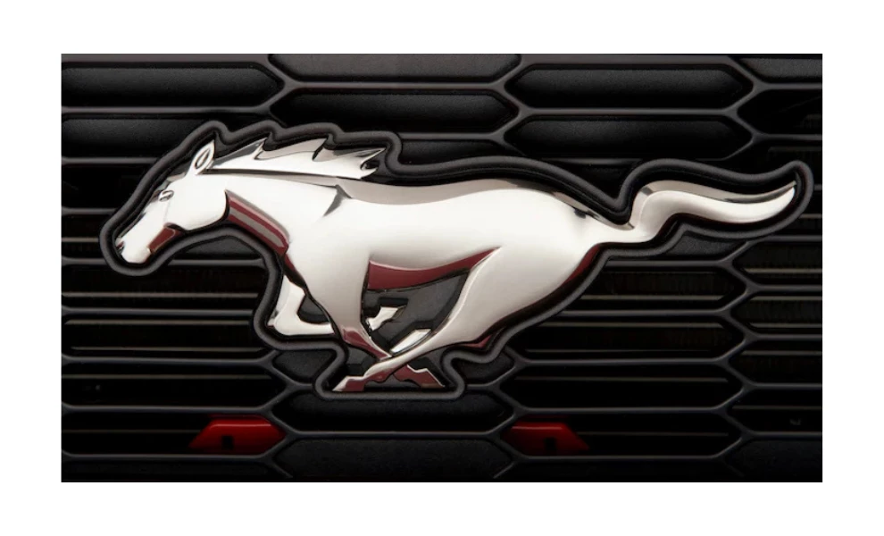
Standout features:
- The iconic free-roaming horse illustration
- A luxurious silver palette
- Three-dimensional effect
The Ford Mustang logo, a captivating emblem in the automotive world, holds a significant place in car design history. As a distinct offshoot of Ford, Mustang's logo stands out for its unique representation of power and freedom, perfectly capturing the spirit of its namesake.
While other manufacturers used horse mascots to symbolize horsepower, Ford's Mustang took it a step further. Its logo features a wild, free-roaming horse reminiscent of the American West, embodying not just power, but also the freedom and independence of the open road craved by its target audience.
To add a layer of sophistication and professionalism to the emblem, the designer embraced a sleek, silver palette. The bright, metallic finish enhances the logo's visibility and conveys the brand's authority and luxury, resonating with the Mustang's status as a symbol of automotive excellence.
Thanks to the silvery gradient, the Mustang exemplifies how the best car logo can achieve the three-dimensional effect that brings the horse illustration to life. This visual depth accentuates the logo’s dynamic nature, making it a compelling symbol for the Mustang’s high-performance identity.
6. Rolls-Royce Motor Cars
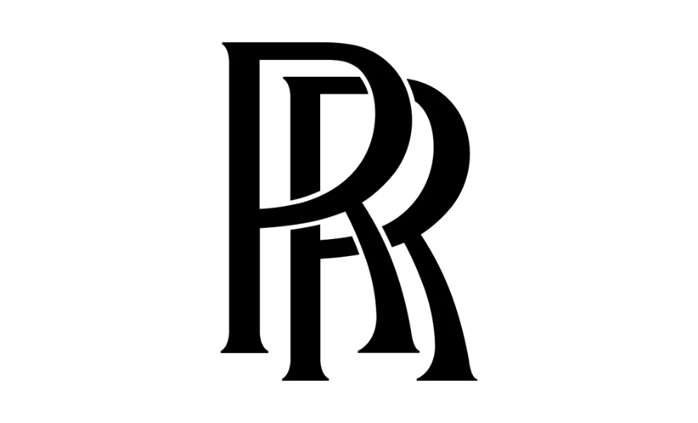
Standout features:
- Sleek double “R” monogram
- Timeless Art Deco serif typography
- Elegant monochromatic palette
Rolls-Royce Motor Cars is synonymous with British luxury. Each Rolls-Royce vehicle reflects meticulous craftsmanship, and its logo perfectly encapsulates the brand’s elegance and sophistication without being ostentatious.
At the heart of Rolls-Royce’s logo is the sleek double “R” monogram, symbolizing the partnership between founders Charles Rolls and Henry Royce. This intertwined design element exudes sophistication, reinforcing the brand’s legacy and its commitment to quality and luxury.
As a nod to its heritage, the logo features Art Deco serif typography with sharp serifs and flared bars that have remained nearly unchanged since the brand's inception. This classic typeface enhances its elegance, blending tradition with a refined, modern touch.
The Rolls-Royce logo most commonly appears in a silver iteration, gracing the front of its vehicles with understated grandeur. For online and print use, black and white versions dominate, maintaining the logo’s refined and versatile appeal across different mediums.
Overall, its subtle yet impactful design complements the brand’s prestigious vehicles, reinforcing Rolls-Royce's reputation as a beacon of refined elegance and dependability.
7. Mercedes-Benz
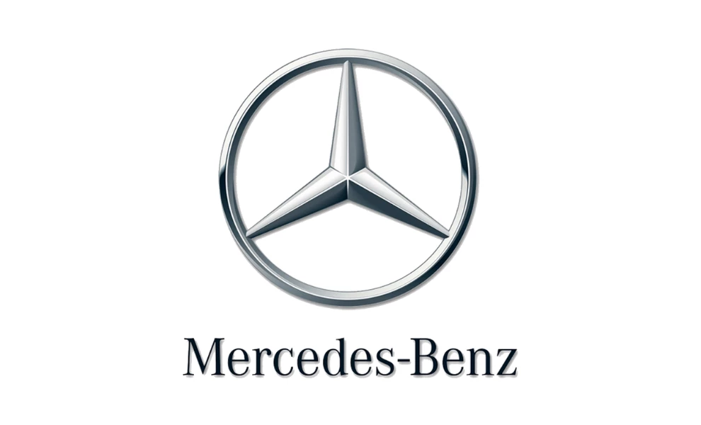
Standout features:
- Encircled three-pointed star emblem
- Bright and bold silver palette
- Classic serif typeface
Mercedes-Benz is a globally acclaimed automobile brand, recognized for its innovative and cutting-edge vehicles. With a rich history rooted in engineering excellence and a relentless pursuit of perfection, the Mercedes-Benz logo is a testament to its legacy and aspirations.
Central to the Mercedes-Benz logo is the encircled three-pointed star, symbolizing the brand's ambition for domination over land, air, and sea. This emblem reflects the company’s innovative spirit and visionary approach, representing its commitment to leading in every dimension of transportation.
To symbolize raw innovation and a nod to the brand’s origins, the logo utilizes a bright silver hue that is prominent on car hoods and various mediums. Before colorful paint jobs became standard, cars displayed a raw, metallic silver finish, which this palette honors. This underscores Mercedes-Benz’s connection to its unfiltered roots and cutting-edge aesthetics.
Accompanying the emblem is a classic serif typeface, which adds an element of timeless elegance to the logo. The sophisticated lettering complements the modern, innovative image of the brand while maintaining a sense of tradition and heritage.
8. Audi
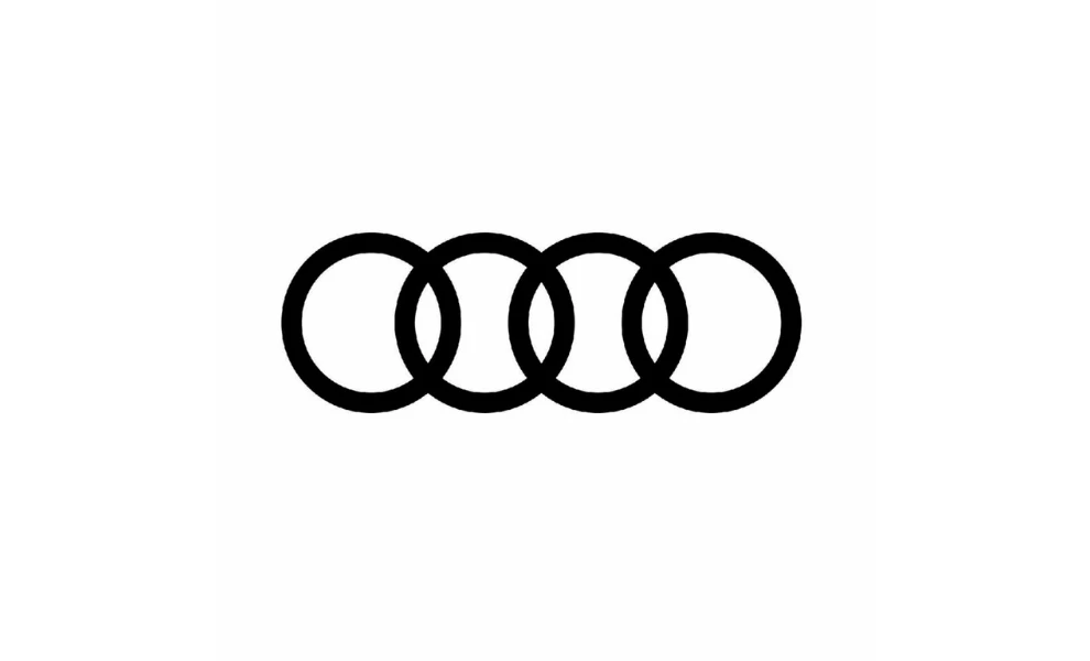
Standout features:
- Simple black palette
- Symbolic interlocking rings emblem
- Minimalist and stylish 2D display
Audi's logo is a quintessential example of the best car logo that thrives without using a wordmark. Instead, its four interlocking rings serve as a distinctive and powerful brand ambassador. As one of Germany's most renowned car manufacturers, Audi’s emblem stands out for its simplicity and heritage.
The interlocking rings symbolize the unification of four distinct vehicle manufacturers— Audi, Horch, Wanderer, and DKW — to form a new company in 1932. While it’s rumored that the rings were inspired by the Olympic symbol, this has never been confirmed. Despite several redesigns, Audi has retained the four rings, paying homage to its rich heritage and historical roots.
To make the logo adaptable to various online and offline environments, the logo uses a monochromatic black palette. This enhances the emblem's modern, elegant appeal while maintaining its timeless simplicity.
Lastly, the Audi logo features a minimalist and stylish 2D design, with the four rings spaced to create a more open and dynamic look. This design choice accentuates the overlapping areas, making the rings appear more powerful and visually striking.
9. Tesla
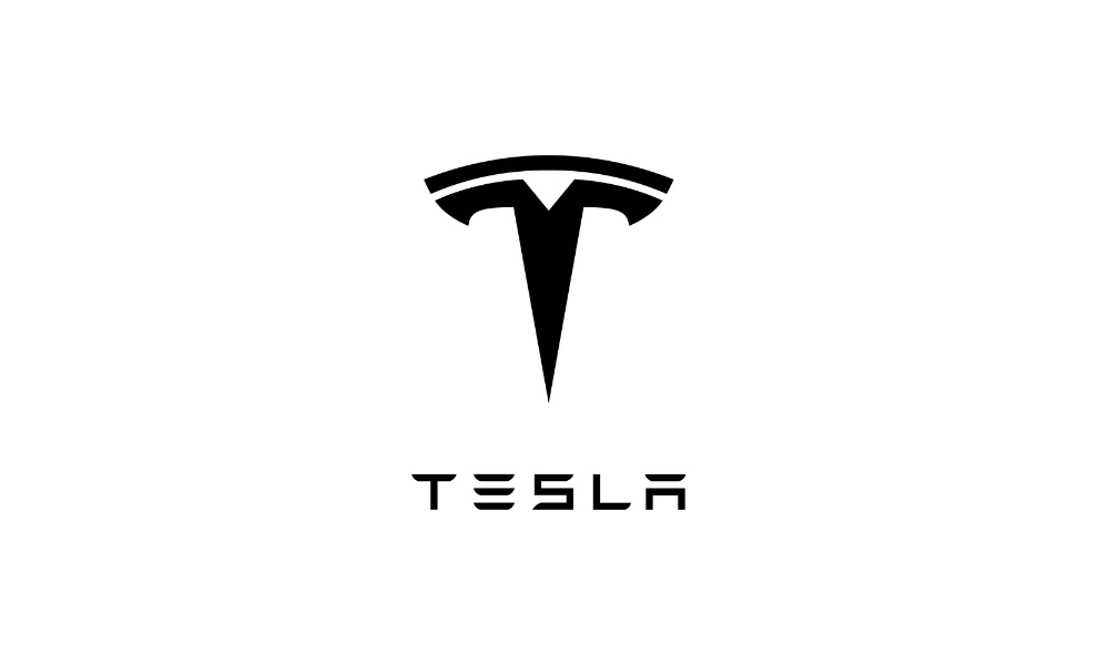
Standout features:
- Futuristic stylized “T”
- Sharp aggressive edges
- Custom industrial typography
Tesla, under the visionary leadership of Elon Musk, has become synonymous with innovation in driverless cars and car automation. Its logo needed to reflect this pioneering spirit, and it certainly delivered with a modern and distinctive design that captures the brand’s essence.
The Tesla logo features a stylized "T" that formally represents the capital letter of the brand name. However, its design goes beyond mere typographical representation; it also symbolizes the cross-section of an electric motor, aligning perfectly with Tesla's identity as a leader in electric vehicle technology.
Musk also clearly intended the Tesla logo to be a visual representation of the company's relentless pursuit of innovation. The sharp lines, aggressive edges, and futuristic "T" symbolize power, cutting-edge technology, and a forward-thinking approach to automotive trends.
Finally, Tesla’s logo employs a custom, industrial-inspired typography that sets it apart from conventional designs. The edgy appeal, enhanced by missing lines in the "E" and "A," adds intrigue and a modern, revolutionary vibe to the logo.
10. Lamborghini
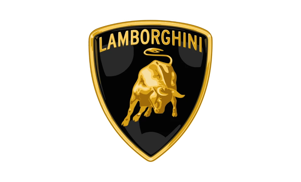
Standout features:
- Captivating stylized bull illustration
- Luxurious black-and-gold color palette
- Robust shield-shaped frame
Lamborghini, a symbol of luxury and high performance, has a logo that exudes power, strength, and prestige. The logo’s design elements, from the captivating bull to the luxurious color palette, perfectly represent the brand's fierce and robust identity.
As the Red Bull logo proves, the bull has become a symbol of energy and strength. Here, it is the centerpiece of Lamborghini's logo, serving as a fitting representation of Lamborghini's high-performance cars. The bull contrasts Ferrari's horse and subtly suggests a rivalry, with Ferruccio Lamborghini aiming to outdo Ferrari in every way.
Moreover, the bull is tied to Lamborghini’s horoscope sign and his passion for Spanish bullfighting, further personalizing the brand's identity. Notably, Lamborghini named some of his cars, like the Miura, after famous bulls, deepening the connection between the logo and his personal experiences.
The Lamborghini logo’s black and gold palette is striking and sophisticated. Inverting Ferrari’s colors, Lamborghini nurtures the rivalry while establishing its own distinct elegance. Furthermore, these colors are used by professional logo designers to personify luxury, style, and the exclusivity of the products.
Lastly, the shield shape of the Lamborghini logo adds a certain robustness, symbolizing the brand’s strong car build and ability to endure challenges. This frame enhances the logo's prestigious and bold character, aligning with the image of Lamborghini as a dominant force in the luxury sports car market.
How to Create the Best Car Logo
Creating an effective car logo requires creativity, symbolism, and strategic design elements. Here are key steps to guide you in crafting a logo that stands out among the best automotive logo designs:
- Understand the brand's identity: Begin by thoroughly understanding the car brand’s mission, values, and target audience. A logo should reflect the brand’s essence, whether it’s luxury, innovation, or heritage.
- Incorporate symbolism: Common themes in car logos include power, speed, and prestige. Consider using animals, geometric shapes, or emblems that convey these qualities.
- Aim for a timeless design: Classic fonts, simple shapes, and minimalistic elements often result in logos that remain relevant over time.
- Select a suitable color palette: For instance, bold colors like red and black can signify power and sophistication, while silver and blue may represent technology and reliability.
- Ensure scalability and versatility: The logo should look great on various mediums, from tiny prints on business cards to large billboards. Test the design at different sizes and across different backgrounds to ensure it remains clear and impactful.
Looking for inspiration or expert guidance? Explore the work of top graphic design companies to discover the latest trends and best practices in logo design.
What the Best Car Company Logos Can Teach Other Industries
If there’s one thing that car companies do right, it's this: They capitalize on rich histories, honor heritage through various design elements, and charm consumers with captivating stories.
For example:
- Many car manufacturers choose to incorporate the colors of the production country or where the car brand was born to create a solid brand identity.
- Luxury and sports car brands choose to emphasize luxury with modern, sleek and elegant designs to create a recognizable brand and attract more customers.
- Family cars and more affordable options use strong mascots, bold designs, lean lettering and carefully chosen color palettes.
When creating your company's logo and visual identity – no matter your industry – take the time to showcase your brand values, history, heritage, and vision. This symbol should tell your brand's story at a glance. The top automotive advertising agencies can also help you craft a recognizable emblem that consumers will instantly recognize and remember.
Best Car Company Logos: Key Takeaways
The best car logo excels by employing timeless and universally appealing design elements. They often feature minimalistic designs that are both distinctive and easily recognizable. For example, using simple shapes helps create a clean and modern look, while ensuring the logo remains relevant across various media platforms and periods.
Another key element is the use of meaningful symbols or emblems that reflect the brand's values, heritage, or origin. For example, the use of animals, shields, or stars can convey strength, reliability, or luxury. These symbols often carry historical significance, which deepens the connection between the brand and its audience.
Color choices also play a crucial role in effective car logos. A well-chosen monochromatic or limited color palette can add sophistication and elegance to the design. By sticking to a refined color scheme, brands can ensure their logos are versatile and adaptable, maintaining their appeal in different settings and formats.
Ultimately, the best award winning logos for cars not only stand out visually but also encapsulate the brand's essence, fostering a strong emotional connection with the audience. This combination of aesthetic appeal and brand storytelling ensures that these logos remain iconic symbols in the automotive industry.
Best Car Company Logos FAQs
1. Why do car company logos often use minimalistic designs?
Minimalistic designs ensure that car company logos are timeless, versatile, and easily recognizable, which helps them maintain relevance across various platforms and periods.
2. How do symbols in car logos convey brand values?
Symbols in car logos, such as animals or emblems, often represent the brand's values, heritage, or origin, deepening the emotional connection with the audience and reinforcing the brand's identity.
3. Why is color important in car company logos?
Color is crucial in car company logos because it enhances the logo's sophistication and adaptability, ensuring it remains visually appealing across different settings and formats.
4. Can car company logos influence consumer perception?
Yes, car company logos significantly influence consumer perception by visually communicating the brand's essence, values, and quality, which helps build trust and recognition.


-preview-webp.webp)