
The US Men's National Team logo history is short on years and long on overhauls.
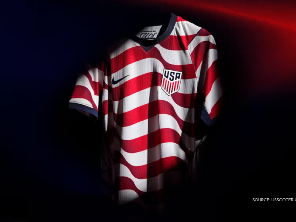
Three real eras in three decades of logo design: a cluttered 1993 shield built for a team nobody expected much from, a 2016 strip-down built for a federation trying to look like it belonged on the same pitch as the rest of the world, and a 2026 kit built for a tournament the US is finally hosting.
Each version tracks almost exactly with how seriously the world was taking American soccer at the time.
That's the real story here. Not a museum tour through every shield the federation has worn since its founding. It's the USMNT logo history that matters: a team's design ambition rising and falling with its own results, now hitting its most consequential design moment yet as the US co-hosts the 2026 World Cup on home soil.
What the current USMNT logo actually looks like
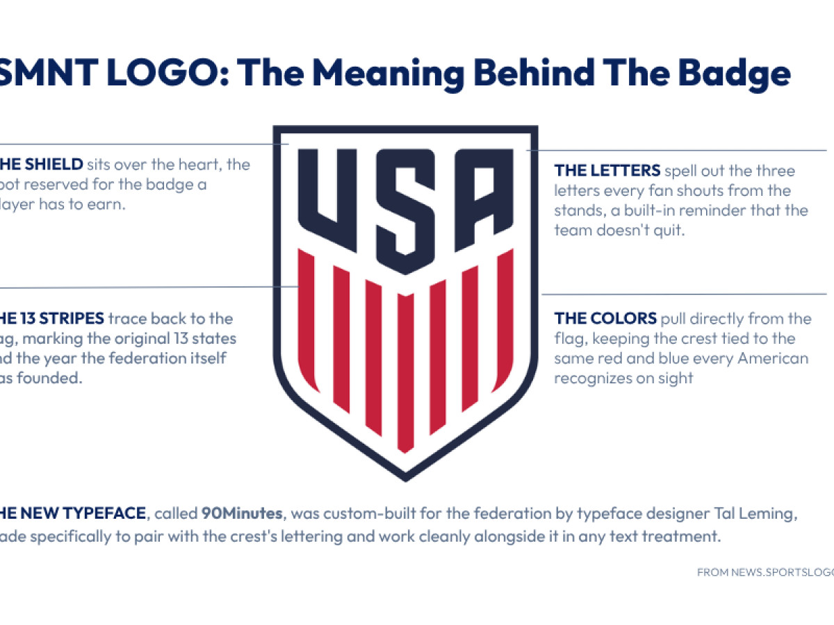
The USMNT shield carries its meaning in three deliberate choices: the navy, red, and white palette ties the crest directly to the flag rather than to soccer convention.
The vertical stripes inside the shield stand in for the flag's own stripes, turning the badge into a compressed version of the country's own symbol rather than a separate sports mark.
And the decision to strip out the soccer ball and stars that cluttered the 1993 to 2016 version signals a shift toward national identity first, sport second, a crest meant to read as "American" before it reads as "soccer."
The USMNT Logo History
Before the 1993 shield set the modern template, the US Men's National Team logo moved through roughly 80 years of badges that changed by decade more than by design logic. Grouped by era, the pattern is easier to see than it is in a year-by-year list.
1913 - 1980s
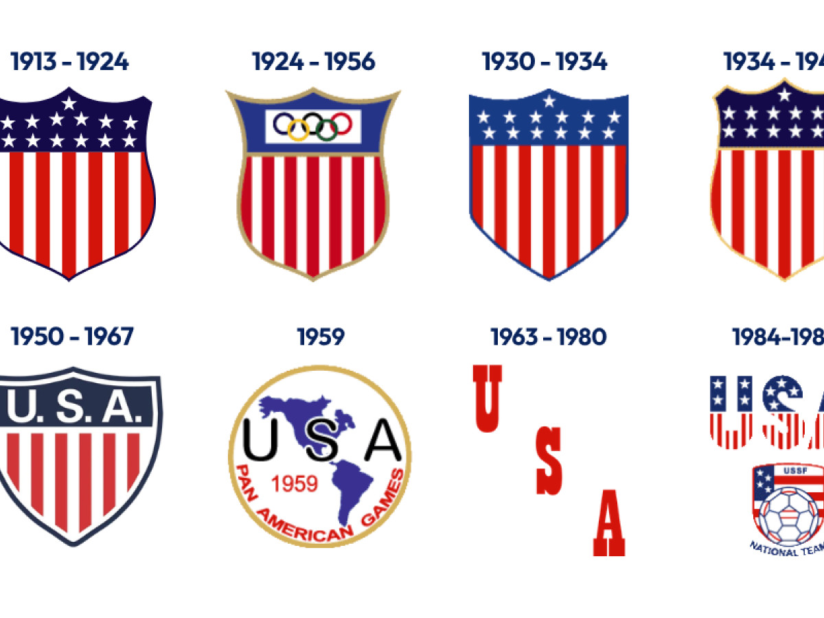
The earliest US Soccer crests didn't bother distinguishing the team from the country.
The 1913-1924 shield is the flag itself, redrawn: a field of stars stacked above 13 red and white stripes, no soccer reference anywhere on it.
For more than a decade, the national team's badge and the national flag were functionally the same image.
Then, starting in the late 50s, the shield disappeared completely. For the next 34 years, across separate versions, the team wore wordmarks instead of crests.
The shield came back in 1984, but split in two: a striped USA wordmark sitting above a separate, smaller soccer badge, the first time the crest acknowledged the sport itself rather than just the country playing it.
It's a clumsy transition piece, two unrelated marks stacked on top of each other, but it's the first version in over 30 years pointing toward the single, sport-specific crest the federation would actually land on a decade later.
1980 to 1991
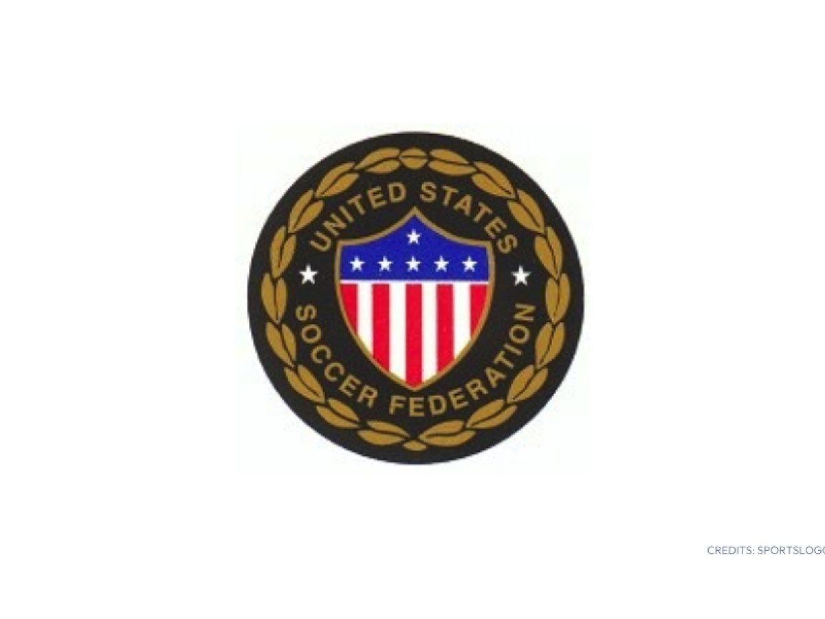
The earliest crest ran for 12 seasons, the longest stretch of any pre-2016 design.
This badge survived one of the worst stretches in the program's history. The North American Soccer League, the country's only top-flight outdoor league, folded in 1984.
The federation wasn't qualifying for World Cups for most of this stretch and a crest with no global stage attached rarely gets pressure to change.
1992 to 1994
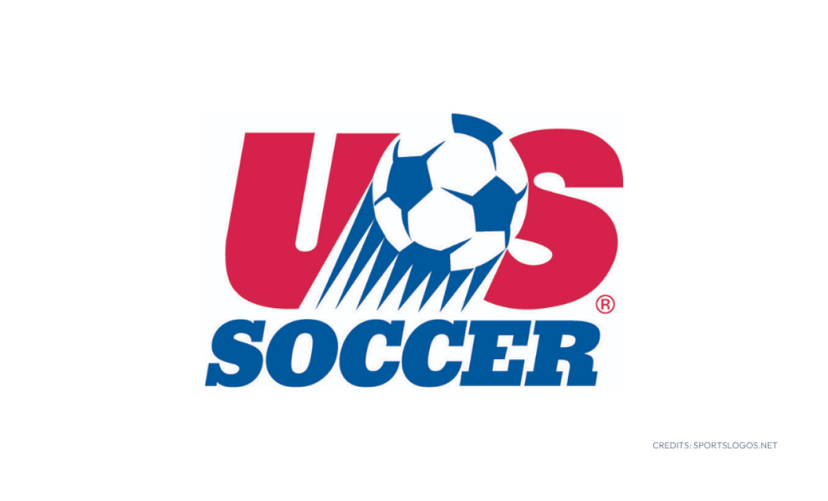
A short-lived three-season crest bridged the 1980s badge and the mid-90s redesign, timed to the buildup toward the US hosting the 1994 World Cup, the first major signal in over a decade that the federation had something worth designing for.
It also broke from the shield format entirely, at least for a moment: a red "US" lettering with a soccer ball streaking across it in blue, no shield outline, no border, the closest the program ever came to a logo built around motion rather than a static crest.
1995 to 2005
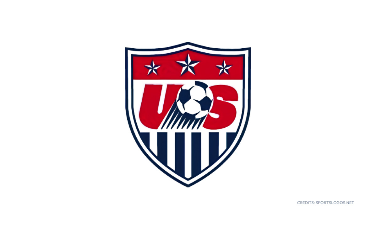
Nike's first crest under the new kit deal runs a true red field behind the "US" wordmark, a thin navy line tracing the shield's edge and nothing else framing it, no extra border, no ornamentation.
It's the plainest of the three shield versions, and it's the one that carried the program through its best modern result: the 2002 quarterfinal run, one of only two times in program history the US has gotten that far.
This first version, despite riding the program's best result in 70 years, would go on to be remembered as one of the least popular crests the federation ever wore.
Strong-enough results and a widely disliked design overlapped for a full decade, proof on its own that results and design quality don't move together.
2006 to 2013
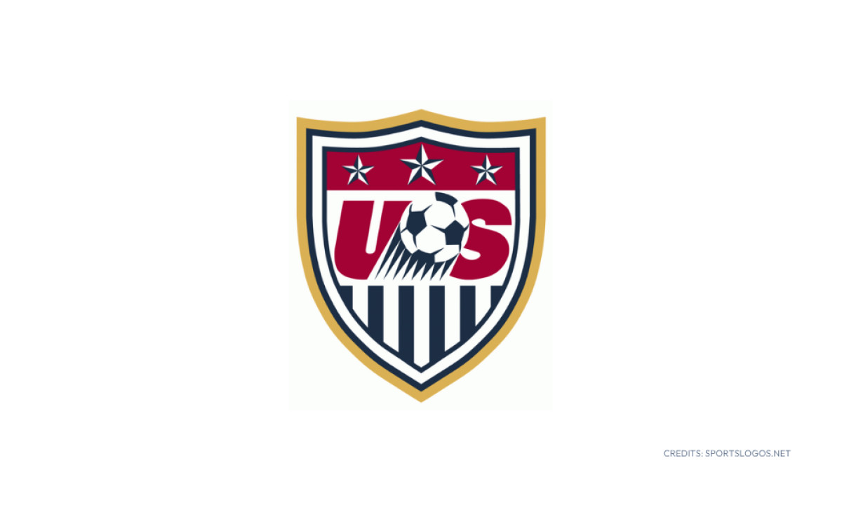
The shield gets dressed up for the first time, the red darkening toward maroon and the entire badge wrapped in a thick gold border, the closest this crest ever came to looking ceremonial.
The dress-up didn't carry over to the scoreboard, though. The US entered the 2006 World Cup ranked fourth in the world, still its highest FIFA ranking ever recorded, and went out in the group stage anyway, manhandled 3-0 by the Czech Republic in the opener. This version also presided over a 2013 Gold Cup title, the kind of trophy that matters more to the federation's record book than to anyone outside it.
2014 to 2015
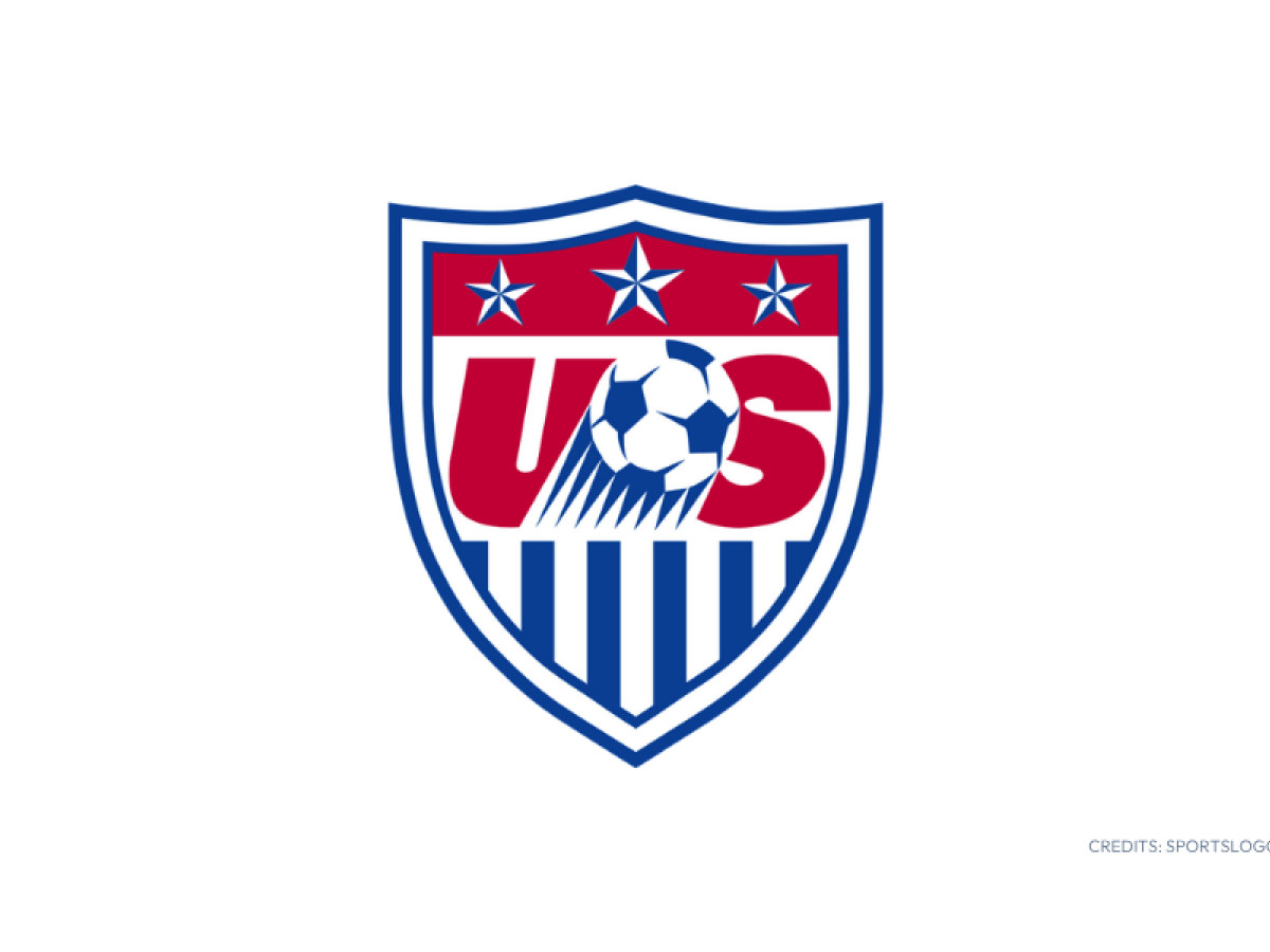
The gold trim disappears, replaced by a heavier blue border around the same maroon shield, a quieter and more athletic finish right before the 2016 overhaul stripped things down further.
It's the shortest-lived of the three versions, and it covers the program's most famous loss.
This is also the stretch covering Nike's 1995 takeover as kit supplier, replacing Adidas, and the 1996 launch of Major League Soccer, the domestic league the US had promised FIFA it would build as a condition of hosting 1994.
The shield's bones barely moved while almost everything else around the program did.
2016 to Present
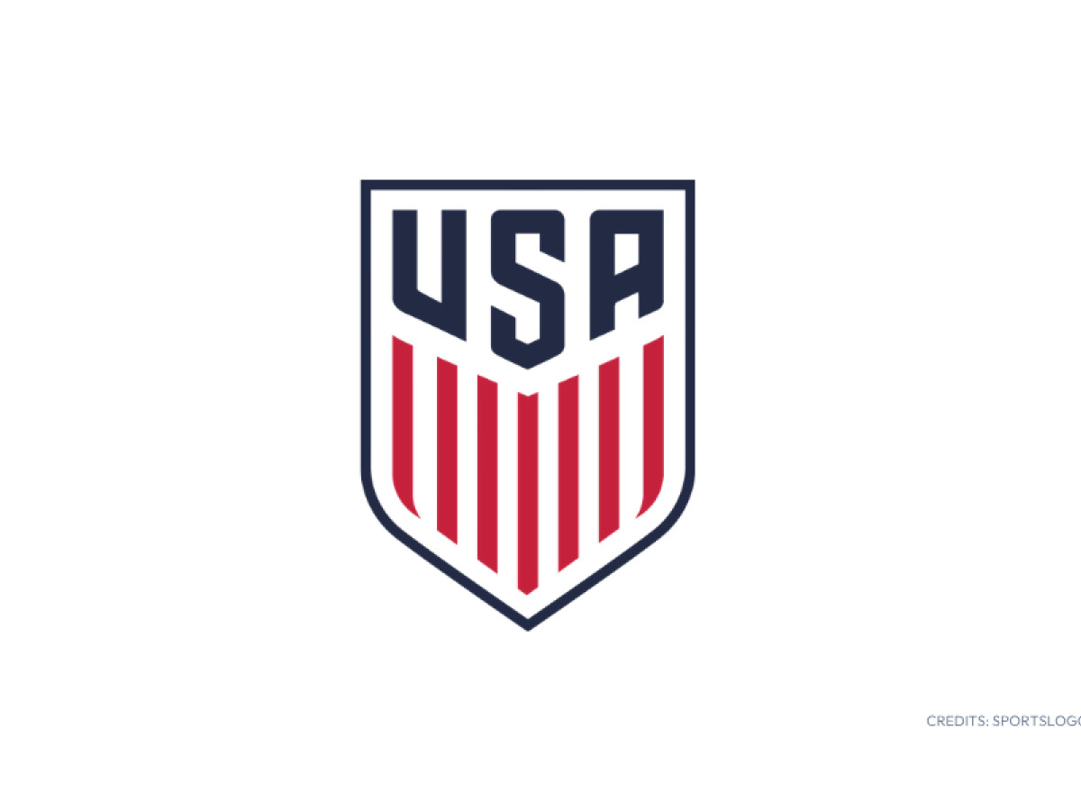
The current crest has run 11 seasons and counting, a tenure that, depending on how the prior era is counted, sits second only to the 1995-2015 plateau or to the 1980-1991 badge.
It's also widely regarded as the best-received crest in the program's history.
The redesign process began in 2014 and ran for two years, arriving just after the men's team reached the knockout round at the 2014 World Cup and the women's team won the 2015 World Cup outright, the two strongest results the program had delivered in years landing right as the federation was rebuilding its visual identity.
The result strips the shield back to essential elements: the soccer ball removed, the three stars removed, the color scheme corrected to match the flag, and an A added to the US monogram.
Eleven seasons in, it remains the version the federation is still building on heading into World Cup 2026.
What the History Actually Teaches
Pull back far enough and a pattern jumps out across 113 years: this crest never changes because somebody had a good idea. It changes because something outside the design room forced its hand.
But here's the actual takeaway, and it has nothing to do with stars or stripes.
A crest is a lagging indicator. It tells you what already happened, not what's coming.
For most of this team's history, the crest got treated like paperwork because paperwork was an honest reflection of where the team stood.
The 2026 version breaks that pattern for the first time: it's a crest commissioned before the results justified it, built for a tournament the US is hosting rather than one it's recovering from. That's the real bet buried in this badge.
Design, for once, is trying to get there first, instead of showing up a decade late like every single version before it.

Looking to build a crest that doesn't have to wait a decade to earn its keep? We can connect you with the right creative partners.
Browse our Agency Directory to find the most capable agency that can help elevate your brand:
And if you're curious for more inspiration, don't miss our other features on standout logo designs in sports.