Every four years, a single emblem has to land with five billion people who share no common language, no common alphabet, and no shared idea of what a "logo" should even look like.
That is the assignment.
The FIFA World Cup logo has answered it 23 different ways since 1950, and the answers say as much about the design culture of each decade as they do about the host country. Read them in order and you get a flip-book of how the world learned to draw for everyone at once.
Three real pivots organize that history. The early 1970s turned the poster into a graphic mark. The 1990s locked onto the globe and the trophy and would not let go. And 2010 kicked off a run of logos that wore their host culture on their sleeve. The 2026 mark belongs to none of these camps, which is the most interesting thing about it.
Era 1: The Poster Years (1950–1966)
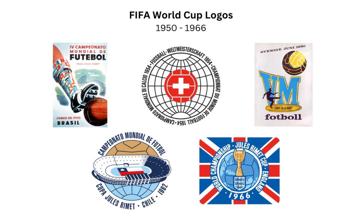
The 1950 Brazil mark was the first official World Cup emblem, and it still behaved like a poster. Hand-lettered type, the Brazilian flag's colors, and the host language carrying the message, built with no interest in looking the same in São Paulo as it did in London.
FIFA had no global media machine yet. The World Cup was a tournament, not a franchise, and nobody was trying to sell you a t-shirt.
Switzerland 1954 produced the first design that works as a true logo. A red football carrying the white Swiss cross sits over a faint globe, ringed by the words for "world football championship" in French, German and Italian, the country's three main languages.
It is minimal, national and legible all at once. The template it set, a host symbol plus a ball plus a globe, is one the next 30 years kept reaching for.
Sweden 1958 slid back toward the poster. The emblem leans on the letters "VM," short for Världsmästerskapet, Swedish for World Championship, paired with a player, a ball and the country's blue and yellow. It is busier than Switzerland's effort and less certain of itself, closer to an event flyer than a fixed identity.
Chile 1962 tried the most ambitious idea of the early years. Its emblem reads two ways at once, a stadium seen from above and a globe, with the Chilean flag planted in the middle.
The top half is striated like rows of seating, the bottom is a solid hemisphere like the earth below the horizon. The execution is rough, but the local-and-global pun is genuinely clever, and it carried some defiance: Chile rebuilt and hosted barely a year after the most powerful earthquake ever recorded.
England 1966 broke the run by cramming everything in: a globe laid over a football, the Jules Rimet trophy front and center, the Three Lions crest, the whole thing wrapped in the Union Jack.
It was the first World Cup mark to put the trophy on display, a full 60 years before 2026 made that idea the entire point.
None of this was a misstep. TV reach was thin, large-scale reproduction was a headache, and design still lived as a local trade rather than a global system. The poster years produced lovely work. They simply were not in the brand business yet.
Era 2: The Geometry Shift (1970–1986)
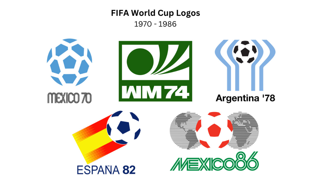
Mexico 1970 is where the real story starts. An abstract football, built from simple geometric panels and the negative space around them, sits above the words "MEXICO 70," the lettering set in the fat, optically vibrating style lifted straight from Lance Wyman's identity for the 1968 Mexico City Olympics.
The whole thing runs in nothing but sky blue and white, with no national colors and no scene to clutter it, legible from across a stadium or shrunk to the size of a stamp. It was the first time the World Cup carried a real graphic-design system instead of an illustrated poster, and it still looks current, which is the whole point.
West Germany 1974 carried that logic forward and pared it down even further. The mark is a single flat green, a set of bold abstract forms that read as a ball and the moment a boot meets it, with "WM 74," short for Weltmeisterschaft, sitting underneath.
Nothing announces the host except that German abbreviation. It kept Mexico 1970's single-color discipline and added a touch of industrial precision, clean and confident with nothing extra.
Argentina 1978 wrapped two sweeping arcs of sky blue and white, the national colors, around a black-and-white ball. The curves read at once as cupped hands, raised arms and a stadium bowl, and they echo the new FIFA trophy introduced in 1974.
As pure graphic work it sits close to Mexico 1970: elegant, restricted to two colors, with the negative space handled by someone who knew what they were doing.
Spain 1982 kept it plain. A football flies through the air trailing a streak of the national red and yellow, and not much else. After Argentina's double meanings it looks ordinary, but the host-flag-color formula it leaned on would carry through the next several tournaments.
Mexico 1986, the country's encore, placed a single red-and-white football between two halves of the globe under the line "the world united by the ball," and modernized the 1970 lettering to do it. That ball-and-globe pairing would go on to run the next 20 years.
What the whole era told you about the World Cup was blunt: the tournament had outgrown the kitchen table. It needed a language the entire planet could read, and in the 70s and 80s, that language was modernism.
Era 3: The Globe-and-Trophy Period (1990–2010)
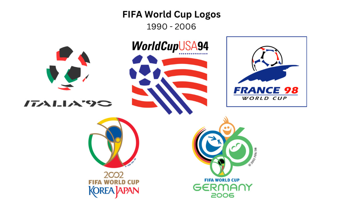
Italy 1990 opened the era with an abstract football built from green, red and black geometric panels, "Italia 90" set below it in sharp angular type.
Stripped back and strongly graphic, it leaned on the host's colors and the round-ball shape rather than any scene. The motif it locked in, a ball rendered as pure geometry, ran World Cup identity for two solid decades.
USA 1994 fused a soccer ball with the American flag, stars across the top and red-and-white stripes waving underneath for movement.
It was big, patriotic and busy, with a jumble of type weights that aged it fast. The idea of folding the host flag into the ball was sound; the crowded execution let it down. (For a brand that kept editing itself out of that same trap, look at the Pepsi logo's long redraw history.)
France 1998 is the peak, and it earned the title with one decision made fully. A football rises over a curved horizon like a sun coming up over the planet, rendered in the blue, white and red of the tricolor, with negative space doing most of the work.
No clutter, no committee checklist. The mark held together at every size because it never tried to say two things at once. That restraint is what separates the best brand marks from the busy ones, and 1998 made it look easy.
Korea/Japan 2002 had to speak for two nations at once, the first co-hosted World Cup, and it changed FIFA's branding for good. Interbrand built an abstract figure caught mid-throw-in inside a circle shaped as a stylized version of the gold trophy, with the two zeros bent into an infinity symbol for the joined hosts.
This was the start of FIFA's "World Cup Trophy" strategy, a protectable trophy shape that every later host would re-skin in its own colors. It is busy up close, but it remains one of the better-liked marks of the modern run.
Germany 2006 went for warmth instead. Called "Celebrating Faces of Football," it stacks three stylized laughing faces, two of them bent into the 0 and 6 of the year, with the German flag's colors sweeping around one side and the 2002 trophy mark tucked in underneath.
It is friendly, sunny and almost impossible to remember afterward, and designers were not kind to it. By this point the pure ball-and-globe idea was already giving way to something more host-specific.
Era 4: Cultural Specificity (2010–2022)
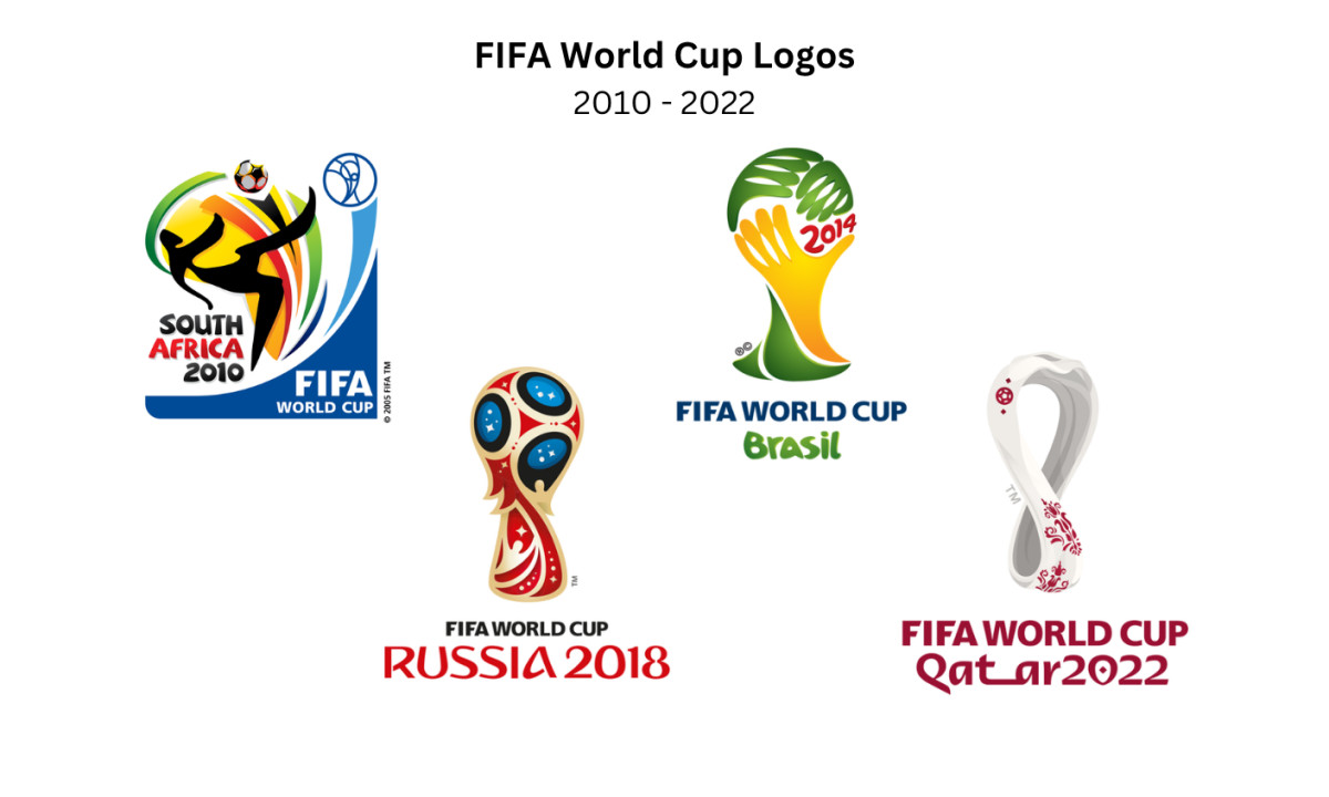
Starting with South Africa 2010 and running through Qatar 2022, four logos planted host-nation visual tradition right in the center of the mark, with a confidence the tournament had never shown before.
South Africa 2010 set the tone with a dynamic figure stretching for the ball, built from fluid ribbon-like strokes that leave the ball itself sitting in the negative space, all in the bright blue, green, red and orange of the South African flag and African textile art rather than the clean geometry of earlier decades.
Brazil 2014 belongs to the same group, and it is the cautionary tale. Three hands come together to form the shape of the trophy, a warm and human idea and Brazil's own take on FIFA's trophy-centered branding.
The concept read fine on paper and betrayed itself in practice: at the wrong scale, those hands look like a facepalm. The internet noticed, the meme wrote itself, and a logo built for five billion viewers became a punchline.
It stands as the most useful failure in World Cup design history, a strong idea undone by a soft craft review.
Russia 2018 was the sharpest of the four. The emblem takes the silhouette of the World Cup trophy itself and fills it with red, blue and gold drawn from Russian folk-art traditions and the country's space history. FIFA even unveiled it by video link from cosmonauts on the International Space Station.
Read it as a tribute to a design heritage or as soft-power flag-waving, depending on what you brought to it. As an act of pure design specificity, it worked.
Qatar 2022 pushed the idea furthest. The mark is a single unbroken loop that reads at once as the number 8, for the eight stadiums, and as an infinity symbol, twisted into the curves of a traditional Gulf woollen shawl and echoing the shape of the trophy, all in deep Qatari maroon.
Its typographic system leans on Arabic letterforms, the first World Cup identity that asked for a little cultural fluency before it fully opened up.
That is an achievement, and it sets up the question hanging over this whole era: when a global event hands its host culture the pen, who exactly is the logo talking to?
The case for cultural specificity is that it makes better, more memorable work than one-size-fits-all geometry, and the receipts back it up. The case against it is that reading clearly to five billion strangers is not a style preference. It is the actual job.
Both are true, which is why the standouts (France 1998, Russia 2018, Qatar 2022) all found the same narrow lane: specific enough to feel like somewhere, clean enough to read everywhere. South Africa 2010 found it too. Brazil 2014 drove right past it.
2026: The FIFA Trophy Finally Goes on the Badge
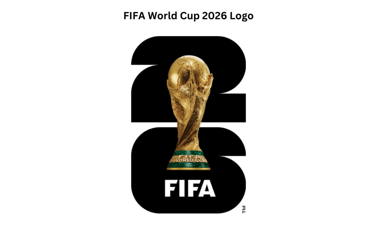
For most of 76 years, the gold trophy that actually exists in a vault never anchored the mark. Early emblems gave you a ball or a globe.
Then, from the 2002 "FIFA World Cup Trophy" strategy onward, the trophy kept turning up as a stylized or abstract shape: the figure cradled in a trophy outline in 2002, the hands of Brazil 2014, the ornate silhouette of Russia 2018, the shawl-loop of Qatar 2022.
England 1966 was the lone early exception, and it buried the old Jules Rimet trophy in a crowd of other symbols.
The 2026 mark tears that page out.
A realistic image of the trophy sits dead center, rendered in gold over a stacked "26." FIFA spelled out the logic plainly when it unveiled the official brand at Griffith Observatory in Los Angeles, calling it the first time the actual trophy and the host year anchor the emblem.
Industry trackers flagged the same break from precedent: this is the first World Cup mark to depict the real trophy rather than abstract it. The move reads less like an aesthetic flourish and more like a strategy memo made visible: the trophy is the brand now, so show the trophy, no hedging.
The "26" itself pulls real weight. As Design Week broke down, the numerals are built from 48 units of squares and quarter circles, one for each competing nation, nodding to the squared pitch and the round ball at the same time.
The wordmark tucks that same "26" in at small scale, the event typeface carries it across every application, and the 16 host cities each get a bespoke version of the mark, swapping in local color and pattern over shared DNA.
It is the most "system" any World Cup identity has ever been, and it sits closer to a modern sports brand framework than to the single fixed emblems of decades past.
Does it work? Depends what you think the job is. As a distinctive design object, it gives you less to chew on than Qatar 2022 or Russia 2018.
As a way to tell five billion people, instantly and without a footnote, exactly what they are looking at, putting the actual trophy on the badge is the bluntest and clearest answer anyone has produced in 76 years.
After 23 attempts at the same question, blunt and clear counts for a lot.

Looking to apply the same approach to your growing market? We can connect you with the right creative partners.
Browse our Agency Directory to find the most capable agency that can help elevate your brand:
And if you’re curious for more inspiration, don’t miss our other features on standout logo designs in sports.