Every four years, a logo has to carry the weight of the world's most-watched sporting event.
It appears on 82,000-seat stadium banners, phone wallpapers, merchandise, and airport wayfinding across multiple countries simultaneously.
The design decisions baked into that mark — what to show, what to abstract, what to leave out — are rarely accidents.
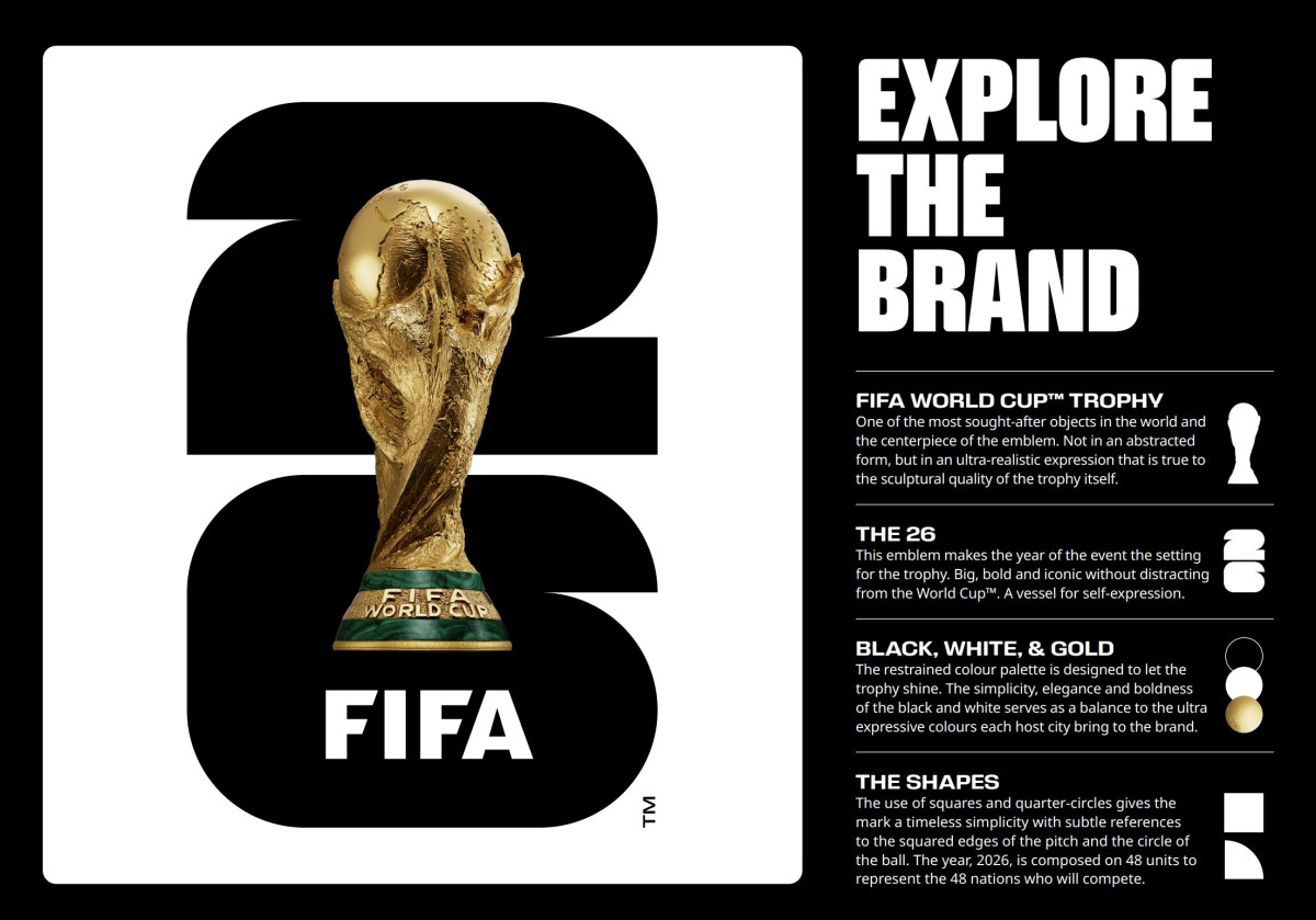
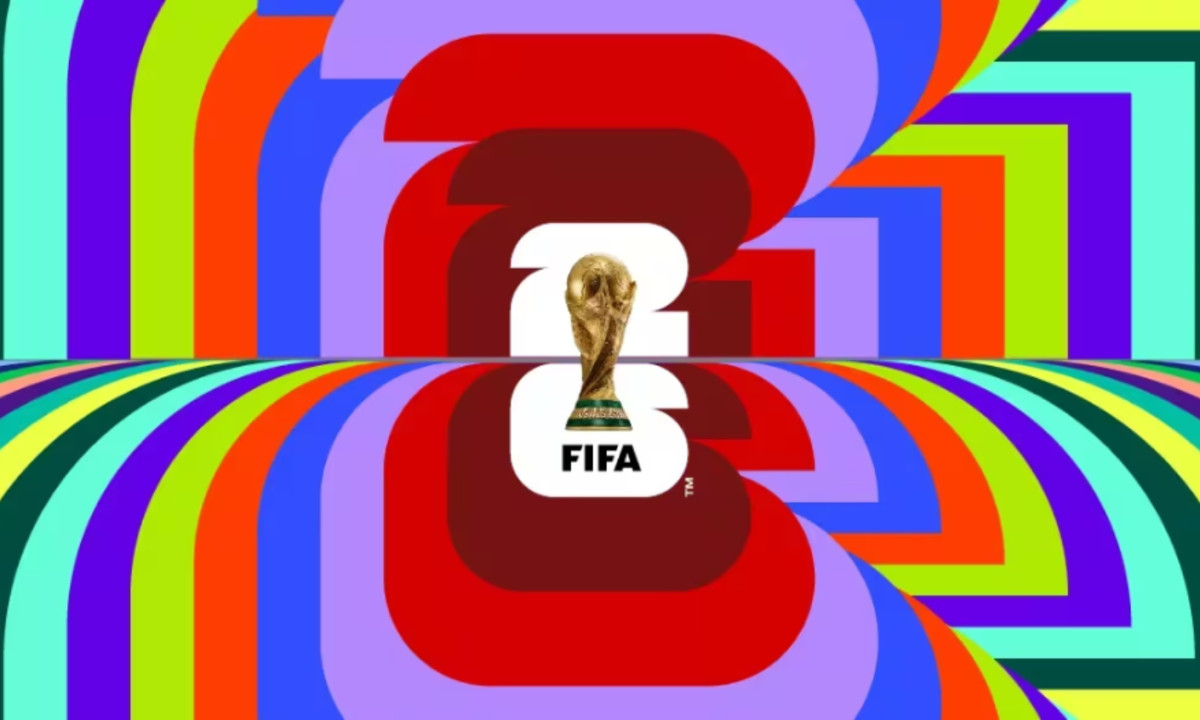
The official 2026 FIFA World Cup logo made one decision that no World Cup logo before it had ever made: it put the actual trophy in the emblem.
Not a stylized interpretation. Not hands arranged to suggest a cup. The real thing, rendered photographically, in three dimensions, superimposed into a flat graphic system.
That choice is either a masterstroke of simplicity or a category error in graphic design terms. Probably both.
Here's what the visual decisions actually communicate.
The Core Tension: Realism Inside a Flat System
The 2026 logo was unveiled in May 2023 at the Griffith Observatory in Los Angeles, with FIFA President Gianni Infantino and two-time World Cup winner Ronaldo presenting the emblem.
It was designed by Toronto-based agency Public Address, the same studio behind the 2023 Women's World Cup identity and one of the designers of the LA28 Olympic logo.
The structure is almost brutally simple: a bold, stacked "26" numeral acts as the base layer, with the FIFA World Cup Trophy centered above it.
The trophy is rendered as a photorealistic object with depth, shadow, and metallic sheen, while the FIFA wordmark anchors the bottom.
That rendering is what makes the composition unusual.
The "26" is flat graphic design: geometric, modular, built from a grid. The trophy is the opposite, existing in volumetric space, catching light and communicating weight.
Superimposing a photographic object onto a flat typographic field produces a hybrid that belongs fully to neither mode, and Public Address had to make that friction feel deliberate rather than accidental.
Rendering the trophy as a flat icon would turn it into a symbol; rendering it photographically makes it present.
You're not looking at a representation of achievement — you're looking at the object itself.
Whether that works depends on what you think logos are for.
If they exist to create a self-contained graphic world, the realism is a contamination. If they exist to communicate desire as directly as possible, this is the most honest mark a World Cup has ever produced.
The '26' Typography: 48 Shapes, One Letterform
The numerals aren't decorative filler behind the trophy — they're structurally meaningful, and understanding the grid explains why the letterforms look the way they do.
According to FIFA, the "26" is constructed from 48 squares and circles, directly referencing the 48 participating teams in the expanded tournament format.
The circular forms reference a football; the rectangular forms echo the squared edges of a pitch. This isn't post-hoc rationalization — study the letterforms closely and the geometry is right there.
The curves are circular arcs on a strict grid, and the straight segments snap to horizontal and vertical axes.
That precision produces type that reads as both text and tile-work simultaneously. Each numeral is modular, a system of interchangeable parts, and that modularity is what makes the city logo system structurally coherent rather than arbitrarily colorful.
The "2" and "6" are stacked vertically rather than set side by side, which compresses the mark into a taller, narrower format and gives the trophy more vertical space to occupy.
The stacking also creates a frame: the trophy doesn't sit beside the year, it emerges from it.
The FIFA wordmark reinforces this with a geometric sans-serif whose letterforms carry diagonally cut horizontal bars, adding subtle tension and movement to what could otherwise read as static institutional type.
Color: Black, White, Gold — and Then 16 Everything Elses
The primary version of the logo uses a restrained black-and-white field with a gold-and-green trophy.
This is the smart call. Against a busy multi-color background, the photographic rendering of the trophy becomes harder to read.
Against black or white, the contrast gives the gold metalwork somewhere to sit.
The green of the trophy's malachite base reads as a counterweight to the gold — two colors doing one job each, neither competing.
That restraint is then completely abandoned for the city logo system, which is where the identity gets genuinely interesting and genuinely risky.
The City Logo System: The Most Interesting Part Nobody Talks About
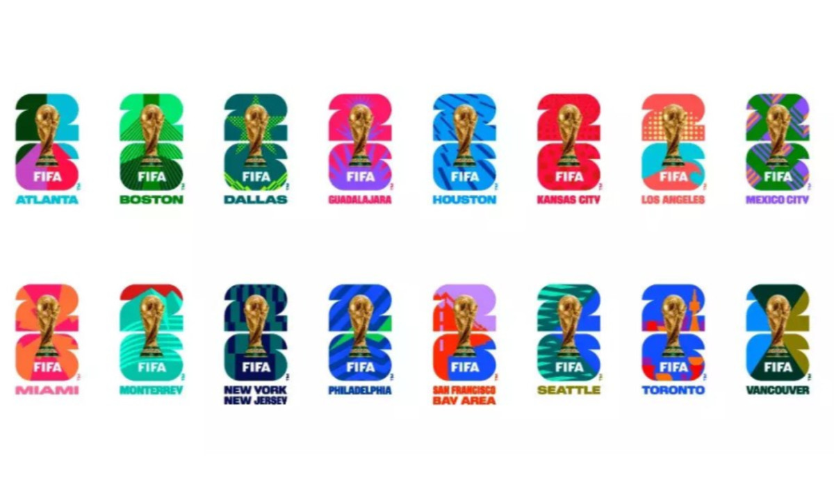
FIFA unveiled 16 host city logos on May 18, 2023 — one for each venue across the United States, Canada, and Mexico.
The structure stays identical across all 16: same trophy, same stacked "26," same FIFA wordmark. What changes is the color applied to the numerals and the background palette.
This is an unusual decision for a global event identity. Standard practice for tournaments at this scale — the Olympics, the Super Bowl, the UEFA Euros — is a single hero palette for the master mark with limited variation.
Decentralizing color across 16 independent palettes is a bet that the trophy-and-type structure is strong enough to hold the family together without a shared color anchor.
It works, partially.
Dallas chose neon yellows and electric blues reflecting the city's skyline at night, and the palette reads as coherent and recognizable. Los Angeles uses ocean blues and sun-warm oranges; Vancouver goes deep teal and forest green, a direct reference to the Pacific Northwest.
Evaluated individually, these are sensible calls.
The problem is what happens when you see all 16 together. The "26" numerals shift to entirely different hues while background colors are interchangeable, and some cities carry multiple colorways within their own branding.
The visual result feels more like a color-swatch collection than a unified system, and the trophy is the only thing preventing that.
Because the photographic rendering stays constant across every version, identical gold finish, identical composition, identical scale, it carries the recognition load that color can't.
You recognize the family not by palette but by that persistent silver-and-gold object sitting in the same position in every version.
That's the structural insight the system is built on: offload the consistency work from color to form.
It's a workable solution. It's also a system that will test itself in execution.
The more the city logos appear out of context — cropped, scaled down, on dark merchandise, on white wayfinding signage — the more they'll need the trophy to carry the recognition load.
Compared to Recent World Cups: A Deliberate Departure
Every recent World Cup logo treated the trophy as raw material.
Brazil's 2014 mark dissolved it into three overlapping hands in green, yellow, and orange; Russia's 2018 version encased it in crimson-and-gold Khokhloma ornament, swirling floral tendrils wrapping the stem; Qatar's 2022 emblem merged the silhouette with a white-and-grey infinity form, maroon embroidery at the crossover.
Each mark was culturally specific and conceptually filtered.
The 2026 logo does neither — it shows the trophy directly, then builds a modular number system around it, with cultural specificity offloaded entirely to the city logos.
FIFA has stated this is the template for all future tournaments, with 2030 and 2034 using the same trophy-plus-year structure.
Whether that holds will depend on whether the "30" and "34" feel fresh or repetitive when slotted into the same compositional frame.
Does the 2026 FIFA World Cup Logo Succeed?
The 2026 FIFA World Cup logo does the hardest thing in event branding well: it is immediately, unambiguously identifiable as a World Cup mark at any size, in any context.
The trophy-plus-year structure is legible on a stadium banner and on a phone notification icon. Public Address achieved that, and it's harder than it looks.
Where it's less convincing is the tension it doesn't fully resolve.
Placing a photographic object inside a flat graphic system creates a hybrid that feels slightly uncomfortable on close inspection, like a high-resolution image dropped into a geometric poster.
The composition works because the trophy is so visually dominant it overrides the dissonance — but it works in spite of the tension, not because of it.
The city logo system is the identity's most interesting structural idea and its greatest executional risk.
Sixteen different color schemes held together by one persistent photographic trophy is a coherent design theory, but whether it holds across four years of real-world application, on stadium facades, merchandise, and broadcast lower thirds, remains to be seen.
What's not in question: this is the first World Cup logo that depicts the object everyone is actually chasing.
That directness is either the most honest thing a World Cup logo has ever done, or a mark that mistakes the trophy for the tournament.
As with most good design decisions, it's probably both at once.

Our team ranks agencies worldwide to help you find a qualified partner. Visit our Agency Directory for the Top Logo Design Companies as well as: