
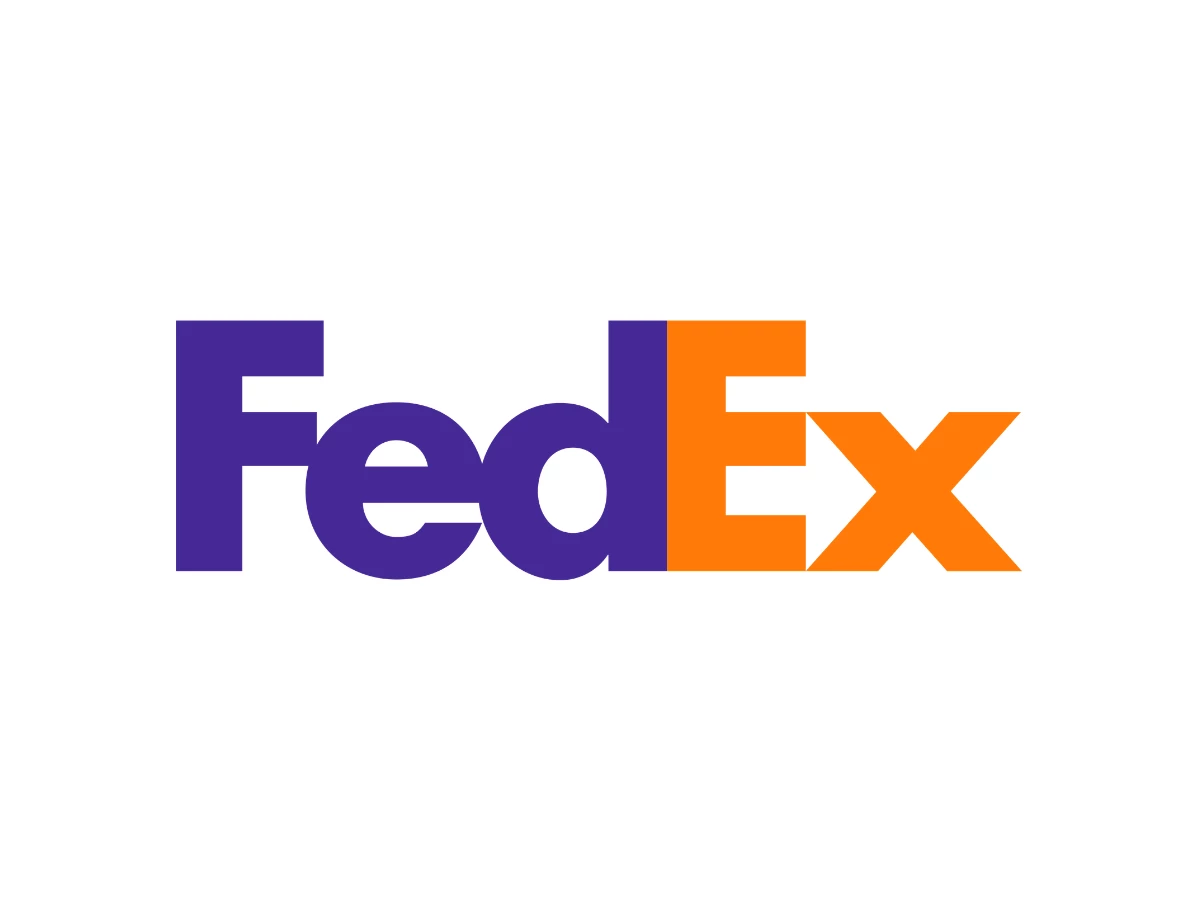

Lindon Leader had drawn more than 200 versions of the mark, then cut them to six. He was studying one with unusually tight letter spacing when he saw it. It was a small, clumsy hint of an arrow in the gap between the E and the x. He had not been looking for it.
The Short Version
- The FedEx logo hides a right-pointing arrow in the negative space between the capital E and the lowercase x.
- Lindon Leader drew the mark at Landor Associates, and Federal Express adopted it in 1994 as the company finished its shift to the shorter FedEx name.
- The wordmark uses custom letterforms that Leader built from two typefaces, and it keeps the purple from the older Federal Express identity while swapping that mark's red for orange.
- FedEx holds the purple constant and swaps the second color by division, so Ground, Freight, and Office each carry their own version of the same mark.
- The craft in the wordmark is real, but the arrow's fame runs well ahead of the work it does.
The Arrow, Up Front
Look at the space between the E and the x. There is a white arrow in there, pointing right. Once you see it, you tend to see it every time.
Here is how the letters build it. The left half of the lowercase x forms a wedge that points right, like a "greater than" sign, because the two strokes meet at the center of the letter. That wedge is the arrowhead. The shaft is the band of white between the top and middle arms of the capital E, lined up with the wedge so your eye reads shaft and head as one shape.
The spacing between the E and the x carries the whole effect. Push the letters apart and the shaft breaks away from the head. Pull them too close and the strokes collide and the arrow turns to mud. Leader drew custom letters so the height of the E's arms and the angle of the x's strokes would match and keep the arrow clean.
Most people never notice any of this. By common estimates, only about one in five viewers spots the arrow without help. A hidden shape that stays hidden for most of its audience is a strange thing to build a reputation on.
Size makes it harder. On the side of a truck or a shipping box, the channel between the E and the x stays open and the arrow reads. Shrink the mark to an app icon or a favicon and that negative space fills in, so the wordmark reads as plain letters and the arrow drops out. The arrow works at the sizes where you have room to look and fades at the sizes where you only glance.
People love to find more shapes in there. The most repeated claim is a hidden spoon. There is no spoon. The shape people point to is just part of the lowercase e, and the online joke versions that add a second arrow or a flag are folklore rather than design. The arrow is the only shape Leader put there on purpose.
Who Designed It
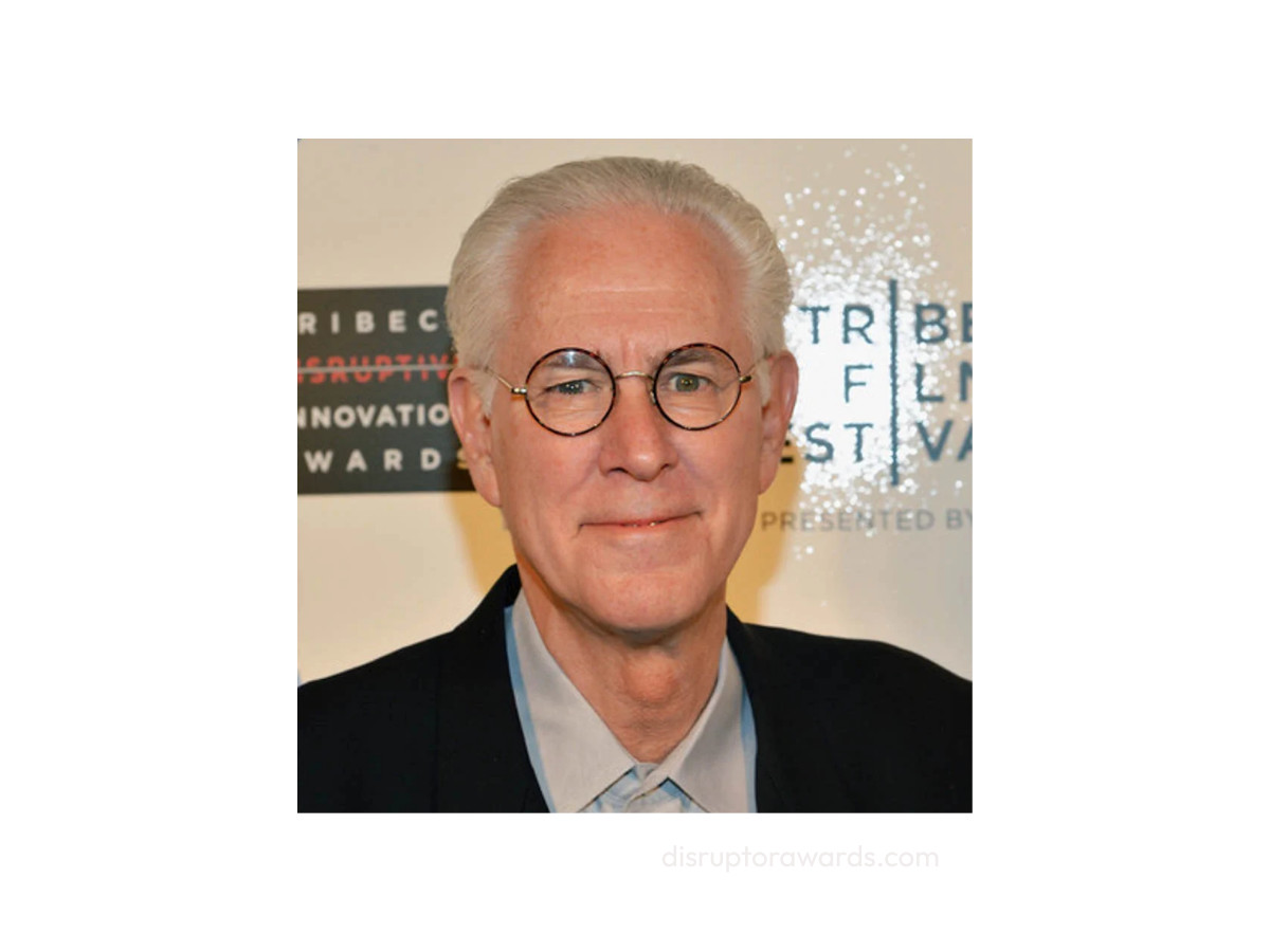
Leader drew the FedEx wordmark in 1994 as senior design director in the San Francisco office of Landor Associates, one of the best-known branding agencies of its era. He built his career on a plain idea about design, which he often summed up as simplicity and clarity.
The arrow was not the brief. Leader's team mocked up more than 200 designs and narrowed them to six before he caught the arrow hiding in a tightly spaced pairing of the E and the x.
He described it in an email interview years later: "Farthest from our minds was the idea of an arrow." He saw a rough hint, then spent real effort turning that hint into a clean shape.
That order matters. The arrow arrived by chance and stayed by choice, which is a fairer account than the tidy story where a designer sets out to hide an arrow and nails it on the first try. It has since become a fixture in classes on graphic design and a regular on lists of the best logo designs.
1973 To 1994: Federal Express
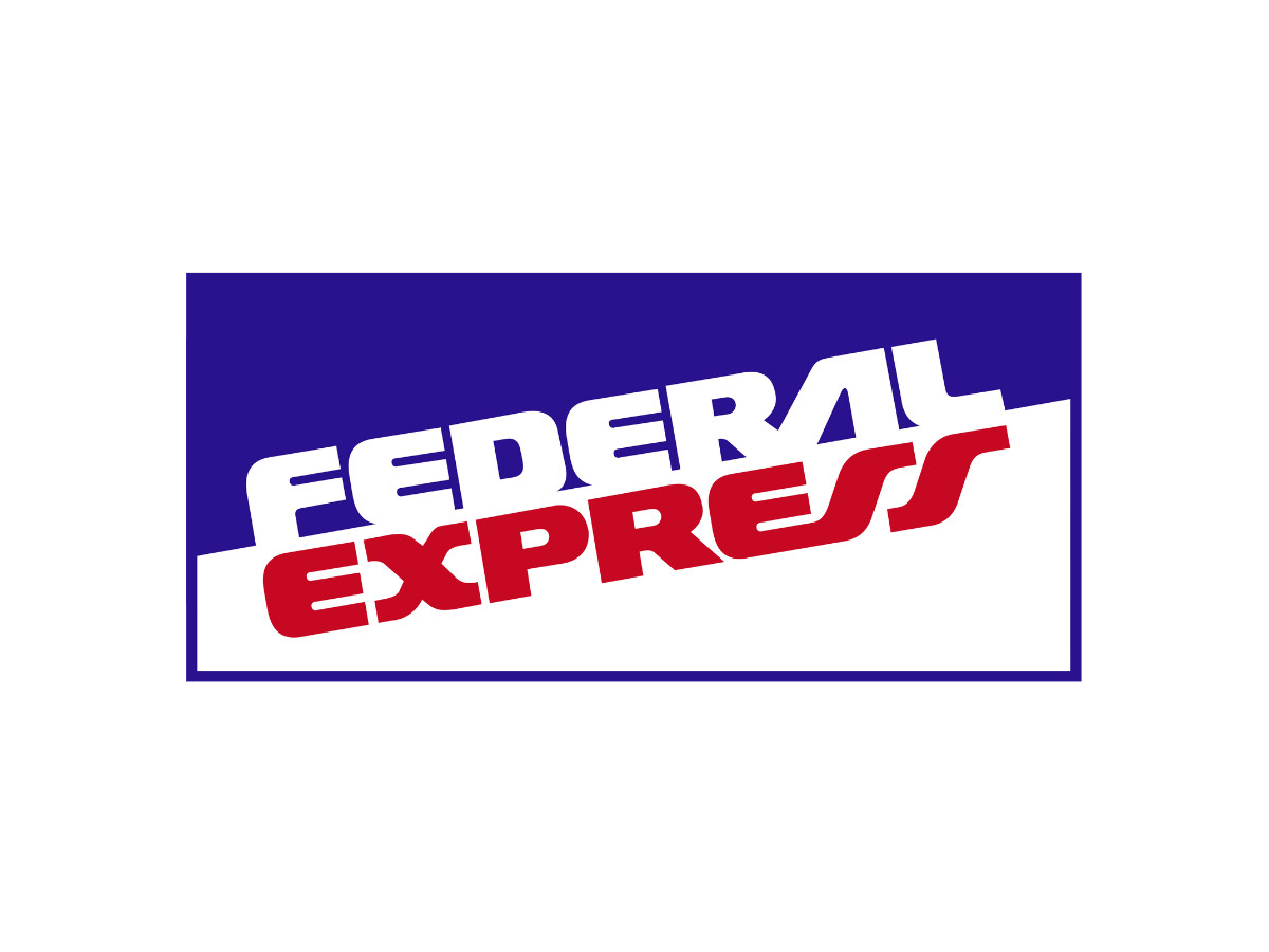
Frederick W. Smith founded the company in 1971 as Federal Express, and package operations started in 1973. The first identity set the full name in bold italic letters that leaned forward, and it boxed the lockup inside a rectangle.
Purple carried the word Federal and red carried Express. There was no arrow and no orange yet, and the mark held for two decades.
By the early 1990s the name had a problem worth fixing. Customers already called the company FedEx in conversation, so the long formal name felt out of step with how people actually spoke about it.
1991 To 1994: The Transitional Wordmark
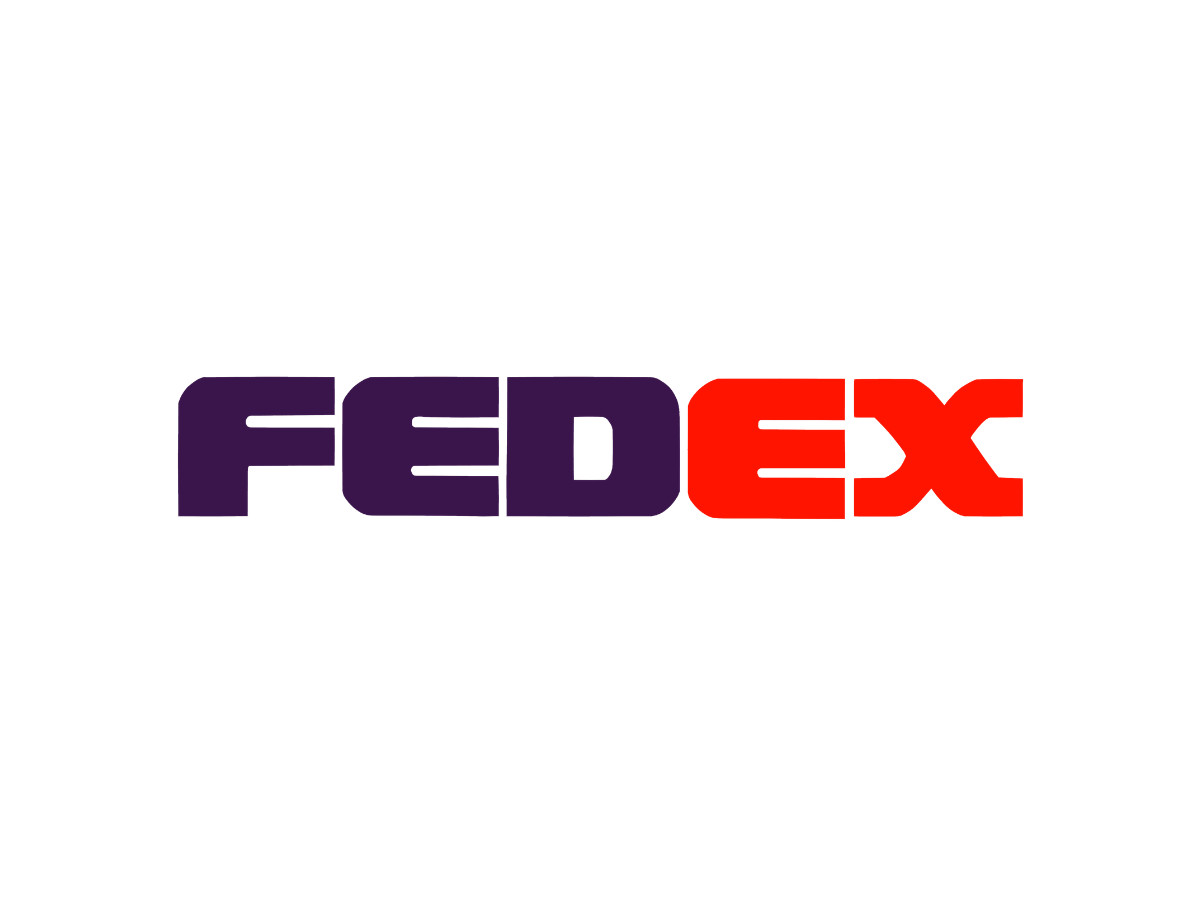
Between the two familiar logos, FedEx ran a plainer bridge mark.
It dropped the rectangle and the forward lean. FEDEX now sat in bold capitals, with FED in purple and EX in red.
This version did quiet work. It got customers used to the short name and the two-color split without asking them to learn a whole new logo at once. There was still no arrow, and the second color had not yet moved to orange.
1994 To Now: Leader's Redraw
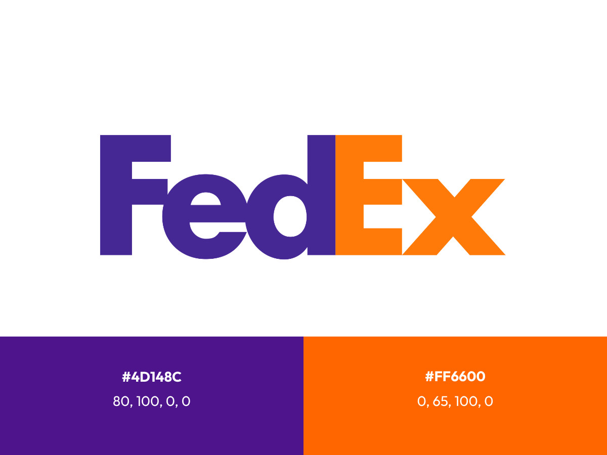
The 1994 project made the short name official and replaced the plain wordmark with the custom letters we know now. FedEx traded the block capitals for a mixed-case FedEx, the form that gave the arrow room to appear. Landor paired the new mark with the tagline "The World On Time" to carry the promise behind it.
Leader did not pull the wordmark from a font menu. He started from two faces, Univers 67 Bold Condensed and Futura Bold, and drew his own letters when neither could form the arrow without bending the original shapes out of true.
Univers 67 Bold Condensed gave him tight, sturdy proportions that pack the letters together. Futura Bold gave him clean geometry, the near-round e and the even stroke weight.
He blended those qualities and cut new letterforms so the arrow would sit in the gap on purpose.
Purple carried straight over from the older identity. The second color changed, though. Orange replaced the red that Federal Express had used, and it marked the express business.
The exact color values are worth getting right, since "what color is the FedEx logo" is a live search and a random web hex is not the answer.
FedEx defines the mark in Pantone. FedEx Purple is Pantone 2685 C, which lands near hex #4D148C and CMYK 80, 100, 0, 0 on screen. FedEx Orange is Pantone 021 C, near hex #FF6600 and CMYK 0, 65, 100, 0.
Treat the Pantone numbers as the source of truth, because the hex and CMYK values drift between vendors and screens.
The Sub-Brand System
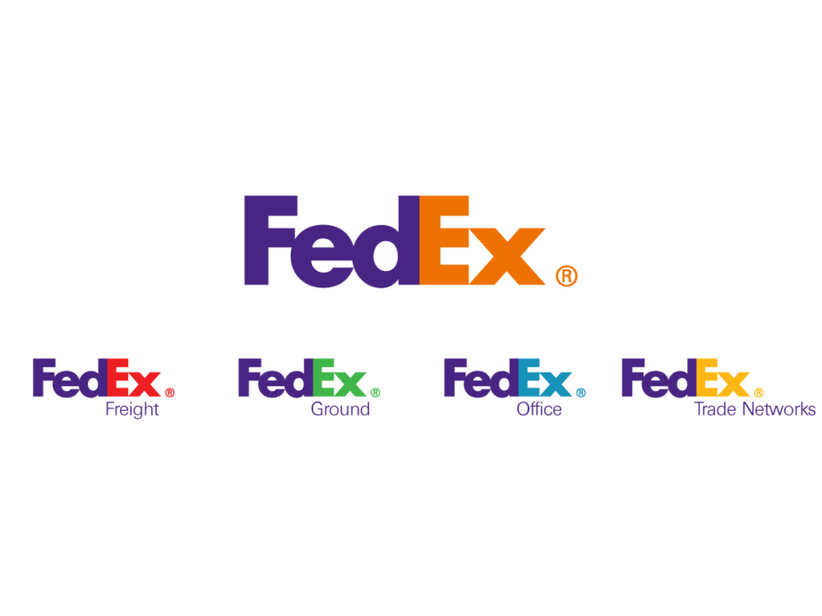
FedEx runs one mark across several businesses by keeping the purple fixed and changing only the second color. Orange marks Express, green marks Ground, red marks Freight, and blue marks Office.
Yellow marks Trade Networks, and a few other small units have carried their own colors over the years, though those first four do most of the work.
The thinking is cleaner than a plain list makes it sound. One constant color ties the whole family together, and one variable color sorts the divisions without a new logo for each.
Line the versions up and the pairings behave differently against the purple. Orange and red push forward and hold your attention, while green and blue sit back and read quieter. That gap is part of why the original orange still feels like the strongest partner for the purple.
FedEx has now reached the same conclusion. In 2024 the company began phasing out the extra colors and standardizing on purple and orange across its units.
It is betting that the version people already recognize is worth more than a color-coded map of the org chart. Running several versions of one mark at once is a known move, and Toyota manages its badges the same way.
How Little Has Changed
For a mark this famous, the surprising part is how little has changed. The letters Leader cut in 1994 are still the letters on the trucks. The biggest recent move is a color cleanup, and the letters themselves went untouched.
Thirty years without a redesign can look like discipline or like luck. In this case it leans toward discipline. Leader drew the wordmark plain enough that it had little to date, so FedEx has had few reasons to touch it. Other marks from the same era did not sit as still.
Xbox and Wendy's both refreshed for digital, Instagram dropped its old icon, and even Target has refined its bullseye more than once.
The Verdict
Does a hidden element that stays hidden actually work?
On its own, not really. An arrow that four out of five people miss, and that vanishes at small sizes, does almost no brand work by itself. What carries FedEx is the wordmark, tight and legible enough to run across a whole company for three decades.
The arrow is excellent craft sitting on top of that, a quiet bonus for the people who look closely rather than the engine of the brand.
The honest read sits between reverence and takedown. The wordmark earns the praise. The arrow earns less of it than its fame suggests, and together they explain why FedEx has left the mark alone for so long.
The arrow is the reward for looking closely. The wordmark is the reason you looked at all.
Our team ranks agencies worldwide to help you find a qualified partner. Visit our Agency Directory for the Top Logo Design Companies as well as:
