
The Short Version
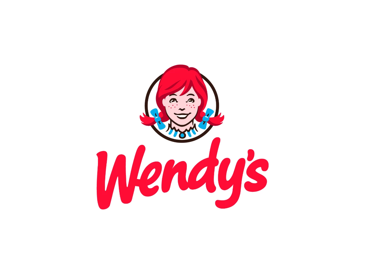
- The Wendy's logo is a portrait of Melinda Lou Thomas, daughter of founder Dave Thomas, drawn from a photograph taken when she was eight years old.
- Dave Thomas opened the first Wendy's in Columbus, Ohio on November 15, 1969, and modeled the mascot idea on KFC's Colonel Sanders.
- The mark has moved through roughly five major versions, and the 2013 redesign by San Francisco agency Tesser was the first full overhaul since 1983.
- Many readers see the word "mom" in the ruffles of Wendy's collar, and the company has said publicly that the effect was not intentional.
Verdict: the portrait is real, the regret is on record, and the "mom" reading is a coincidence the company acknowledged only after fans spotted it.
Does The Wendy's Logo Say Mom?
Yes, many people see it. On the 2013 logo, the blue trim on the ruffled collar and the scalloped black edge above it read as three rounded shapes that resolve into m-o-m.
The theory took off in July 2013, months after the new logo reached packaging and signage. Design blogs spotted the collar first, and the idea spread across national news within days.
Denny Lynch, then Wendy's senior vice president of communications, told ABC News the company found the collar reading interesting but added, "We can assure you it was unintentional."
Lynch also confirmed that an outside design firm produced the logo, which rules out an in-house Easter egg.
The reading is strongest on the single-color cup and packaging version, where the collar drops to one flat tone and the eye fills in the letterforms faster.
On the full-color mark, the blue trim and the freckled face pull attention away from the collar, so the word is easier to miss.
This is the same class of effect as the arrow in the FedEx wordmark, a shape the brain resolves once and then cannot unsee.
1969 To 1971: The First Portrait
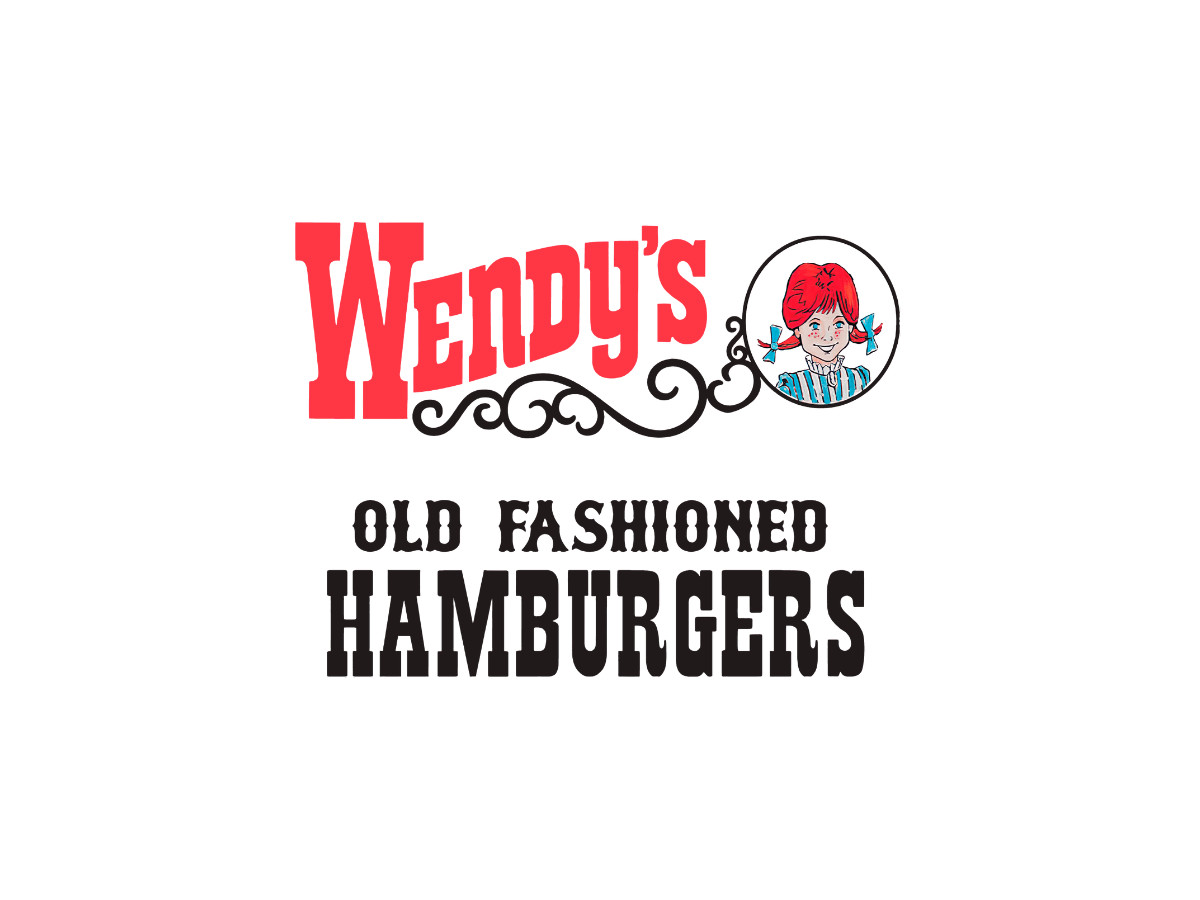
The first Wendy's logo is a portrait before it is anything else.
Dave Thomas set a cartoon drawing of his daughter inside a plain white circle, added "Wendy's" in a red slab serif with a black scrollwork flourish, and ran "OLD FASHIONED HAMBURGERS" beneath it in condensed woodtype. The circle carried no ring text yet, and "Quality Is Our Recipe" had not appeared.
The idea came from Thomas's years inside KFC, where he worked with Colonel Harland Sanders and helped shape that chain's operations before selling his stake.
He wanted a human face for his own restaurant the way Sanders anchored KFC, so he photographed his daughter Melinda Lou Thomas in red pigtails stiffened with pipe cleaners.
Her siblings had nicknamed her Wendy years earlier because she could not pronounce Melinda as a toddler, and Thomas built the restaurant's name around the nickname. The Colonel's playbook shows in the current KFC mark too, which still centers on the founder's face.
Thomas later said he regretted naming the company after her, because a national chain put lasting pressure on a private person who never asked for it.
In a Wendy's blog interview marking the chain's 50th anniversary, his daughter recalled him telling her, "I should've just named it after myself," reported by Today and Fox News. The regret is worth stating plainly, because most retellings skip it in favor of the warmer origin story.
This first mark appeared only on the original Columbus restaurant, which makes it the rarest version in the set.
1971 To 1972: "Quality Is Our Recipe" Arrives
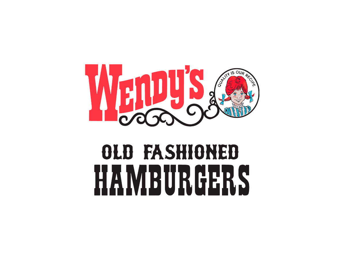
The second version keeps the first portrait but wraps the circle in ring text.
Wendy's added "Quality Is Our Recipe" around the frame and shrank the portrait to make room. The change is small, but the ring text became a fixture that survived redesign after redesign.
Wendy's introduced this version after opening its second restaurant, the location that added the drive-thru pickup window.
The two-year run is short, yet the ring text is the reason it earns its own entry. Once the tagline circled the cameo, the logo stopped being a loose lockup and started behaving like a seal.
1972 To 1976: The Yellow Block
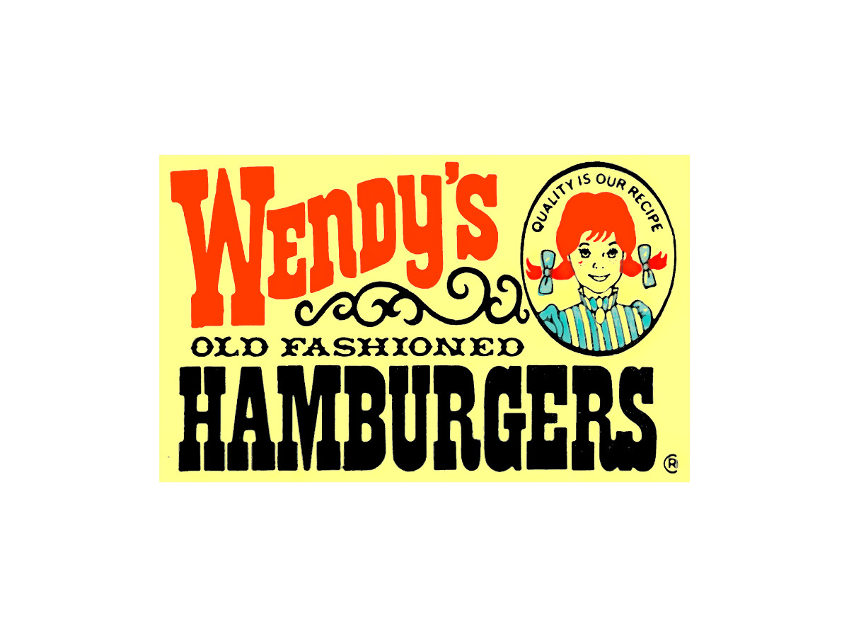
Here the logo becomes a sign rather than a lockup. Wendy's moved the mark onto a solid yellow field, pushed the wordmark toward an orange-red, and compressed the layout so it read fast at a distance. The portrait was redrawn for the first time with flatter colors.
The yellow block is the point where roadside legibility starts to drive the design.
A cameo and a script wordmark work on a menu, but they wash out on a pole sign at 45 miles per hour. Filling the field with yellow gave the mark a solid shape drivers could catch from the road, which mattered as the chain expanded beyond Ohio.
Burger King fought the same roadside battle in the same decade, and the DesignRush Burger King logo history tracks how it landed on its bun lockup.
1976 To 1983: The Red Banner
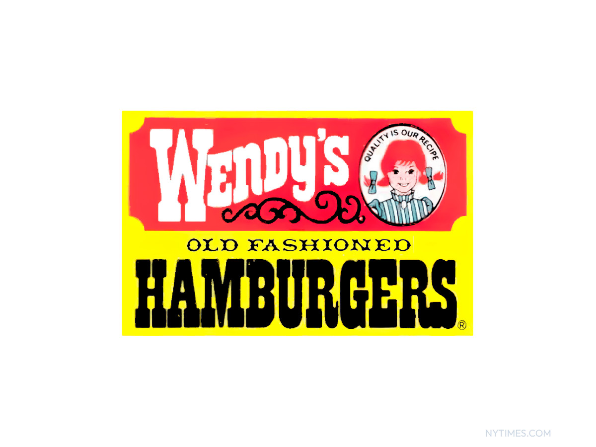
The red banner is the first version built around contrast.
Wendy's reversed "Wendy's" to white inside a red bar, pulled the portrait onto the red, and set "HAMBURGERS" in heavy black across the yellow below. The reversal is the whole point of the design.
White type on a red bar carries farther at roadside distance than dark type on yellow, because the eye locks onto the brightness gap first.
The mark reads as three stacked blocks: red bar, cameo, black word. That structure gave franchisees a sign that held up on a tall pole and in a rearview mirror, which was the practical problem the 1970s marks kept trying to solve.
1983 To 2013: The Badge
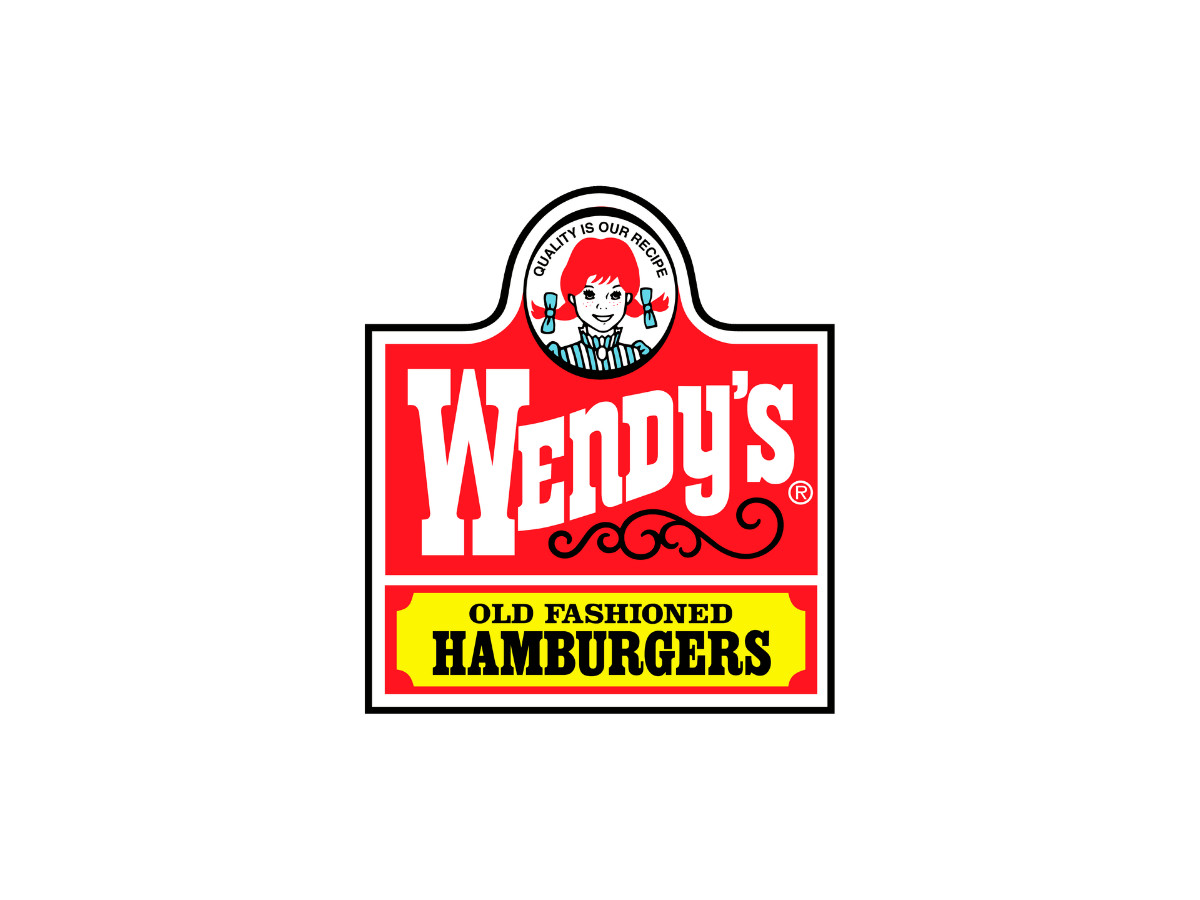
The Wendy's badge is the logo most Americans picture, and it served for about 30 years.
Wendy's set the cameo in the crown of a dome-topped badge, ran the wordmark in white on red, laid "OLD FASHIONED HAMBURGERS" across a yellow strip below, and held the whole shape inside a black keyline. This is the longest-serving mark in the chain's history.
The badge solved the earlier tension between portrait and signage by giving both a permanent home. The dome silhouette worked as a pole sign, a cup print, and a paper bag without redrawing, and the black keyline kept the shape crisp against any background.
Thirty years of stability also built the recognition that made the 2013 redraw feel like a shock when it arrived. McDonald's leaned on that same kind of long-run consistency with its arches, as the DesignRush McDonald's logo history shows.
The Mid-2000s: A Simplified Badge
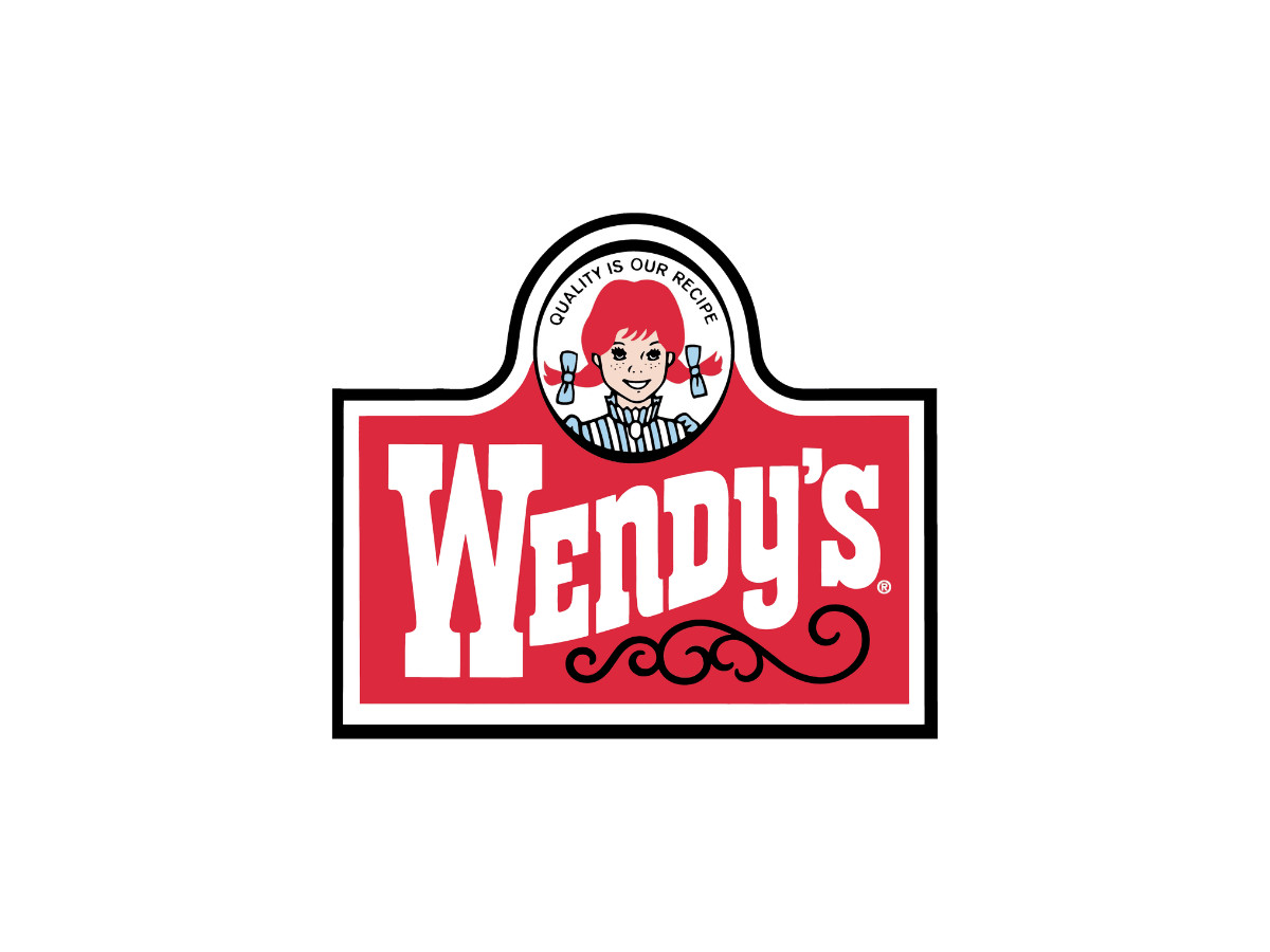
Wendy's ran a stripped-back version of the badge in the 2000s. The dome silhouette stayed, the yellow "OLD FASHIONED HAMBURGERS" strip came off, and the wordmark grew to fill the space it left. The change reads as housekeeping rather than a new identity.
Design archives disagree on the exact years, and some show this simplified badge circulating alongside the fuller 1983 version rather than replacing it outright.
If that overlap holds, it explains why published version counts for Wendy's range from four to six: the same era carried more than one mark at once. The safe reading is that the badge simplified in stages through the 2000s, then held until Tesser replaced it.
Taco Bell ran a similar quiet simplification before its bigger 2016 break, covered in the DesignRush Taco Bell logo history.
2013 To Now: The Tesser Redraw
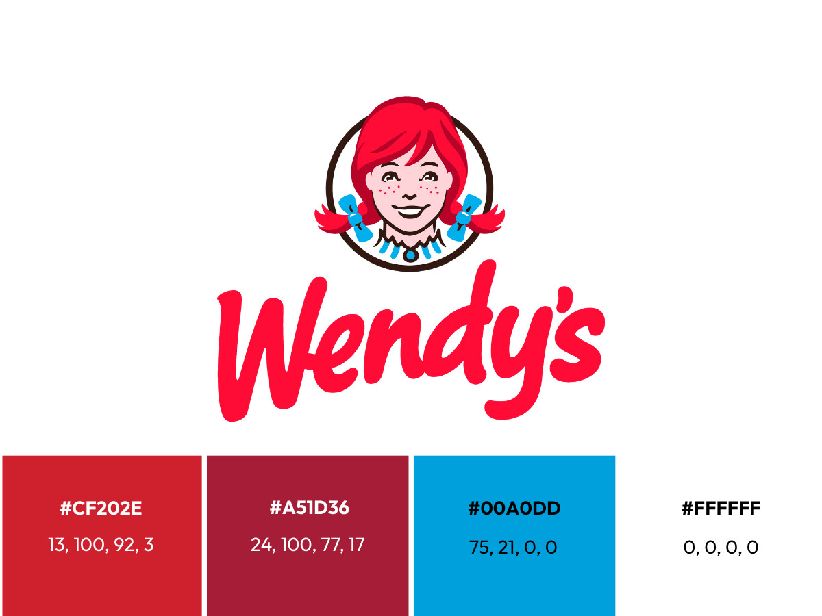
The current logo is the first full overhaul since 1983, and it broke almost every rule the badge had set.
San Francisco branding agency Tesser designed it, Wendy's unveiled it in October 2012, and the new mark rolled into advertising, packaging, uniforms, and signage through early 2013, reaching stores systemwide that February, per Chain Store Age and Nation's Restaurant News.
The slab serif, the yellow strip, the black keyline, and the tagline all disappeared.
Tesser kept the cameo and the "wave" motif in the wordmark, then rewrote everything around them. The wordmark switched to an informal red script that looks hand-drawn, the kind of open, casual lettering Fast Company described as belonging to 2012 rather than 1969.
The portrait moved to the front, gained freckles, and softened its expression, and Wendy's hair now breaks the circle instead of sitting inside it. The company framed the change as the fifth redesign since 1969 and its first in nearly 30 years, according to Mediapost, and confirmed Tesser as the agency in its own transformation release.
A lead designer on the project later documented the cameo iterations in a public case study.
The collar is the detail everyone argues about, so it is worth describing precisely. The ruffled collar sits under the chin in a short run of folds, with a blue trim line tracing the top edge and a scalloped black outline above that.
Where the trim curves through each fold, the negative space between the ruffles resolves into three rounded shapes, and that is the reading fans call "mom."
On the full-color version, the blue ribbons and freckles compete for attention and the collar recedes; on the single-color cup and bag print, the collar flattens to one tone and the letterforms jump forward.
Scale changes what the mark can carry. On a pole sign or a storefront, the script wordmark, the cameo, and the collar detail all survive.
At app-icon size, the wordmark drops out and the app leans on the cameo alone, which is why the face, not the letters, does the identifying work on a phone screen.
The full mark uses more than red and white. Because Wendy's does not publish a public brand book, these values come from design color references rather than an official spec, and the red is the one point the sources agree on:
- Red: hex #CF202E, CMYK 13, 100, 92, 3, Pantone 186 C. The wordmark and the cameo frame.
- Maroon: hex #A51D36, CMYK 24, 100, 77, 17, Pantone 201 C. Shading in the hair.
- Blue: hex #00A0DD, CMYK 75, 21, 0, 0, Pantone 2925 C. The collar ribbons and trim.
- White: hex #FFFFFF, CMYK 0, 0, 0, 0. Background and reversed type.
The set is a narrower working range than the red, yellow, and black the badge once balanced, since the 2013 redraw dropped the yellow strip and the heavy black keyline for a lighter gray linework.
That is why the mark now reads cleaner on a single-color cup or bag than the 1983 version did, and the move toward a single ownable color tracks the wider 2010s trend also visible in the DesignRush Spotify logo history and Target logo history.
The Girl Behind The Logo
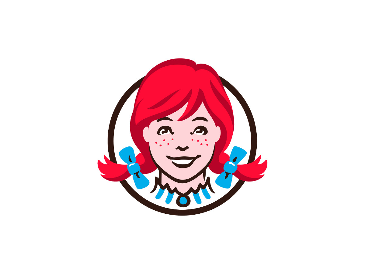
Melinda Lou Thomas is a real person, and the logo freezes her at eight.
She grew up in Ohio, and she has served as a spokesperson for the chain under the name Wendy Thomas, per public record.
Beyond that, she is a private individual, and the reliable version of this story stops at what she and her father have said on the record.
That is the tension the whole logo carries. A father's affection put a child's face on a national trademark, the mark outlived the era that drew it, and the internet later decided the collar held a secret the company never planted.
The portrait is genuine, the "mom" is a coincidence, and the regret is the part most retellings leave out. For a case where a brand did lean into its own history rather than a rumor, compare the DesignRush Walmart logo history.
Our team ranks agencies worldwide to help you find a qualified partner. Visit our Agency Directory for the Top Logo Design Companies as well as: