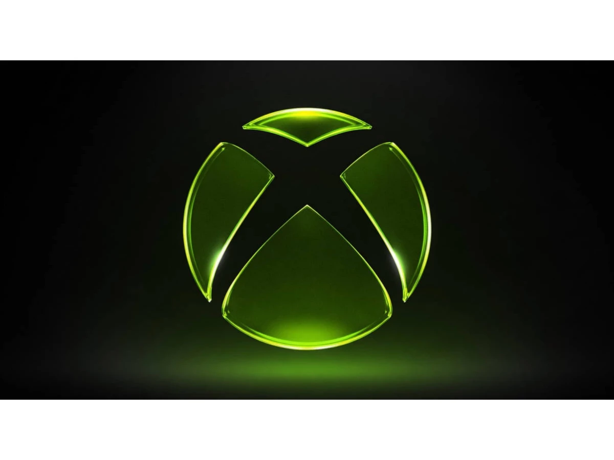

For seven years the Xbox sphere sat flat and colorless, a monochrome circle parked over a monochrome wordmark. On April 23, 2026, the green switched back on. New CEO Asha Sharma sent a staff memo titled "We Are Xbox," retired the Microsoft Gaming name that had covered the division since 2022, and unveiled a new Xbox logo that looks pulled straight from 2001: the same sphere-and-X emblem, now rendered as a glossy green glass orb glowing on black.
A Game Pass price cut landed alongside it, so the mark arrived to a warm room. Eight days later, on May 1, it reached hardware as dynamic backgrounds and gamerpics on the Xbox Series X and S. Our newsroom tracked the shift in DesignRush's report on the green-logo return.
The applause was instant. The design question underneath is thornier, and this review lands on a verdict: is the return to glass a brand rediscovering its confidence, or nostalgia doing the work strategy should be doing?
What is the new Xbox logo?
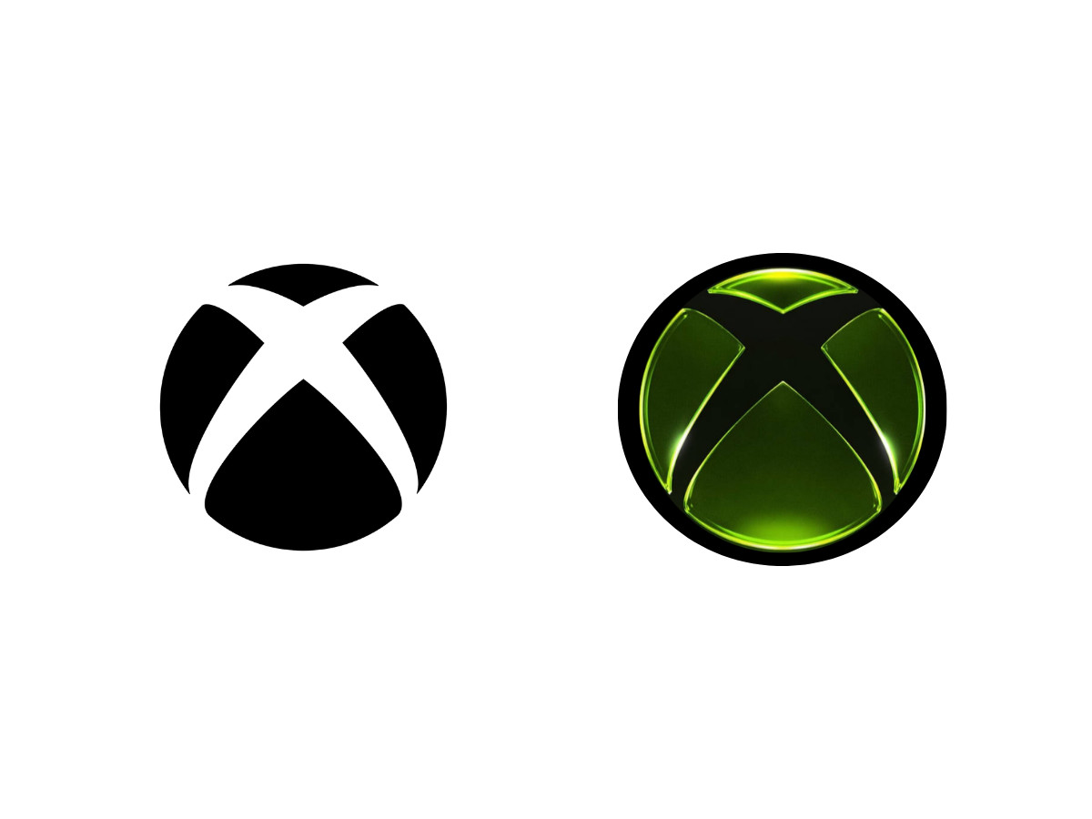
The new Xbox logo is the sphere-and-X emblem Xbox has carried since 2001, re-rendered as a green glass orb with 3D depth, shading, a bright specular highlight, and an emerald glow on black. That is the whole change, and the change is the finish.
The verdict up front: a confident silhouette wearing a nostalgic coat, and the coat is doing most of the talking. The 2019 version was flat and monochrome, drawn at a single weight. The 2026 version keeps that exact vector outline and pours dimension into it: a modeled sphere shaded front to back, with a specular highlight riding the upper curve and an emerald glow bleeding onto black. Set the two side by side and the geometry is identical. The difference is light.
Specs at a glance:
- Brand: Xbox (Microsoft)
- Announced: April 23, 2026, in the "We Are Xbox" staff memo
- Console rollout: May 1, 2026, backgrounds and gamerpics on Series X and S
- Mark type: sphere-and-X emblem, silhouette unchanged since 2001
- Treatment: 3D glassmorphism, skeuomorphic gloss, specular highlight, emerald glow on black
- Aesthetic lineage: Frutiger Aero and the early-2000s Xbox dashboard
- Core color: Xbox green, #107C10 (documented brand standard)
- Directed under: CEO Asha Sharma, with content chief Matt Booty
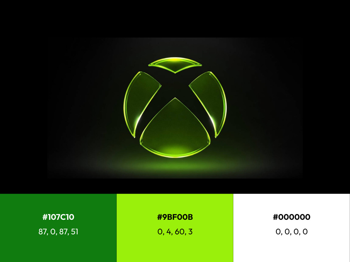
Color reference:
- Xbox Green: HEX #107C10, CMYK 87 / 0 / 87 / 51, PMS 362 C
- Accent Green: HEX #9BF00B, CMYK 35 / 0 / 95 / 6, highlight tone
- Field Black: HEX #000000, CMYK 0 / 0 / 0 / 100, ground
Microsoft has not published a brand hex value specific to the 2026 glass mark. The glow reads brighter and more acid than #107C10, closer to the launch-era green and the accent tone above.
Why did Xbox bring back the 3D look?
The glassmorphic treatment is built for a big canvas. At size, on a 4K dashboard or a store hero, the render reads exactly as intended. The highlight sits high on the sphere and implies a light source above, so the orb behaves like a physical object under studio lighting.
The glow lifts the mark off the black field and gives it a presence a flat icon cannot hold. This is the logo at its best, and it is the context Microsoft controls most tightly. Design writers clocked the reference fast, with Creative Bloq tagging the look as Frutiger Aero and, in a separate piece, tying it to Apple's Liquid Glass and the wider retreat from flat design.
Shrink it and the treatment starts to cost. At app-icon scale, around 60 pixels, the highlight compresses into a white smear and the internal shading muddies the carved X. At favicon scale, 16 to 32 pixels, the glow has nowhere to go and the gloss reads as noise. The gradient that gives the orb its body cannot survive a single-color context, so print, embroidery, laser etching, and any one-ink application fall back to a flattened version that looks nothing like the hero. A logo that needs its lighting to be itself has a reproducibility problem, which is why Xbox has quietly kept the flat mark on hand for exactly these cases. Weighed against the marks in our collection of the best brand logos, the strongest identities hold up in one ink, and this one does not.
What color is the new Xbox logo?
Green has carried Xbox since the first console. The 2001 launch used a bright, almost radioactive green that the marketing of the era pushed hard to separate the box from Sony's grey and blue.
The 360 kept green as an accent against silver. The corporate standard later settled at #107C10, a darker forest green with CMYK values of 87, 0, 87, and 51, and that is the green that lived inside the flat 2019 system.
Microsoft's parent brand went the other way years ago, as our Microsoft logo breakdown notes, trading color drama for a clean four-square mark.
The 2026 mark walks away from white-on-black, and that move alone is a statement: after seven years of monochrome, color is back as a brand asset. The sharper question is which green. The emerald in the glass mark reads brighter and more acid than the #107C10 standard, sitting closer to the original 2001 glow and to the accent green (#9BF00B) Xbox reserves for highlights.
That accent tone is doing real work here, since the glow and the specular edge lean toward it rather than toward the muted corporate value. Underneath it all, field black (#000000) still holds the ground, the one constant the brand carried through the monochrome years and kept for the glass mark. No new official hex value accompanies the glass logo as of this writing, so the exact number stays undocumented, yet the effect is a deliberate reach past the muted corporate green toward the louder green of the launch years. The color is choosing memory over the style guide.
Is The Xbox Logo Sourdough Bread?

The short answer is no. The viral claim runs like this: Seamus Blackley, the game designer credited as the father of the original Xbox, is also a serious baker who once revived 4,500-year-old yeast from Egyptian pottery to make bread. Bakers score a cross into the top of a sourdough loaf to control the rise, and a scored cross looks like an X. The internet did the rest, and the resemblance is close enough to make a good video.
The documented origin is duller. The X traces to the console's working name, DirectX Box, later clipped to Xbox, after a prototype built partly from Dell PC parts cycled through several names before launch. Windows Central traced the same lineage and put the bread comparison where it belongs, as a coincidence. No primary source from the 2001 design work connects the mark to bread, and Blackley's baking fame arrived years after the logo already existed. The sourdough story is a coincidence with a charismatic mascot attached, not an origin. That is the version worth citing: the cross on a loaf and the X on the sphere look alike because a cross and an X look alike.
What is the history of Xbox logo?
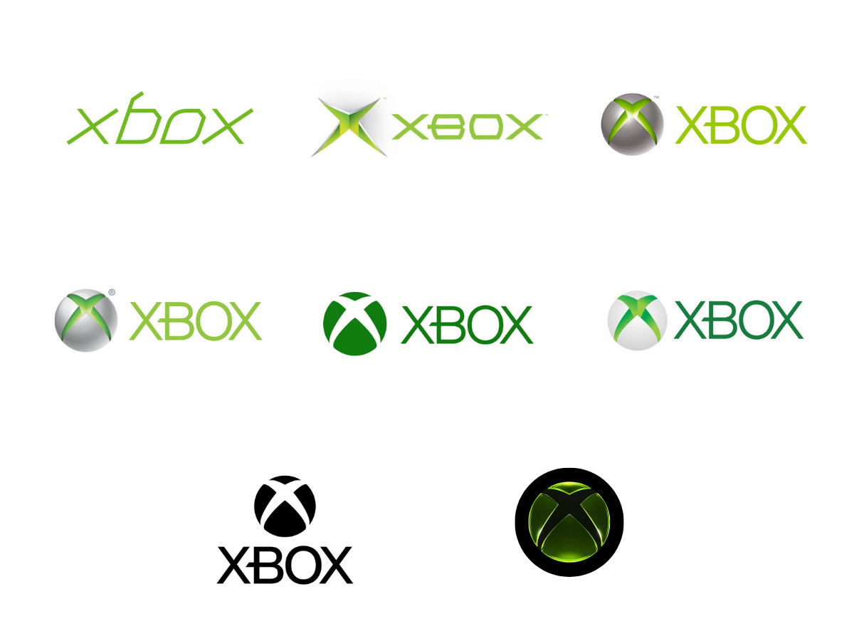
The mark has moved through five clear states, a run GameSpot laid out in full.
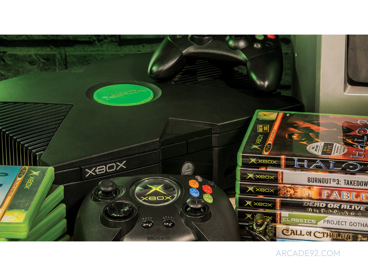
The 2001 original paired a glowing green X with the sphere and read as loud and angular, thoroughly of its nu-metal moment.
The 2005 Xbox 360 set the X into a metallic sphere with green light coming from inside, the most three-dimensional the emblem had yet been. The 2013 Xbox One shifted the sphere toward a gradient white and brightened the green for a cleaner, screen-native look.
The 2019 redesign flattened everything into monochrome, stacked the wordmark under a plain circle, and joined the industry-wide slide into flat minimalism, which held as the standard until this spring. A longer logofile history from Fabrik Brands walks each step in detail.
April 2026 is the reversal: the silhouette from 2019 kept intact, with the dimension and glow of the 2001 through 2013 era brought back on top of it.
Is the new Xbox logo nostalgia or strategy?
Fan reaction has been loud and warm, which deserves to be taken seriously and read carefully. The logo did not arrive alone. It shipped inside a package that carried Game Pass price cuts, a renamed and re-centered division, teasers for next-generation hardware under the Project Helix codename, and the approach of Xbox's 25th anniversary in November 2026.
In Sharma's own framing of the reset, the priority is the return of Xbox as an identity. Every one of those moves is built to make people feel good about Xbox, and a logo is the visual people share when they feel good. Separating the design's quality from the goodwill of its announcement is hard precisely because the announcement was engineered to be liked.
Held on its own, the design is a strong render of a strong silhouette, and the change is a new coat of paint on a drawing that never moved. Compare the approach to Sony and Nintendo.
PlayStation has kept the same PS monogram since 1994 and evolved it by subtraction, dropping color in 2009 and otherwise leaving the geometry alone, a discipline our PlayStation logo breakdown traces across every console generation; its heritage is a constant it never set down.
Nintendo treats its wordmark as a fixed asset and holds its logotype stable across decades. Xbox did the opposite. It put its own heritage look away for seven years, then picked it back up wholesale. Reviving an identity is a different act from stewarding one, and this reads more as a course correction after a rough stretch than as a plan that was always running.
Is the new Xbox logo a good design? The verdict
The 2026 Xbox logo succeeds at the job Microsoft most needed done, which is making the brand feel like itself again on the screens Xbox controls, and it underperforms as a full identity system because it leans on lighting that evaporates at small sizes and in single-color use.
The silhouette was always strong. The glass finish flatters it in the hero and abandons it in the favicon. Call it a qualified win, carried further by the announcement it rode in on than by anything new in the drawing.
The sphere did not change shape. It just remembered how to catch the light.

Our team ranks agencies worldwide to help you find a qualified partner. Visit our Agency Directory for the Top Logo Design Companies as well as:

_ce0905e40f87-preview.jpg)