
A name goes up on a roller door in one color and under two minutes. Most people clock it as a scribble and keep walking. A writer reads it in a second and knows the hand behind it. That split, a scribble to one eye and a signature to another, is what every graffiti font is trying to bottle.
This guide pulls together 20 graffiti fonts, most of them free for commercial use, sorted the way the culture sorts its own lettering: tag, throw-up, wildstyle, and piece. And nearly every face was tested down to the pixel where it stops being readable, so you know how small you can run it before the wall wins.
The Short Version
- Graffiti fonts fall into four working families that match how the culture names its own lettering: tag, throw-up, wildstyle, and piece. Sort a roundup by those and it becomes a guide instead of a pile of downloads.
- Legibility is the deciding factor. Marker and bubble faces stay readable small. The inflated bubble faces close up fast, so their size floor matters more than their looks.
- Most faces here are free for commercial use under the OFL or Apache 2.0, embedding included. Wildstyle is the exception, where the real choices are personal-use demos or paid faces built by working writers.
- "Free" on an aggregator page often means free for personal use only, which fails the moment a client is attached. Read the license at the source before the file reaches a job.
- The free libraries are deep in marker and bubble faces and empty of true wildstyle. That gap is real, and this piece explains why rather than papering over it.
What Are Graffiti Fonts?

Graffiti fonts are display typefaces drawn in, or styled after, the lettering writers developed on walls, trains, and paper from the 1970s on. The good ones carry a specific hand rather than a generic "street" mood. The weak ones drop a spray texture on a plain face and stop there.
The culture sorts its lettering by effort and intent, and that vocabulary is the useful way to sort the fonts too. A tag is the fast single-color signature, closer to handwriting than to display type. A throw-up is the two-color bubble form, an outline and a fill, built for speed. A piece, short for masterpiece, is the full multicolor wall work with highlights, depth, and background. Wildstyle is the interlocked, near-illegible construction of arrows and connected letters that writers use to signal skill to other writers.
That last one carries a rule the others do not. Wildstyle is hard to read on purpose. Reading it is the test of whether you belong to the audience it was made for. A font that imitates wildstyle inherits that difficulty, which is why the same face that looks incredible on a poster can turn to noise in a caption.
Worth naming up front: this is a living culture with real practitioners, and a lot of graffiti fonts were drawn by people outside it. This list stays honest about who made each face and where the look actually comes from, rather than treating the style as something that appeared from nowhere.
Are Graffiti Fonts Free To Use?
Most fonts in this guide are free to use commercially, but "free" on a font page still needs a second look, because most graffiti faces online are not this clean.
The common trap is a face listed as free that turns out to be licensed for personal use only. You can use it on a flyer for yourself. You cannot use it for a client, a product, or anything that earns money. Many of the best-known "free graffiti fonts" on aggregator sites sit in exactly this bucket, with the commercial license sold separately. Wildstyle-leaning demos are the worst offenders here.
A second issue is scope. A license can cover desktop use, so you can install the font and make artwork, yet still exclude web embedding through @font-face and app embedding inside software. Paid desktop faces sold through the big marketplaces usually split those out and charge for each.
Sixteen of the twenty faces below avoid both problems, carrying one of two open licenses. The SIL Open Font License 1.1 (OFL) covers personal and commercial use, desktop and web, with one real limit: you cannot sell the font file on its own. Apache License 2.0, which covers Permanent Marker, Rock Salt, and Luckiest Guy, is similarly permissive for commercial use and embedding. Both let you put the font in a website or an app without a second purchase. The four wildstyle picks are the deliberate exception, flagged in that section, because no wildstyle font clears a free commercial license.
Every license here was read at the source, either the font's own license file or its entry in the Google Fonts repository, and every designer credit came from the font's own metadata. Download-site badges were used only to find candidates, never to confirm terms. One honest note on the tools people search for: a graffiti font generator is a preview widget, not a license. Typing your word into one shows you the shape, but any file it hands back carries whatever terms the underlying font came with. The generator grants you nothing.
How The Picks Were Tested
Every size floor in the sections below is tested, apart from the four wildstyle faces, which are display-scale by nature and flagged in place. A tested floor comes from setting a five-word phrase and shrinking it until the letters stopped resolving, then reading off the point where it broke. That number is the most useful thing here, and the thing no download aggregator gives you. On licensing, most of the list is free for commercial use with embedding allowed, OFL throughout, except Permanent Marker, Rock Salt, and Luckiest Guy, which are Apache 2.0.
The Twenty Faces At A Glance
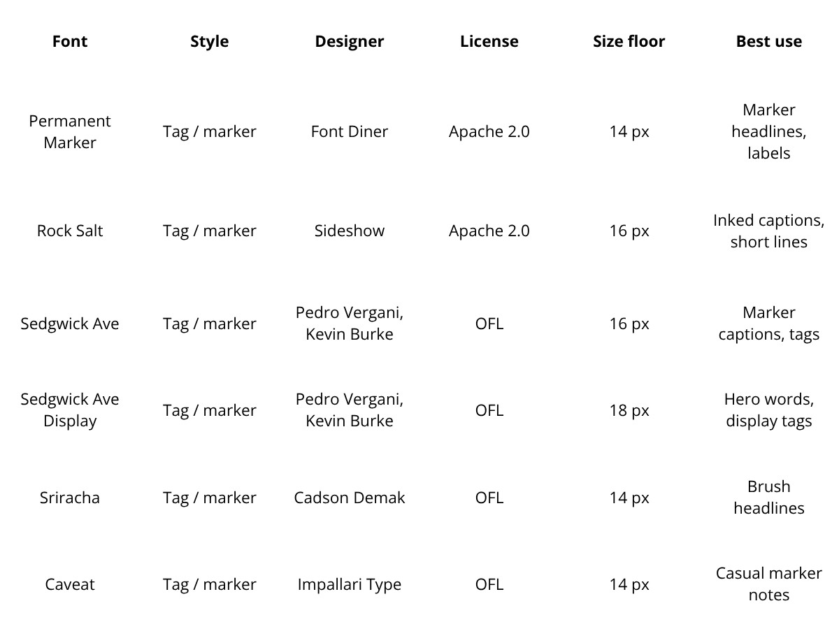
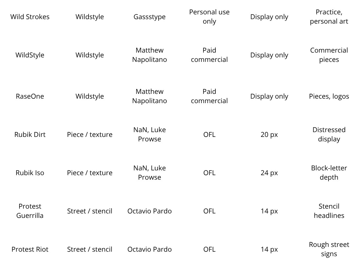
The full set, sorted by family. Best use is summarized here and expanded in each font's entry below.

Tag And Marker
This is the readable end of the category, and the right place to start.
A tag imitation is close to handwriting, so it keeps open counters and stays legible smaller than any other graffiti style. If you need graffiti energy in something people actually have to read, look here first.
Permanent Marker by Font Diner is the workhorse, and it behaves better small than anything else in this section. The strokes are clean and the forms stay open, so a full phrase reads down to about 14 px and stays legible near 12. It reads as a fat chisel-tip marker rather than a spray hand, which is why it survives where wilder faces fall apart.
Rock Salt from the same studio, under its Sideshow name, was inked with felt-tip markers, and it keeps that hand-drawn wobble. It runs wide and eats horizontal space, so it wants a short line, though it holds to about 16 px before the ink starts to close.
Sedgwick Ave is a marker hand with a real story behind it. Pedro Vergani and Kevin Burke drew it for a Google Doodle marking the 44th anniversary of hip-hop, and it takes its name from 1520 Sedgwick Avenue in the South Bronx, the building where the culture started. The text cut is thin and script-like, so it holds a five-word line to about 16 px, and since neither designer is a writer, treat it as an affectionate marker script with an honest name.
Sedgwick Ave Display is the heavier cut of the same pair, drawn for scale. It survives to roughly 18 px before the strokes thicken toward each other, so save it for hero words rather than captions.
Sriracha by Cadson Demak is a slanted brush marker with a loose, informal bounce, legible to about 14 px. It loosens in long all-caps runs, so keep it to a headline.
Caveat from Impallari Type is the most legible and least graffiti of the group, a casual marker script that reads to roughly 14 px. Reach for it when you want the marker feel without the attitude turned up.
Throw-Up And Bubble

A throw-up is the two-color bubble form: a fat outline, a flat fill, letters squeezed together for speed. Here is the honest catch. Most free "bubble" fonts give you the inflated mass but skip the second-color outline, so they read as friendly display rounds rather than true throwies.
That is fine as long as you know it, and you can add the outline yourself in Canva or Illustrator. This is the deepest corner of the free graffiti world.
Bagel Fat One by Kyungwon Kim pushes the balloon hardest and inflates the counters almost shut, so each letter looks ready to pop. A five-word line turns muddy below about 20 px and closes to a blob by 16, which makes one word at poster scale the whole use case.
Modak from Ek Type runs the same inflated idea with rounder, heavier forms, and it hits the same wall near 20 px. Use it when you want the bubble to feel soft and toy-like rather than tight.
Rubik Bubbles by NaN and Luke Prowse is the rough-edged, pressurized option, and it holds a phrase to about 14 px. One OFL grant covers it alongside the Rubik texture faces further down.
Titan One by Rodrigo Fuenzalida is fat but keeps its counters clear, so it holds to about 14 px where Bagel Fat One would clog. It is the readable pick when you still want real weight.
Luckiest Guy from Astigmatic is a comic bubble in all caps, open and friendly, and the most readable of the bunch at roughly 12 px. It brings poster energy without closing up at small sizes.
Baloo 2 from Ek Type is the clean rounded workhorse of the group, open-countered and dependable to about 12 px. Reach for it when the bubble is a supporting player rather than the star.
Wildstyle

Here the free libraries come up empty, and it is worth stating plainly: a wildstyle font that is both free for commercial use and verifiable at the source does not really exist. So this section runs differently from the others.
It lists the two honest routes a designer actually has, free demos you can study but not sell, and paid faces built by working writers that you can license for client work.
Wildstyle is the hardest lettering in the culture to draw, built from interlocking arrows and connected letters that still have to read to the right eye.
The people who build it well are writers, and they sell it rather than give it away, which is why the commercial picks below come from a foundry run by one.
Wild Graf by Cikareotype is free to download but personal use only, with commercial rights sold separately, so keep it to sketches and personal art rather than a paid job. It has the tangled, edgy strokes of a quick wildstyle sketch, and like all wildstyle it wants display scale, breaking up fast in anything small or long.
Wild Strokes by Gassstype is the other free demo worth studying, again personal use only until you buy the license. The brushy, overlapping strokes read as raw and fast, which makes it a fair practice face for the look, though the personal-use limit rules it out the moment money is involved.
WildStyle by Matthew Napolitano is the commercial anchor, and the one agencies reach for. Released through his Graffiti Fonts foundry, it was the first digital font with connecting, interlocking wildstyle letters, and it ships as stackable fill, outline, drip, and fade layers that build a finished piece. It is licensed for commercial work, priced per style or as a family, with web and app embedding sold separately.
RaseOne by Matthew Napolitano is the other paid pick, a layered system drawn from his own handstyle that leans a touch more legible than full wildstyle. It gives you the interlock and the fill-and-outline treatment without losing the word, and it carries the same commercial desktop license as the rest of the foundry.
Piece, Texture, And Street

A piece is the full multicolor wall work, and here is the thing no roundup admits: a piece is not in a font. It is layered mural work with a fill, an outline, a highlight, and depth, built up by hand. No single free typeface hands you that. What the faces here give you is raw material, either a sprayed surface or the block depth you build a piece on.
Rubik Dirt by NaN and Luke Prowse puts a distressed, grimy texture onto solid letters, and unlike many texture faces it holds together, so it reads to about 20 px before the noise eats the shapes.
Rubik Iso from the same designers gives you an isometric 3D block with real depth, legible to roughly 24 px before the offset and outline merge. Both faces sit in the Rubik superfamily, built on the original Rubik by Hubert and Fischer, so one OFL grant covers them alongside Rubik Bubbles above.
Protest Guerrilla by Octavio Pardo is a cut-stencil face, the digital version of spray-through-a-template, and it holds to about 14 px. It shares spacing with its sibling, so you can swap the two without reflowing a layout.
Protest Riot, the sibling face, captures the rough, hand-marked look of an informal street sign at the same 14 px floor. Neither is a mural piece, though both carry the surface honesty this section is really about.
Putting Graffiti Type To Work
One graffiti face per layout, and it goes on the loudest thing you have: the hero, the single word, the logo. Everything around it stays quiet, usually a plain sans carrying the reading. A marker tag over body copy, or a bubble word over a light rounded face like Baloo 2. Stack two graffiti faces together and the page turns into a gig poster nobody can actually read.
The sizes are not a suggestion. Marker faces hold a line into the mid-teens of pixels, so one can carry a subhead. The inflated bubbles, Bagel Fat One and Modak, seal shut below 20 px and want one big word. Wildstyle and the texture faces live at display scale only, where the interlock and the grain still register. If you need graffiti flavor inside running text, use a marker and nothing else here.
Some brands wear this and some fight it. Music, streetwear, gaming, skate shops, and event work were built for it, while a bank or a hospital will only ever look like it borrowed the jacket. That same taste for a look with a date on it drives the Y2K type revival and the broader trend-driven logo work it sits beside, and if you want more free faces to try, the wider roundups of free fonts are a good next stop. Used with intent, a graffiti alphabet reads as a deliberate choice.
Whatever you choose still has to hold up as type, which is the lesson behind the best typography logo designs: the letters do one job and do it cleanly. Graffiti earns its place as a single wordmark far more often than as a full system, the same line that separates a logo carried by type alone from one leaning on effects to prop up a weak base.
When a headline grows into a whole identity, and especially when the brief calls for real wildstyle, bring in a branding studio that draws lettering and knows which writers to license from.
Which brings it back to that roller door. The name worked because it was aimed, a single clear move made for the people meant to catch it. Graffiti type on a screen asks the same of you: pick the eye you are writing for, then commit to one gesture and keep the rest of the layout out of its way.
Our team ranks agencies worldwide to help you find a qualified partner. Visit our Agency Directory for the Top Logo Design Companies as well as: