
In 1999 a designer rendered a wordmark in liquid chrome on a beige tower that hummed, and it glowed because the monitor's glass was curved. The screen did half the work. Today that same chrome sits on a phone sharp enough to show every seam, faking a light it used to get for free.
The Short Version
- Y2K fonts revive the digital design of 1998 to 2004, built on chrome gloss, inflated rounded forms, and low-resolution pixel and techno shapes.
- The style breaks into three working families: chrome and metallic, bubble and rounded, and pixel and techno.
- Verified free-for-commercial faces exist in all three families, but the "free" label on most download sites means personal use only.
- The look lands as one loud gesture on a calm layout, and it falls apart the second a whole page runs in it.
- Start in the free tiers, and read the license before the file ever reaches a client.
What Are Y2K Fonts?
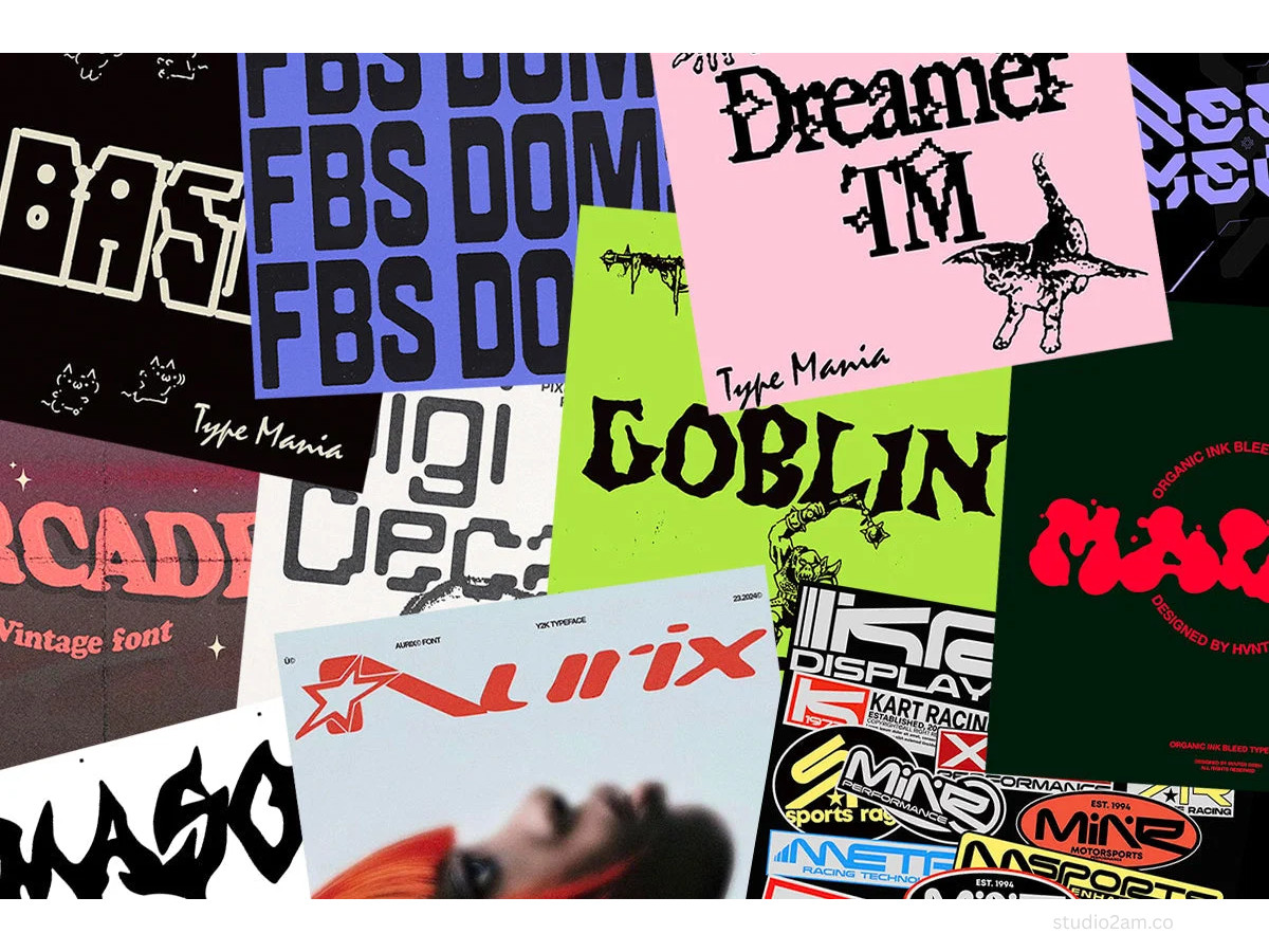
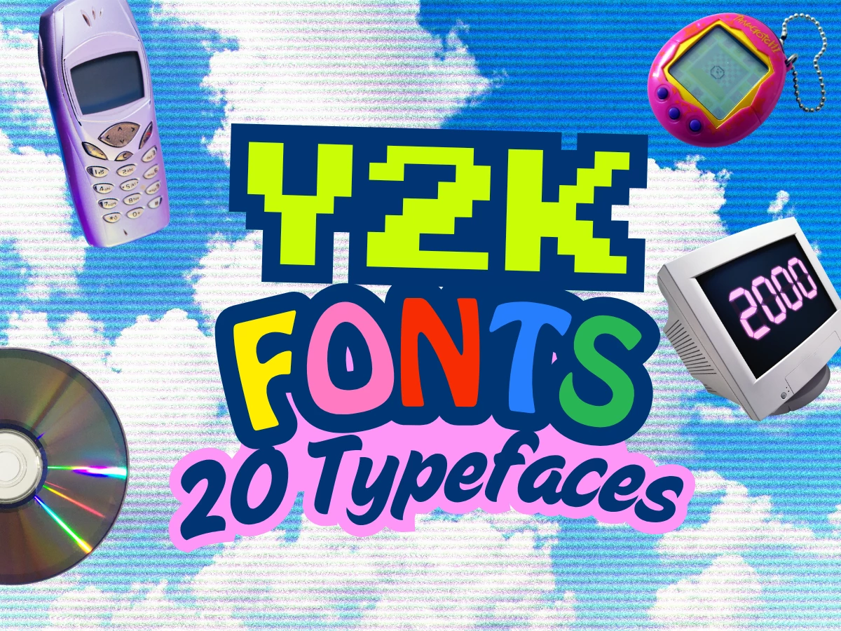
Y2K fonts are display typefaces drawn in, or styled after, the digital design of roughly 1998 to 2004. Three traits recur: metallic chrome surfaces with hard highlights, inflated rounded forms with soft terminals and high x-heights, and low-resolution pixel or squared techno shapes.
Most were made for screens rather than print, and most carry the era's confidence that machines were about to make everything better.
The revival has concrete anchors, not just mood. The 2021 Bratz relaunch, the visual language of hyperpop and its album art, and the iMac G3's translucent color returning as a design reference all pushed the aesthetic back into commercial work.
Fashion and music moved first, and branding followed, which is the usual order for a look that started on album covers and MTV bumpers.
Are Y2K Fonts Free To Use?
"Free" on a download page rarely means what a working designer needs it to mean.
The common trap is a face listed as free that is licensed free for personal use only, which makes it unusable the moment there is a client, a product, or money attached.
A second trap is scope: a license can cover desktop use (installing the font to make artwork) but not web embedding (serving it through @font-face) or app embedding (shipping it inside software), and those are priced and granted separately.
The licenses that clear commercial work sit in three buckets here:
- The SIL Open Font License 1.1 (OFL) covers personal and commercial use, desktop and web embedding included, with one real limit: you cannot sell the font file on its own.
- The Indian Type Foundry Free Font License, used by Fontshare, also clears personal and commercial use, but it asks you to serve the files through Fontshare rather than self-host and redistribute them, so read that clause before you put the file on your own server.
- The third bucket is straightforward commercial: free to try, paid to ship. That is the model behind most premium display faces, like Pangram Pangram's Monument Extended, though none of the twenty here need it.
Every license below was read at the source: the font's own OFL.txt, the foundry's license page, the Fontshare license text, or Pangram Pangram's terms.
Download-site badges, roundup articles, and marketplace listings were used only to find candidates, never to confirm a license. Any face whose license could not be read at the source was left out.
As of this writing, the OFL, ITF, and Pangram Pangram terms cited here are the current ones, though revival-trend faces do get relicensed, so confirm on the font's page before you ship.
Chrome And Metallic
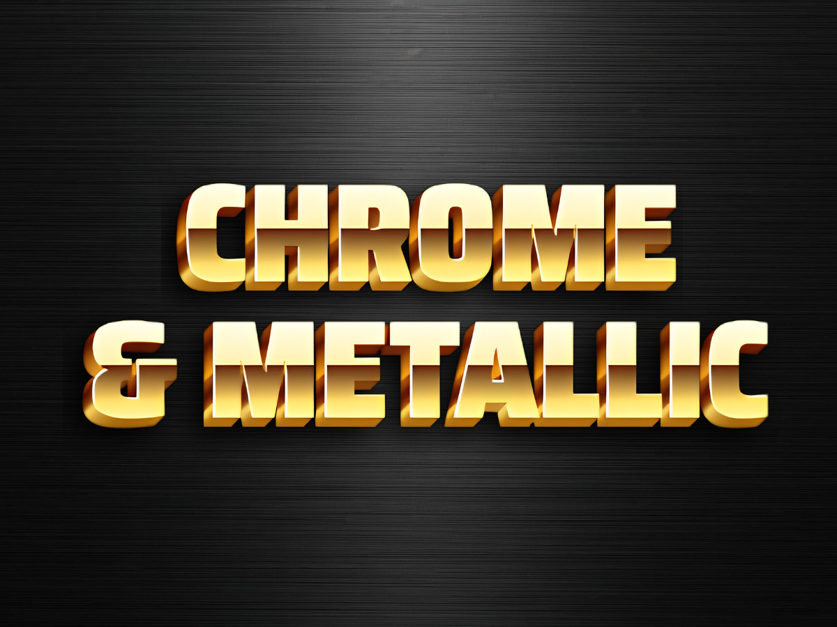
This is the shortest list, and the reason is worth stating plainly: chrome is mostly not in the font.
The liquid-silver look of the era came from designers who had just gotten their hands on 3D software and rendered lettering as reflective metal.
Almost every "chrome font" you find is a clean display face that someone finished in Photoshop with a gradient, a hard bevel, and a highlight streak. So one face here ships the metal, and the rest are strong bases you chrome yourself.
A layered chrome text effect from Adobe's own library or a Canva gradient plus bevel will get you there faster than hunting for a font that does it for you.
Nabla is the exception, and the one to reach for first. Built by Arthur Reinders Folmer at Typearture and engineered by Just van Rossum in the COLRv1 color-font format, it carries gradients, highlights, and extrusion depth inside the file, with variable axes for depth and highlight thickness.
The catch is rendering: the color only shows in software that supports color fonts, which now includes recent browsers, Figma, and current Photoshop and Illustrator. Drop it into an app without color-font support and it falls back to flat outlines. Use it at display sizes, where the isometric depth reads.
Anton is the pick when you are working in Canva, where it sits in the default library. Vernon Adams drew it as a heavy condensed sans with a tall x-height and low stroke contrast, so the letters hand a chrome gradient a large, flat plane to sit on and hold the highlight without breaking up.
Set your word in Anton, then build the metal in Canva's Effects panel with a silver gradient and a hard shadow, since the shine is not in the file. Free for commercial use under the OFL.
Bebas Neue is the free alternative when the timeline rules out buying anything. Ryoichi Tsunekawa's tall, narrow caps give you a clean vertical canvas, and the flat stroke takes a highlight streak cleanly. There is no metal in the file, so plan on building the effect.
Zen Dots by Yoshimichi Ohira runs in the squared sci-fi direction, with wide letterforms and cut corners that read as machined even before you add anything.
It works as a chrome base and doubles as a techno display face. Set it in caps at large sizes; the detail muddies below roughly 24 pixels.
Clash Display from the Indian Type Foundry is the editorial option. Its tight apertures and small counters, close to shut in letters like the lowercase c, hold a bevel without the shine filling the letter in.
It reads more magazine cover than energy-drink can, which is useful when you want the metal to feel deliberate rather than loud. Free for commercial use under the ITF license, served through Fontshare.
Bubble And Rounded
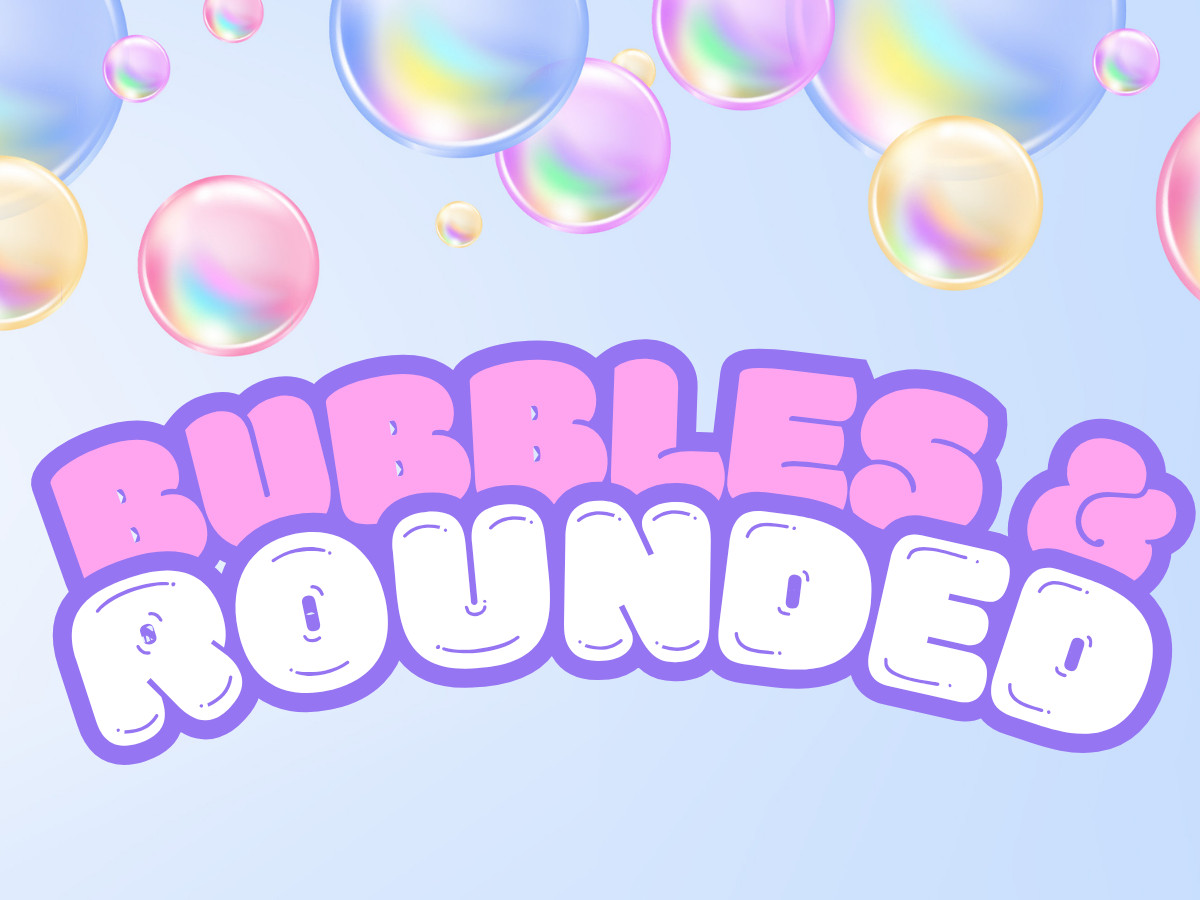
The most usable family, and the one that survives contact with a real product.
Inflated counters, soft terminals, and high x-heights read as friendly at a glance and stay legible where chrome and pixel type fall apart.
The spread runs from maximal to restrained, so match the weight to how loud the brief actually wants to be.
Bagel Fat One is the loudest. Kyungwon Kim's face pushes the strokes until the counters nearly close and the letters look pressurized, like each one was inflated past its limit.
That leaves almost no room inside the letters, so it works for one or two words at poster scale and turns to a solid blob in a sentence. One word, very large, is the whole use case.
Baloo 2 by Ek Type is the workhorse. The rounded terminals stay soft, but the counters stay open and the x-height is tall, so it holds up in interface headings and product packaging where Bagel Fat One would clog.
It appears in a real weight range, which makes it usable for more than a single hero line.
Fredoka, drawn by Milena Brandão, is the pick when the rounded type has to go small.
The strokes are bold and the forms are even, so it stays readable at sizes where thinner rounded faces break down, which suits informal headlines and short labels. A thick outline in Canva lifts it off a busy background if you need the contrast.
Sniglet is heavier and more display-only. Haley Fiege's rounded forms have a chunky presence that suits a headline and nothing smaller. Keep it for titles.
Chillax from the Indian Type Foundry is the soft-branding option. Its even spacing gives it a near-monospaced rhythm, and the rounding is gentle rather than inflated, so it reads calm where the others read cartoon.
Manushi Parikh designed it on a geometric skeleton, which is why it holds a brand mark cleanly. Free for commercial use under the ITF license.
Quicksand and Comfortaa are the clean rounded partners, not the stars. Andrew Paglinawan's Quicksand is a geometric rounded sans that works as the calm body face under a louder Y2K headline.
Johan Aakerlund's Comfortaa runs lighter and thinner, better for small labels and interface text than for anything that needs weight. Reach for either when the hero face is carrying the style and everything else should get out of the way.
Pixel And Techno
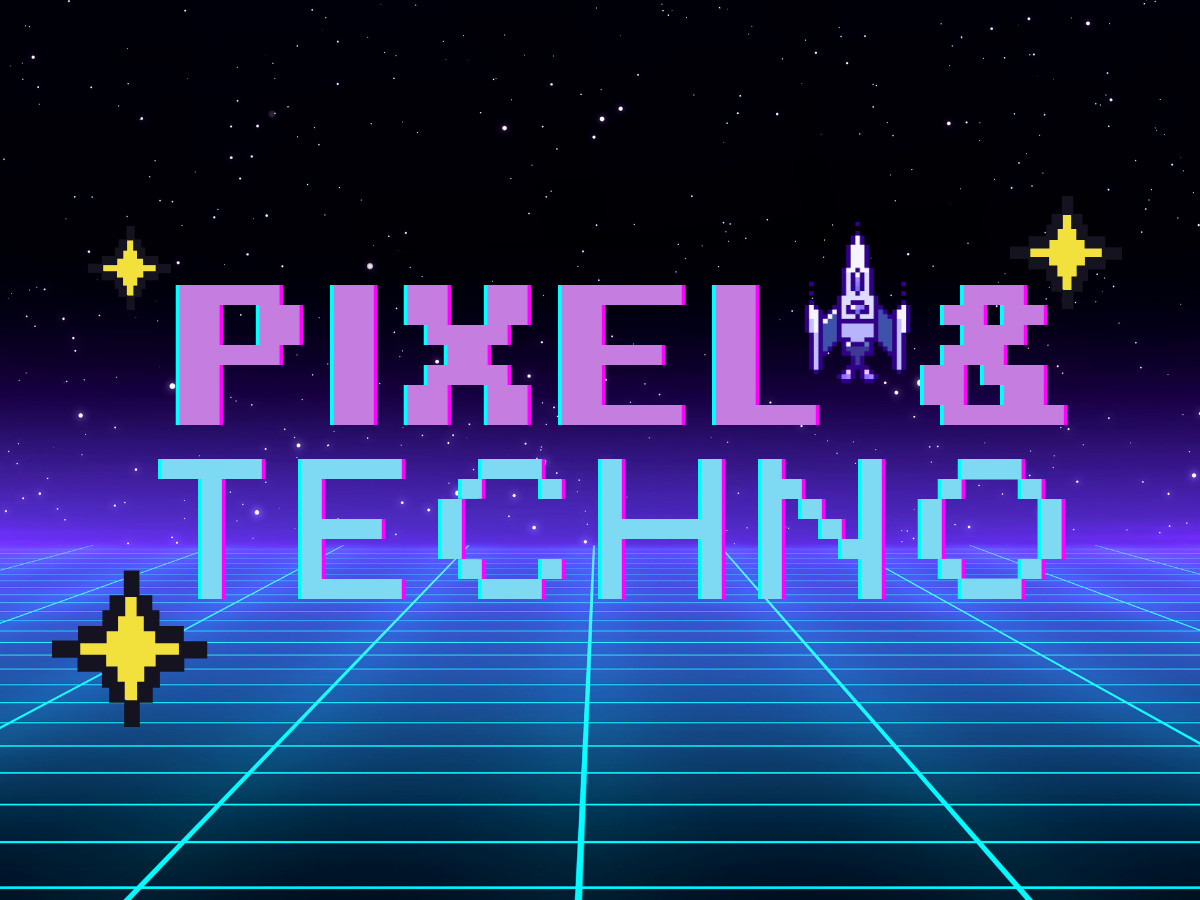
The techy end of the era, split between literal bitmap faces and the squared sci-fi sans that turned up on CD-ROM menus and music-video graphics.
The pixel faces come with a hard rule the others do not: bitmap type has correct sizes, and it breaks badly away from them. State the size, or the type dissolves.
Orbitron is the anchor.
Matt McInerney's geometric sans, released through The League of Movable Type, is built on near-circular forms that read as clean tech at any weight, which is why it lands on so many logos and headlines. It runs from light to black, so it scales from a wordmark to a headline without a second family.
Also available through Adobe Fonts if you would rather sync it.
Audiowide by Astigmatic runs softer, with tubular forms and rounded corners that carry a retro-tech tone rather than a hard futuristic one. It suits titles and short headlines and gets loose in body text.
Michroma, from Vernon Adams, reworks the rounded-square genre tied to a 1960s idea of the future. The wide, even letterforms read as a machined interface label, which makes it a good heading face when Orbitron feels too circular.
Departure Mono is the pixel face that behaves. Helena Zhang built this monospaced font with a lo-fi terminal look, and it is pixel-perfect at font sizes in multiples of 11 pixels, so 11, 22, and 33 stay crisp and the values between them smear.
It carries a real glyph set, including small caps and old-style numerals, so it works for captions and interface text, not just a logo.
Pixelify Sans is the readable pixel display face. The Pixelify Sans project, led by eifetx, keeps the letterforms clean enough that a longer title survives without dissolving into static, which is more than most bitmap faces manage.
Use it when you want the pixel reference on a phrase rather than a single word.
VT323 by Peter Hull is the dial-up option, drawn from the glyphs of the DEC VT320 terminal and softened to mimic the way a CRT smeared the pixels. It is monospaced and reads best at small to middle screen sizes; blow it up and the softness turns to blur. This is the less-Bratz, more-boot-screen corner of Y2K.
Micro 5 is a genuine miniature. Part of the Google Fonts Soft Type Collection, it is drawn to stay legible at very small sizes and is close to unusable large, where the construction shows. Treat it as a label face, not a headline.
Sixtyfour closes the set with the old-computer boot-up look, a reworked CRT bitmap that references DEC raster typography. It leans hardest into the phosphor-screen aesthetic of the three, so keep it for display and for the moments where the reference is the point.
How To Use Y2K Type Without Looking Dated
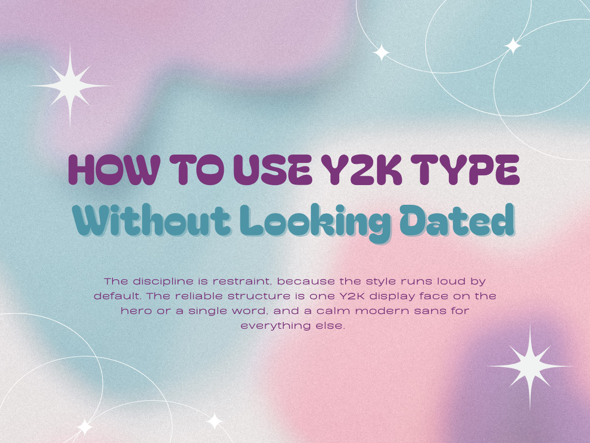
The discipline is restraint, because the style runs loud by default.
The reliable structure is one Y2K display face on the hero or a single word, and a calm modern sans for everything else. A chrome title over a cool gray body, a bubble title over a rounded sans like Quicksand, a pixel title over plain Inter.
When two Y2K faces compete on the same layout, the page stops reading as design and starts reading as a wrestling poster.
The line between intentional and costume is specificity. Y2K done well quotes a particular cue, the chrome, the gel, the CRT, and commits to it against a clean layout.
Y2K done badly drops a metallic gradient on any font and hopes. The supporting cues do half the work: iridescent silver, electric blue, hot pink, and lime, plus gel buttons and lens-flare accents, are what make the type read as a decision rather than a default.
Those cues drive a lot of the trendiest logo work at the moment, which is part of why the style feels current again.
It is the wrong call for anything that trades on trust or timelessness. A bank, a law firm, a health brand, or a face that has to stay legible in long copy will fight the style rather than wear it.
Where it belongs is fashion, music, gaming, event, and product work that wants a dated reference on purpose, and even there it works best as a single strong gesture. T
he same restraint runs through the best typography logo designs and separates a redesign that ages well from one that chases a year.
Most of the faces above also sit in wider roundups of free fonts worth a browse, and if the work has outgrown a single headline, hand the type system to a branding studio that does this daily.
Chrome was always about the light hitting a screen. Get the light right and the year takes care of itself.
Our team ranks agencies worldwide to help you find a qualified partner. Visit our Agency Directory for the Top Logo Design Companies as well as: