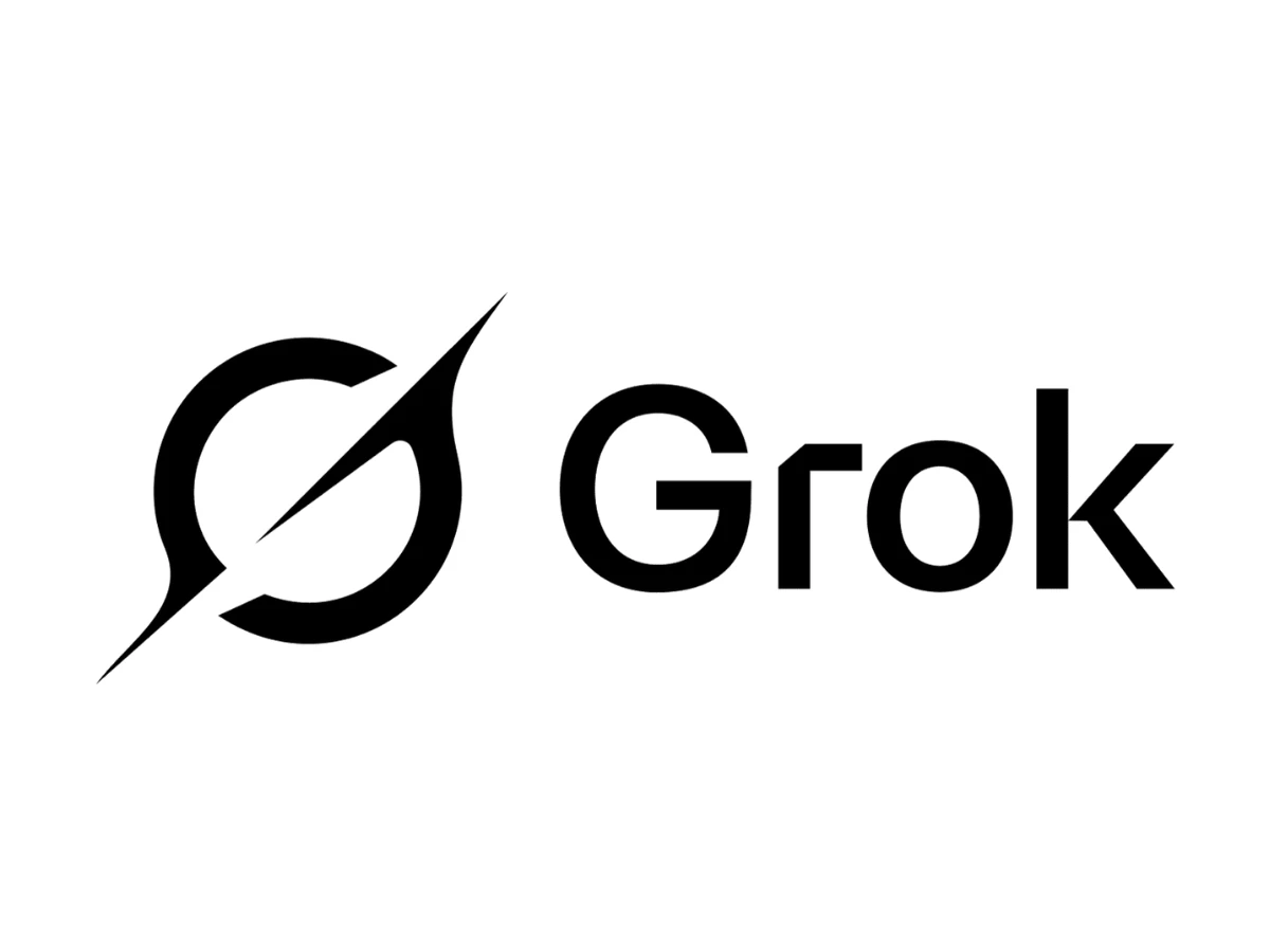

Ship a logo. Watch strangers online read it as a broken, upside-down cross. Field boycott calls. Pull it by mid-February. That was the Grok logo's winter of 2024 into 2025, and no other major AI brand has lost a mark to what the public saw in it. The replacement was a black hole.
The Short Version
- The Grok logo is a black-and-white mark that has appeared in several forms since 2023, and currently pairs a circular black-hole symbol carrying a diagonal slash with a sans-serif wordmark.
- xAI launched Grok in 2023 with an icon that matched the company's own mark, a forward slash set inside a black square.
- A version introduced around December 2024 drew public criticism for resembling an inverted, broken cross, and xAI replaced it by mid-February 2025.
- Grok's identity uses no gradient and no color, which sets it apart from nearly every competing AI brand.
- Grok is the rare case where reduction backfired first and paid off second, because the black-hole reference finally gave viewers something specific to read instead of a shape they could fill in themselves.
What Is The Grok Logo?
The Grok logo is the visual identity of Grok, the AI assistant built by xAI (a company that rebranded to SpaceXAI in July 2026, though the Grok product kept its name and its mark). In its current form the identity has two parts. On the left sits a circular symbol; on the right, a wordmark reading Grok, an initial capital followed by lowercase letters.
The symbol repays a close look. A bold ring stands in for the black hole and its accretion disc, broken open where a diagonal blade sweeps through it. The blade runs lower-left to upper-right, the forward-slash direction carried over from the first Grok icon, and it tapers to sharp points at both ends that overshoot the ring, one spearing down below the circle and one up above it. Ring and blade together trace a stylized letter "G," its opening set where the disc parts. The fill is solid black, the ground plain white. xAI publishes no named brand black, so there is no house ink to cite the way a heritage brand names a Pantone. The mark reads as pure black on pure white.
One distinction gets lost in most coverage, so it is worth stating cleanly. Two marks sit next to each other in this story. The Grok product mark is what appears in the chatbot, the apps, and the favicon. The xAI corporate mark is the parent company's own identity, an angular figure built from the letters X, A, and I. For most of Grok's life the product borrowed the corporate mark or something close to it, which is exactly why a corporate-level design decision landed on a consumer product and produced the backlash below. The two only fully separated in February 2025.
What Does The Grok Logo Mean?

xAI has said very little about what any Grok mark is supposed to mean, which makes honest labeling more useful than confident guessing. What follows are the readings that circulate, marked for what each one is.
The clearest reading belongs to the original 2023 icon. A forward slash inside a square is a command-line and slash-command reference, the "/" a developer types to trigger an action.
For a product aimed partly at technical users on X, that is a piece of audience signaling that works without a caption. The people meant to catch it, catch it.
The current symbol has a stated concept, which is unusual for this brand. The designer credited with the mark, Jon Vio, described it publicly as built on the idea of a singularity and the pull of a black hole, and pointed to cinematic references, among them the Gargantua black hole from Interstellar, along with 2001: A Space Odyssey and Dune.
Read that way, the circle is an accretion disc and the break in the ring resolves into a "G." A closer critical reading of the mark traces the same move, the luminous disc around the hole becoming the letterform.
Treat all of this as the designer's account and one essayist's analysis rather than an official xAI brand rationale, because xAI itself has not published one.
The last reading is the one xAI never wanted, and it gets its own section.
Why Did Grok Change Its Logo?
Here is the sequence, dated as tightly as the record allows.
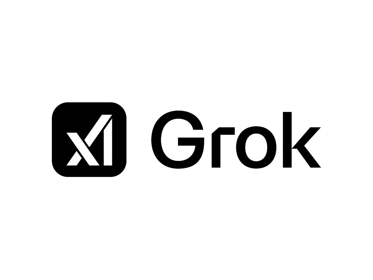
Around December 2024, as Grok became free to users on X, the app's icon switched to match xAI's updated corporate mark, the angular X-A-I figure. Almost at once, two separate reads spread on the platform.
The first: the figure looked like a cross snapped in half and knocked sideways, an inverted broken cross.
The second, from designers, was that the same angular mark closely echoed the Algorand cryptocurrency logo, a distinctiveness problem rather than a symbolic one.
Through January 2025 the broken-cross reading traveled fast. Posts multiplied, and by late January the criticism had peaked, with some users calling for a boycott and others defending the mark as a plain nod to Musk's X.
Before the replacement landed, the site briefly reverted to the original 2023 slash-in-square. Then on Feb. 18, 2025, alongside the launch of Grok 3, xAI swapped in the black-hole symbol, and Musk changed his own profile picture to it.
xAI gave no public design reason for dropping the earlier mark. The mark simply went away and a new one arrived.
Now the part nobody has taken apart: what specific geometry made the misreading available. The angular mark set X, A, and I as bare white strokes on a black tile, with nothing enclosing or joining the individual letters, so the eye grouped the strokes by proximity instead of parsing three letters.
A tall vertical crossed by a shorter diagonal near its upper end matches the schema of a cross before it matches "A." Because the vertical sat off-center and the crossing stroke tilted, the cross the eye assembled read as leaning and broken rather than upright.
The strokes, cut square at their ends and set in flat high contrast, gave the figure the weight of a symbol instead of the lightness of a wordmark.
Nothing in the mark, no curve, no color, no enclosing shape, pushed back on the first thing viewers saw. A mark that leaves that much open lets the audience finish it, and a large audience will not all finish it the same way.
Why Is The Grok Logo Black And White?
Look across the category and the pattern is easy to see. OpenAI reaches for a soft, symmetrical blossom. Google's Gemini and Anthropic's Claude lean on gradient and warm, organic form. The default gesture for an AI brand is a rounded, friendly, glowing thing, the kind of trendy gradient logo the category keeps producing.
Grok rejects gradient, curve, and warmth in one decision, the same austerity that runs through the strongest minimalist logo design. The palette is the entire color system: pure black (HEX #000000, CMYK 0, 0, 0, 100) on white (HEX #FFFFFF, CMYK 0, 0, 0, 0), with no third value anywhere in the mark.
That choice buys real things. It separates Grok from a field of near-identical soft marks, so the icon is legible as itself in a phone's app tray.
And it reads as a power tool rather than a companion, a hard monochrome figure with a seriousness pastel gradients cannot carry, which fits the product's stated positioning.
It also costs something, and the cost is the whole story above. Soft, over-specified forms are hard to misread because they already say "flower" or "spark" and little else. Hard geometry says less, and the less a mark says on its own, the more the viewer supplies. That is the trade Grok made twice.
Reducing a mark to bare geometry does not empty it of meaning. It hands the job of finding the meaning to whoever is looking. The 2023 slash and the current black hole both give the eye a specific thing to land on. The 2024 angular mark gave it a blank, and the blank filled with a broken cross.
What Font Does The Grok Logo Use?
The typeface question has a clean answer once you separate the eras.
The 2023 wordmark used Josefin Sans, the geometric, generously spaced face Santiago Orozco drew from 1920s models. The current wordmark is visibly heavier and tighter, so it is a different face, identified in places as Elido Semi Bold and elsewhere read as custom graphic design.
xAI has published no type specification, so the heavier face stays unconfirmed by name. The mistake is naming a single font for the Grok logo, since the mark has worn more than one.
How Did Grok's Logo Get Here?
The line runs short and is worth keeping short.
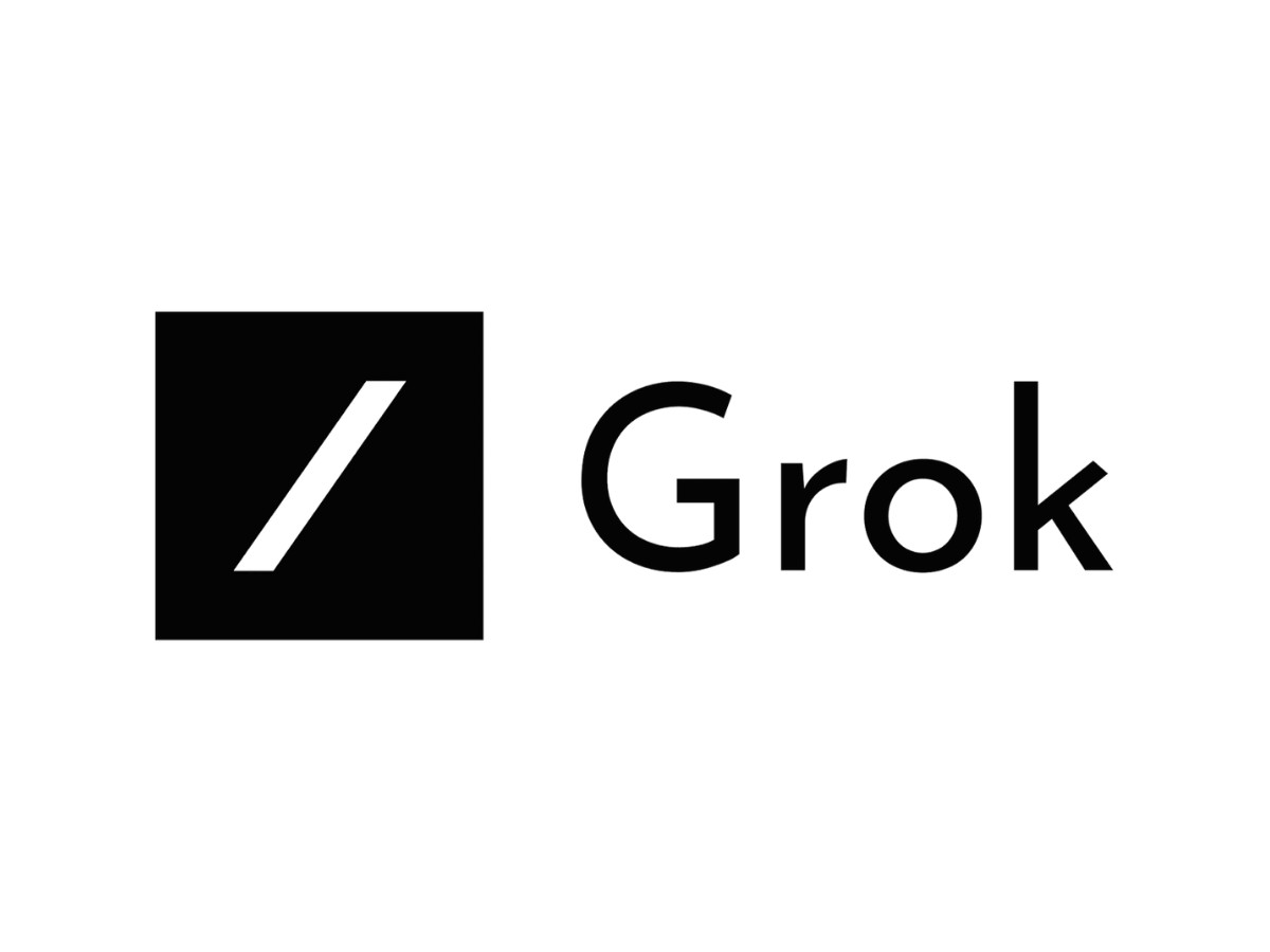
In 2023, Grok launched with a forward slash inside a sharp-cornered black square, an icon shared with xAI's own identity.
The slash was heavy against the frame, its ends cut flat rather than angled, set near-center with even negative space on both sides. The wordmark used Josefin Sans, the geometric 1920s-flavored face by Mexican designer Santiago Orozco, with generous spacing and a full-circle "o."
Around December 2024, the icon moved to xAI's updated angular X-A-I mark, the version that drew the broken-cross and Algorand comparisons. A brief reversion to the 2023 slash-in-square appeared on the site during the fallout.
On Feb. 18, 2025, the black-hole symbol arrived with Grok 3 and became the product's first identity fully its own, separate from the corporate mark. The wordmark shifted too, to a heavier, cleaner geometric sans set in the same title case.
In July 2026 the parent company rebranded from xAI to SpaceXAI, refreshing the corporate logo, while Grok's product mark and name carried through unchanged. This brand swaps marks faster than any other in the AI category, so anyone citing a "current" Grok logo should check the live app the week they publish.
Does The Grok Logo Work At Small Sizes?
Yes, and for a specific reason. A favicon or app icon has roughly sixteen pixels to work with, and detail dies at that size. The current symbol is one circular gesture with a single diagonal cut, in maximum contrast, black on white, with no gradient to muddy at low resolution and no fine counters to collapse.
Reduce it and the shape survives because there was almost nothing to lose. A mark this stripped-down should perform well small, and this one does. The same reduction that invited projection in the 2024 mark is, in the current mark, exactly what keeps it sharp at logo design scale.
The Verdict
Grok is the most instructive identity in the AI category precisely because it failed in public and then corrected in public.
The 2024 mark proves that stripping a symbol to pure geometry does not remove meaning from it. The audience installs the meaning, and a mark with no color, no curve, and no frame gives them room to install one nobody intended.
The black hole works now for the plain reason that it says something specific, handing the viewer a reference instead of a vacancy. Every brand manager weighing a logo redesign can take the lesson without ever loading the app.
Reduce a mark far enough and you are no longer deciding what it means. You are deciding how much of that decision to give away.
Our team ranks agencies worldwide to help you find a qualified partner. Visit our Agency Directory for the Top Logo Design Companies as well as: