This post showcases some of the most creative and inspiring graphic design logos from various industries and businesses. From minimalist designs to intricate illustrations, the best logo designers today have covered everything.
Whether you're a designer looking for inspiration or a business owner seeking ideas for your project, our best logo design collection is worth a look!
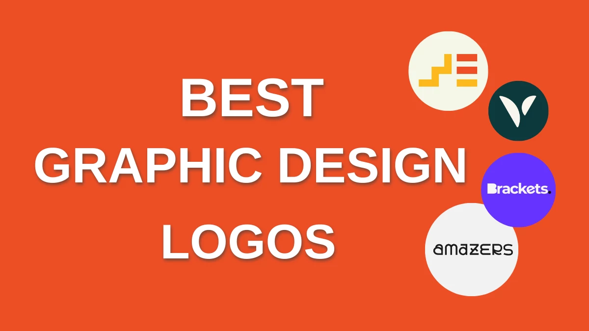
1. Amazers - Coder agency by Cobra
Standout Features:
- Funky typeface
- Stylized A
- Monogram logo version
Design agency Cobra did two versions for the coding company Amazers. One is a monogram design, and the other spells the company name in a funky typeface.
The monogram version features a stylized A that transforms into different objects, adding fun, flexibility, and personality to the graphic logo design. The font style used looked similar to the little chips inside computers with different cuts and lines, aligned with the brand's goal of modernizing how users interact with the web.
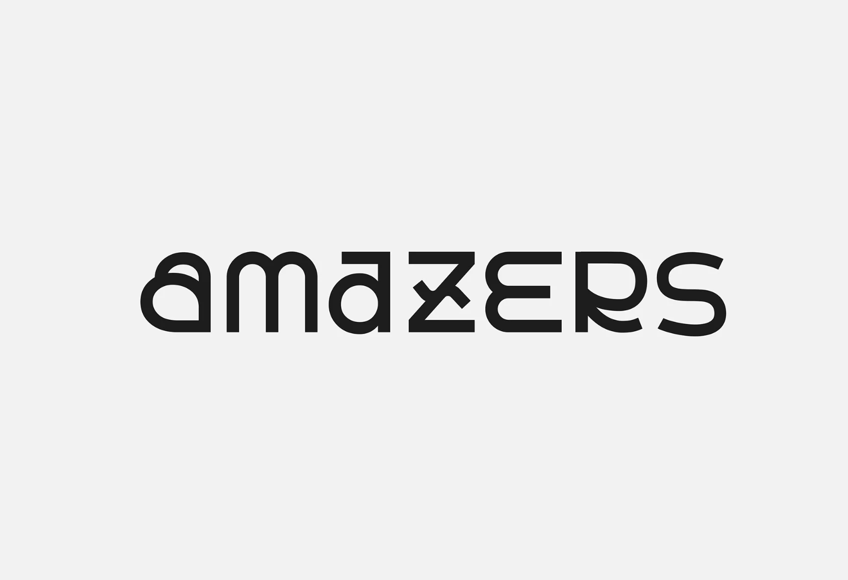
2. Brackets by Quirky Agency
Standout Features:
- Logo variations
- Different colors
- Bold sans-serif font
Design team Quirky Agency developed different logo variations for Brackets, showcasing the brand’s versatility towards many different needs. These variations have an accent dot that features different colors from the text and circle. In addition, "Brackets" is spelled with a bold sans-serif font.
Aside from the traditional logo, Quirky Agency also came up with a monogram version. Both versions have the iconic blue dot beside them that quickly ties up to the brand identity.
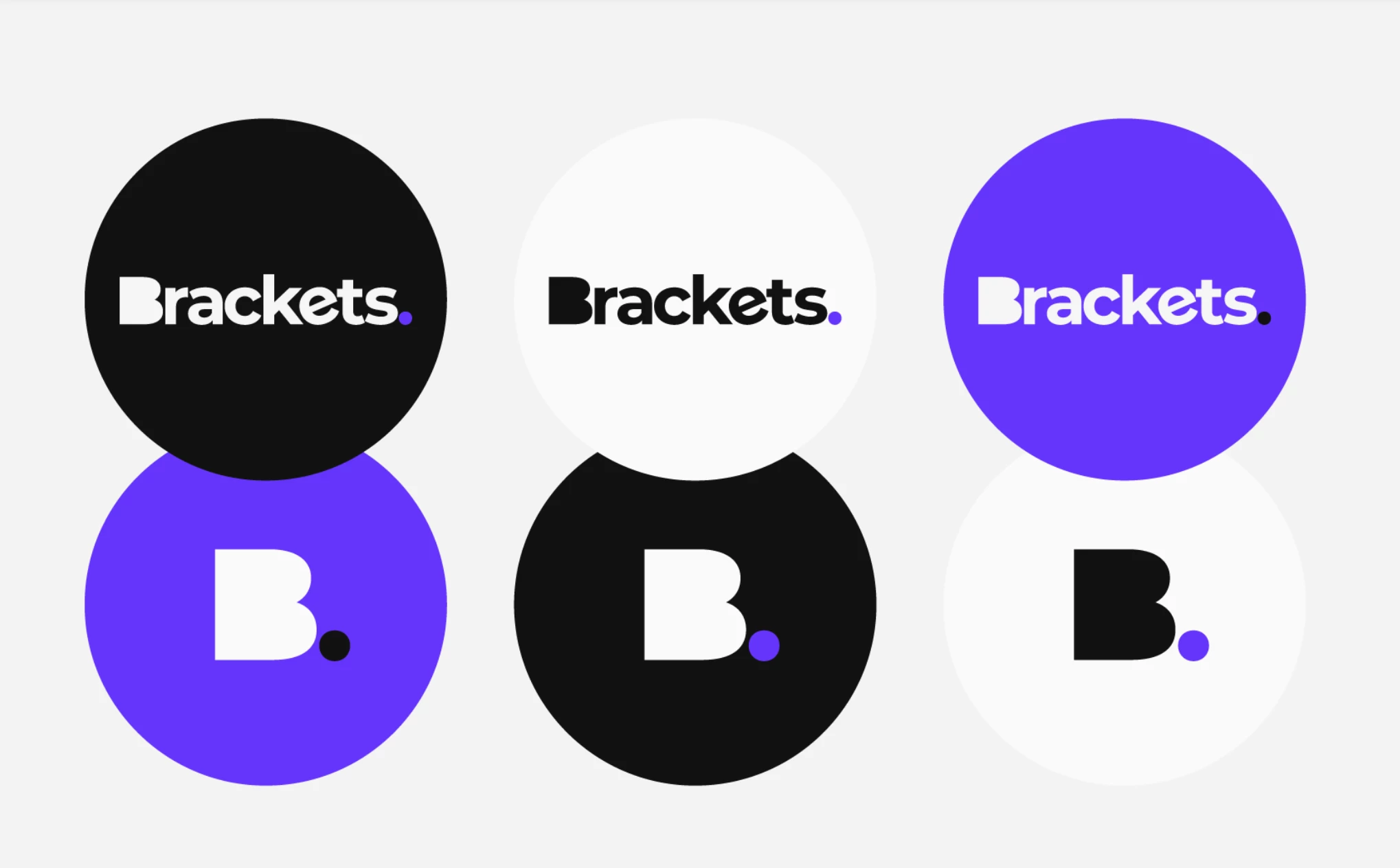
3. Vively by Oke Design
Standout Features:
- Stylized V-shaped logo
- Sleek typography
- Nature-inspired color story
With its stylish take on the monogram logo for Vively, design agency Oke Design earns a spot in our best graphic logo designs list.
The company focuses on holistic health as a tech company, with the stylized V symbolizing strength, empathy, and well-being. One can also interpret the logo as a bicep or a person with raised arms. This hits two birds with one stone as it serves as a unique monogram but also toes the border toward an abstract logo design.
The greens and nudes in the color story, along with the bold typography, boost the company's standing as a trusted tech company with an eye and a heart for holistic well-being.
Check out some of the best business logo designs.
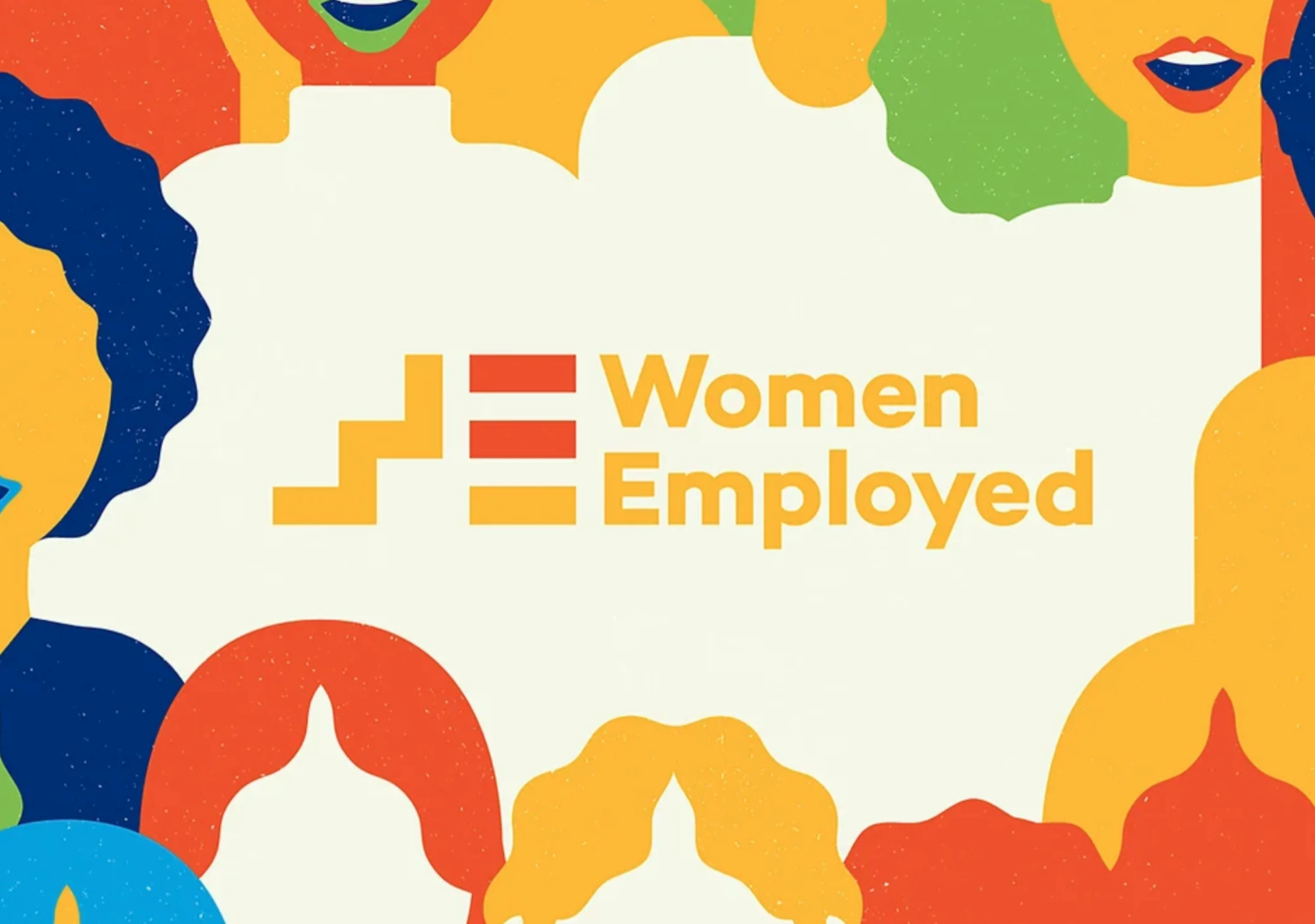
4. Women Employed by Lucia Vaughan Design
Standout Features:
- Warm color story
- Symbols for letters
- Meaningful monogram
For this company focusing on empowering American women, this graphic logo design takes the monogram logo style to greater heights.
Designed by Lucia Vaughan Design for Women Employed, the logo design features a ladder and three horizontal blocks stacked on top of each other, with the brand's full name beside it. From another perspective, the ladder and the blocks are letters W and E, respectively.
The W, or the ladder, signifies growth. The horizontal blocks forming the letter E has different colors for the upper and middle block, looking like an equal sign. This represents the brand’s goal for equal protection and legislation for American women. The warm color story adds a welcoming image to the brand. Check out best graphic design trends.
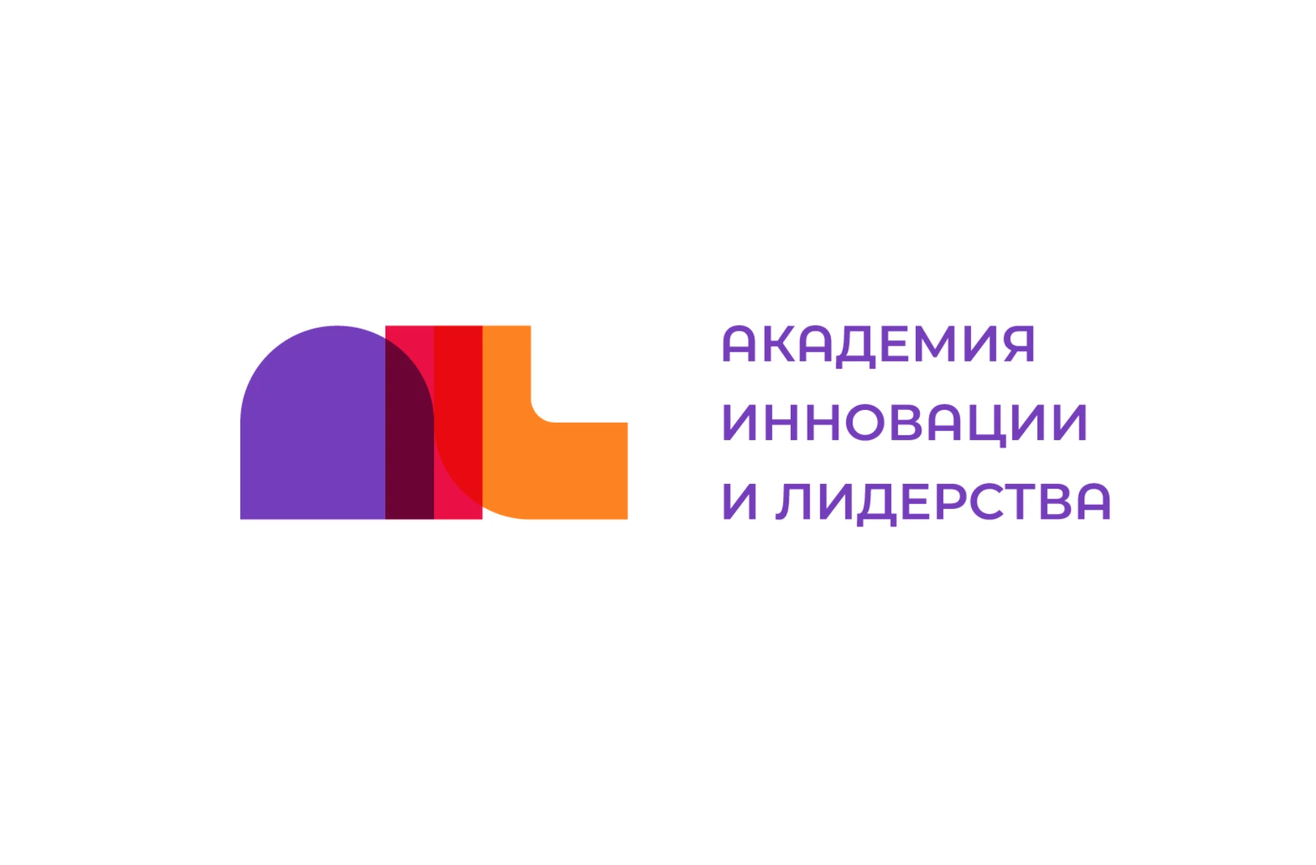
5. AIL by SHIFT Studio
Standout Features:
- Modern art movements-inspired
- Vibrant colors
- Rounded edges
AIL by SHIFT Studio is an excellent example of a graphic logo design with clever use of colors.
The logo design features the letters of AIL using a rounded font style that closely resembles the modernist art movement element of big shapes. The letters are superimposed on each other, so the colors for each letter combine and create a new adjacent color. They add life and vibrancy to the design, while the rounded edges add a touch of softness to it.
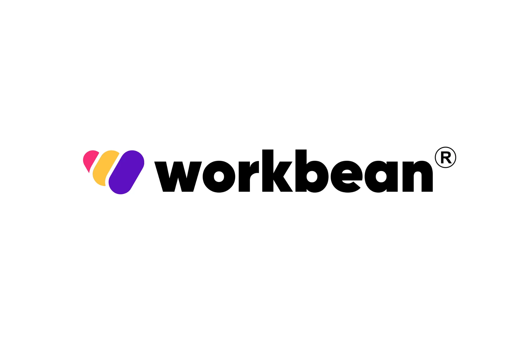
6. Workbean by Studio EJ
Standout Features:
- Striking colors
- Iconized W
- Bold sans-serif font
One of the most noticeable features in this graphic logo design for Workbean created by Studio EJ is its creative take on monogram logos, iconizing the W and giving it life.
The rainbow colors on the W in Workbean align with the inclusivity promised by the brand to its clients. Staying true to its slogan, "Work where you belong," the Workbean graphic logo design aims to showcase feelings of hospitality and acceptance to everyone.
Adding the bold sans-serif font style to the equation, we have a successful logo design.
Check out more of the most successful logos here.
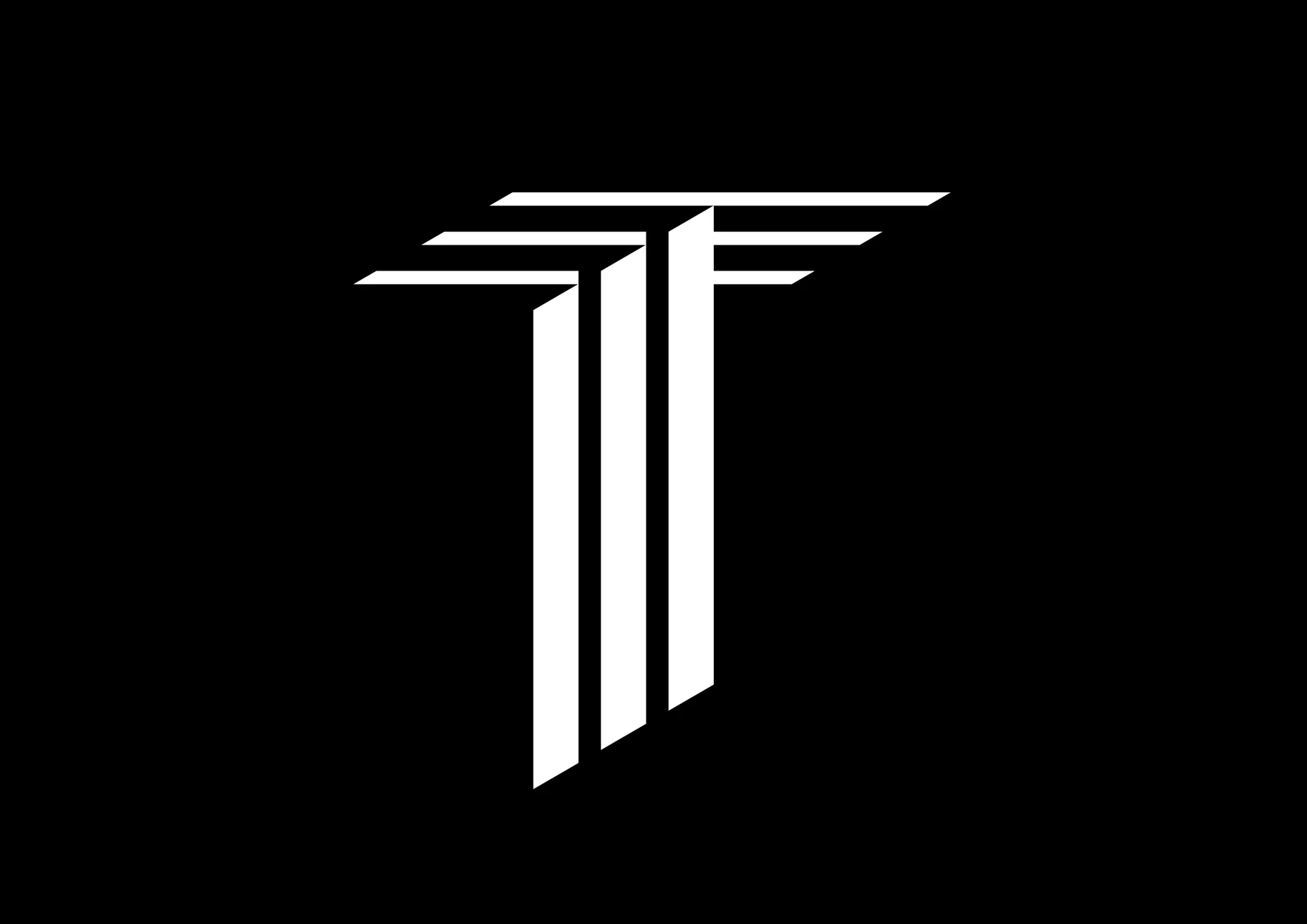
7. T Lettermark by Shot Identity
Standout Features:
- 3D logo design
- Monochrome colors
- Tall, straight lines
T Lettermark's stunning 3D logo design, created by Shot Identity, looks professional and sleek with a combination of different visual elements.
The logo design features the letter T using straight lines with a monochrome color palette. The tall and straight lines create an image of elegance and professionalism for the brand.
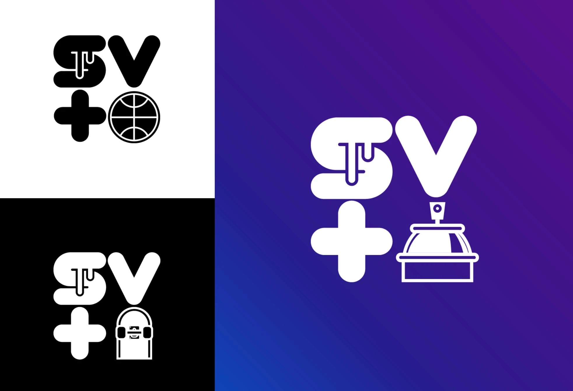
8. Sea Vibes by Cosmonavt Studio
Standout Features:
- Iconized letters
- Negative space
- Lively color story
Sea Vibes' logo design by Cosmonavt Studio combines personality and function with different visual elements creating harmony throughout the design.
The letters for the Sea Vibes are arranged in a square, with each letter transformed into an icon, such as a jukebox or a basketball. In addition, the S has a dripping effect to it.
The negative space in the logo is a nice touch that ties these busy figures, and the vibrant color backgrounds add a dash of fun to this creation.
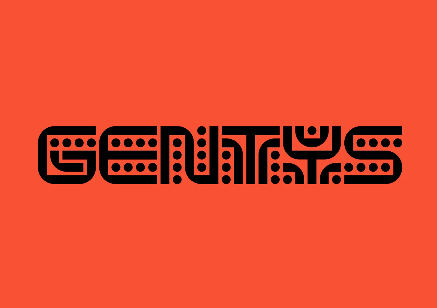
9. Gentys by DADADA studio
Standout Features:
- Mayan culture-inspired
- Dotted letter style
- Texture in letters
What sets this next-best graphic logo design from the others in this list is its apparent inclination to the Mayan culture, where the client's ideals are based.
The design agency DADADA studio used a custom typeface that reflected the values of Gentys, a community of like-minded men. The letters have dotted designs, a nod to the Mayan coding culture. The combination of rounded and sharp edges to the letters adds a layer of character to the logo design.
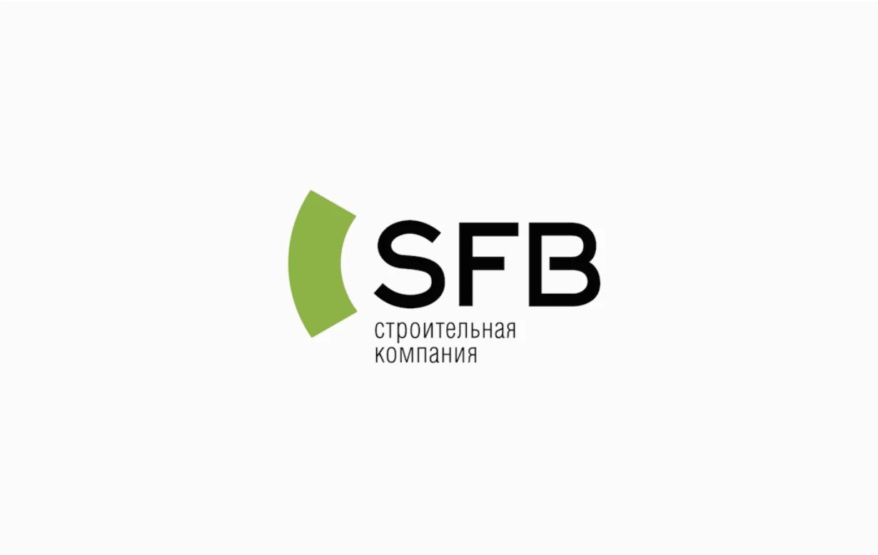
10. SFB by Alexey Lysogorov
Standout Features:
- Abstract logo
- Central arch
- Multiple meanings
This next-best graphic logo design packs different meanings despite having fewer visuals present.
Using abstract logos is ideal as it creates a sense of intrigue, piquing one’s curiosity about the brand. SFB's logo by designer Alexey Lysogorov features an arch, which means many things to the brand. It might look simple, but it embodied many metaphors, such as dynamism, movement, fresh starts, and more.
Explore some of the best abstract logo designs.
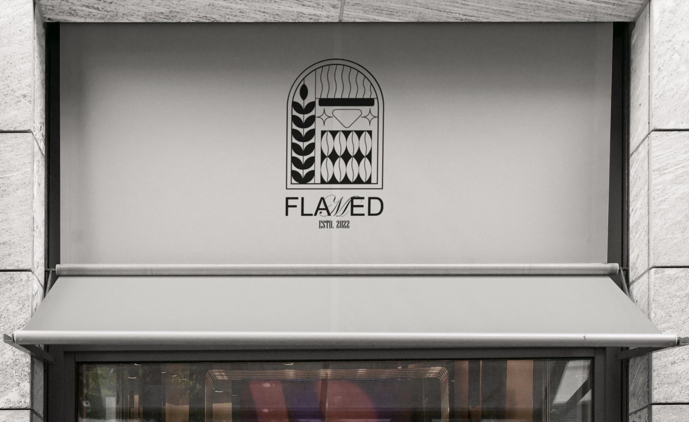
11. Flamed Coffee by Mokh Design
Standout Features:
- Modern and vintage fusion
- Elaborate monogram
- Monochrome colors
The highlight of Flamed Coffee's gorgeous logo design by Mokh Design is the harmonious fusion of modern and vintage art movements.
Its logo features a simple and modern rendition of leaves and coffee beans, aligning with its vision of uniting people's creativity through a good cup of coffee and inspired conversations. The black and white color scheme adds elegance to the well-crafted monogram logo, making it look more luxurious.
12. NEO PLAZA by Vadim Paschenko
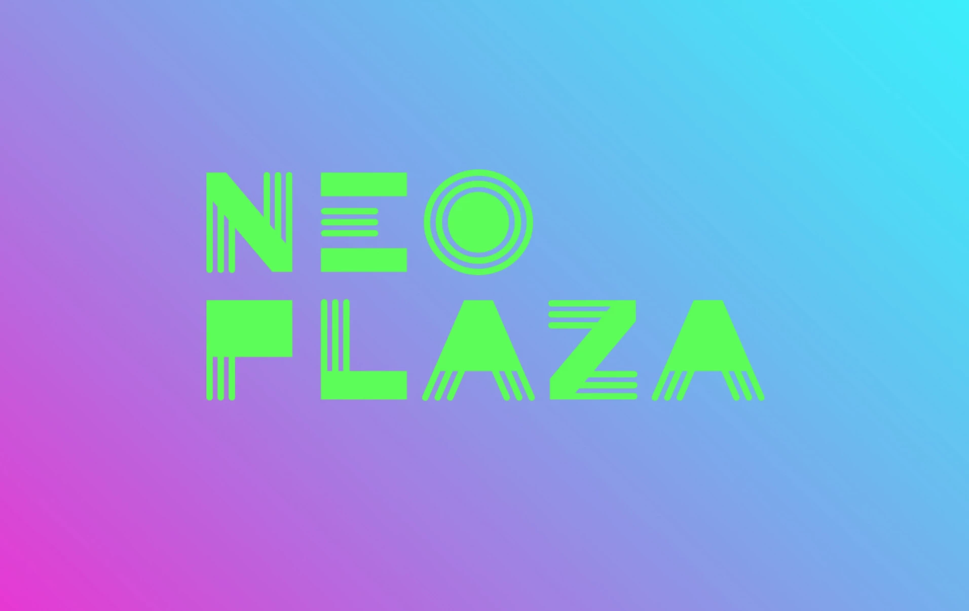
Standout Features:
- Modernist art inspired
- Vintage typeface
- Rainbow color background
NEO PLAZA's logo by Vadim Paschenko takes us back to the glorious days of the 70s and 80s in Europe with the vintage typeface inspired by modernist art movements popular at the time.
The font style used is reminiscent of the music posters we saw in the 70s and 80s, adding a layer of nostalgia to the design. The rainbow background adds a pop of life to this logo design, making it look hip and updated.
13. iCred by BRAVUS Agência
Standout Features:
- Symbolic arrow icon
- Vibrant and dark color contrast
- Simple and stylized fonts
iCred's logo by BRAVUS Agência captures the brand's intelligent solutions through a minimalist symbol, fresh color palette, and clean typography.
The sleek and modern icon conveys the brand's commitment to simplicity, innovation, and customer-centricity.
Its rectangular grid base represents mobile devices, while the opposing arrows highlight iCred's expansion strategy. The design also depicts a hugging figure, emphasizing the brand's focus on proximity.
The color palette features vibrant green for growth and innovation, balanced with sober black for a professional look. Lastly, the contemporary yet authoritative typeface reflects iCred's other core pillars: Experience, Practicality, and Security.
Our design experts recognize the most innovative and creative designs from across the globe. Visit Design Awards to see the:
- Best Logo Designs
- Best Website Designs
- Best Video Designs
- Best Print Designs
- Best Packaging Designs
- Best App Designs
Our team also ranks agencies worldwide to help you find a qualified agency partner. Visit our Agency Directory for the top Logo Design Companies, as well as:
- Top Web Design Agencies
- Top Video Production Companies
- Top Print Design Companies
- Top Packaging Design Companies
- Top Mobile App Development Companies


-preview-webp.webp)