
The HYROX Logo Is Engineered To Look Identical In Every City
A wordmark spaced like the codes stamped on gym equipment, drawn so a thousand local partners can reproduce it without getting it wrong. Here is how it works, and where the promise behind it is starting to strain.
Your HYROX time in Hamburg is supposed to mean exactly what it would in Chicago. Same eight stations in the same order, every distance measured to the meter, in every arena on earth. That is the promise the sport rests on, because a race only counts as a sport when the conditions never move. Sell sameness at that scale and the logo has one job: to look like a system, which is exactly what the HYROX mark does.
The Short Version
- HYROX is a fitness race with a fixed format: eight one-kilometer runs paired with eight functional stations, in the same order at every event worldwide.
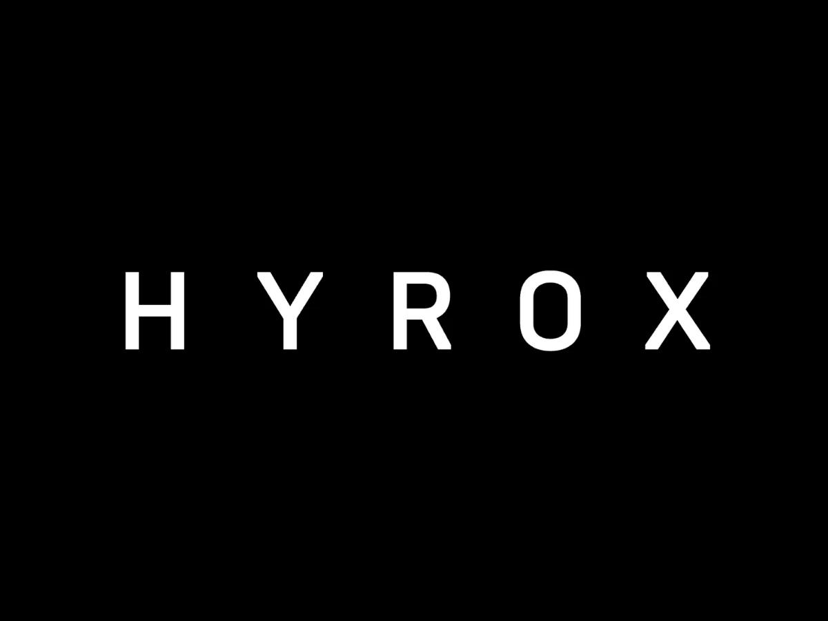
- The logo is a wordmark, the five letters H, Y, R, O and X set in white, heavy, even-weight capitals spaced far apart.
- The identity reads as a system rather than an event, through a uniform stroke, a rounded-rectangle O, and letter spacing wide enough to hold up on a phone, a race bib at distance, or a dark arena wall.
- HYROX publishes no formal brand guide, no official color or type spec, and no logo designer credit in its press materials.
- The mark's job grew harder as HYROX reached roughly 1.4 million participants across more than 100 events in more than 30 countries, and a September 2026 rule change is why the brand is in the news this week.
What Is HYROX?
HYROX is an indoor fitness race with a format that never changes. You run one kilometer, complete one workout station, and repeat that pairing eight times, moving through the SkiErg, sled push, sled pull, burpee broad jumps, rowing, farmers carry, sandbag lunges, and wall balls in that fixed order. There is no qualifying standard and no time cutoff, and about 98% of entrants finish, per HYROX's own numbers. Waves start every 10 minutes across divisions that include Open, Pro, Doubles, and Relay.
What Does The HYROX Logo Look Like?
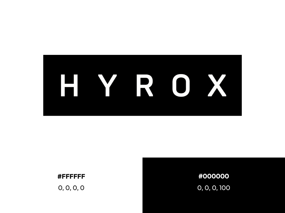
The primary mark is a wordmark, the brand name set as five white capitals on black, and it does nearly all of the identity's work. What you notice first is the space: the gap between each pair of letters runs about as wide as a letter, and a little wider in places.
On color, HYROX runs on two values and no more. The letters are pure white, #FFFFFF, on a #000000 black field, which reads as 0/0/0/0 and 0/0/0/100 in CMYK. HYROX publishes no formal palette, so those are the standard black-and-white values rather than a brand-guide spec, and any other hex codes you find on logo aggregators come from third parties.
What The HYROX Mark Is Built To Say
Start with the stroke weight. Every line in every letter is the same thickness, close to a sixth of the cap height, whether it is the upright of the H, the stem of the Y, or the wall of the O. There is no thick-to-thin contrast and no tapering, the sign of a monolinear drawing set to a fixed measure rather than a drawn-by-hand one.
The O gives the game away. Its sides are straight verticals and its top and bottom fully curved, so the shape is a rounded rectangle rather than a circle or an ellipse, and it runs a touch taller than its neighbors so the curve reads level with the flat-topped letters. A letter drawn to that kind of specification looks engineered, which is the intent.
The Space Between The Letters
The spacing does the heavy lifting. At a gap about as wide as a letter, two things happen at once. Each letter reads as a separate stamped unit, the way codes sit on industrial equipment, and the whole word stretches into a long horizontal bar that scans as a label.
None of this is decoration. A wordmark this plain, monolinear and widely spaced, is close to the easiest thing there is to reproduce exactly, at any size, by the hundreds of local organizers, printers, and screen vendors who put HYROX in front of athletes each week. The identity does the job the rulebook does, which is holding one appearance steady across a system that spans continents.
HYROX's App Icon Is Its Own Mark
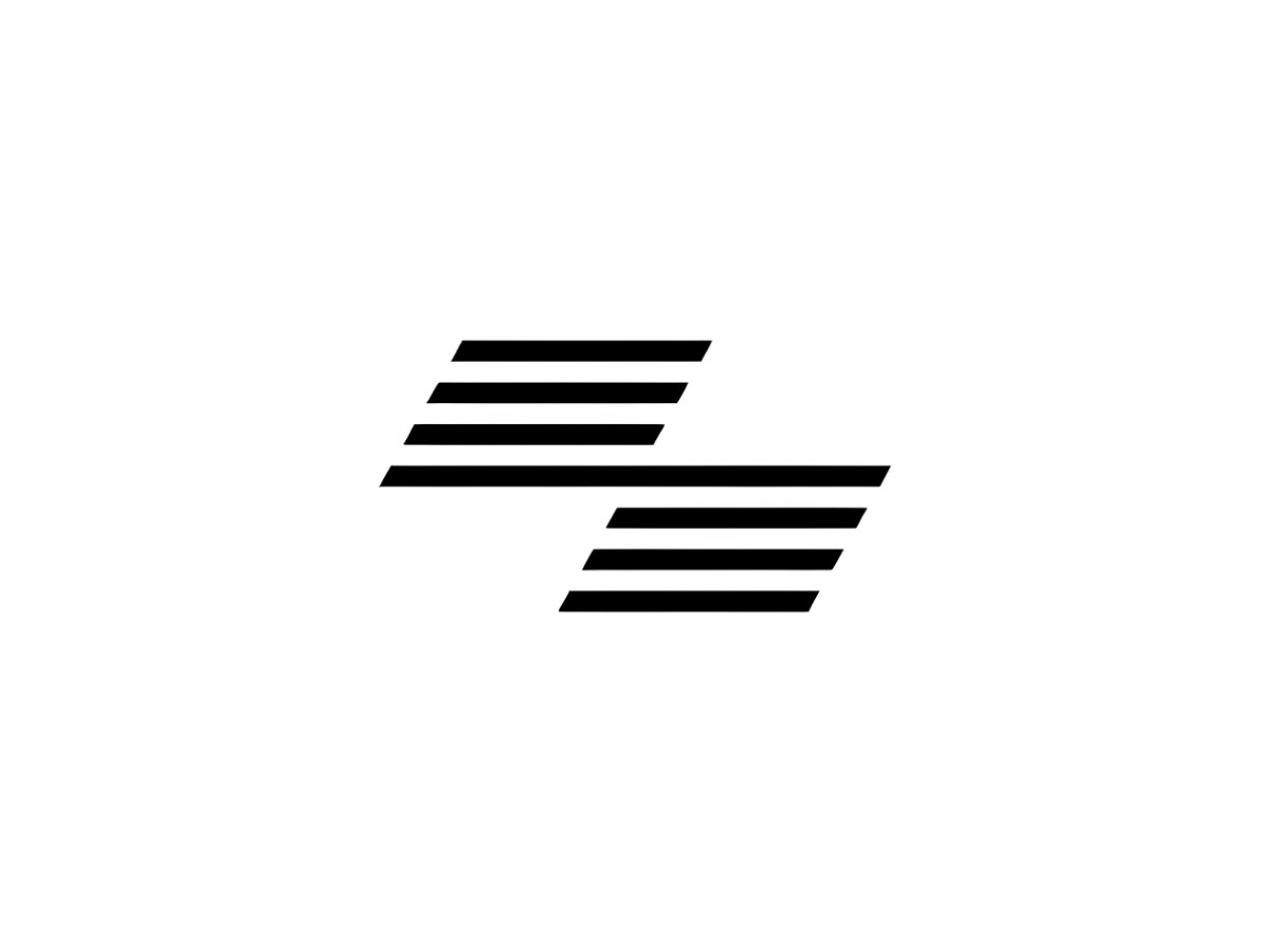
HYROX does keep one secondary mark, and most people only meet it on a phone. Its app icon and website favicon use a small standalone emblem, two offset clusters of slanted parallel bars in black, with no letters at all. The device reads as motion or a finish flag rather than a lettermark, and HYROX holds it back for square spaces too tight for the full word.
Where The Logo Has To Survive
The mark earns that plainness in the three places it actually lives. On a race bib seen across a hall, the heavy strokes and open spacing keep the letters from closing into a smear, so the word stays readable at a glance. On a phone, that same width holds the letters apart at small sizes, where a tighter or lighter logo would clot.
The third home is the dark one. On a black screen or an arena wall, white-on-black is the mark's native setting, drawn for it from the start rather than flipped into it later.
What Font Is The HYROX Logo?
Short answer: HYROX does not say. The company publishes no brand guide naming the typeface, and no designer credit for the mark appears in its press materials.
The font-spotting sites that offer a name are reading it off the shapes, and their guesses disagree, so treat any single answer you see as unconfirmed.
From the letterforms themselves, you can say the drawing is geometric and even-weight, either custom or a heavily reworked and widely spaced geometric sans. The specific face is not on the record.
The Rise
HYROX launched in Hamburg, Germany, in 2017, the work of race organizer Christian Toetzke, Olympic field hockey champion Moritz Fürste, and marketing veteran Michael Trautmann. The first race drew about 650 people.
By the 2025/26 season the sport reported roughly 1.4 million participants across more than 100 events in more than 30 countries, and a Birmingham event once sold 16,000 tickets in four minutes.
A December 2019 stake sale to Infront Sports & Media funded the push abroad, and in September 2026 the LVMH-linked firm L Catterton took a majority stake at a valuation reported near 600 million euros.
For a wordmark, that growth curve is the real test. A logo that has to look identical on a bib in Hamburg, a livestream overlay in Chicago, and a franchise gym's wall in Singapore cannot lean on gradients, fine detail, or a second color to survive the trip.
The plainness that can read as generic in a slide deck is exactly what holds up when a thousand different hands redraw it. HYROX's mark scaled because there was almost nothing in it to get wrong.
Where The System Strains
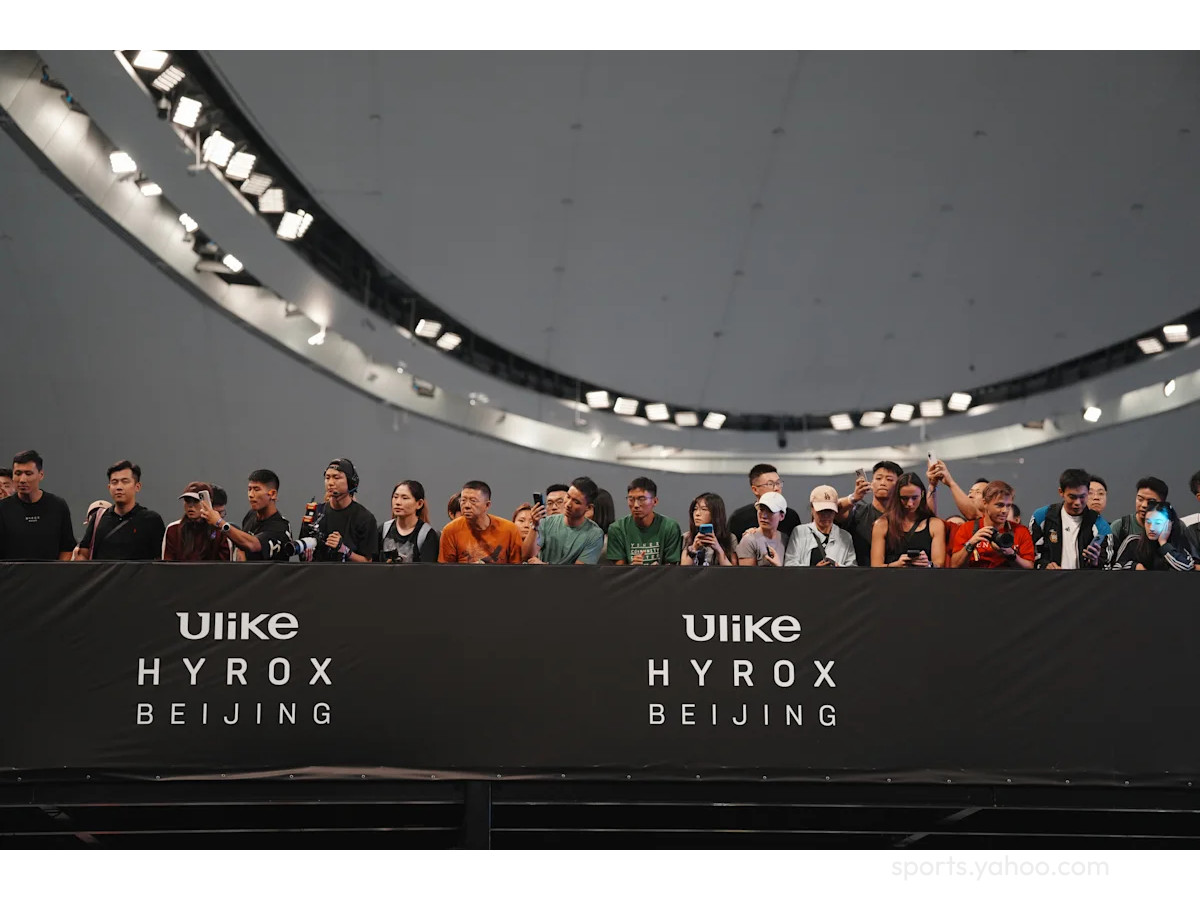
A system is only as sound as the body enforcing it, and this is where the growth shows its seams. HYROX runs more than 100 events a year through regional operators and licensed partners, and a rulebook written for a smaller operation has had to stretch to cover situations no one drafted for. The patches tend to arrive after the fact rather than ahead of it.
On September 12, 2026, at HYROX Beijing, Australian world-record holder Joanna Wietrzyk won the women's pro race after suffering fecal incontinence mid-course and carrying on across shared stations, and the footage forced a rulebook change within days.
HYROX added a clause letting race directors withdraw an athlete, recorded as a Did Not Finish, when blood, vomit, urine, or fecal matter poses a welfare or contamination risk. Co-founder Fürste apologized and said the organization should have stepped in during the race.
The Gap The Rulebook Missed
For a design story, the useful detail is the gap the incident exposed. The rulebook already carried a specific penalty for spitting on the floor, yet no procedure for a biohazard, which is what a system looks like when its written rules trail its real-world size.
The criticism that followed kept circling one question, whether a sport can count a win without asking how it was won. A brand that sells identical conditions now runs at a size where identical is hard to guarantee.
The Verdict
As a piece of design, the HYROX wordmark does its one job well. It looks like a standard, holds that look across every surface and country the brand touches, and asks nothing of the viewer except to read five letters.
That discipline is a real achievement at this scale, and most fitness logos reaching for motion and muscle would trade a lot for it.
The strain sits elsewhere: in the distance that has opened between what the mark promises and what the organization can still deliver. A wordmark can hold one appearance steady across a hundred cities.
It cannot, on its own, hold a hundred cities to one standard of judgment. HYROX built an identity that says system. The work now is making the system behind it as reliable as the letters that stand for it.
Our team ranks agencies worldwide to help you find a qualified partner. Visit our Agency Directory for the Top Logo Design Companies as well as: