
Brand symbols are visual representations that capture a brand’s identity. These symbols can take many forms — from a specific shape, pattern, or emblem to anthropomorphic characters or mascots — and are designed to grab the customers’ attention and become synonymous with the brand.
With the help of our experts, we’ll explore what brand symbols are, how they differ from logos, and five best practices for effectively incorporating them into your branding strategy.
Brand Symbol vs. Logo
While both a brand symbol and a logo serve to identify a business, they are not the same thing. The key difference lies in their complexity and the scope of their representation:
- Logo: A logo is an all-encompassing design that often includes text (like the brand’s name or initials), a brand symbol and additional elements, distinct typography, and colors. It represents the overarching brand identity.
- Brand symbol: A brand symbol is a simplified visual element that can be part of a logo or be featured independently. For example, in 2012, Microsoft updated its wordmark logo to feature the iconic Windows emblem. This emblem functions as both an independent brand symbol and an integral part of the overall logo design. Similarly, the Michelin Man and KFC’s Colonel Sanders are standalone brand symbols that are instantly recognizable.
So, while all brand symbols can be part of a logo, not all logos feature a distinct, separate brand symbol.
5 Best Practices for Using Symbols in Logos
Our branding experts share five best practices to guide you in using a brand name symbol effectively:
- Ensure your symbol reflects your brand identity
- Keep it simple and memorable
- Choose a timeless design
- Make it universally recognizable
- Differentiate your symbol from competitors
1. Ensure Your Symbol Reflects Your Brand Identity
Each symbol carries a certain message — reflecting the brand’s purpose and vision. Build a compelling narrative around your symbol and make sure that all imagery aligns with what your brand is about.
Simply put, the symbol should represent your brand’s personality and resonate with your target audience. For example, the Nike swoosh symbolizes motion and speed — core aspects of the brand’s products and its athletic target market.
2. Keep It Simple and Memorable
Opt for a symbol that’s easy to recognize and remember. Moreover, a simple design is usually more versatile and adapts well to various formats or size requirements. This approach results in a clear, uncluttered look that effectively communicates your brand’s message. Minimalist business branding often captures attention more readily and is easier to recall than complex designs. This is because simplicity enhances memorability and brand recognition.
3. Choose a Timeless Design
A successful brand symbol can survive the test of time, maintaining relevance even as design trends shift. For instance, the arrow in Amazon's logo signifies the company's promise of delivering everything from A to Z and has been a recognizable symbol around the world for decades.
4. Make It Universally Recognizable
If you plan to expand globally, ensure your brand symbol is recognized positively across different cultures and countries. For example, while the bald eagle is a symbol commonly associated with the United States, it holds a sacred significance for Native Americans, representing nature and spiritual communication.
Cultural contexts can dramatically shape how symbols are perceived. Make sure you thoroughly understand your audience and incorporate culturally sensitive elements into your brand symbol.
5. Differentiate Your Symbol From Competitors
When introducing your brand to the market, the significance of a unique symbol cannot be overstated. It's your visual handshake, an instant reflection of your brand's personality and values. A unique symbol creates a clear and lasting image in the consumer's mind, facilitating easy identification and brand recall.
6 Famous Brand Symbols You Instantly Recognize
Good branding symbols can help a business scale and bring in new customers. Here are six examples of company symbols that are instantly recognizable:
- Apple: The bitten apple
- Nike: The swoosh
- Shell: The seashell
- McDonald’s: The golden arches
- Target: The bullseye
- Starbucks: The siren
1. Apple: The Bitten Apple

One of the largest and most valuable companies in the world, Apple has built its reputation through the power of simplicity, and the company’s brand symbol is a good example of that.
Whether it’s on the back of your Mac, iPad, or iPhone, or displayed on your screen, the iconic half-bitten apple is unmistakable and hard to miss. Not only does it prove that simplicity is impactful and memorable, but it also highlights how a brand symbol can be synonymous with the brand itself.
2. Nike: The Swoosh

Everybody knows the iconic swoosh symbol associated with Nike. Inspired by the Greek goddess of victory, the idea behind this brand symbol is to embody agility and speed — qualities that Nike wants its customers to connect to with the brand.
The swoosh’s simplicity and compactness allow it to be seamlessly applied to any apparel, product, or advertisement. Plus, there’s no need to mention the brand when people immediately recognize it just by seeing the symbol.
3. Shell: The Seashell

You might not be familiar with the company, but you’ve likely seen its symbol at least once. Shell, just like Apple, took its name and made it into a visual icon that everyone directly associates with the brand.
Interestingly, for the first 40 years of its existence, Shell’s symbol was so distinctive that there was no need to add the name of the company to the logo. It wasn’t until 1948 that Shell decided to incorporate the name into the logo. However, in 1999, Shell reverted to the iconic yellow and red shell symbol we know today — practical, simple, and easily recognizable.
4. McDonald’s: The Golden Arches

McDonald's iconic Golden Arches originated from the architectural design of its early restaurants. In 1952, brothers Richard and Maurice McDonald sought to create a standout design for their San Bernardino, California, location.
They envisioned two large, golden semicircular arches on either side of the building, aiming to make their restaurant more visible and memorable. This distinctive design element eventually evolved into the stylized 'M' logo, symbolizing the brand's identity and global presence.
5. Target: The Bullseye
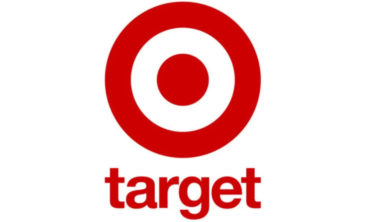
Target's bullseye logo is a masterclass in simplicity and brand alignment. Introduced in 1962, the original emblem featured three concentric red circles with the company name overlaid in bold, black italics. This design mirrored an actual target, directly reflecting the company's name and focus. Over time, the logo was refined for clarity, eventually evolving into the singular red circle with a central dot we recognize today, symbolizing precision and focus.
6. Starbucks: The Siren
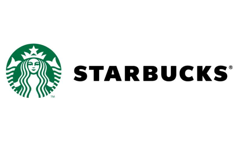
Starbucks' emblem features a twin-tailed siren, rooted in maritime mythology. This symbol reflects the brand's Seattle origins and its commitment to sourcing the finest coffee globally. The siren has undergone several redesigns, evolving from a detailed illustration to a more modern and streamlined image, yet it continues to embody the brand's rich heritage and connection to the sea.
These examples illustrate how thoughtful design and symbolism can create enduring brand identities.
Brand Marks: Key Takeaways
Brand symbols add depth to your brand, making it more memorable and relatable. When used strategically and thoughtfully, symbols in logos can improve brand recognition. It's not just about artistic design; it’s also about effective marketing communication.
Follow the best practices we discussed above or contact a branding agency to help you create an impactful brand symbol and build your brand from the ground up.
![]()
Our team ranks agencies worldwide to help you find a qualified partner to implement the latest AI solutions. Visit our Agency Directory for the Top Branding Agencies, as well as:
- Top Brand Strategy Agencies
- Top Brand Positioning Firms
- Top B2B Branding Agencies
- Top Corporate Branding Agencies
- Top Cincinnati Branding Agencies
Our team also showcases award-winning projects on our Design Awards page, making it a useful place to find inspiration and benchmark what effective design looks like across branding, websites, and digital experiences.
Brand Symbols: FAQs
1. What are the most recognizable brand symbols?
The most recognizable logos worldwide include:
- Starbucks
- Coca-Cola
- Apple
- McDonald’s
- Nike
- Amazon
- Microsoft
- Adidas
2. How do brand symbols impact consumer trust?
Brand symbols create instant recognition, build emotional connections, and reinforce brand credibility. A strong symbol makes a company appear more established and trustworthy in the eyes of consumers.


-preview-webp.webp)