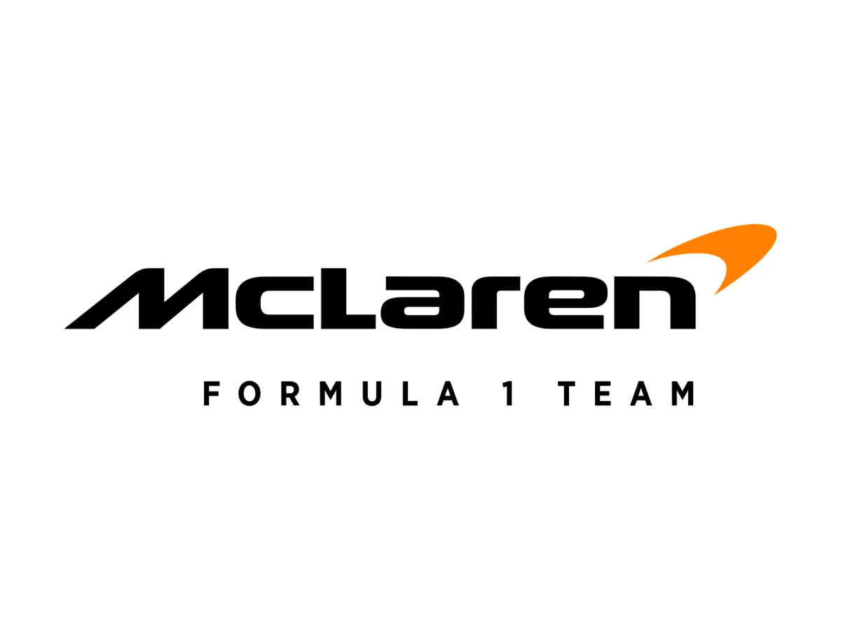

The McLaren Racing logo does two jobs at once. It is excellent at one of them and mediocre at the other.
On a steering wheel hub, a team polo, or a phone case, the Speed Mark is clean, holds together at small sizes, and reads instantly to anyone who follows the sport. On a car traveling 200 mph in a helicopter shot, it contributes almost nothing. The papaya orange does the identifying. The Speed Mark is along for the ride.
That split is not fatal, but it means you are looking at a mark with two personalities: a badge that punches above its weight when it shrinks, and a livery element that punches below its weight when it grows. This is a close reading of both, and a verdict on whether the system built around it holds. For anyone studying logo design in a high-speed brand category, the McLaren mark is one of the more instructive cases on the grid.
What The McLaren Speed Mark Actually Is
Before the meaning debate and before the livery argument, look at the object itself, as if you have never seen it.
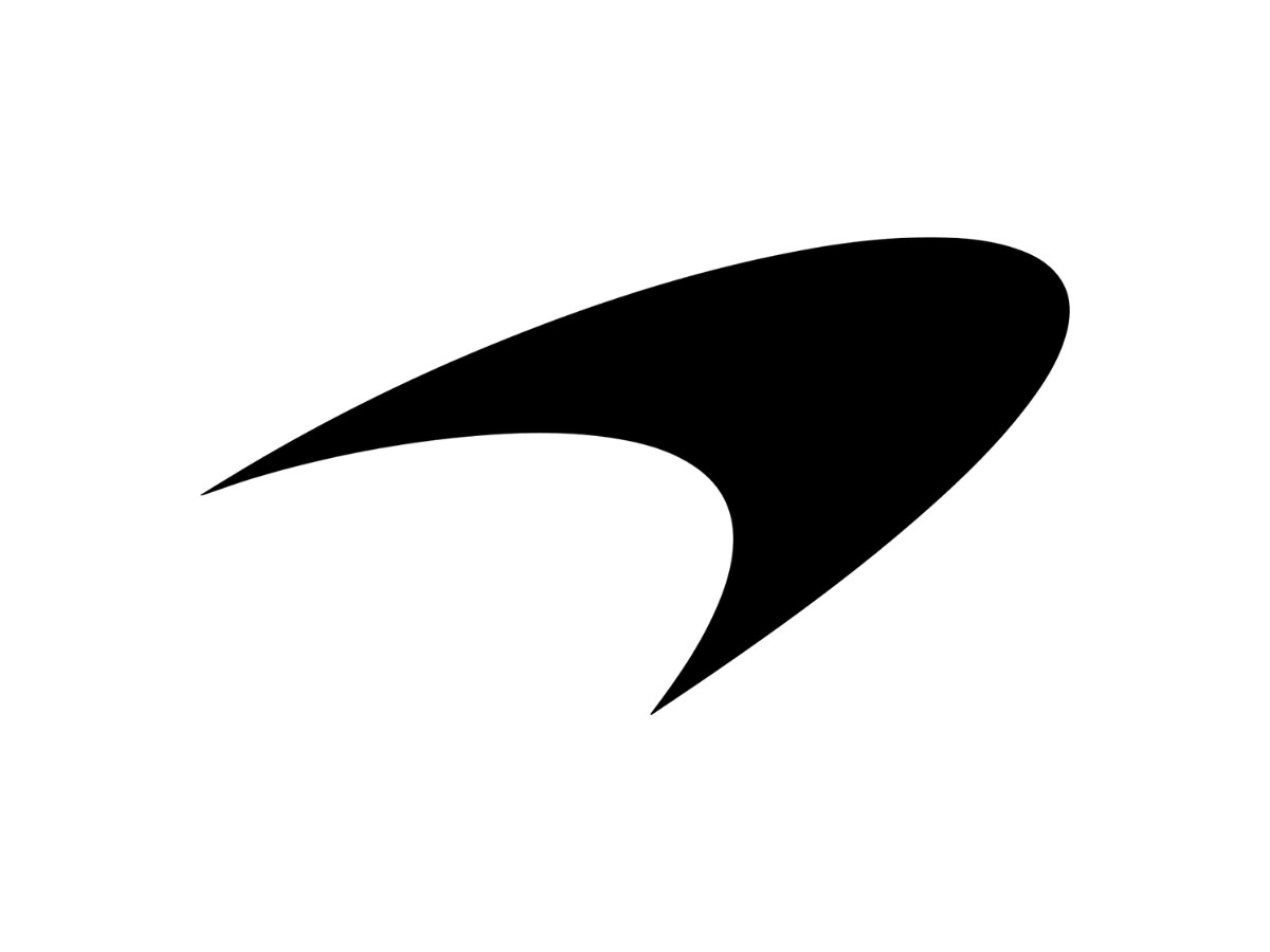
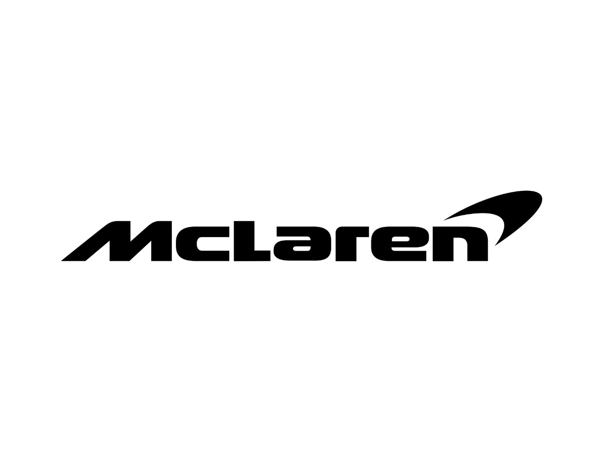
The Speed Mark is a single open curved stroke. It is not a closed shape or a letter, and it depicts nothing literal. In the primary lockup it sits above and to the right of the "n" in "McLaren," anchored to the wordmark rather than floating free. The stroke widens toward the right, which is the leading direction, and tapers toward the left, which is the trailing edge, so the weight distribution reads as forward motion without resorting to drawn-on speed lines.
The stroke is not a uniform-width arc. It reaches its greatest thickness at roughly the two-thirds point along its horizontal span. The leading edge ends in a near-blunt cut, while the trailing edge thins to almost nothing. There are no enclosed negative spaces, no counters, and no interior detail. What you see is the entire mark, a pure silhouette.
The wordmark beside it is a custom geometric sans-serif: condensed, evenly tracked, with a moderate x-height. The letters stand upright with no italic lean. "McLaren" carries no speed cues of its own, so the stroke handles that job by itself.
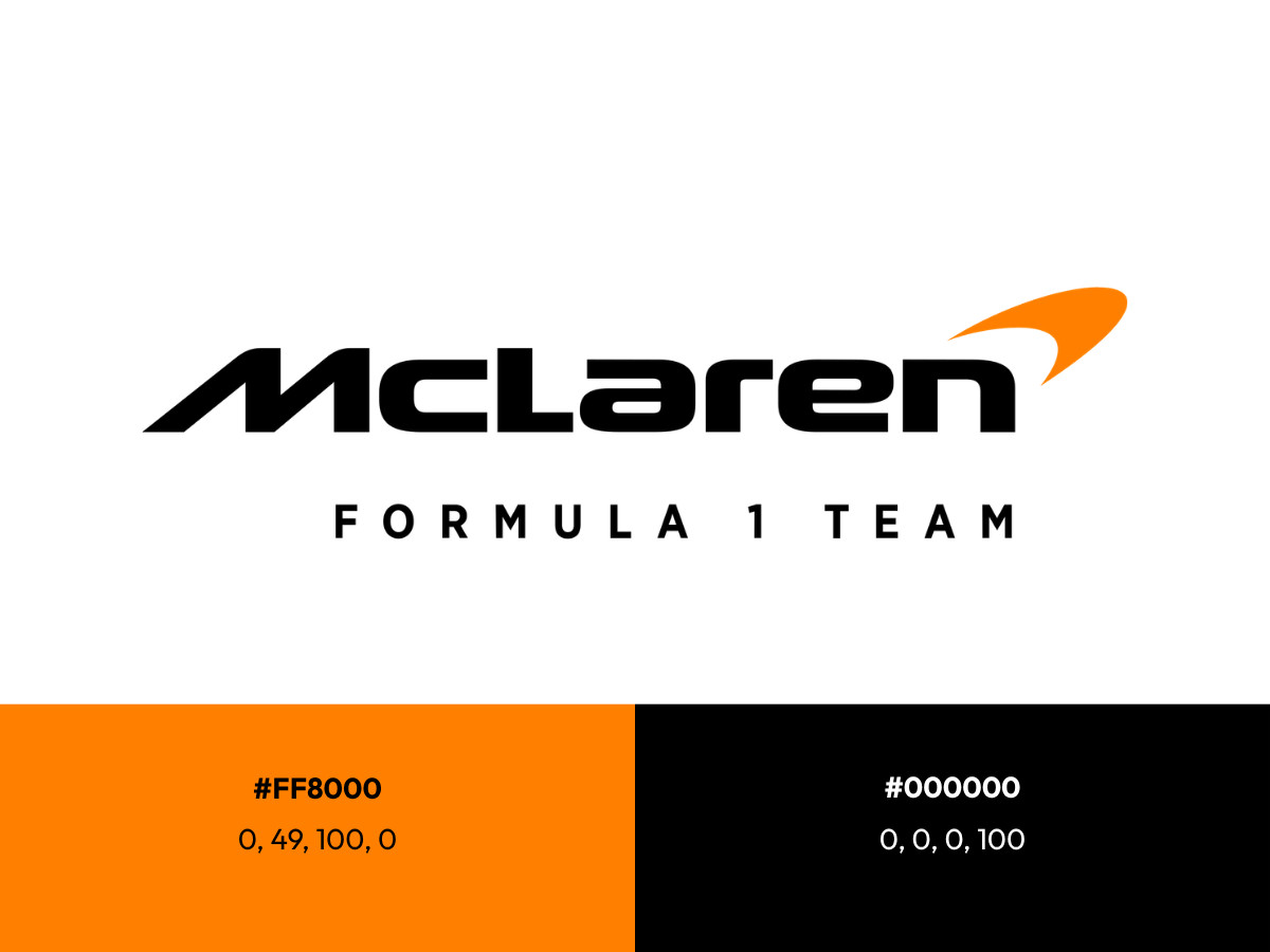
In the racing context the mark runs in papaya orange, roughly #FF8000 in digital use, which is McLaren's heritage color rather than an arbitrary pick. In corporate and monochrome settings it also appears in solid black or reversed white, and the shape survives each of those swaps intact. Sources including Logos World and Car Logos trace the current form back to the streamlined mark introduced in the late 1990s.
The Meaning Problem, And Why It Matters
The Speed Mark has two competing explanations, and the one you accept changes how you read the design.
The official account, which McLaren has pushed for years, is that the stroke echoes the vortices spinning off the rear wing of the car, a nod to airflow and downforce. MotorBiscuit quotes the company describing a mark that resembles those wing vortices and the aggressive markings on predatory animals and insects. The unofficial account, argued by outlets such as CarBuzz, is that the curve is a stylized survival of the old "Speedy Kiwi," the bird silhouette McLaren ran in the 1960s and 1970s to honor founder Bruce McLaren's New Zealand roots.
A single paragraph of history explains why the debate never settles.
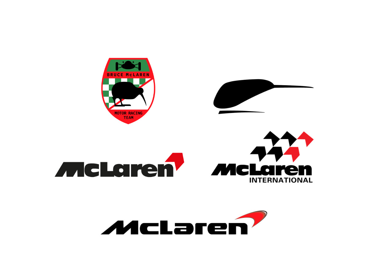
McLaren's first logo in the mid-1960s used a kiwi; the Speedy Kiwi followed in 1967. In 1981 Raymond Loewy replaced it with the McLaren International mark, whose chevrons doubled as a checkered-flag reference and coincided with Marlboro sponsorship.
The chevrons narrowed to one through the early 1990s, and when the Marlboro relationship ended, McLaren redrew the survivor as the current stroke for the late-1990s cars, later refining it in the 2000s and returning the racing team to papaya orange in 2021.
Each era left a fingerprint, which is why the vortex and the kiwi can both be argued from the same curve, with the old Marlboro chevron muddying it further.
The choice matters because a mark that could mean the wing vortex or the old kiwi does not commit to either. That ambiguity buys mystique, and it costs the brand a fixed story it can build on.
What The Speed Mark Does Well
Every strength here attaches to something you can point at on the mark, not to a mood.
Scalability is the headline. Because the stroke is one silhouette with no counters, thin joints, or interior detail, it stays legible from a large sponsor board down to a favicon or an embroidered chest badge, where finer marks would clog or break apart.
The geometry produces a directional read on its own. The right-widening, left-tapering weight tells your eye which way the mark is moving without any of the cheap conventions, so it signals speed while staying still.
The mark also scales independently of the color system. In black on white or white on black, the Speed Mark reads as the same mark, which is not true of every F1 badge. Shape recognition does not depend on the papaya orange; the orange adds heritage resonance, and it is not load-bearing for legibility.
The lockup relationship is clean. The stroke sits in a consistent spatial relationship to the wordmark, tucked above the final letters, so the two elements read as one unit rather than a symbol parked next to some type.
What The Speed Mark Fails To Do
This is where the mark separates from every other McLaren logo write-up, because the weaknesses are specific and real.
The mark is semantically empty without its partners. Strip the papaya orange and strip the "McLaren" wordmark, and you have a single curved stroke that could belong to a bank, an airline, or a fitness app. Nothing inside the shape says "McLaren," "racing," or even "car."
On the race car, it is not load-bearing. At broadcast scale the papaya orange does the identification work, and the Speed Mark rides along on the bodywork as a small graphic. The thing that tells you which car just came out of the corner is the color field, not the stroke.
The wordmark carries too much of the identity weight. "McLaren" is doing more work than it should have to. In a mature system the symbol operates independently enough that the wordmark becomes confirmation, but here the order reverses: the wordmark is primary and the stroke is a decorative accent. That is a system limitation, not a matter of taste.
The ambiguity cuts both ways. The vortex-versus-kiwi debate creates mystique, and it also means the mark cannot anchor a single narrative. Brands that tie a symbol to one clear story get to build a myth around it that reaches far past the pixels; McLaren left that value on the table.
The Speed Mark On The F1 Grid
A quick benchmark against three grid rivals shows where the McLaren mark sits, without turning into a full study of each.
Ferrari runs the prancing horse, a figurative emblem loaded with a specific origin story, so the symbol carries meaning even stripped of color or type. Mercedes uses the three-pointed star, a geometric icon so established that it needs neither color nor wordmark to identify the team. Red Bull leans on bold typography and the charging-bulls device, an aggressive, story-driven mark that anchors the brand on its own. Against those three, the McLaren stroke is the most abstract and the most dependent on its color and wordmark to do the identifying.
The Verdict On The McLaren Speed Mark
Does the Speed Mark work as a logo? Yes, conditionally. As a badge at small to medium sizes it is clean, scalable, and directionally effective, and it earns its place on the steering wheel hub and the team kit. It does not earn its place as the primary identity element on a car moving at 200 mph, where the color, not the mark, tells you what you are watching.
Does the design system hold? Only partly. The system works when the papaya orange and the "McLaren" wordmark are both present. It does not hold on its own, because the stroke cannot carry the identity alone. That is a structural limit of the system, and it sits alongside the same tension you see in many sports and leisure logos that lean on color equity to do their heavy lifting.
What Designers Can Take From The McLaren Speed Mark
Our team ranks agencies worldwide to help you find a qualified partner. Visit our Agency Directory for the Top Logo Design Companies as well as:

-preview.jpg)