Having a great logo design guarantees you many benefits, including brand recognition. We've compiled today's most successful logo designs that help promote brands and increase recall.
See our collection of the best logo designs and how they resonate with the right audience, even in a sea of related products, thanks to the creative logo design agencies that made it happen.
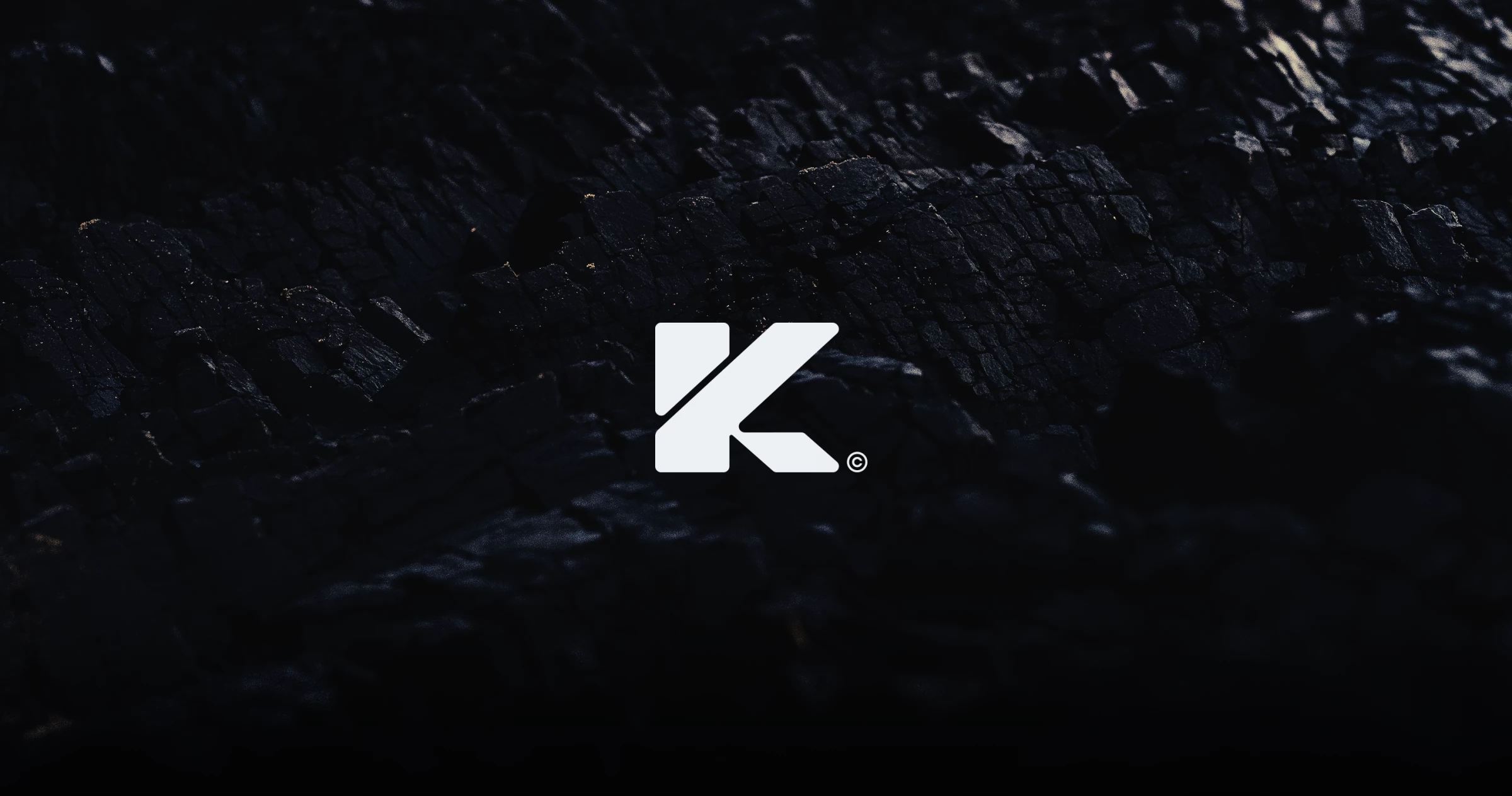
1. KMM by Mahbub Sumit
Standout Features:
- Stylized letter K
- Futuristic
- Simple logo design
Kazi's logo by Mahbub Sumit in metallic white and a jet-black color conveys the brand's modernity, making it one of the most successful logo designs in the tech industry.
The logo features several unconventional shapes forming the letter K to show the brand's futuristic appeal. An innovative monogram logo like this, combined with a sleek black-and-white palette, emphasizes Kazi's bold and professional image.
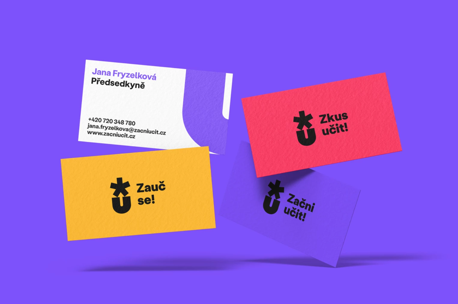
2. Start teaching! by Semibold
Standout Features:
- Animated logo
- Thick bold letters
- Colorful background
Design agency Semibold created a successful logo design that shows dynamism and movement for Start teaching!, a Czechia-based educational company.
The logo design features thick bold letters of a lowercase U and an asterisk on top of the letter. The thick bold letters relay trust and the colorful backgrounds imply the company’s fun personality.
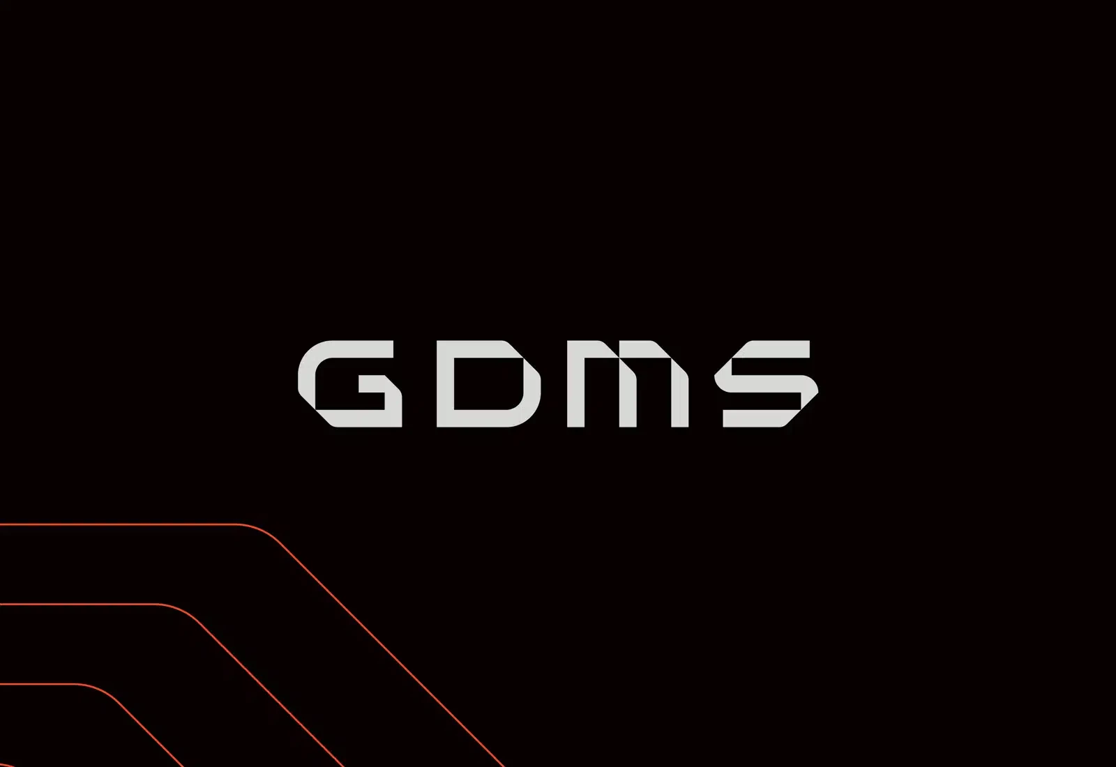
3. GDMS by Four Stripes
Standout Features:
- Calculator-inspired or digital font style
- Monochrome color story
- Minimalist design
GDMS’s logo by Four Stripes is a successful, minimalist design with simple details.
Design agency Four Stripes created a logo for GDMS featuring a calculator-inspired font style. The typography has stylized letters with edges and cuts. They also used a black-and-white color story, allowing flexibility in many designs, from print to website designs.
The minimalist approach complements the brand's uncomplicated, immersive technological solutions. It sparks confidence and trust among customers.
Look at some of the best minimalist logo designs out there.
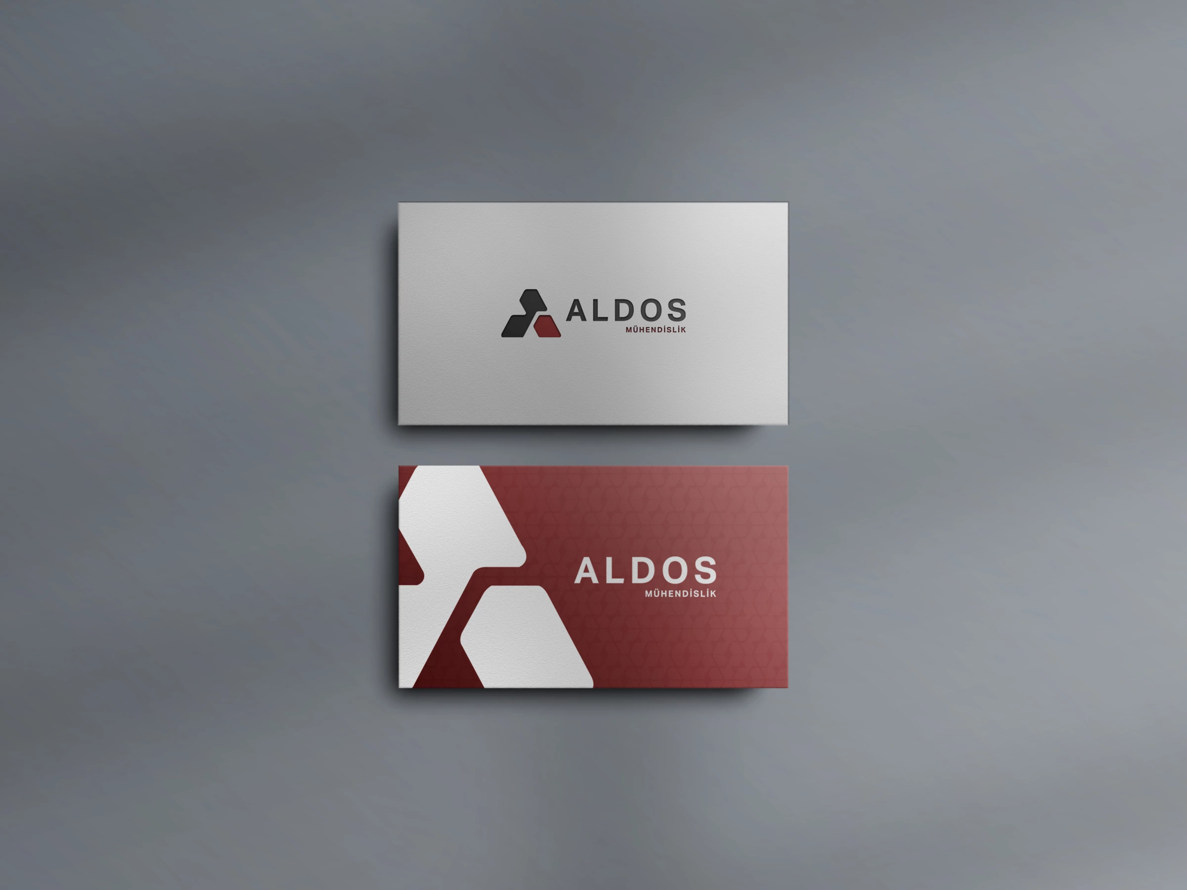
4. Aldos by Vonart Creative
Standout Features:
- Use of triangles
- Bold sans-serif font
- Monogram
Vonart Creative designed a logo using interconnected triangles that form an uppercase letter A, representing Aldos.
The monogram logo features a bold sans-serif typeface for the brand name, conveying security and stability. On the other hand, triangles are seen as a symbol of structure in many industries. Using triangles to form the logo is a clever way of telling their customers that they are stable and reliable.
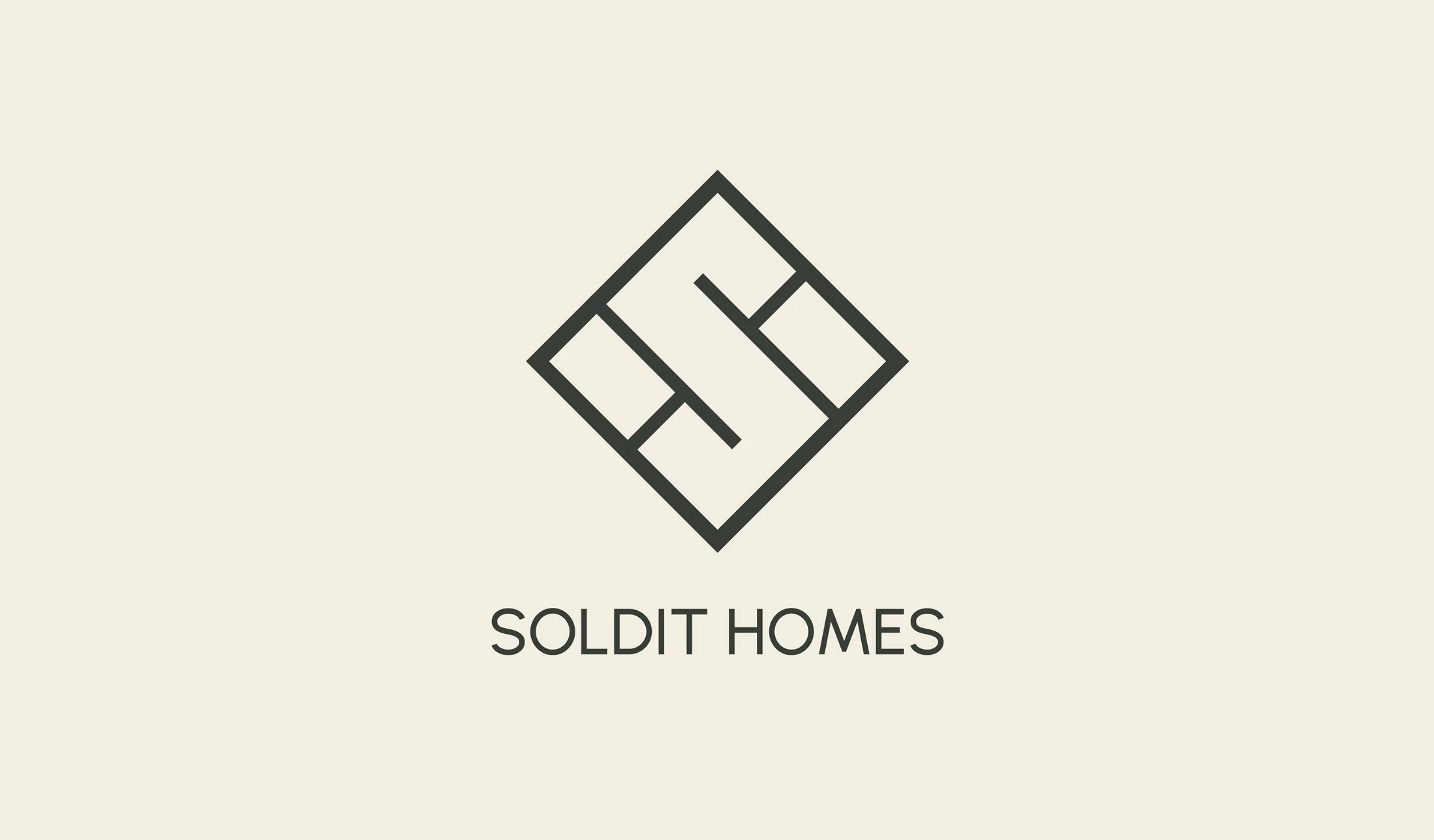
5. SOLDIT HOMES by Nanook Agency
Standout Features:
- Lines forming the letter S
- Simple and meaningful
- Rhombus shape
Soldit Homes' logo by Nanook Agency makes it to our list of the most successful logo designs because of its straightforward yet meaningful design.
The SOLDIT HOMES logo design represents the floor plan of a house. It evokes the minimalist and elegant style that characterizes the brand and its color palette symbolizes confidence and professionalism.
Gabriel Sanchez, Art Director of Nanook, assures that the real challenge was to fit and introduce the initials of the brand: the S and the H, in the badge. He also argues that it is an interesting combination of the simple and the complex but of great functional character. Ingenious is how he would describe it in one word.
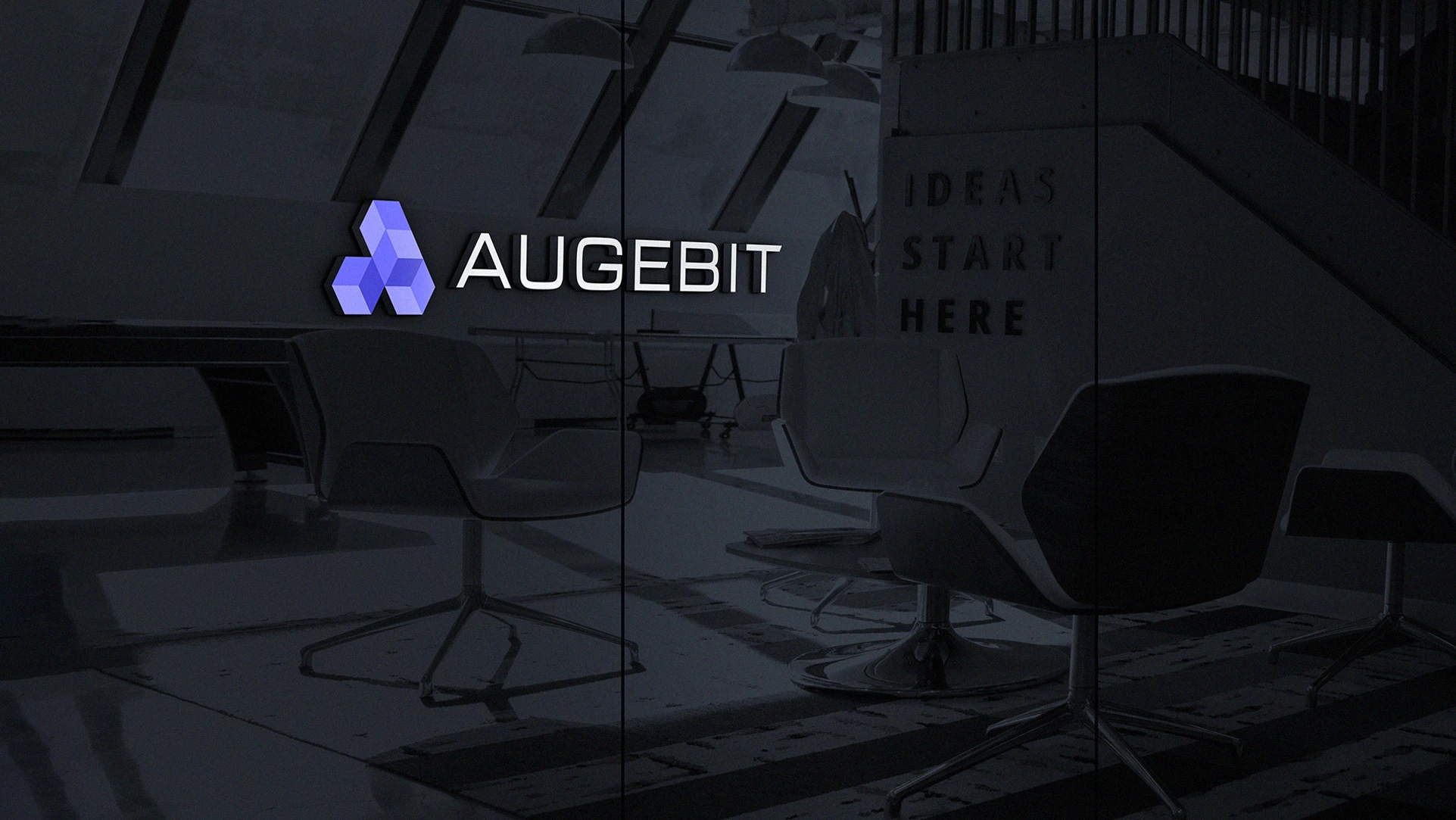
6. Augebit by Vitor Linhares
Standout Features:
- Artistic letter A
- Three-dimensional logo
- Blue color palette
Vitor Linhares’s logo design for Augebit sets the bar high for logos because of its fantastic harmony between shapes and colors that create an ideal picture for the brand.
The logo showcases the company’s creativity through four 3D blocks that form the letter A. The 3D logo shows their customers that they can do any design with the same quality as their logo.
The blue color palette highlights their modern touch and dynamism.
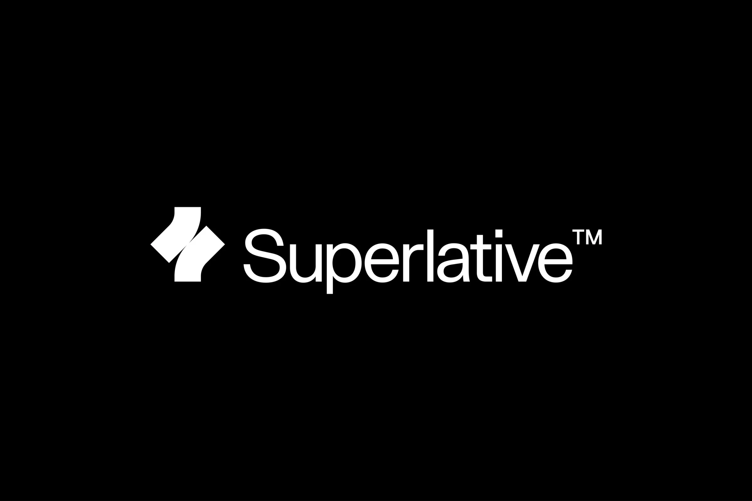
7. Superlative by Kurppa Hosk
Standout Features:
- Tilted curved rectangles
- Condensed sans-serif font
- Minimalist design
Superlative’s stunning logo design by Kurppa Hosk makes it into our list of the most successful logo designs thanks to its reliable feel.
The logo design features two tilted curved rectangles connecting through their curved centers. The condensed sans-serif font complements the design and adds a touch of class to it.
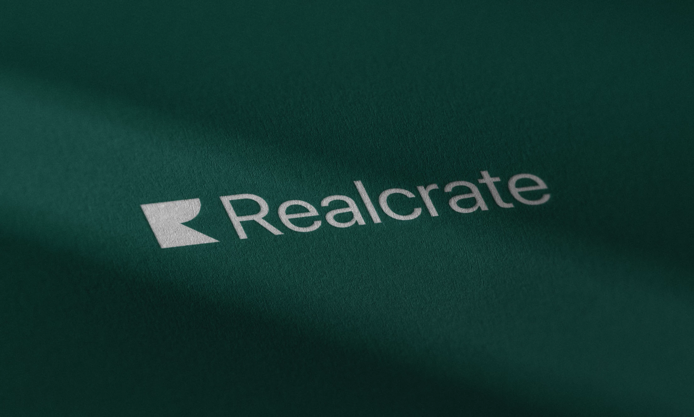
8. Realcrate by Spacemotion
Standout Features:
- Iconized brand initial
- Monochrome color story
- On-brand design
Spacemotion’s logo design for Singapore-based real estate firm Realcrate is fittingly on-brand as a company you can trust with your housing needs.
The agency took the brand name's first letter (R), stylized it, and created an iconized version of it. The result is a stunning icon made of unique shapes that form the letter R. Beside it is the brand name in Montserrat font.
Overall, the logo goes well among the real estate agencies in the region with its sleek and minimalist design with monochrome color stories.
Check out some of these amazing business logo designs.
9. Arusa by Designely
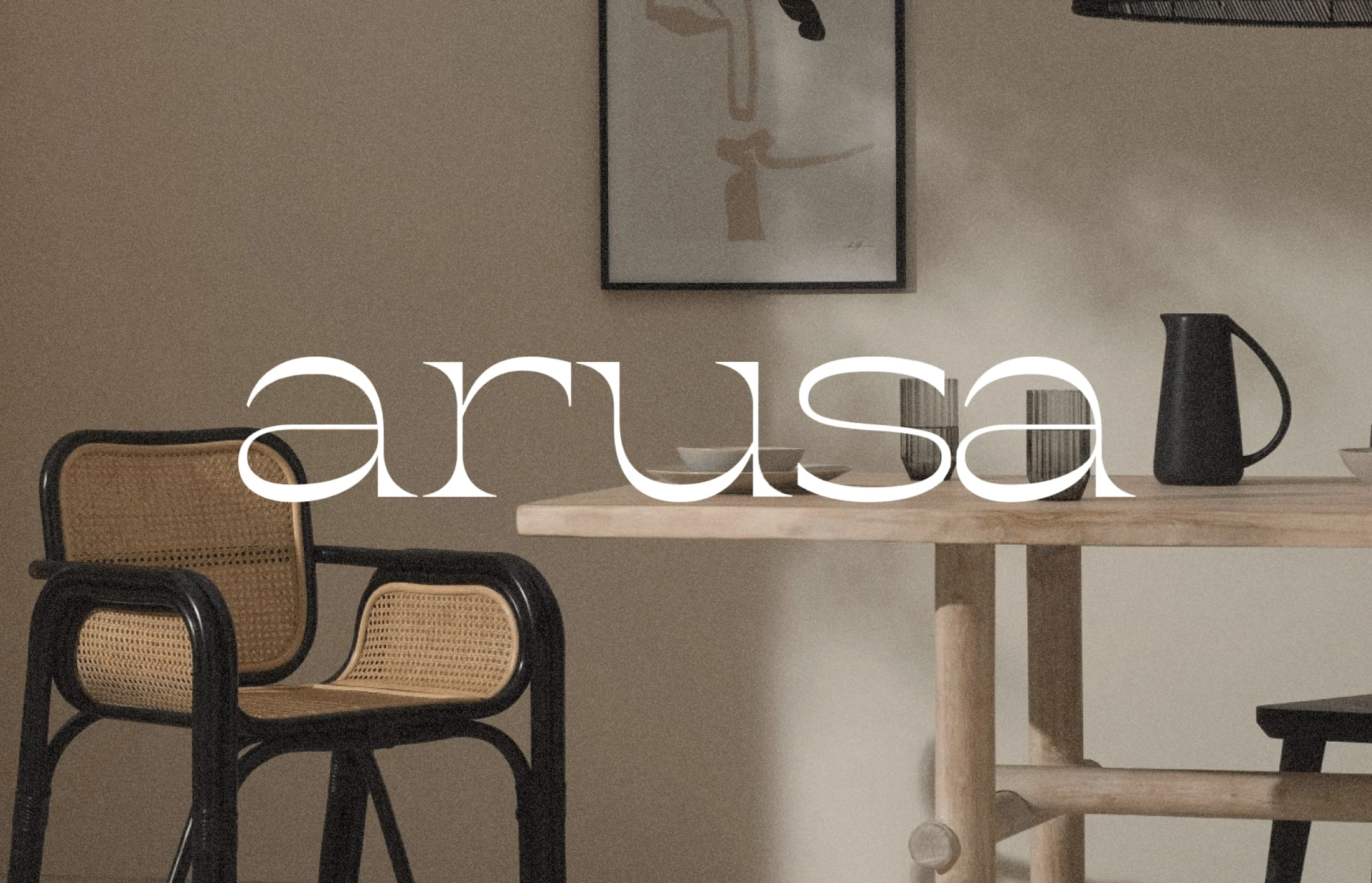
Standout Features:
- Curved typography
- Scandinavian-inspired colors
- Serif font style
As a modern furniture company, Arusa inspires people to adopt minimalist and clean styles through its products. Their logo design by Designely features a curved typeface that can be traced to their design aesthetics.
The curved lines are a prominent feature in many of Arusa’s furniture designs, with the serif font style establishing style and class effortlessly.
Adding a touch of modernism to the design are the colors used, typically seen in Scandinavian-themed interiors worldwide.
10. BONANZA Kino by oofbox Media
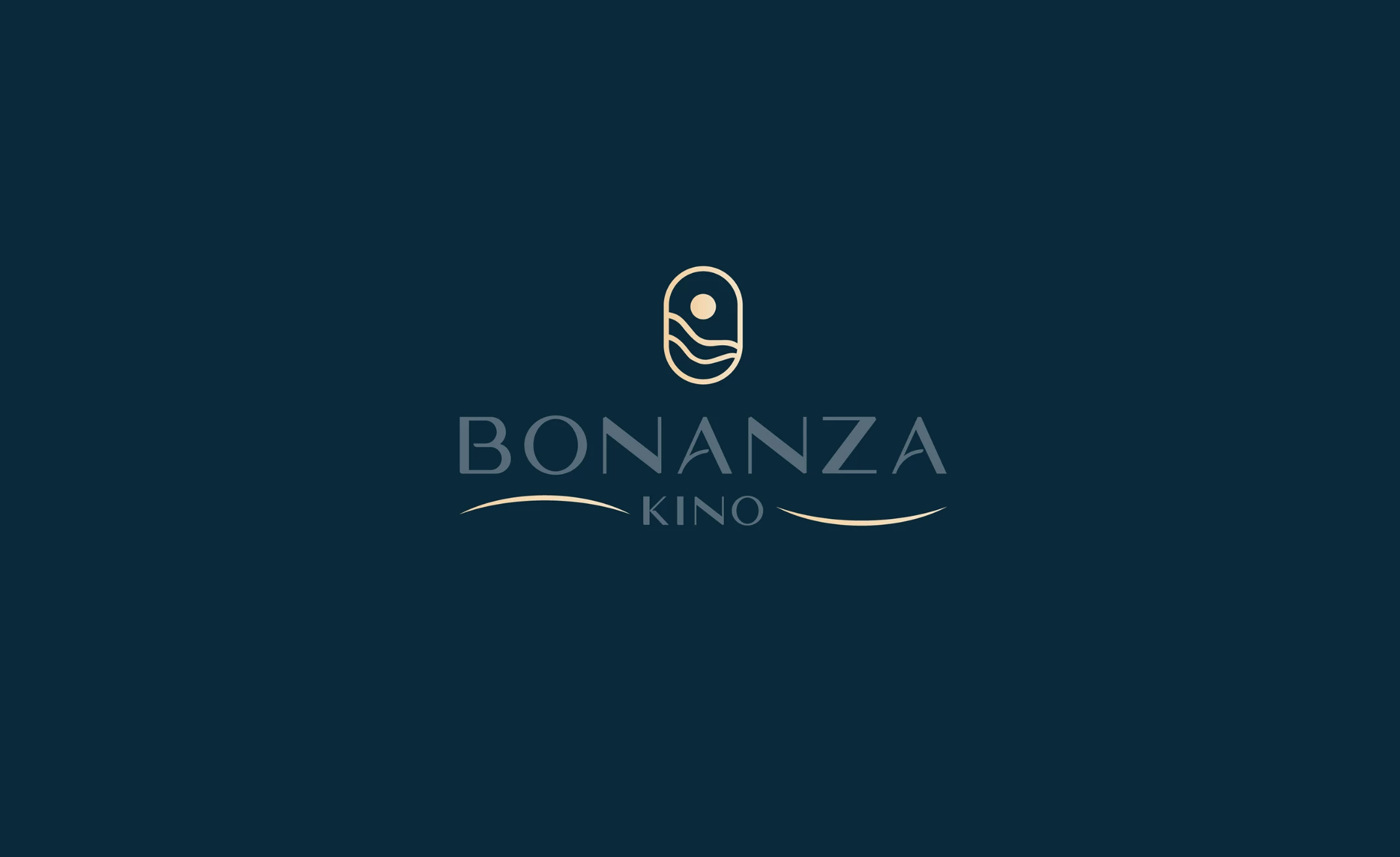
Standout Features:
- Unique imagery
- Soft lines and shapes
- Seaside-themed
Looking at BONANZA Kino’s logo by oofbox Media is like peeking out of your window to see the shore.
The logo features an oval with wavy lines and a full round that resembles a window cabin view of the sea and the sky. The imagery is unique, giving us a beautiful visual treat.
The agency also used dark blue-green and metallic gold to perfectly portray the design’s aquatic theme.
11. Pedant by Ran Malul
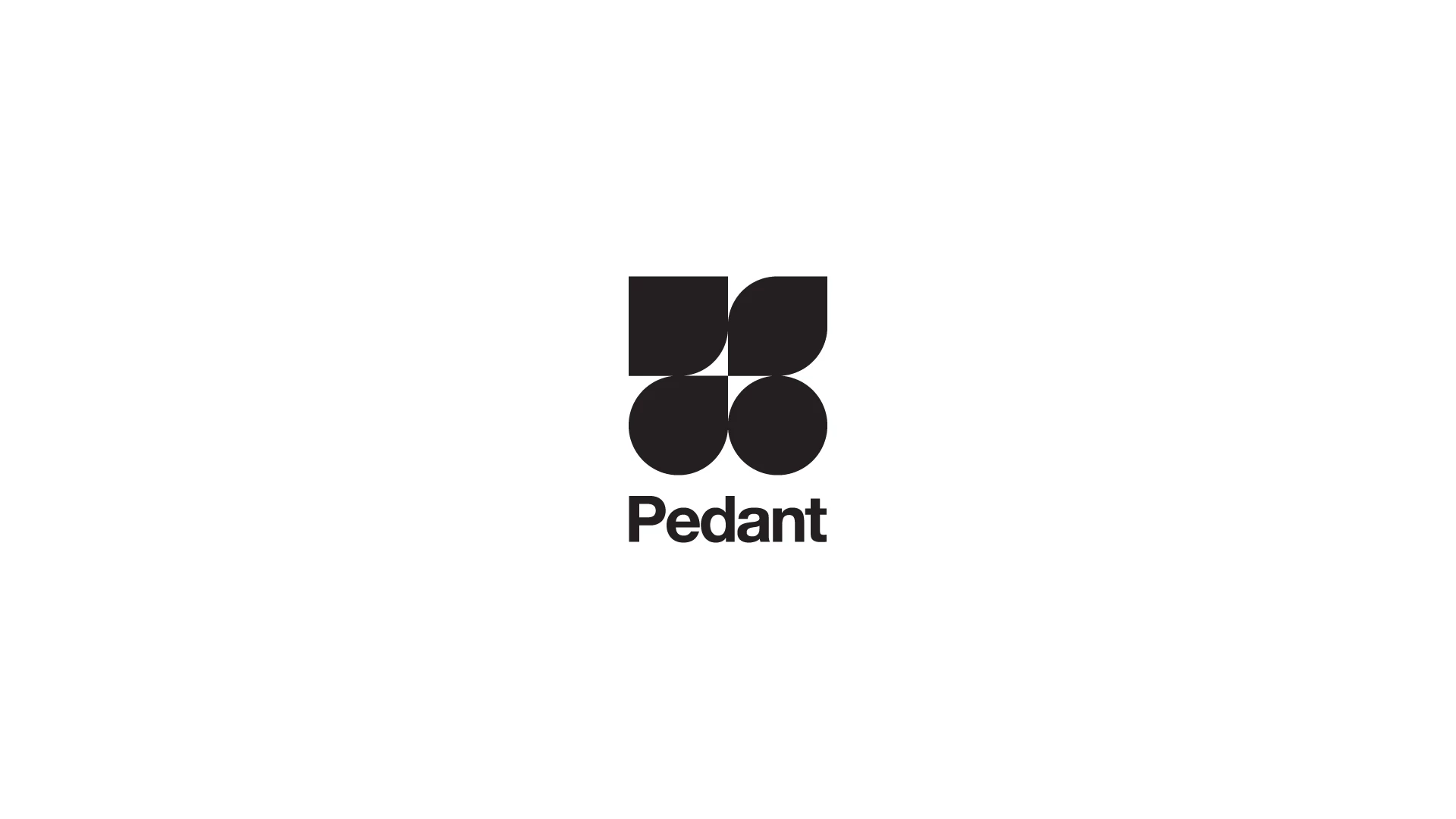
Standout Features:
- Various shapes
- Thick bold typeface
- Clean lines
This next entry on our list features clean lines that mirror the brand identity seamlessly. Designer Ran Malul created this successful logo design for the Pedant clothing line by featuring flawlessly arranged shapes to convey the brand's desired streamlined image.
The design features two circles with two tilted teardrop shapes on top, and the brand name is spelled in thick typography at the bottom. The lack of unnecessary figures and lines makes the design striking without boring the people viewing it.
It fits the design brief excellently and makes for a successful logo design. Check out our article on best small business logo designs.
Check out some of these excellent clothing brand logo examples.
12. Mode Sensors by Elle Visual
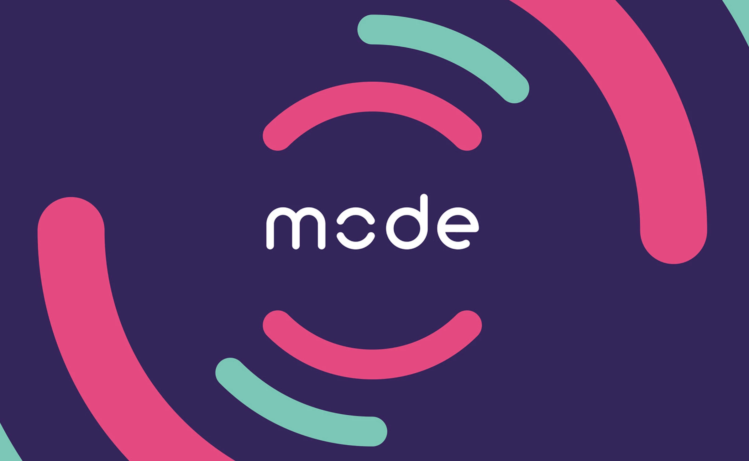
Standout Features:
- Evocative typography
- Attractive color scheme
- Innovative design
Mode Sensors is one of the latest players in the ever-expanding medical technology sector. Developing disposable sensor patches that measure vital parameters such as hydration levels, heart rate, skin temperature, and general activity, the company masters the craft of non-invasive medical analysis.
In designing their logo, Elle Visual focused on two primary elements, a sensor icon that represents the tech aspect of the company, and the future that immediately calls to mind never-yielding innovation.
The circle symbolizes security and protection, adding another layer to its universal story of unity and limitless potential.
Our design experts recognize the most innovative and creative designs from across the globe. Visit Design Awards to see the:
- Best Logo Designs
- Best Website Designs
- Best Video Designs
- Best Print Designs
- Best Packaging Designs
- Best App Designs
Our team also ranks agencies worldwide to help you find a qualified agency partner. Visit our Agency Directory for the top Logo Design Companies, as well as:
- Top Web Design Agencies
- Top Video Production Companies
- Top Print Design Companies
- Top Packaging Design Companies
- Top Mobile App Development Companies


-preview-webp.webp)