
The Apple Music Logo Stays Put As Apple Music Hall Gets A Lowercase Wordmark
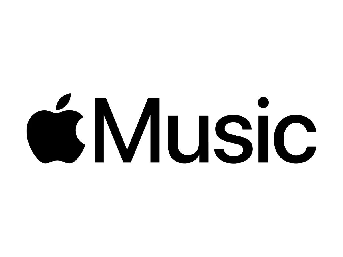
The Apple Music logo you know is still the official one: the black Apple glyph beside "Music," set with a capital M in Apple's San Francisco typeface. This week, a heavy, all-lowercase "music" appeared on the Apple Music Hall website, home of Apple's new 600-person venue inside London's Battersea Power Station.
That lockup belongs to the venue alone. Still, for a company that sets nearly every word in one typeface, it stands out.
What To Know
- Apple has not changed the Apple Music app logo. The app icon and the standard wordmark look the same as they did last week.
- The heavy lowercase wordmark belongs to Apple Music Hall, a live music venue Apple announced in London this week.
- The typeface is unidentified. It reads as a wide, heavy grotesque, far from the San Francisco setting Apple uses everywhere else.
- In iOS 27, artists can now upload their own text logos and pick button colors for their Apple Music profile pages.
- Apple hasn't connected the two moves. Side by side, they suggest Apple Music is loosening its type rules at the edges first.
Did Apple Change The Apple Music Logo?
No, Apple has not changed the Apple Music logo. The app icon and the standard Apple Music wordmark are unchanged, and the new lowercase wordmark belongs only to Apple Music Hall, a 600-capacity venue in London's Battersea Power Station.
The mix-up started with early coverage that called the lockup a new Apple Music logo and read it as the end of minimalism. Social posts repeated the "old versus new" framing within hours.
Apple's own announcement of the venue says nothing about a new logo. The lowercase mark appears only on the venue's site and social channels, and Apple's partner identity guidelines, dated 2023, still set the name with a capital M.
What Does The New Apple Music Hall Logo Look Like?
Start with the baseline. The official Apple Music logo font is San Francisco, Apple's system typeface, set in a medium-to-semibold weight with even spacing and open counters. The Apple Music icon, the one on your home screen, carries no type at all: just white eighth notes on a red-to-pink gradient.
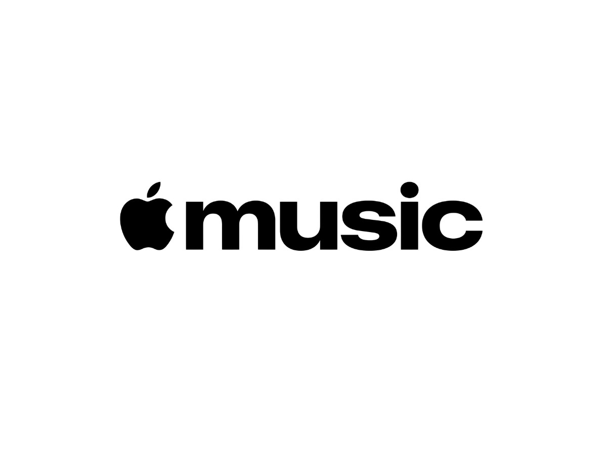
The Apple Music Hall wordmark pairs the Apple glyph with "music" in a heavy, wide sans serif. We can't identify the typeface with confidence, so treat it as custom or unidentified until Apple says otherwise. The letters read as grotesque. Look at the bowls on the u, s, and c: each one is a squarish oval.
Everything about it runs tight. The gaps between letters are narrower than a third of a stem, so the word reads as one dark bar.
The counters shrink too. The s closes down to two thin horizontal slits, and the c and s end in flat, horizontal cuts. Where the arches of the m and u meet their stems, the joins thin out slightly, which keeps the heavy weight from clogging.
The glyph changes its role as well. In the official Apple Music logo, the full apple stands a touch taller than the capital M, and it sits about one letter space from the word.
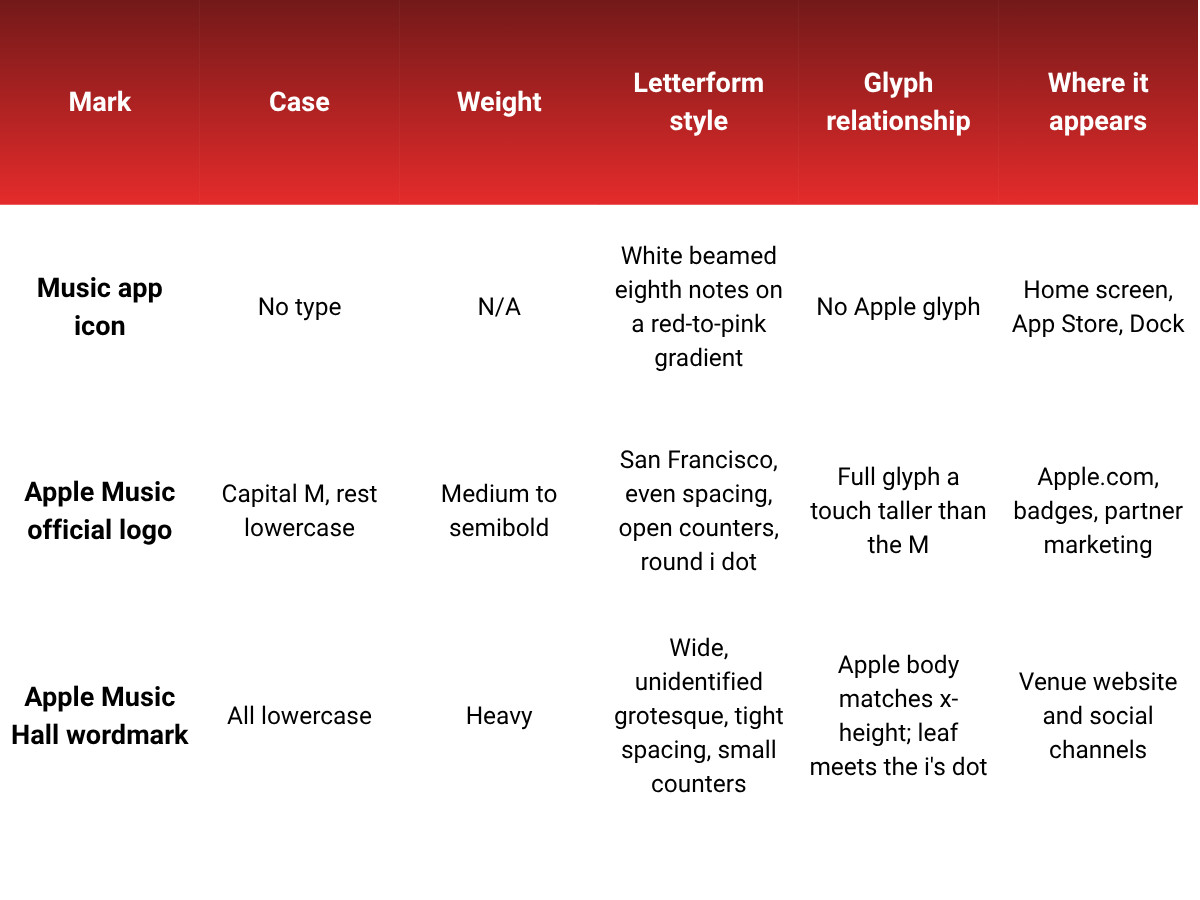
The Apple Music Hall wordmark shrinks that relationship. The apple's body matches the x-height, and its leaf rises to the top of the dot on the i, a wide, rounded oblong. The gap between the glyph and the m runs about three times the gap between letters.
We tested it small and on black, where the venue site uses it. At around 10 pixels tall, the heavy mark holds up better than the standard lockup, whose thinner strokes start to fade. The s counter nearly disappears at that size, but the word stays readable.
One more detail: the venue's full name appears in capitals. The site's hero sets "APPLE MUSIC HALL" in a wide, heavy all-caps face with the same flat character. So the lowercase lives only in the glyph lockup.
What Color Is The Apple Music Logo?
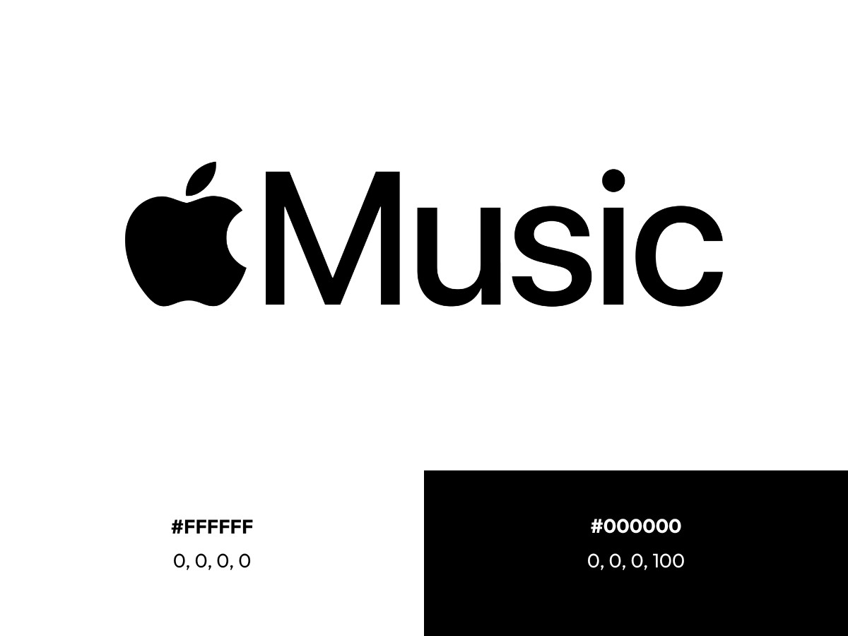
The official Apple Music logo is monochrome. The Apple glyph and the word "Music" run in one flat color with no gradient or outline.
On light backgrounds, the logo is black (hex #000000, CMYK 0, 0, 0, 100). On dark backgrounds, it switches to white (hex #FFFFFF, CMYK 0, 0, 0, 0).
Color only enters through the Apple Music icon, which shows white eighth notes on a red-to-pink gradient. Apple hasn't published official hex or CMYK values for that gradient, so we won't guess them here.
So why is the Apple Music logo red? Apple has never explained it publicly, so any story about passion or energy is a reader's interpretation. The Apple Music Hall wordmark keeps the one-color approach and runs white on black across the venue materials we reviewed.
What Does The Lowercase Wordmark Do?
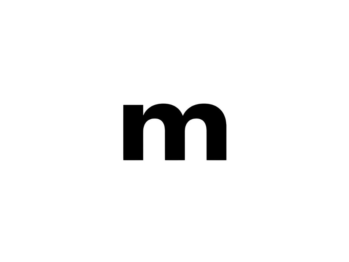
Capital-M "Music" is a product name. Lowercase "music" is a common noun. The standard lockup says Apple's music service, while the Apple Music Hall wordmark says something closer to apple, music: the brand and the category run together.
That's a confident move for a room built for live shows. The hall has a 38-foot stage that can switch between front-facing and in-the-round setups, a 48-speaker spatial sound system, and two recording and mixing studios. A heavy, compact word fits a place where the sound is the product.
The move also sits in real tension with the capital-M rule Apple asks partners to follow. Call it tension, since the guidelines govern how partners typeset the name. They don't govern how Apple designs its own marks.
Why Are Artists Getting Their Own Logos On Apple Music?
The venue isn't the only place Apple is loosening its type. Apple's own artist logo guidelines say that with iOS 27, artist pages are redesigned and customizable, and an artist logo puts a stylized version of the artist's name on Apple Music. Before this, every artist name appeared in system type.
The rules are strict. The logo must be a text-based image that matches the artist name, supplied as a transparent PNG on a 3,000 by 1,200 pixel template, and it cannot be solid black. Artists can also set a color for their page buttons. Those Info, Play, and Favorite buttons default to white, but artists can pick a suggested color or enter their own hex value.
Here's the telling detail. Apple bars artist logos from using terms like "Apple Music," "MUSIC," or "iTunes," along with the Apple logo. Apple hands its type over to artists and keeps its own mark fenced off.
Is Apple Letting Go Of San Francisco?
Apple's design identity rests on typographic control: San Francisco everywhere, one voice across every product. Apple Music is now loosening that control in two places in the same season.
Apple hasn't said the venue wordmark and the artist-logo feature are connected, so treat them as a pattern worth noticing. The plan, if there is one, is Apple's to confirm.
Music may be the one category where Apple's house voice was always a poor fit. A band, a label, and a venue each need to sound like themselves. A venue is also a low-stakes, culture-facing place to test a looser voice before a brand decides whether to take it further.
Don't read the Apple Music Hall wordmark as a preview of an app rebrand, though. It might be one, and nobody outside Apple knows.
The wider pattern points backward. Xbox brought back its glossy 2001 sphere as a green glass orb on April 23. Instagram redrew its wordmark on Aug. 13, and users joked the new letters read as "Instagzam." Early reaction to the Apple Music Hall type fits the same mood. Commenters online compared it to a music magazine cover or a cassette insert.
Apple's history raises the stakes. iOS 7 moved the industry toward flat design in 2013, and Liquid Glass drew a wave of imitators last year. When Apple changes its register, even at the edges, other brands watch.
Still, one venue wordmark is thin evidence for the end of anything. One early take argued that Apple's future looks louder, and that may prove true. Right now, the evidence covers a single website and a new set of artist tools.
Verdict
The Apple Music Hall wordmark is the most expressive type Apple has attached to its music brand in years, and it works. It stays legible at small sizes on black, and the lowercase noun suits a room built for live sound. It also shows where Apple draws the line: the music brand can speak louder at a venue, while the app and partner rules stay the same.
Watch the next move. If the lowercase lockup reaches the Music app or Apple's partner guidelines, the story changes. Until then, it's a venue mark with a lot to say.
For more context, see our breakdowns of the Apple logo, the Spotify logo, and WhatsApp's unchanged icon, or browse the latest logo design picks.

Our team ranks agencies worldwide to help you find a qualified partner. Visit our Agency Directory for the Top Logo Design Companies as well as: