
Meta has changed almost every logo it owns. Facebook received a new all-caps company wordmark in 2019. Instagram dropped its skeuomorphic camera on May 11, 2016 for a flat gradient glyph. Messenger swapped its blue bubble for a purple-and-pink gradient in 2020, then reversed course in 2025. The parent company renamed itself Meta in October 2021.
Yet WhatsApp logo design has barely moved since 2009. The product Meta bought for $19 billion in 2014 still runs the same white telephone receiver inside a green speech bubble it launched with.
The green is #25D366. The shape is a rounded bubble with a tail at the lower left. This is not design inertia. It is a calculated decision about where brand equity lives and what happens when you touch it.
What the Mark Actually Is
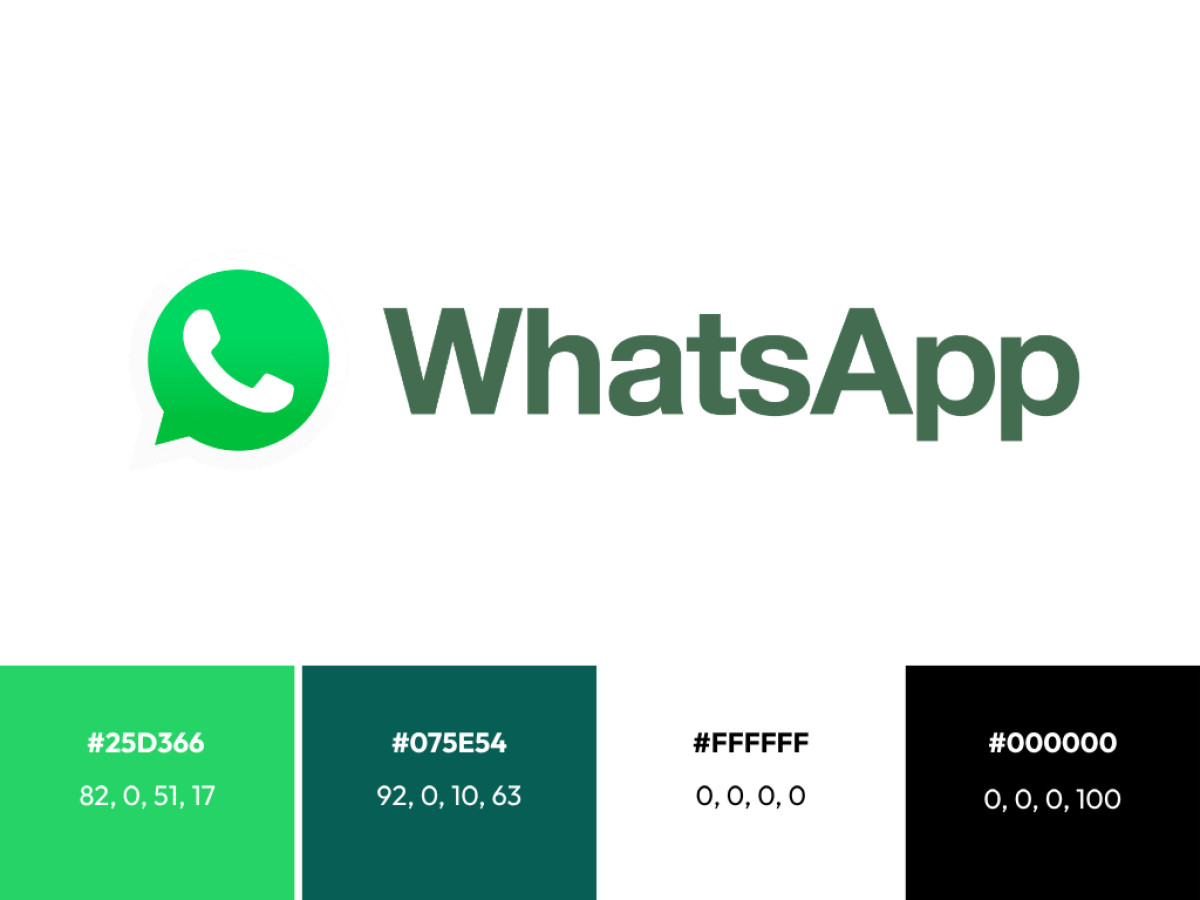
The icon holds two elements, and both were chosen for legibility rather than personality.
The speech bubble. A rounded square with a short tail extending from the lower left corner. The tail direction matters. In chat interfaces, received messages carry a left-pointing tail while sent messages point right.
By anchoring the tail on the left, the mark reads as an incoming message: the small dopamine cue of someone reaching out to you, not the neutral act of you sending something into the void. The bubble sits in white against the green field, which keeps the silhouette readable at 16 pixels.
The receiver. Inside the bubble sits a landline telephone handset, drawn as a single white silhouette: earpiece and mouthpiece connected by a curved bar, tilted at roughly 45 degrees in the lifted position.
By 2009 the wired handset was already an anachronism on a smartphone screen, and the choice was deliberate.
A smartphone icon inside a smartphone app would be redundant. The lifted handset borrows a pre-digital shorthand for "the line is open," a signal every generation of users decodes without instruction.
The color. WhatsApp green is #25D366, a bright yellow-leaning green, supported in the wider palette by the darker teal #075E54 used across the interface. Green was rare in the 2009 app ecosystem, where communication tools defaulted to blue.
On a home screen crowded with blue icons, the green field did the differentiation work that the generic bubble-and-receiver combination could not do alone.
Nobody famous designed it. The mark appears to date from the app's initial development, attributed to founders Jan Koum and Brian Acton or an unnamed contractor. That anonymity is part of the point: this is a functional mark that succeeded on clarity, not authorship.
The Flat Transition: What Changed and What Did Not
The original 2009 icon followed the glossy conventions of the early iOS era: a gradient green field, a horizontal gloss highlight across the upper half, and a subtle shading that gave the bubble physical depth, consistent with the version history documented across the mark's early years.
When iOS 7 forced the industry flat in 2013, WhatsApp complied with the minimum possible intervention. The gloss highlight disappeared. The gradient collapsed into a single flat green.
The bubble's corner radii were evened out, and the receiver was redrawn with cleaner curves and more balanced negative space around it. Proportions shifted marginally: the receiver grew relative to the bubble so the mark held up at smaller rendering sizes.
That is the complete list. The bubble stayed. The tail stayed on the lower left. The receiver stayed a landline handset. The hue stayed green. Compare that to Instagram, which used the same flat-design moment to discard its entire visual metaphor.
WhatsApp treated the transition as a rendering update, not a rebrand. The distinction is the difference between changing how a mark is drawn and changing what a mark is.
Why Meta Left It Alone
The non-rebrand is the story, because Meta had every institutional reason to intervene and repeatedly chose not to.
Consider the pressure the mark absorbed. The 2014 acquisition made WhatsApp part of a portfolio company famous for consolidating its brands. In 2019, Facebook began adding "from Facebook" to its apps and rolled out an all-caps company wordmark built to sit above them, later updated to "from Meta," the softest possible form of brand annexation.
In October 2021, the parent company rebranded itself entirely, an umbrella identity built to unify everything it owned. Messenger, WhatsApp's closest sibling, was pulled into gradient colors borrowed from Instagram to signal cross-app integration. The icon was the obvious next candidate.
Then came the stress test. In January 2021, WhatsApp announced a privacy policy update covering data sharing with Facebook. The backlash was immediate and measurable: Signal recorded 17.8 million downloads in a single week, a 61-fold increase, while Telegram added 15.7 million.
Over the first four months of 2021, Signal installs grew 1,192% year over year while WhatsApp installs fell 43%. Users were not fleeing the green bubble. They were fleeing the blue company behind it. The icon held trust that the corporate parent had burned, which made it the single most valuable asset in the relationship. Repainting it in Meta's visual language would have transferred contamination in the wrong direction.
Meta's designers understood this, and the proof is in what they did instead. In 2023, studio Koto built WhatsApp a full design system: new typography, illustration style, and motion language.
In 2024, the app itself received an official interface update with rounder icons, a darker dark mode, and a color scheme rebuilt around variations of the signature green, replacing the blue accents iOS users had seen for years. Everything around the mark was modernized. The mark itself was not. That is not neglect. That is a company drawing a precise boundary around the one asset it could not afford to spend.
The economics reinforce the logic. Rebrands at this scale carry real costs, as the most expensive logo redesign campaigns demonstrate, and they carry risk that scales with user count.
WhatsApp serves more than two billion people, most of whom interact with the brand exclusively through a 60-pixel icon on a phone screen. Any change to that icon is a change to two billion daily muscle-memory interactions. Against that, the upside of a refresh rounds to zero.
What WhatsApp Logo Design Teaches Brands and Agencies
The transferable lesson is not "never rebrand." Meta rebrands constantly, and the best rebranding examples show that visual change can repair perception gaps a logo alone cannot. The lesson is that brand equity is unevenly distributed across a visual identity, and the discipline lies in mapping where it actually sits before touching anything.
For WhatsApp, equity concentrates almost entirely in the icon because the icon is the product's only persistent brand surface. There is no packaging, no storefront, no ad-supported feed.
When equity pools that heavily in one asset, the correct move is to modernize the system around it, which is exactly what the Koto design system and the 2024 interface refresh did, and leave the reservoir untouched.
Messenger shows the inverse case: a mark that had accumulated less independent equity could absorb a gradient experiment and a reversal five years later without measurable damage, because users' loyalty was to the function, not the bubble.
Agencies pitching a rebrand should be able to answer one question before presenting a single concept: what does this mark currently hold that the business cannot rebuild? If the audit shows the logo is carrying trust the company itself has lost, as WhatsApp's icon did in January 2021, the recommendation may be a design system, not a new mark.
Clients pay for restraint less often than they pay for change, but WhatsApp is the strongest available evidence that restraint is sometimes the more sophisticated deliverable. Logo redesign work succeeds when it moves equity forward. When the equity is already exactly where it needs to be, the bravest design decision on the table is the one that ships nothing.

Our team ranks agencies worldwide to help you find a qualified partner. Visit our Agency Directory for the Top Logo Design Companies as well as: