The Spotify logo — a bright green circle with three tilted sound-wave arcs — is one of the most recognized app icons on earth.
At first glance it reads as simple, but underneath that simplicity is a carefully constructed system of color, geometry, and typography that has shifted across four distinct eras.
Whether you're here for the full history, the hidden design details, or the 2024 anniversary update, this breakdown covers all of it.
Spotify Logo History
Spotify's logo has seen a few variations over the years, but the overall concept of the design has remained largely the same. From playful beginnings to sleek modernity, these changes highlight Spotify’s adaptability and innovative spirit, solidifying its status as a global leader.
2008–2013: The Original Playful Logo

Designer: Christian Wilsson (internal Spotify founding team)
The initial Spotify symbol, introduced in 2008, featured a white serif wordmark set within a lime-green square. This square had rounded edges, giving the design a friendly, approachable feel. Additionally, the lettering was playful, with the "O" slightly raised. Above the "O," three arched lines in varying weights and opacity represented sound waves or a Wi-Fi signal, emphasizing Spotify's role as a pioneer in music streaming apps.
No external agency was involved. Wilsson and the founding design team built it internally, and in doing so set the visual DNA — green, three arcs, forward energy — that every subsequent version would inherit.
For inspiration on app design and development, check out our list of the top app development companies.
2013–2015: The Minimalist Overhaul

Agency: Collins (New York)
In 2013, the Spotify app logo introduced a radically new look, discarding the square and serif typeface in favor of a cleaner, more modern aesthetic. The logo adopted a lime-green circle with three white arcs, retaining the wave motif from its predecessor. This circular emblem was paired with a black sans-serif wordmark, giving the logo a confident and streamlined appearance.
This redesign by Collins, one of the leading NYC branding agencies, also produced the wider "burst" identity system — the visual metaphor for the emotional jolt of hearing a perfect song — which gave the new circular icon a full brand ecosystem to live within.
2015–2024: A Vibrant Evolution

Designer: Internal Spotify Design team
Spotify's 2015 update further refined the logo, brightening the lime-green circle to an almost neon hue and matching the wordmark to this bold color. While the wave lines within the circle and the sans serif font remained, the updated design emphasized modernity and energy, reinforcing Spotify's approachable and dynamic brand image.
No external agency was credited. The in-house team produced the update, and the green they landed on, #1DB954, became the brand's most widely distributed color, running for nine years across Spotify Wrapped, global campaigns, and platform UI.
2024–Present: A Subtle Sophistication of the Spotify Symbol

Designer: Internal team led by Rasmus Wängelin + Dinamo (typeface)
The 2024 update is the most typographically considered version of the logo to date. The circle was slightly reduced in size, the arcs angled more deliberately to the right, but the main shift happened in the lettering.
The wordmark moved from Spotify Circular, a licensed geometric sans-serif used since 2013, to Spotify Mix: a bespoke variable typeface developed with Berlin-based foundry Dinamo over 18 months.
The result is a wordmark with real character. Sharper, bolder letters throughout, a triangular "T," elegant "S" tails, and almond-shaped counters in letters like "p," "d," and "g" that subtly echo expanding audio waves. Every detail is specific, and none of it reads as arbitrary.
2026: The Disco Ball Anniversary Logo
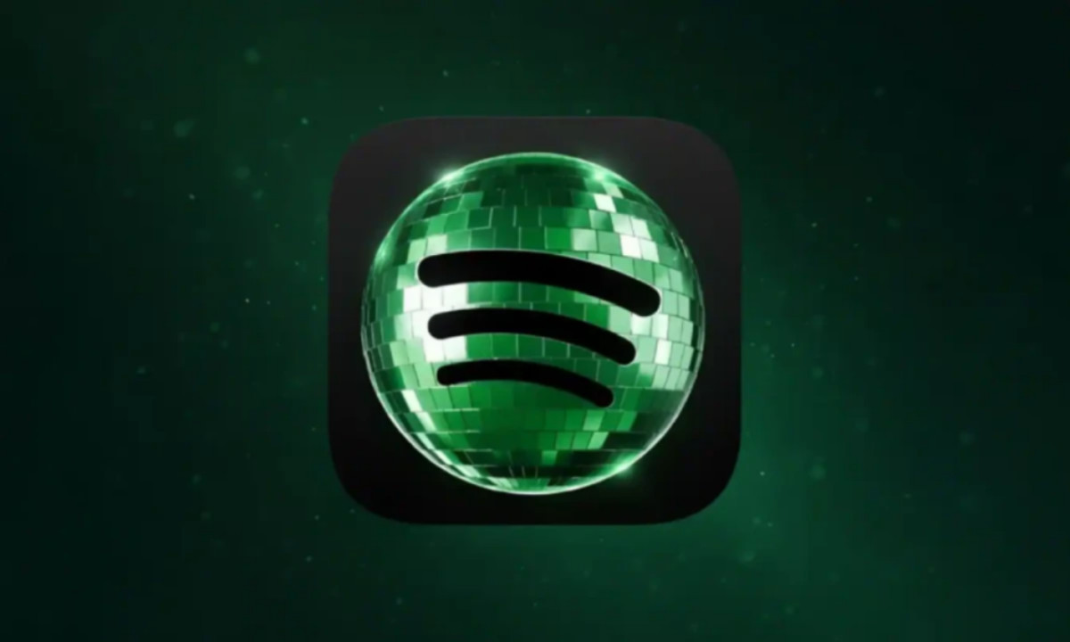
In May 2026, Spotify temporarily replaced its flat green circle with a sparkling disco ball app icon for its 20th anniversary, part of the "Spotify 20: Your Party of the Year(s)" campaign.
The redesign kept the signature soundwave arcs but wrapped them inside a reflective green sphere with gradients and mirror-ball texture, rolling out on iOS on May 13.
The reaction was immediate and divided. Designer and social media consultant Jack Appleby posted on X that the icon had "huge readability & brand issues" — the green read too dark against black, and the texture looked pixelated at app-icon scale.
Michael J. Miraflor, Global EVP at WPP's Essence Mediacom, pushed back: "You've bullied Spotify into reversing something fun and different (and temporary to begin with) for their 20th anniversary. We don't deserve nice things."
Spotify's Senior Director of Global Brand, Lauren Solomon, told Spotify's newsroom the brand periodically adapts its logo as an "expression of culture." The flat logo returned as planned within the week.
The episode shows exactly what happens when you alter a mark that millions of people tap daily out of pure muscle memory.
The backlash wasn't really about the disco ball — it was about how much recognition the flat green circle had quietly accumulated, and how quickly people notice when it's gone.
What Makes the Spotify Logo Work
The emblem pairs a lime-green circle with three white curved arcs, tilted slightly to the right, with the wordmark sitting beside it in Spotify's custom proprietary typeface.
Together they form a mark that works at every scale, from a 16px app icon to a 10-foot billboard, while communicating something instantly legible: streaming, sound, and motion.
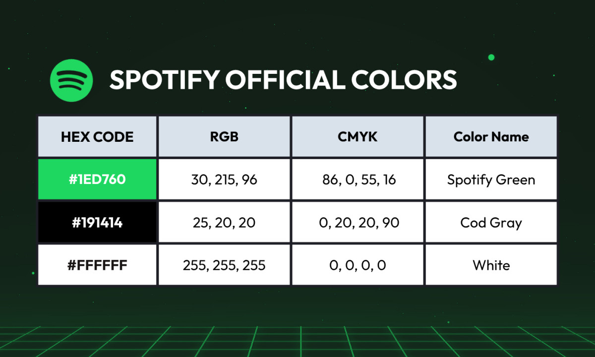
Spotify Green is the brand's resting state. The official hex is #1ED760 (RGB: 30, 215, 96; CMYK ≈ 86, 0, 55, 16), and the near-black used throughout the app carries its own value: #191414, warm enough to avoid OLED harshness.
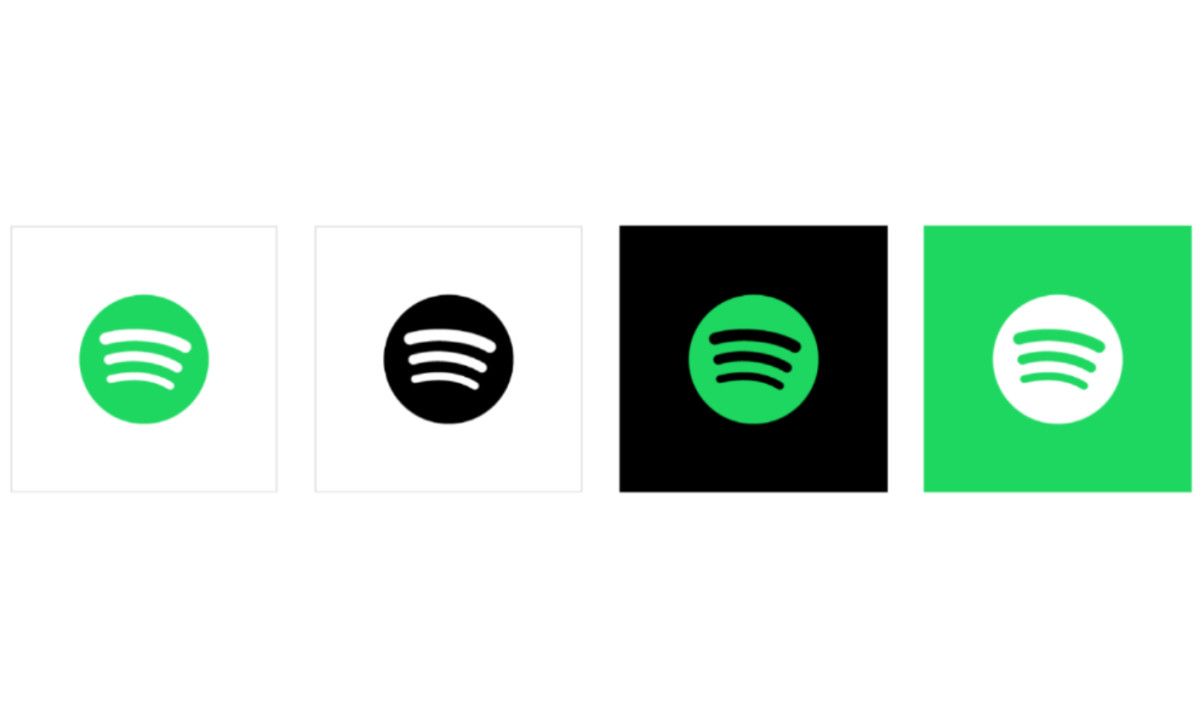
Per Spotify's official brand guidelines, the green logo may only appear on black or white backgrounds, with a monochrome version required everywhere else.
That green was chosen with competitors in mind.
Apple Music moved toward red-pink gradients, Tidal adopted premium monochrome, and SoundCloud claimed warm orange.
Spotify's electric green sits in unclaimed territory: energetic, optimistic, and immediately distinct.
The three arcs do specific work. In a 2013 interview with Gizmodo, designer Christian Wilsson explained their intent: "It's basically illustrating streaming. It's supposed to be streaming. It's good that it could be both."
Signal radiating outward, music reaching a listener wherever they are.
Why the Spotify Logo Is Tilted
One of the most-searched Spotify logo questions is also one of the least-answered: why are the arcs crooked?
Designers Wilsson and Andreas Holmström addressed this directly in the same 2013 Gizmodo interview.
Perfectly horizontal arcs were tested and rejected — they looked too much like a Wi-Fi symbol.
A stronger clockwise rotation was ruled out too, as it started reading as an RSS icon.
The current angle sits between both failure states, landing in what the team described as "more organic" and "not super perfect, which gives it more personality."
The tilt works on multiple levels. Angled elements imply forward momentum, fitting for a playback and discovery service, and the slight imperfection makes the mark feel more human.
Perfect symmetry, the designers noted, felt static and lifeless.
That right-leaning direction has been retained through every major redesign since 2013.
Spotify vs. the Competition
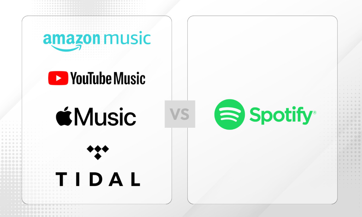
Where Spotify's green circle reads as warm, energetic, and accessible, its rivals each stake out different territory:
- Apple Music — Red-pink gradient with a music note. Premium, editorial, cool-toned. Works within Apple's broader design ecosystem but lacks independent sonic personality.
- Tidal — Monochrome precision, near-black-and-white. Audiophile credibility. The most minimal identity in streaming, signaling exclusivity over accessibility.
- YouTube Music — Inherits YouTube's red-and-white play button. Instant recognition within the Google/YouTube ecosystem, but nothing in the icon specifically suggests music culture.
- Amazon Music — Wraps Amazon's smile-arrow with music elements. Strong within the Amazon universe; weak as an independent brand.
Against all of these, Spotify's tilted green circle occupies unique space: energetic rather than austere, culturally embedded through Wrapped campaigns, and now backed by a bespoke variable typeface that no other streaming platform has matched.

Our team ranks agencies worldwide to help you find a qualified partner. Visit our Agency Directory for the Top Logo Design Companies as well as: