
Stuttgart takes its name from a stud farm. The word comes from Stutengarten, old German for mare garden, and a horse has stood on the city's seal for centuries.
Porsche builds its cars there. So when the company wanted a badge, it took the city's horse and put it on the hood.
What To Know
- The animal on the Porsche crest is a horse, taken from the coat of arms of Stuttgart, the city where the company is based.
- The crest also carries the antlers and colors of Württemberg, the historic German state that once contained Stuttgart.
- Porsche adopted the crest in 1952, and the badge has been refined four times since without a single clean-sheet redesign.
- Porsche's horse and Ferrari's prancing horse come from separate, unrelated sources.
- Seventy years of small edits instead of one bold redesign tell you the mark was close to right the first time.
What Animal Is On The Porsche Logo?
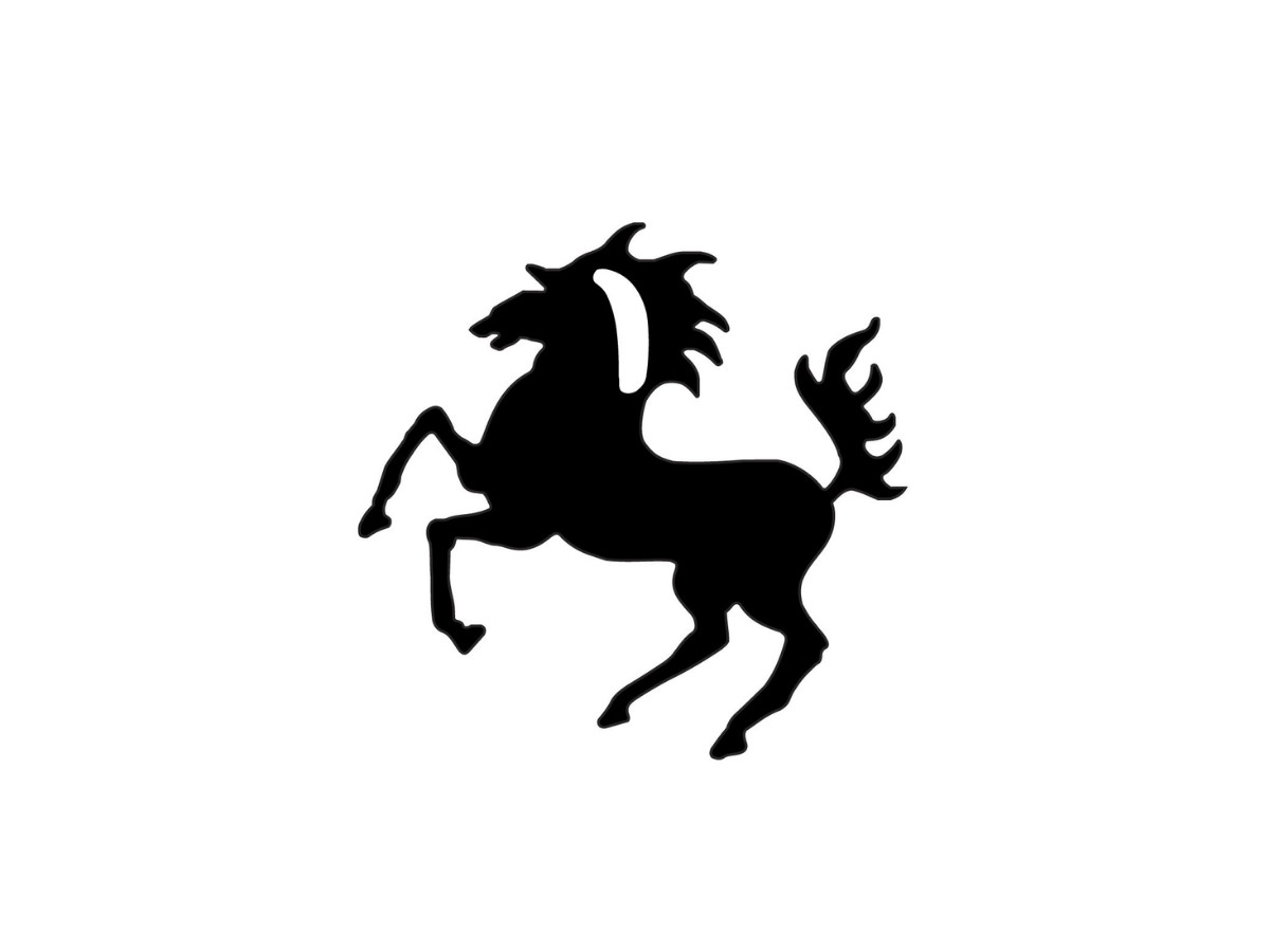
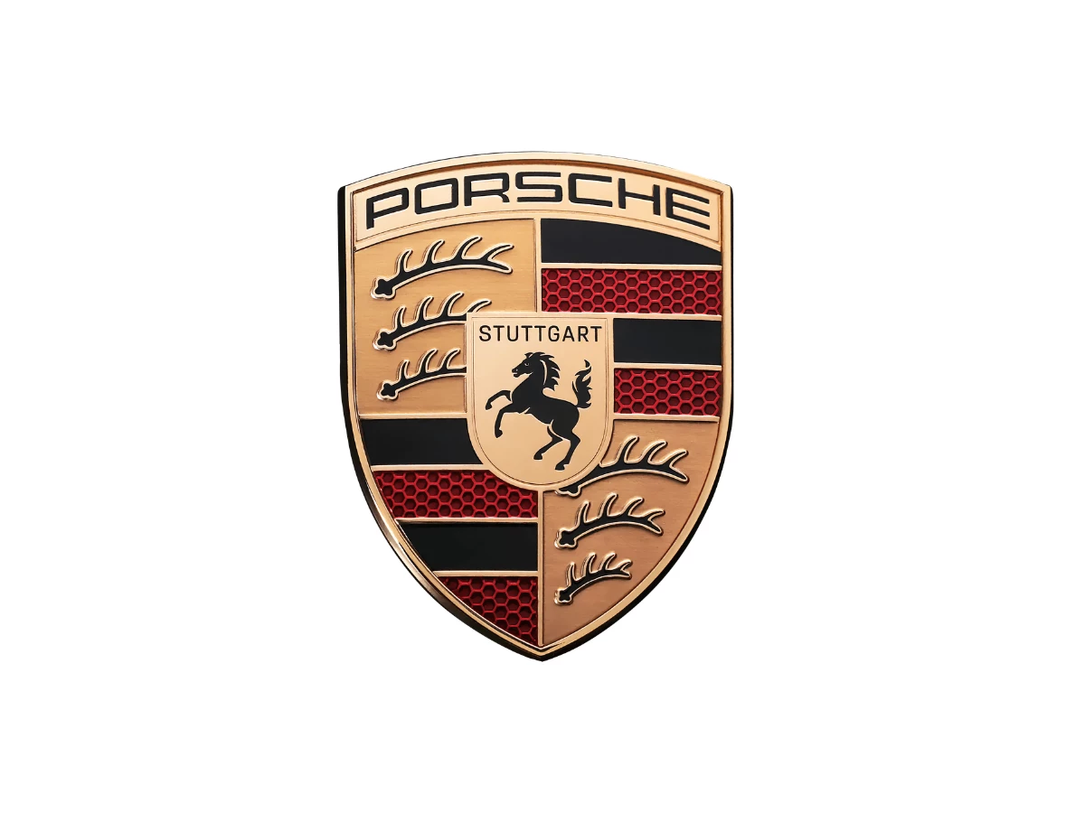
The animal on the Porsche logo is a horse, shown black and rearing on a gold field. It sits at the center of the crest, inside a small shield of its own, facing left.
Porsche did not invent the horse. It lifted it straight from the coat of arms of Stuttgart, where a single black horse has appeared on city seals since the 1400s.
The city was founded around 950 as a place to breed cavalry horses, and the horse on the seal is a pun on the name: Stute means mare, so Stuttgart wears its own founding on its shield.
People ask about the horse partly because a second, more famous horse looks similar. That is Ferrari's, and the two are not related. Ferrari's prancing horse came from Francesco Baracca, an Italian fighter ace of the First World War who painted a horse on his aircraft.
Enzo Ferrari met Baracca's parents after a 1923 race, and the pilot's mother suggested he use her son's horse for luck. One old story claims Baracca copied his horse from a downed German plane flown by a pilot from Stuttgart, which would tie the two marks together.
No document supports it, and the museum that holds Baracca's records has nothing to back it up. Treat the shared horse as a coincidence of two cities and one animal, not a borrowing.
The two marks also behave differently on the car. Ferrari's horse stands alone on an open yellow field, so you read it at a glance. Porsche's horse is one of six elements packed into a quartered shield, which is a harder thing to take in and a much harder thing to shrink.
Among car company logos, Porsche's is one of the few still built from real heraldry.
The Antlers, The Colors, And A Coat Of Arms
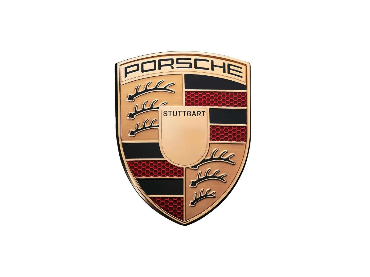
Look past the horse and the crest fills with borrowed heraldry.
The gold shield is quartered on the diagonal. Stylized black antlers on gold sit in the top-left and bottom-right quarters, and red and black horizontal bands fill the top-right and bottom-left.
The word STUTTGART runs across a band above the horse, and PORSCHE sits across the very top in block capitals, over the shield like a roof.
The antlers and the colors both come from Württemberg, the region and former state that held Stuttgart. The historic arms of Württemberg are three black stag antlers stacked one above the other on gold, first recorded in 1228.
Heraldry counts these things, and the counts mean something: the three antlers in the old arms carry five, five, and four points. Red and black were later fixed as Württemberg's state colors, which is where the striped quarters come from. Porsche's account names the specific source as Württemberg-Hohenzollern, a state that existed only from 1945 to 1952.
That distinction matters more than it looks. A logo is drawn to sell a product, so it can change whenever the product does. A coat of arms is drawn to claim a place, a family, or a right, so its parts follow rules and its colors mean something before a designer touches them.
Porsche did not commission a symbol. It assembled one from marks that already belonged to its home ground, then arranged them into a shield.
The Crest, Year By Year
Here is the mark running forward, one version at a time. The first three entries below are the source arms, not car badges, since the horse and the shield both existed long before Porsche put them together. The date ranges follow the standard timeline for the crest.
1922-1938: The Württemberg State Arms
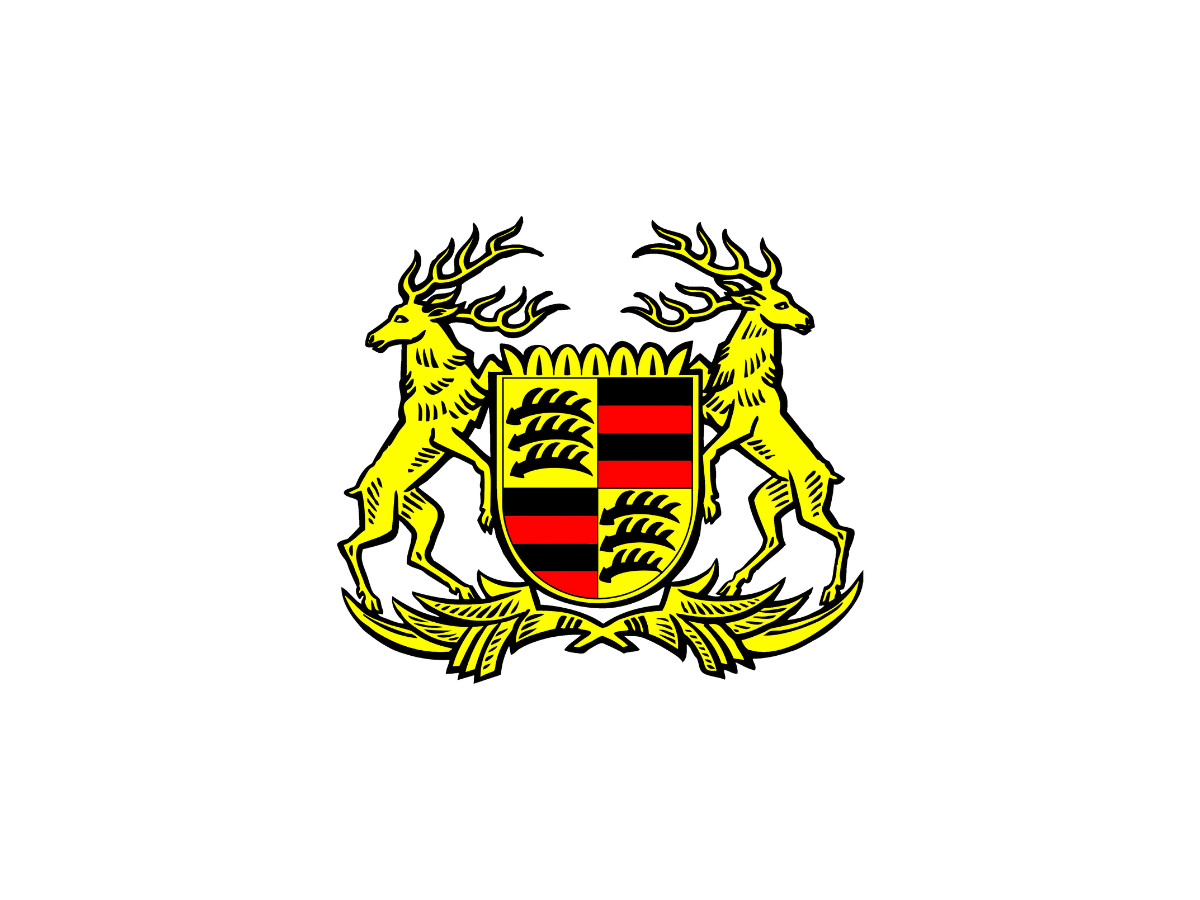
The timeline opens with a full coat of arms rather than a badge.
Two golden stags rear on their hind legs, face outward, and hold up a shield between them, with crossed branches at the base. The shield is quartered on the diagonal: gold fields with black antlers top-left and bottom-right, red and black bands in the other two.
These are the arms of Württemberg, the German state that surrounded Stuttgart, and the antlers and colors here are the exact parts Porsche would later pull into its crest.
1938-1948: The Stuttgart Horse
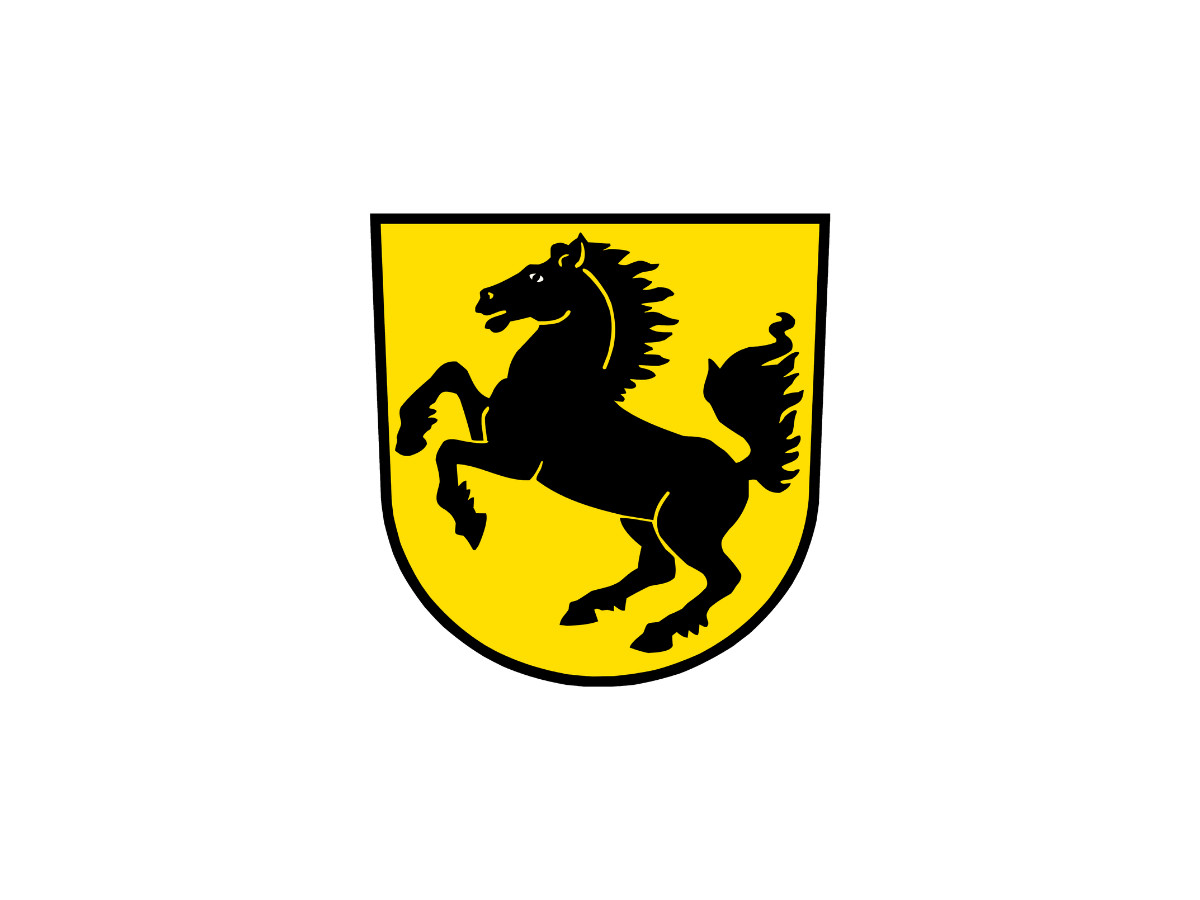
A single black horse rears on a plain gold shield, facing left, with no antlers, no stripes, and no lettering. This is the coat of arms of Stuttgart on its own.
The horse is the pun on the city's name, and it is the same figure that ends up at the center of every Porsche crest.
1948-1952: The Württemberg-Hohenzollern Shield
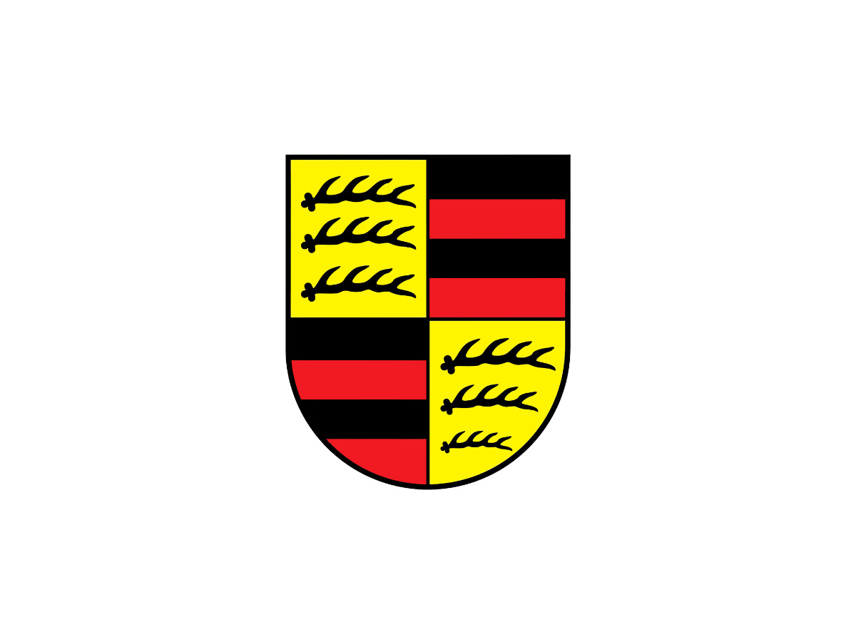
A quartered shield with no horse: gold with black antlers top-left and bottom-right, red and black bands top-right and bottom-left.
These are the arms of Württemberg-Hohenzollern, the postwar state that held Stuttgart from 1945 to 1952. Porsche's crest takes this quartered layout almost whole and drops the Stuttgart horse into the middle of it.
Set these last two panels side by side and you can watch the badge assemble itself: the city's horse, placed inside the state's shield.
1952-1963: The First Porsche Crest
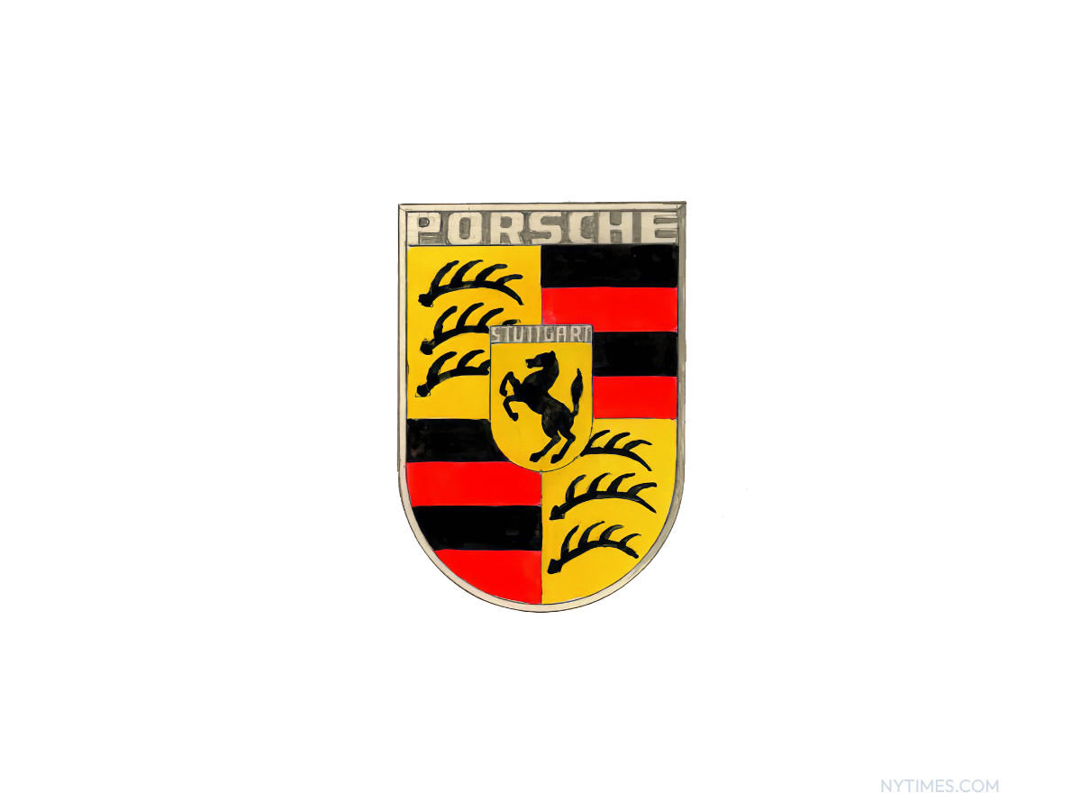
The first badge pulls it all together. PORSCHE sits across the top on a silver-toned plate, the quartered shield forms the body, STUTTGART runs on a small bar across the middle, and the black horse rears on a little gold shield at the dead center.
The shield is tall and narrow, the enamel colors are flat and bright, and the metal frame reads silver rather than gold. This is the crest as a hand-built enamel object.
The name had a head start. PORSCHE lettering had run across 356 hoods since 1948, four years before the crest existed. The badge joined it in 1952 on the steering wheel hub, then moved to the bonnet handle in 1954 and the wheel hubs in 1959.
There the story splits on who drew it: one account credits Franz Xaver Reimspiess, also tied to the 1936 Volkswagen logo, while another has Ferry Porsche sketching it on a New York napkin and Erwin Komenda finishing the drawing.
Porsche's own archive is thin, so anyone naming a single designer as fact is picking a side the records do not settle. The registration year is disputed the same way, with 1952 and 1953 both in circulation.
1963-1994: The Gold Badge Settles In
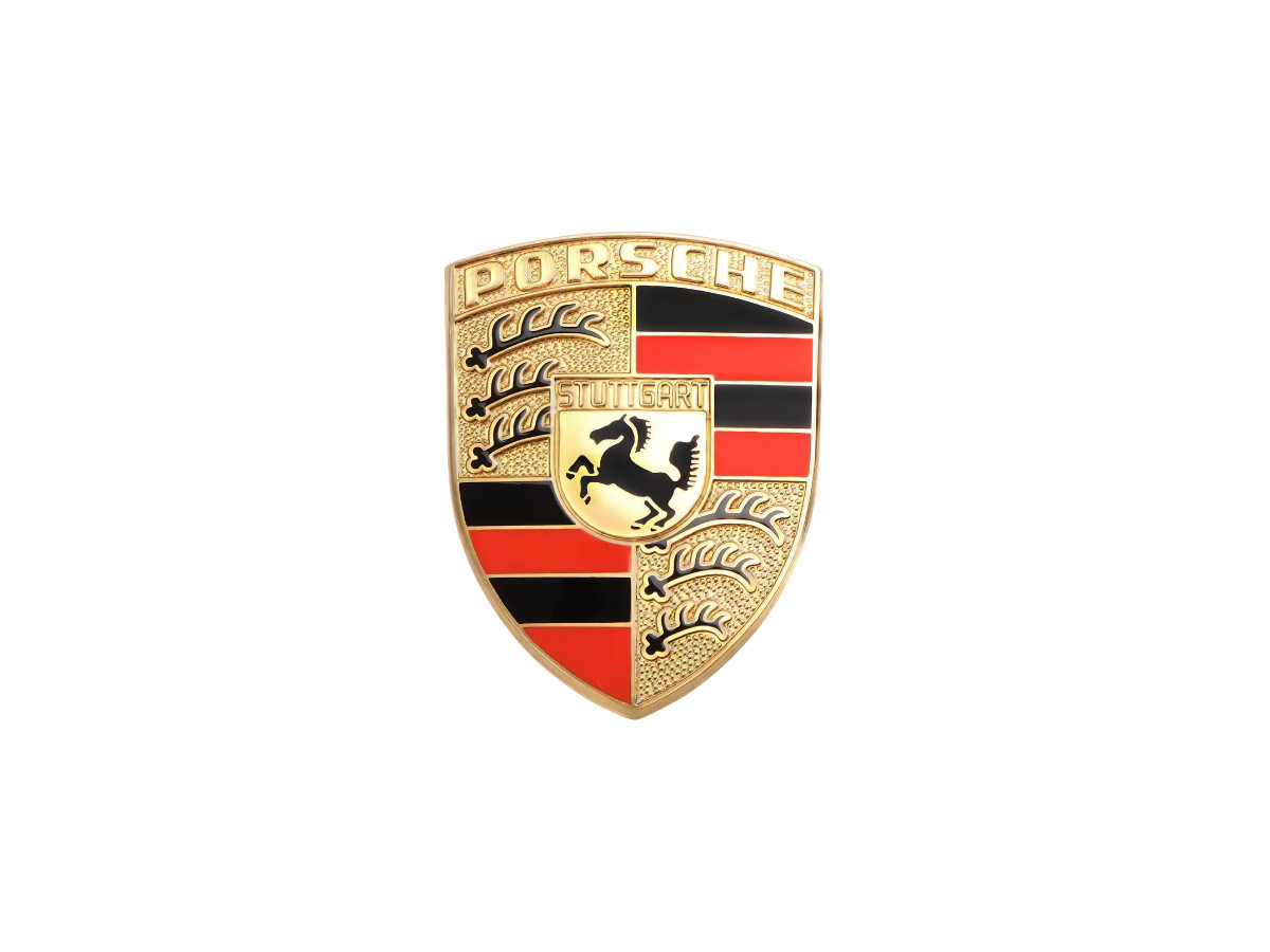
The badge fills out and turns gold.
The frame and lettering shift from silver to a warm brass-gold, the shape grows wider and more rounded, and the whole thing gains a domed, three-dimensional finish.
The red brightens. This is the version most people picture when they think of the crest, and it ran with only small tweaks for about thirty years.
1994-2014: A Darker, Flatter Crest
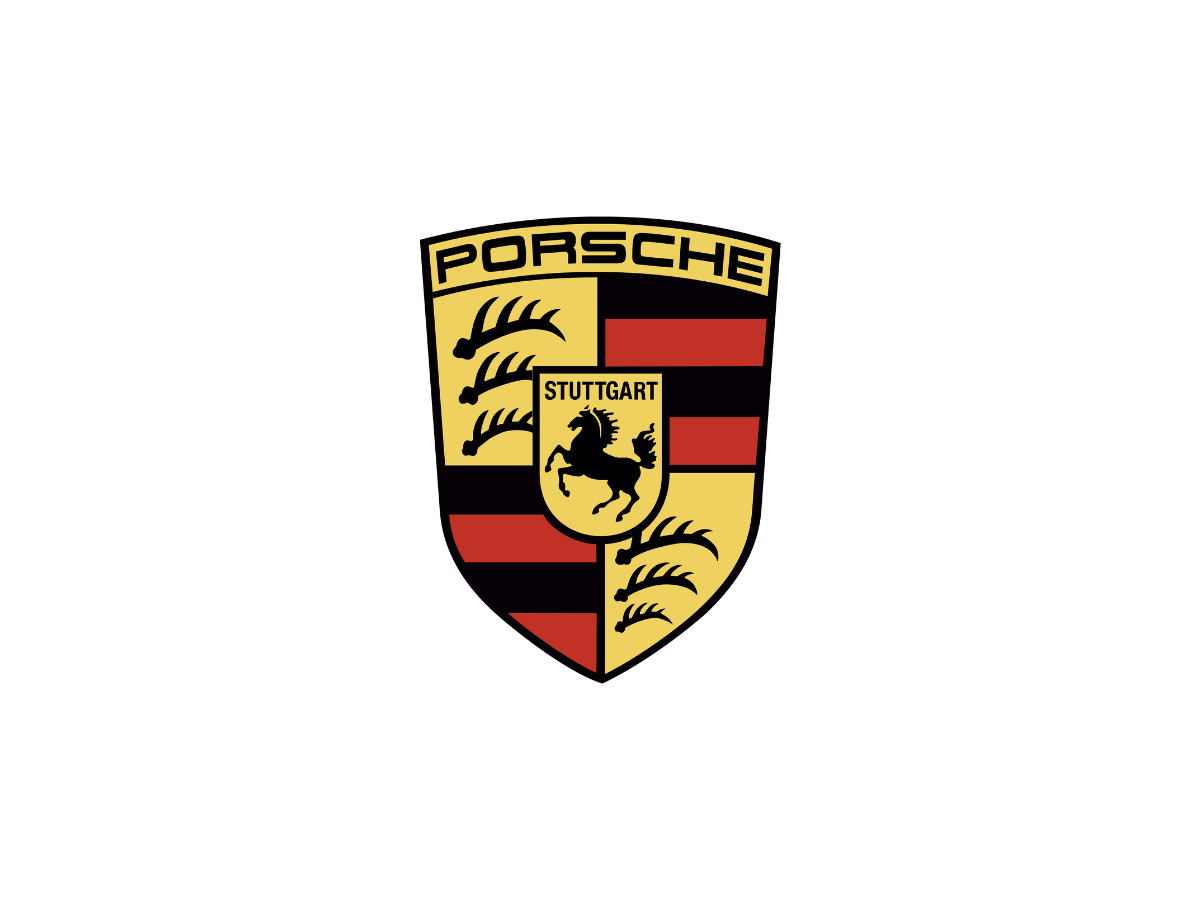
The 1994 version dials everything down. The gold goes flatter and less shiny, the red deepens toward a dark, brick tone, and the black outlines and border thicken.
Held next to the badges before and after it, this one looks muted, almost matte. The likely reason is reproduction: a flatter, higher-contrast mark holds up better on print, low-resolution screens, and early websites than a glossy domed one.
2014-2023: Cleaned Up And Brightened
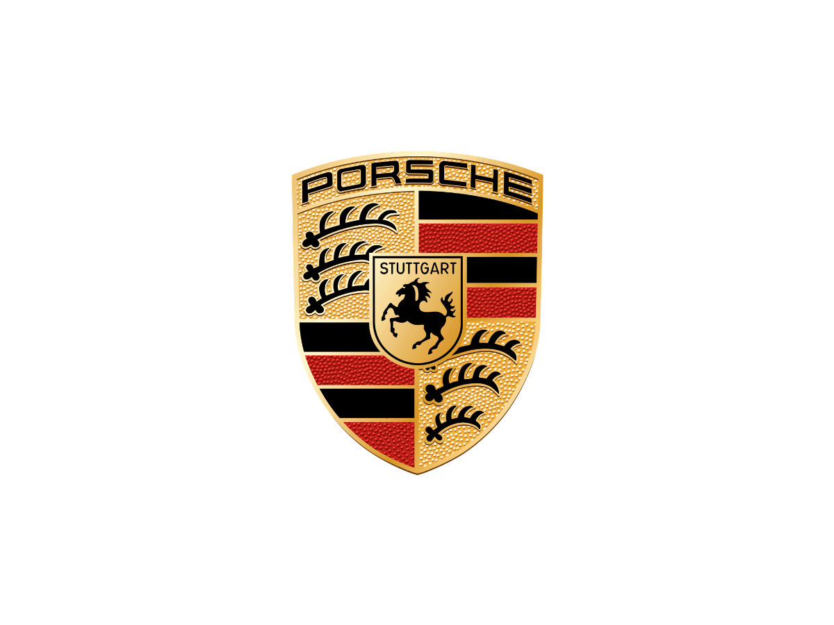
The 2014 crest brings back the shine and sharpens the drawing. The gold turns warm and bright again, the red goes clean and vivid, and the lettering and horse read crisper, with PORSCHE in black across the top.
Nothing structural moves. The shield, horse, antlers, and colors all stay put. This is the badge tuned for high-resolution screens and modern paint.
2023-Present: The Honeycomb Refresh
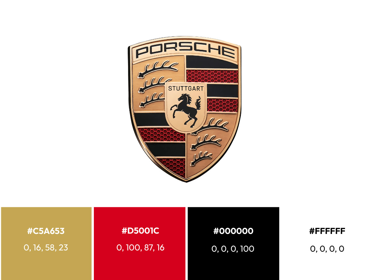
The current crest, released for Porsche's 75th anniversary, is the most careful change of the run. Style Porsche spent three years on it. The horse was redrawn, the shield was widened at the top and pulled in at the bottom to stand up straighter, and the outer bevel grew a touch wider.
The red bands picked up a raised honeycomb texture you can read as a fine mesh, the metal moved to a brushed precious-metal finish, and the gold softened to a subtler, almost rose-gold tone. STUTTGART is picked out in black.
It reached the road on the latest Panamera in late 2023 and now sits on current models, and it is the fifth version of the badge since 1952, which matches Porsche's own count of five stages of evolution.
Older versions stay available through Porsche Classic, and a Turbo-only variant with metallic gray accents arrived later in 2023. If you want the shortest read on how deliberate all this is, Porsche treats the badge as a harder sign-off than the design of a new 911.
The crest itself uses gold, red, and black, with white kept as the brand's background rather than a fill inside the badge. Porsche publishes these as digital brand values in hex, so the hex and CMYK below are firm and the Pantone numbers are third-party nearest matches, not Porsche's own callouts.
- Gold is HEX #C5A653, CMYK 0, 16, 58, 23, nearest Pantone 117 C.
- Red is HEX #D5001C, CMYK 0, 100, 87, 16, nearest Pantone 485 C.
- Black is HEX #000000, CMYK 0, 0, 0, 100, Pantone Black 6 C.
- White is HEX #FFFFFF, CMYK 0, 0, 0, 0, with no Pantone match since it reads as unprinted ground.
On the badge itself the red is a translucent red laid over a gold base and the metal is a brushed rose-gold, so a flat swatch cannot copy the object in your hand.
The finishes carry more of the mark than the flat values suggest. Gold leaf and brushed metal break up light, so the badge reads as an object with depth rather than a printed sticker.
The honeycomb keeps the red from going dead and plastic at close range or on a bright screen.
Does The Crest Hold At Small Sizes?
This is the real design question about any coat of arms in a phone-screen era, and the crest half passes it. On a hood badge, a steering wheel, or a wheel cap, the mark has room, and the enamel and metal do their work.
On a website favicon or an app icon, a quartered shield with six elements and two words has nowhere to go.
The antlers, the striping, and the STUTTGART lettering all collapse into a blur, and only the gold shield and the central horse survive.
Ferrari's lone horse on an open field shrinks far more cleanly, and McLaren went further still, dropping heraldry for an abstract speedmark that reads at any size.
That trade-off, legibility against meaning, is the call a logo design company has to make on every heraldic mark, and it is why so few survive the shift to screens.
Porsche keeps the meaning and pays for it in small sizes, which for a badge that mostly lives on a hood is a fair price.
Why Your Porsche Crest Spins Out Of Line
A common search is some version of "Porsche logo spinning," usually from an owner who has noticed the crest on a wheel sitting crooked. Here is the honest answer, which is not the one most people expect.
Porsche's factory center caps do not stay level on their own. The crest is meant to be set so its lower point aims at the tire valve stem, or at the wheel lock on cars that have one.
The habit comes from racing, where a fixed reference made the valve easy to find in a hurry.
The caps can drift out of that alignment over time, which is why one wheel ends up looking rotated a quarter turn from the rest. Porsche treats this alignment as policy, and technicians reset the caps by hand.
The version that truly stays upright while the wheel turns, the way a Rolls-Royce center cap does, is a weighted floating cap. On a Porsche that is an aftermarket part, not a factory feature.
So a crest that never spins out of line is something you buy, not a fault you fix.
The Verdict
Is A Coat Of Arms For A State That No Longer Exists Heritage, Or Costume?
Lean on the dates and it looks like costume. The specific state Porsche names, Württemberg-Hohenzollern, existed for seven years and merged into Baden-Württemberg in 1952, the same year the crest debuted.
The badge fixed a border at the exact moment that border was being erased.
Look again and it is heritage after all. The horse is older than any of those states, and the city it stands for is still there, still building the cars.
Porsche never preserved a government. It preserved an address, and the address still holds.
The seventy years of restraint cut the same two ways. A company in trouble redraws its logo to signal a fresh start. A company that keeps winning tightens the one it has, because there is no crisis forcing its hand.
Porsche is not alone in the bet: Toyota has kept its three-oval emblem since 1989, and both companies wager that recognition beats novelty.
Porsche's edit-don't-redraw record is discipline and luxury at once, and it earns a place among the most recognizable brand logos without ever chasing a trend.
The city is still called Stuttgart, the horse is still on the hill, and Porsche has never needed a better reason.

Our team ranks agencies worldwide to help you find a qualified partner. Visit our Agency Directory for the Top Logo Design Companies as well as: