The Scuderia Ferrari racing mark has run through about eleven documented versions since 1950, and the surprising part is how little the center has moved. Across every version the horse stays black and the ground stays yellow. Once the shield form settles, the Italian tricolor sits on top and the letters S and F flank the base. What actually churns is everything wrapped around that core: a plain wordmark, then a rectangle, then more than a decade of sponsor lockups pushed into shape by tobacco money and the bans that eventually killed it.
The story of this logo design is less about the horse than about the frame it sits in. The mark rarely leads. It follows the team's sponsors and the rules imposed on them, and the horse stays put while the packaging moves.
Before the Timeline: Where the Horse Came From
The horse predates the team. After Enzo Ferrari won the Circuito del Savio near Ravenna in 1923, he met Count Enrico and Countess Paolina Baracca, parents of Francesco Baracca, an Italian flying ace killed in World War I. Baracca had painted a black prancing horse on his aircraft, and by Ferrari's own account of that meeting, the countess suggested Enzo put her son's horse on his cars for luck.
Ferrari founded Scuderia Ferrari in Modena in 1929 as a racing operation running Alfa Romeo cars, but he did not put the horse on a car until 1932, when the shield first appeared on the team's entry at the 24 Hours of Spa-Francorchamps. For its first two decades on a car the shield lived on the hood. That changed in 1952, when sporting manager Nello Ugolini had it applied to the side panels for the first time. The yellow ground was a tribute to Modena, Enzo Ferrari's home city.
1950 to 1964: The Wordmark Years
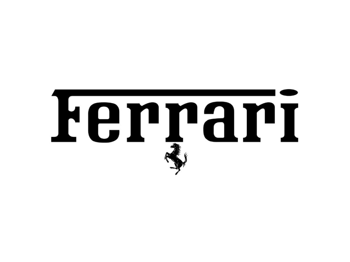
The earliest mark in the timeline is a wordmark, not a shield. The company and team name ran in a black serif, with a miniature prancing horse tucked beneath the word, and the badge appeared on the Scuderia's trucks and equipment. Two details carry the design: the top stroke of the capital F stretched the full length of the word, and a horizontal oval replaced the dot over the i. The lowercase r was drawn so its shape echoed the horse's contours.
1964 to 1983: The Horse Takes Over
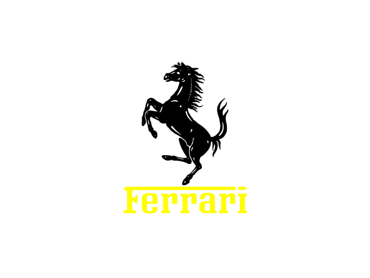
Around 1965 the proportions flipped. Designers enlarged the prancing horse until it became the dominant element, then shrank the Ferrari name, colored it yellow, and set it below the animal so the word read almost like a platform holding the horse up. The wordmark that had carried the badge for a decade became the supporting piece.
1983 to 1994: The Rectangular Badge Arrives
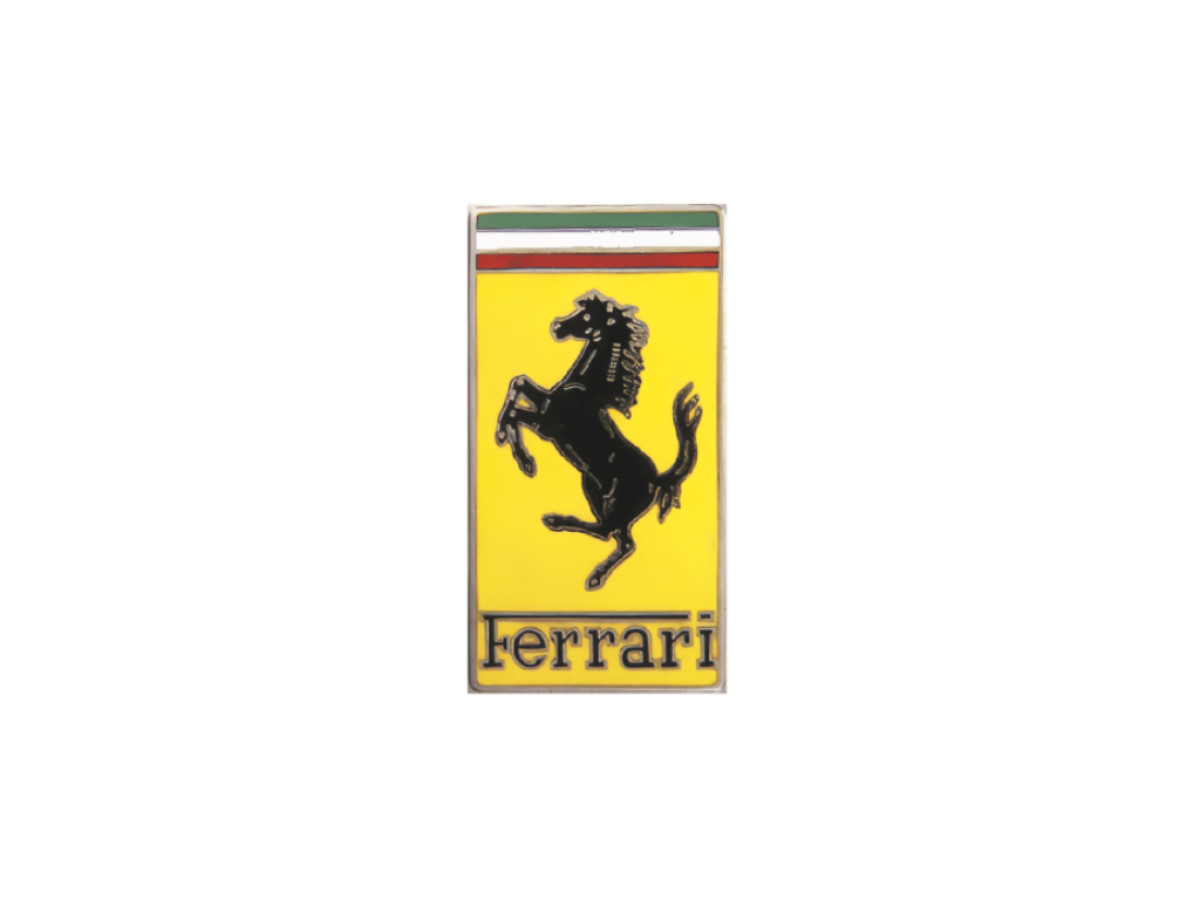
In 1983 the mark moved into a yellow upright rectangle with a glossy enamel finish. A black prancing horse sat in the center, the Ferrari name ran across the bottom with the same elongated F stroke reaching toward the dot on the i, and three horizontal bands in green, white, and red crossed the top. This is the version most people picture as the classic fender badge.
1994 to 1996: Official Status and a Vertical Frame
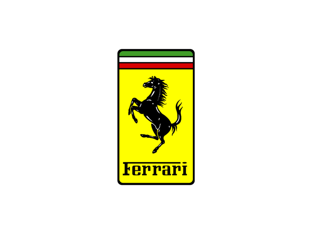
The 1994 update gave the badge official status and cleaned up its construction rather than redrawing it. The horse and name stayed inside a yellow vertical rectangle, now with rounded corners and a thin dark frame running the whole perimeter. The Ferrari lettering was repainted black so it would not blend into the yellow ground, and the tricolor bands stayed across the top.
1996 to 1999: The Marlboro Block
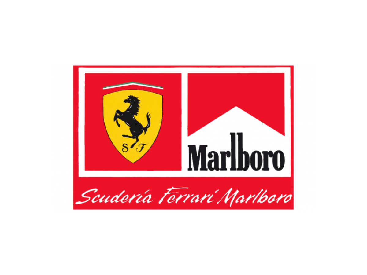
Philip Morris became the team's sponsor in 1997, and the mark absorbed a cigarette brand. A large red panel split into three zones. The top two were equal squares framed in white: the left held the yellow shield with the horse and the script S and F, the right held "Marlboro" in tall thin serif capitals. A band across the bottom repeated the names in slanted script reading "Scuderia Ferrari Marlboro." For a study in how sponsor logos get stitched into a team identity, this is the clearest example in the run.
1999 to 2006: The Stretched Marlboro Banner
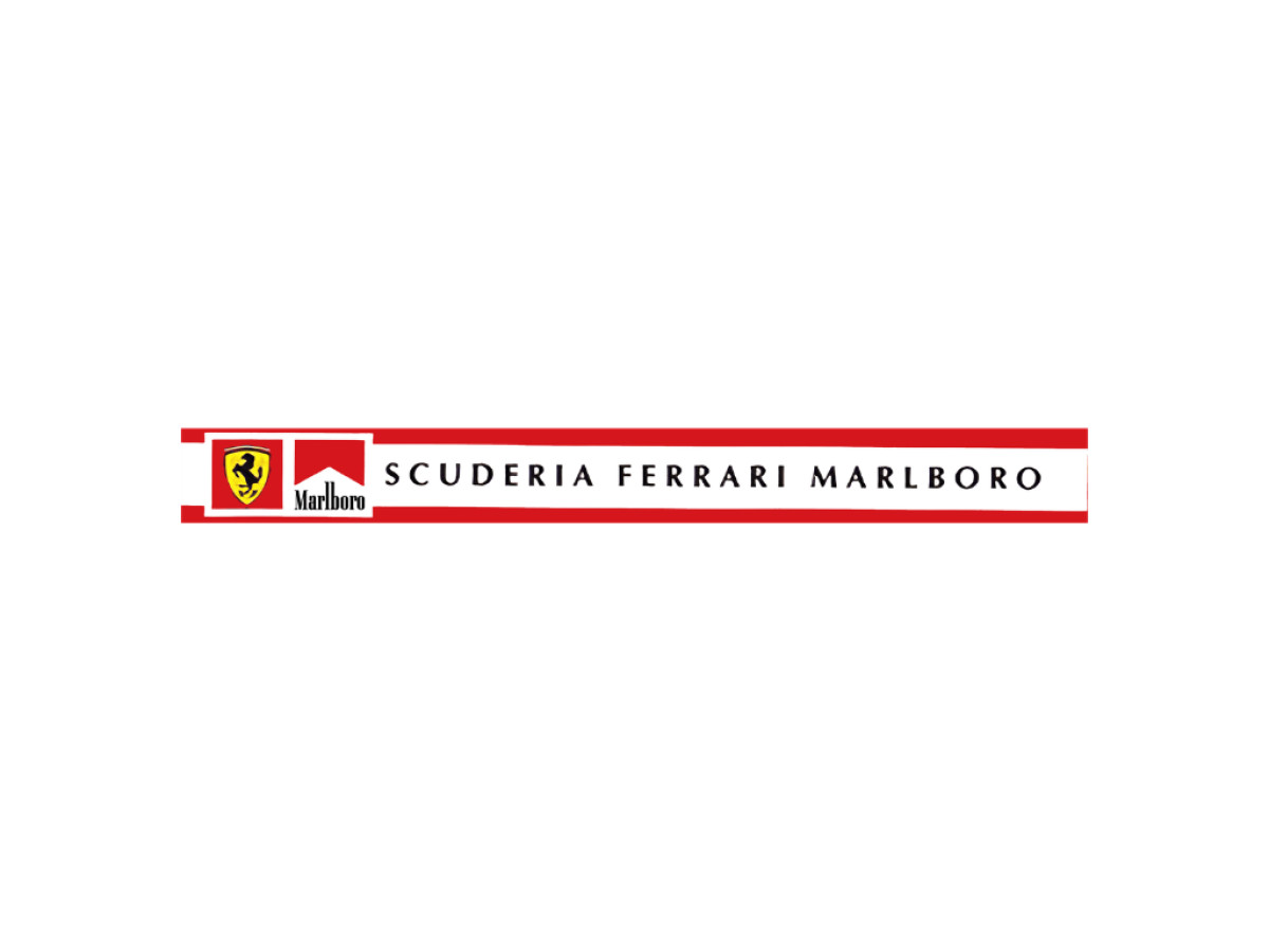
The same elements were regrouped into a long horizontal bar. The shield and Marlboro box shifted to one side, and an expanded "SCUDERIA FERRARI MARLBORO" ran in widely spaced uppercase to fill the width. Two red bands, one top and one bottom, stretched the full length and pulled the whole lockup into a flatter, more elongated shape.
2007 to 2008: A Barcode in Place of a Brand
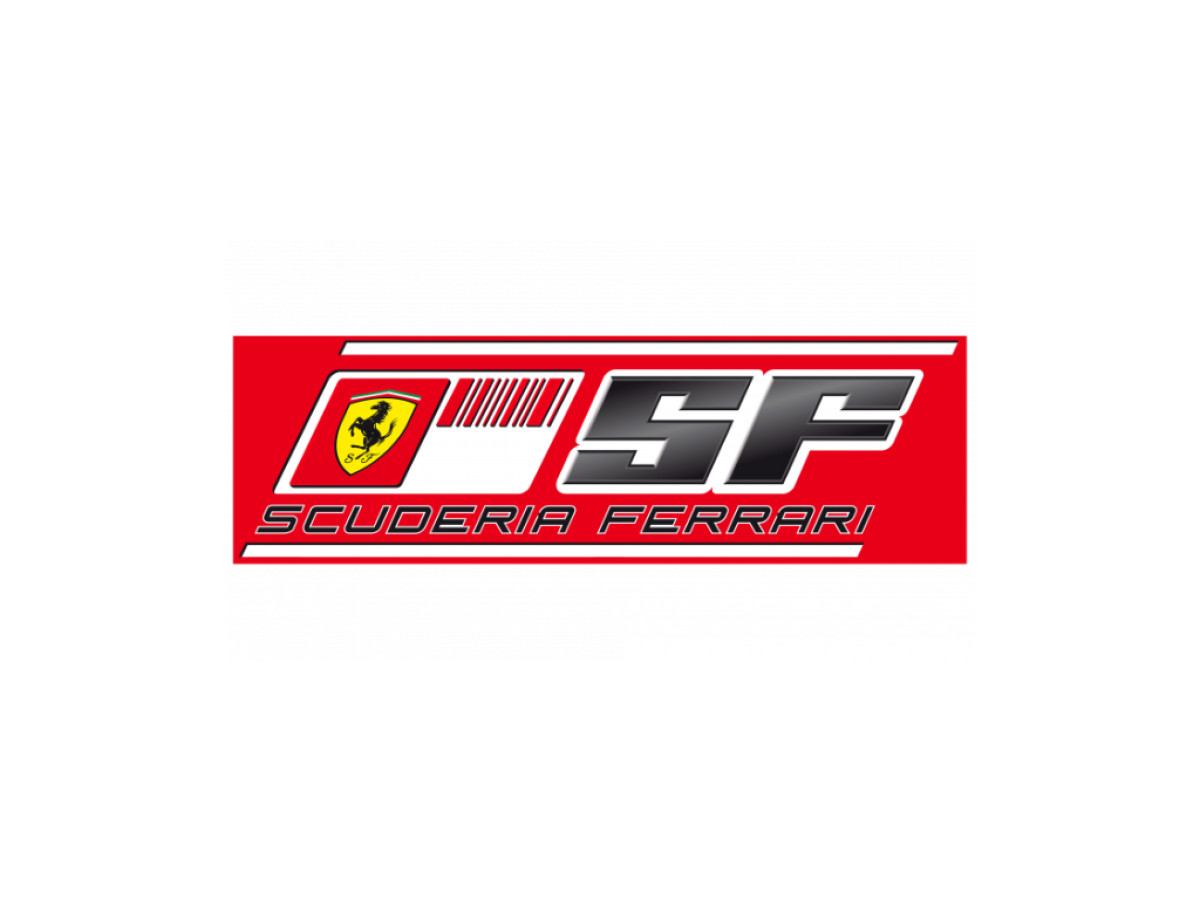
Tobacco advertising bans forced Marlboro's name off the car, and the workaround became one of the more debated marks in the sport. The yellow shield and black horse stayed, but a barcode took the sponsor name's place. A large geometric SF sat to the right, with "Scuderia Ferrari" lettered below on a red field bounded by two lines. Critics read the barcode as hidden cigarette branding, and the argument followed the team into the next version.
2009 to 2010: A Sharper Barcode and a Scarlet Field
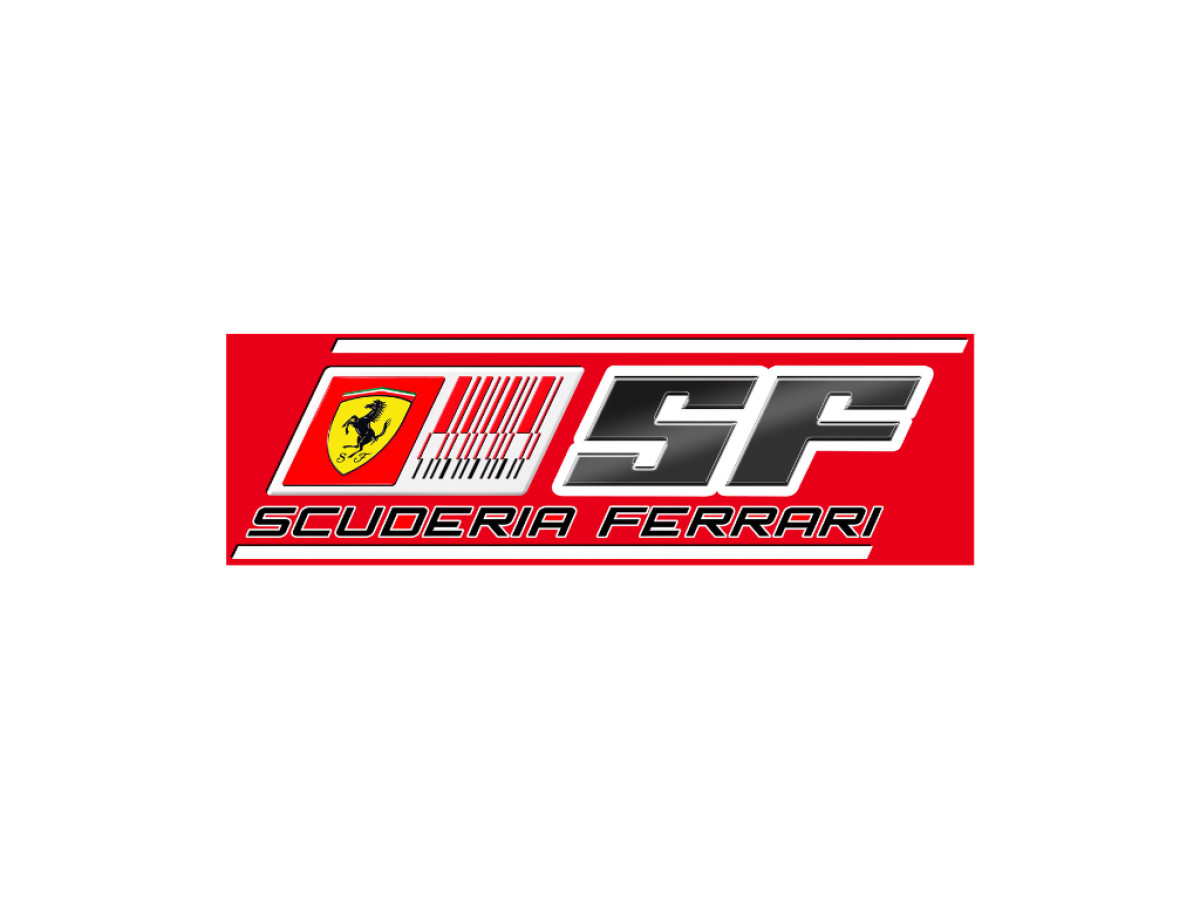
The response was to fine-tune rather than remove. The barcode picked up extra short strokes, the red deepened to a brighter scarlet, and the black SF gained gradient shading and highlights that pushed it forward on the panel. The sponsorship controversy carried on regardless, and the barcode's days were numbered.
2011 to 2017: Back to the Shield and Swept Red
With the barcode gone, the layout returned to something closer to a shield-led mark, though Philip Morris stayed on as sponsor. The yellow triangular scudetto with the horse moved to the upper left, "Scuderia Ferrari" sat in the lower right, and the two rested on a swept red field with wide red stripes. The horse was back in charge of the composition after nearly a decade of sponsor typography running the show.
2018 to 2021: Mission Winnow and the Arrow Lockup
Marlboro references disappeared, and Mission Winnow, another Philip Morris brand, took their place. The classic scudetto sat on the left, a vertical divider split the mark, and a set of red and white chevron arrows sat on the right, formed from negative space so the red shapes cut out of white and the white out of red. The arrows drew regulatory pushback of their own, and the branding did not last.
2018 to Present: The Clean Shield
The mark the car races under today is the oldest idea in the whole run stripped of everything added to it. A triangular crown in green, white, and red sits above a yellow shield, the black prancing horse rears in the center, and the letters S and F flank the base. After two decades of barcodes, banners, and arrows, the team landed on the bare scudetto and left it alone.
What's in the Scuderia Ferrari Logo Today
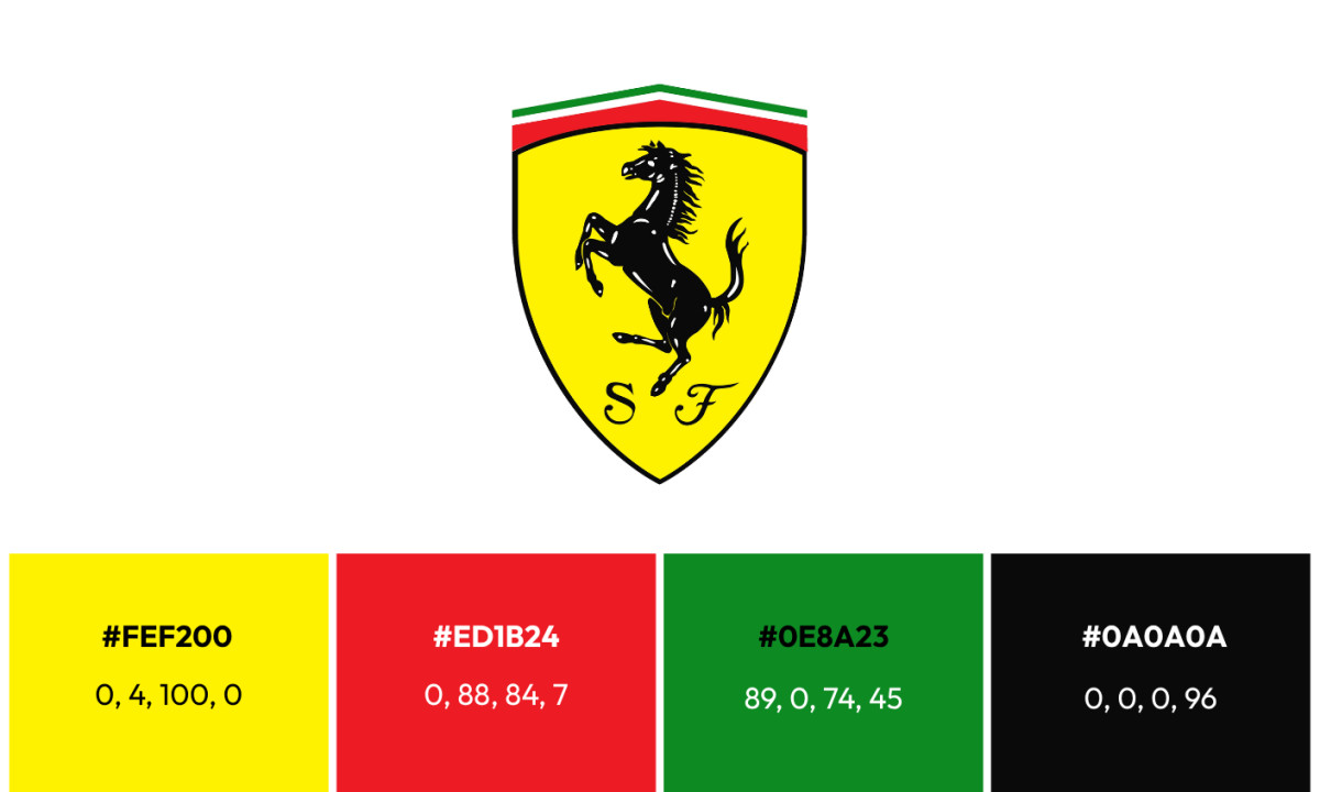
Lewis Hamilton is chasing Ferrari's first title in nearly two decades, and he is doing it under a mark that carries no sponsor at all. After twenty years of barcodes, banners, and arrows bolted onto the badge, the team races today under the plainest version of its own shield. Every element left in place earns its spot.
Black prancing horse: the same horse Countess Paolina Baracca offered Enzo in 1923, drawn black in mourning for her fallen son and read ever since as a shorthand for power and speed.
Yellow shield: the yellow of Modena, Enzo Ferrari's home city, carried unbroken since the shield first settled into form.
Triangular tricolor crown: green, white, and red, the colors of the Italian flag, now shaped into the triangular band that tops the current scudetto.
The letters S and F: the initials of Scuderia Ferrari, the word for a stable where racehorses are kept, sitting at the base of the shield on either side of the horse.
Palette: yellow, black, green, white, and red.
What this logo really is, when you look closely, is a subtraction that became permanent. The 2011 mark had the shield back in charge. The 1983 badge had the tricolor and the horse in the right relationship. The 2018 return did not invent anything. It stripped away the Marlboro block, the barcodes, and the Mission Winnow arrows, kept the four elements that had survived every version, and locked them into a shape clean enough to read at 200 miles an hour, on a cap, or shrunk to a favicon. The strongest move a mark can make is to drop everything it does not need, and the shield racing today is what was left once the team stopped adding.
What the Timeline Actually Shows
The through-line is easy to miss because the packaging changed so often. The horse, the yellow ground, and the S and F have held for decades, while the frame around them cycled through a wordmark, a rectangle, a Marlboro block, a stretched banner, two barcodes, a swept red field, and a set of arrows. The core was never the variable. The sponsors were.
Ferrari has not won a drivers' championship since Kimi Räikkönen in 2007, and its last constructors' title came in 2008. Lewis Hamilton joined the team in 2025, carrying a personal logo built around an ambiguous panther-and-wings mark, and took his first win in Ferrari red at the 2026 Spanish Grand Prix. Through all of it the scudetto has stayed the clean 2018 version. If the pattern holds, a title will not change the shield the season it arrives. Any tightening will come quietly, afterward.
Three Things Designers Can Take From a Badge That Barely Moves
Refinement is a form of confidence. Every real change to the core scudetto is a tightening rather than a reinvention, and the yellow, the black horse and the tricolor never leave the composition. A brand that edits its mark instead of restarting it is making a deliberate design decision, and the discipline shows.
Segmentation works better through form than through copy. The long-running split between the racing shield and the rectangular road car badge lets one horse do two jobs. The shield reads as competition heritage and the rectangle reads as luxury product, and the different frames keep the two from stepping on each other.
The mark you strip back is a statement too. Returning to a bare shield in 2018, after years of sponsor scaffolding bolted onto it, was a bet that the horse can carry the team without any help. Very few brands can drop the extra elements and stay instantly readable. Ferrari can, which is why the plainest version of its mark is also the one racing today.

Looking to apply the same approach to your growing market? We can connect you with the right creative partners.
Browse our Agency Directory to find the most capable agency that can help elevate your brand:
And if you’re curious for more inspiration, don’t miss our other features on standout logo designs in sports.

_86d4907c13b1-preview.jpg)