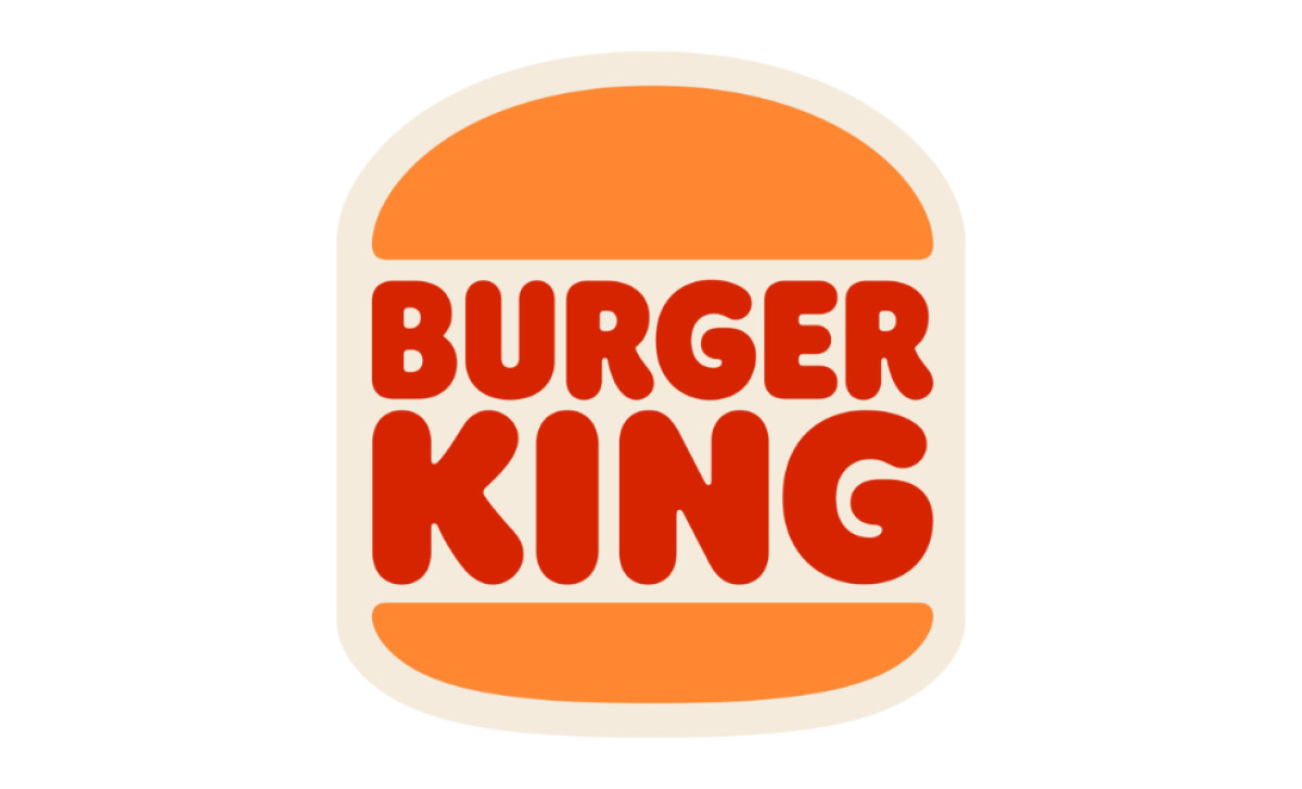
The Burger King logo design captures the brand’s playful energy with bold typography nestled between two bun halves, evoking the joy of a delicious fast-food meal. Its vibrant red and orange palette stimulates appetite, while the custom rounded sans-serif font adds a friendly, approachable vibe. Through this design, Burger King successfully exudes an inviting and memorable brand identity in the fast-food industry.
Burger King Logo Details
The Burger King logo combines vibrant colors and a distinctive typeface to create a strong visual identity. The lettering is set in uppercase, using a heavy sans-serif font that closely resembles Corkboard JNL or Frankfurter Std Normal, with custom modifications like rounded contours. This typography conveys authority and approachability, ensuring the brand’s name is memorable and impactful.
The logo’s color palette is equally vital, featuring bright orange and red as primary colors with a beige background. These hues evoke energy, happiness, and a connection to the appetizing colors of bread, meat, and vegetables.
The logo’s straightforward design represents a burger, with the brand name sandwiched between two bun halves, symbolizing the company’s core product and identity. This simplicity and vibrancy ensure that Burger King’s logo remains distinctive and instantly recognizable in the competitive fast-food market.
Burger King Logo History
Over the years, the Burger King logo has transformed to catch the attention of patrons and design enthusiasts alike. Any professional logo agency can tell you that branding is critical in the fast-food industry: it serves as a visual identifier that shapes perceptions, drives recognition, and fosters customer loyalty.
Let's walk through the history of Burger King's logo design, from its monochromatic beginnings to its recent colorful rebranding.
1953–1954: The Burger King Logo History in Greyscale
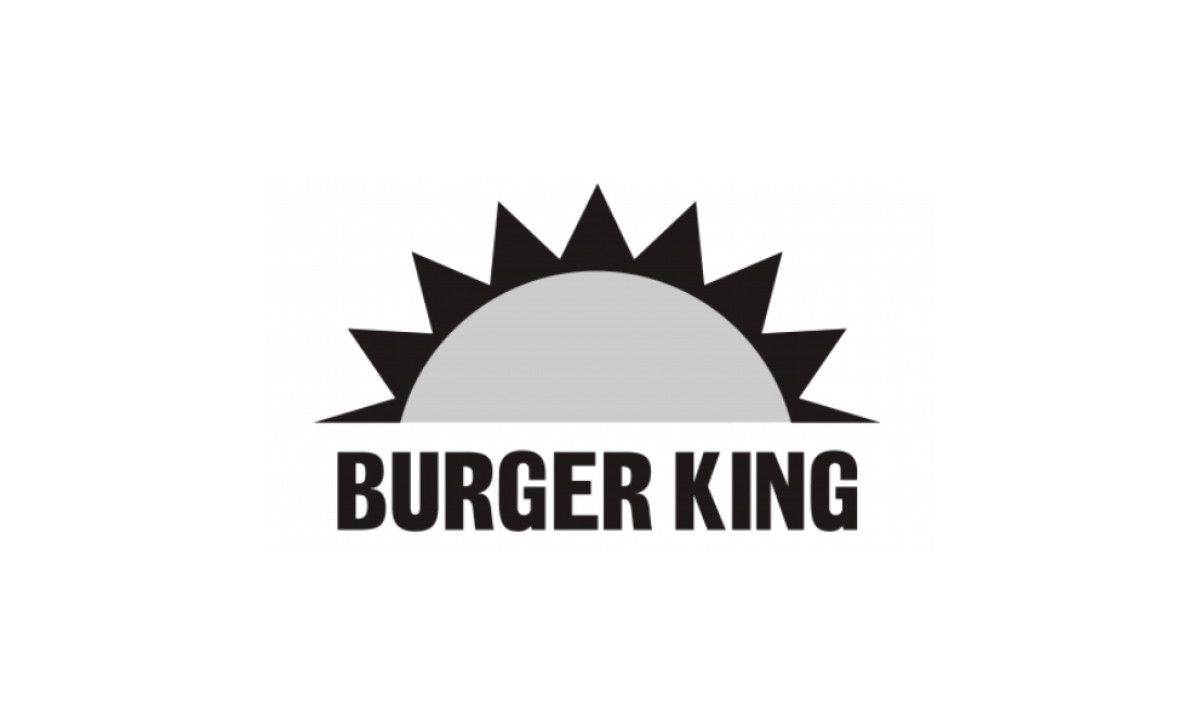
Burger King's original logo was introduced in 1953. Featuring a bold, all-caps wordmark paired with a semi-disc resembling a rising or setting sun, complete with short triangular rays, the design symbolized a fresh start and quick satisfaction. Rendered in a grayscale palette, it conveyed a straightforward yet inviting aesthetic, welcoming diners to a place where a hearty meal awaited.
1954–1957: A Straightforward, Monochromatic Wordmark
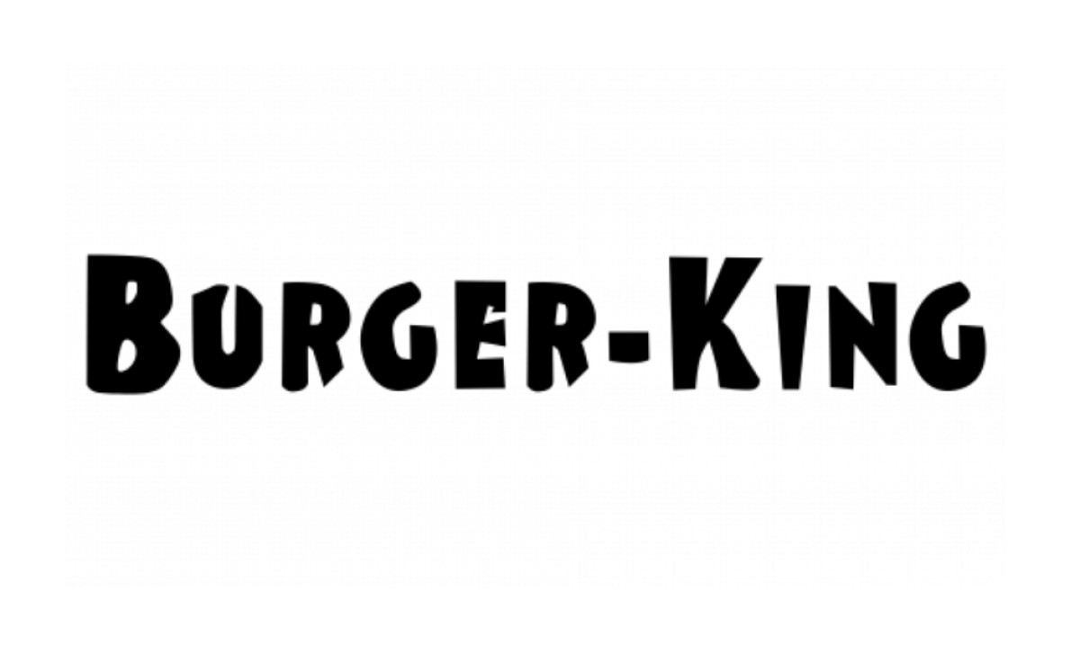
The first iteration in Burger King logo history was a textbook example of minimalist design. This logo featured straightforward typography with no intricate imagery to dilute its message. The layout and composition were consistent throughout, with prominent placement of the brand name ensuring immediate recognizability.
1957–1969: A Quirky King on A Bun
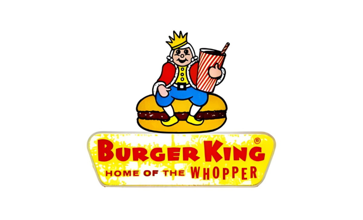
In its third iteration, the Burger King logo embraced a playful yet regal identity by introducing a crowned king perched atop a hamburger throne. The bold addition of the slogan “Home of the Whopper” proudly declared its iconic sandwich as the pinnacle of burger royalty, distinguishing it from other burger branding examples.
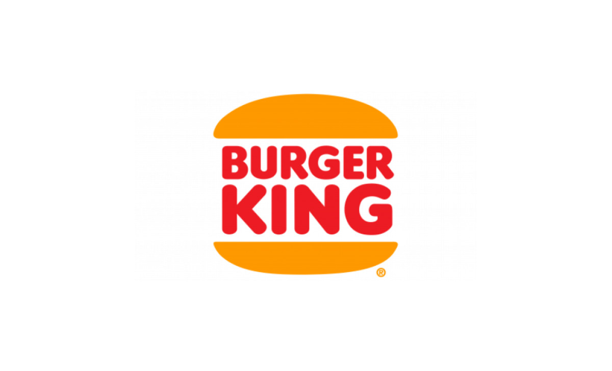
1969–1994: The Birth of the “Bun Halves” Concept
This logo version featured a less complex and colorful design, introducing the "bun halves" concept that will soon become a defining identifier for Burger King. This design also introduced the vibrant red and orange color scheme, intended to stimulate appetite.
1994–1999: A Smooth Refinement
Introduced in April 1994, this refined Burger King logo evolution was a modernized version of its predecessor, featuring a more traditional and solid typeface. The ochre buns were replaced with a slightly more vibrant orange, paired with red accents to create an energetic color palette symbolizing passion and youthful spirit.
1999–2021: Adding a Diagonal Orientation and Blue Swirl
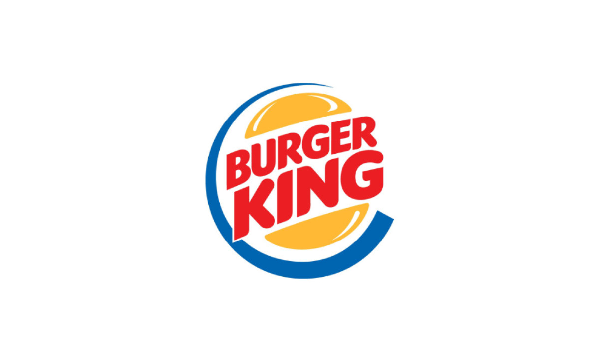
The Burger King logo, over the years, has received minor tweaks. Then, in 1999, the most significant change occurred. The design retained the bun concept, but the wordmark was placed diagonally between the bun halves. Moreover, a blue crescent-like swirl enveloped the logo, adding a modern edge. You might still even see the 1999 logo at some locations as franchises transition to the new branding.
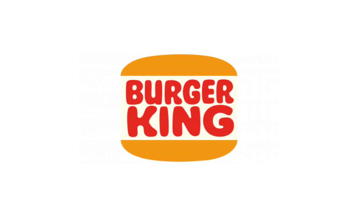
2021–Present: Nostalgia Meets Modern Simplicity
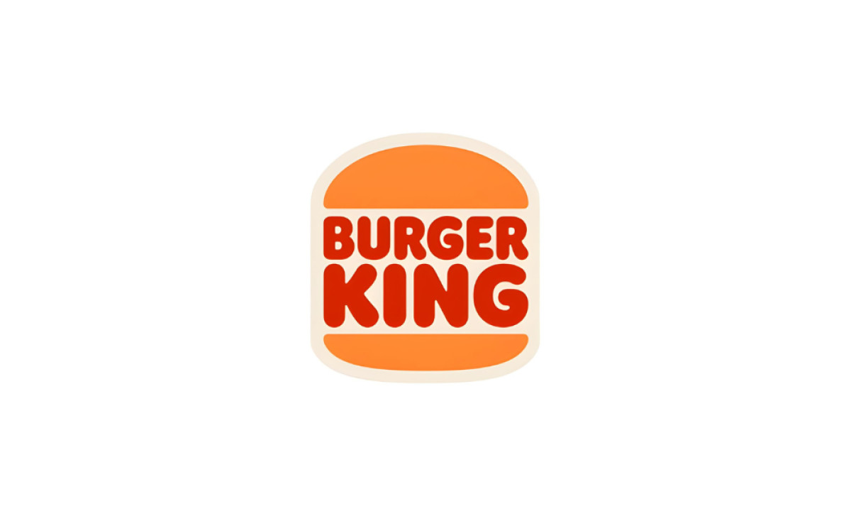
In 2021, Burger King unveiled a logo redesign, a vibrant and delightful blend of nostalgia and modern simplicity. The new design draws inspiration from the classic bun-halves logo, featuring a custom, rounded sans-serif typeface and a flat layout. The new logo's color palette flaunts a vibrant red and orange, giving it a warm, delicious appeal.
Explore more powerful logo design examples.
This rebranding was driven by the need to better align the company's visual identity with its evolving services, including digital and delivery services, while still preserving its distinct elements. The impact on customer perception has been substantial and positive, contributing to reinforced brand recognition and business performance.
Burger King Logo: The Symbol of a Hearty Meal Awaiting
Despite all the design shifts, the Burger King logo through the years has kept its unique symbols that allowed it to maintain a consistent and on-brand image. It's a testament to the power of effective logo design and branding — a silent yet influential brand ambassador that has stood the test of time and trends.
With every bite of a Burger King meal, customers partake in a brand legacy represented by the logo, one that’s rich in history and geared towards a future of continual adaptation and innovation.