
Go find the taco in the Taco Bell logo. Take your time.
Where is the taco in the logo? Nowhere. There is not one, and there never has been. More than half a century in, across redesign after redesign, not a single taco has ever landed on the mark.
That is not an oversight. It is the entire strategy. A chain named after a Mexican dish built its identity around a bell and a purple no fast food rival would touch, then rode that choice to the fourth-largest fast food chain in the United States.
Most people never clock what the logo leaves out. Once you do, the smartness of it is hard to unsee.
Why purple was the smartest color call in fast food
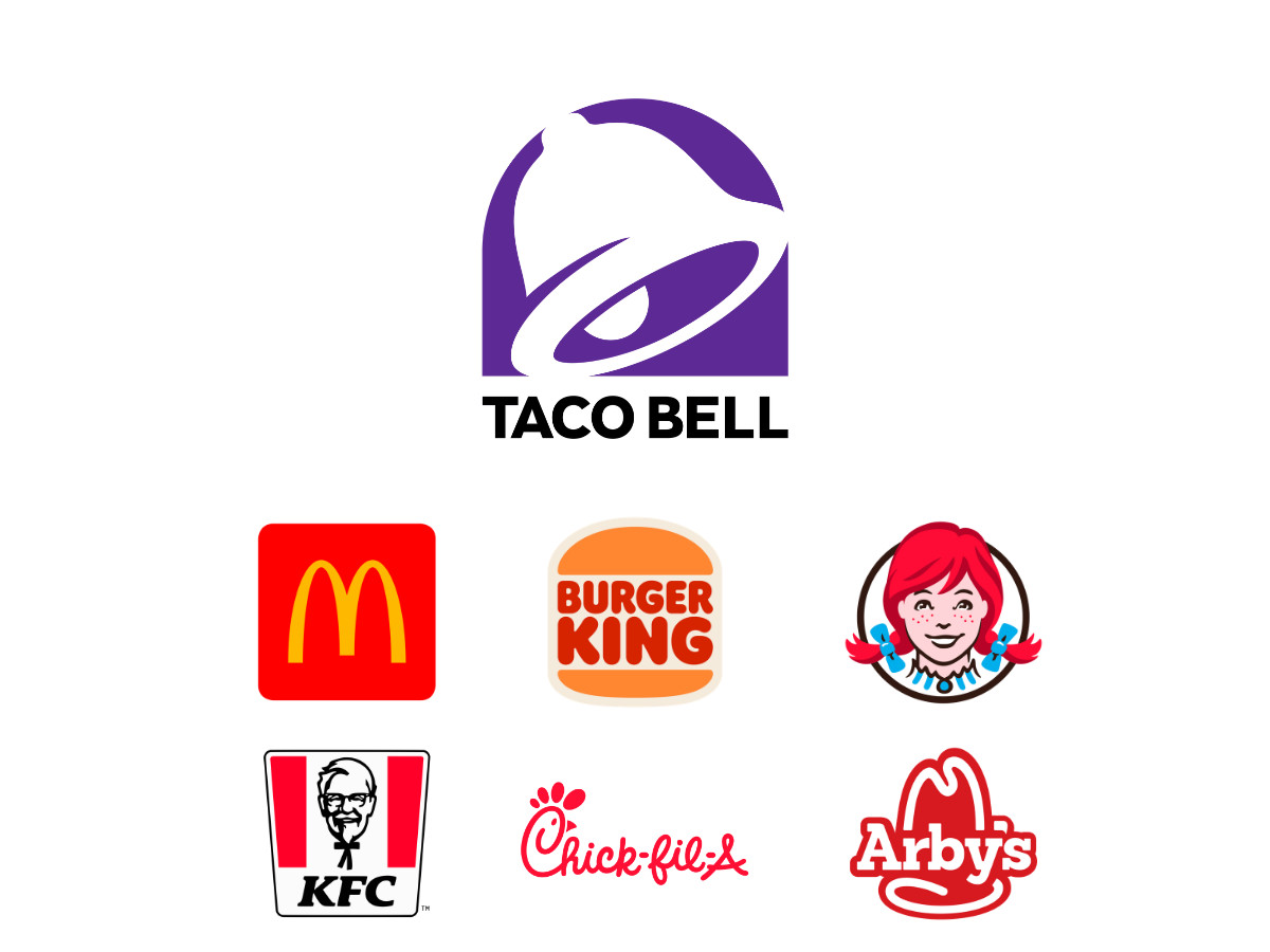
Look at the category first. McDonald's, Burger King, Wendy's, KFC, Arby's, and Chick-fil-A all lean on red, yellow, or both.
The reason is old and well documented: warm tones read as appetite and urgency, and studies cited by Tasting Table show red raising heart rate and pushing the quick, energetic decisions a drive-thru depends on. One analysis of the category found red in roughly 60% of major fast food logos, a pattern branding writers at Morel call deliberate down to the pixel.
Taco Bell looked at that wall of red and yellow and picked purple, a color that sits almost nowhere else in the category.
Purple does not say "crunchy taco." It signals creativity and nonconformity, with a late-night edge, which is a different job from making you hungry. Taco Bell's logo does not try to make you hungry. It makes you notice.
That is the strategic value hiding in plain sight. On a highway sign, a strip mall, or a delivery app grid stacked with red and yellow tiles, the purple bell is the mark your eye lands on first. Taco Bell claimed the space nobody else wanted.
The 2016 shift from hot pink and bright purple to a calmer two-tone purple and black read as the brand growing up. It kept the color that owned its category while dropping the parts that had started to look dated.
The bell says three things at once
The bell works on three levels, and each one carries weight.
Literally, it is Glen Bell's surname. Bell opened the first stand in Downey, California, in 1962, and the symbol turns his name into an object, per the company history compiled by Strategic Management Insight.
Regionally, it points to the mission bells of California's Spanish colonial history. Taco Bell was born in southern California selling Mexican-inspired food, and the bell nods to both the place and the cuisine without a single literal ingredient.
Behaviorally, a bell is an announcement. It says something is about to happen, which is the exact register of the brand's "Live Más" campaign. The mark tells you to pay attention before you have read a word.
The shape has quietly moved over the years. Early versions sat static and symmetrical; the current bell carries a slight diagonal that suggests it is mid-swing, ringing rather than resting.
One detail is worth knowing. The inner curve of the bell frames a piece of negative space that a lot of people read as a smile. Lippincott has never said the smile was intentional, and it does not need to be, because the eye finds it either way.
And for anyone still hunting the taco: some fans argue the golden circle inside older bell versions resembles a taco shell. If that reading holds, the taco was tucked inside the bell the whole time.
The 2016 redesign: what Lippincott stripped, and why the internet hated it
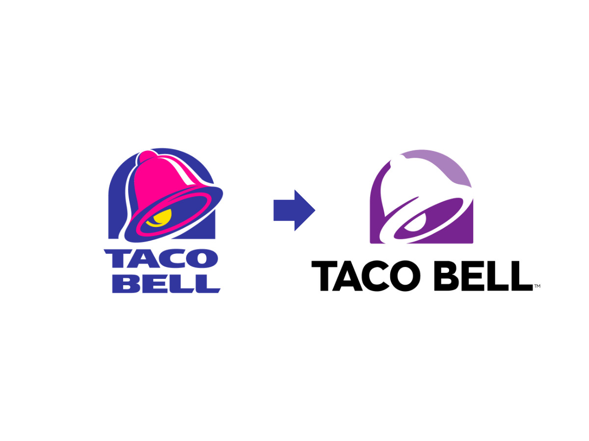
Taco Bell unveiled the current direction on November 14, 2016, timed to the opening of its Cantina flagship in Las Vegas. The brand built it in-house with the creative consultancy Lippincott, the same firm behind the 1994 mark, working alongside Taco Bell's internal design group, as the company laid out in its own brand evolution announcement.
The stated goal: fit the "Live Más" lifestyle and work natively on phones, app icons, and delivery platforms, where the old three-dimensional bell broke down at small sizes.
Lippincott's move was to open up the bell so its outline could hold patterns, textures, and images, then pair the icon with a simpler wordmark. Out went the gradients, the drop shadows, the hot pink, and the faux-3D. In stayed the bell, the purple, and the name, each cut back to its plainest geometric form.
The reaction was rough. Designers and fans called the result bland and generic, compared it to a tech startup logo, and kept the jokes running for weeks, as DesignMantic documented at the time.
Here is what the critics missed. A quieter logo let the marketing carry the noise. The campaigns, the food drops, and the brand collaborations moved to the front, and the logo held steady behind them as an anchor instead of a competitor for attention.
The wordmark itself is a custom proprietary sans-serif built for the rebrand, with geometric letterforms, rounded terminals, and slightly loose tracking. Every typeface Taco Bell has used in its identity has been custom, as Fabrik Brands notes, and you cannot download this one. That is a deliberate brand-protection call, not an oversight.
The 2023 update almost nobody noticed
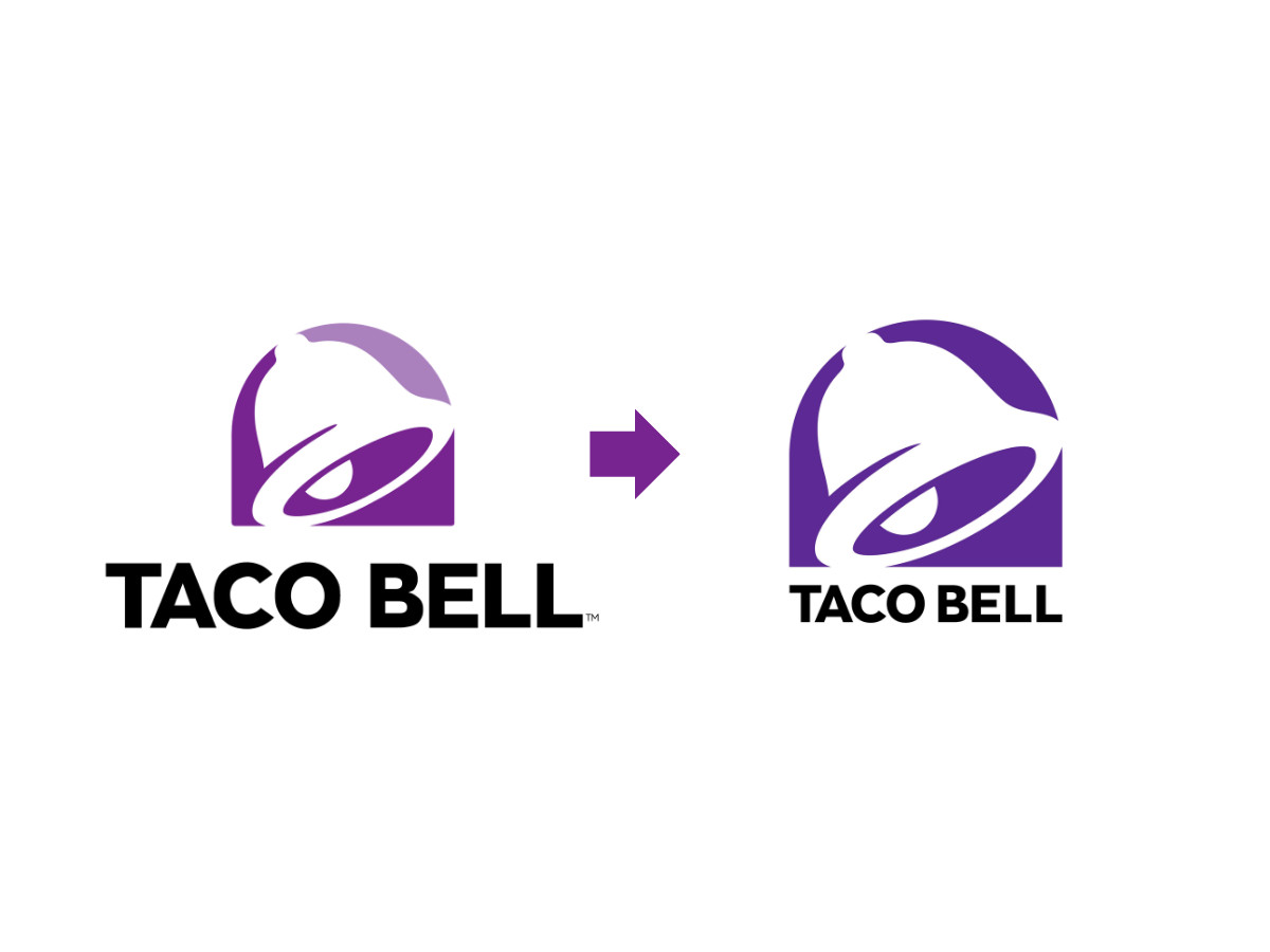
In 2023, Taco Bell adjusted the logo again, and it did so without a press release. The rounded edges came off, the proportions tightened, and the bell outline sat transparent against a single unified purple.
No announcement. No campaign. The brand changed its most visible asset and moved on, and that quiet is its own lesson. A company this sure of its mark does not need to explain it.
What the bell teaches
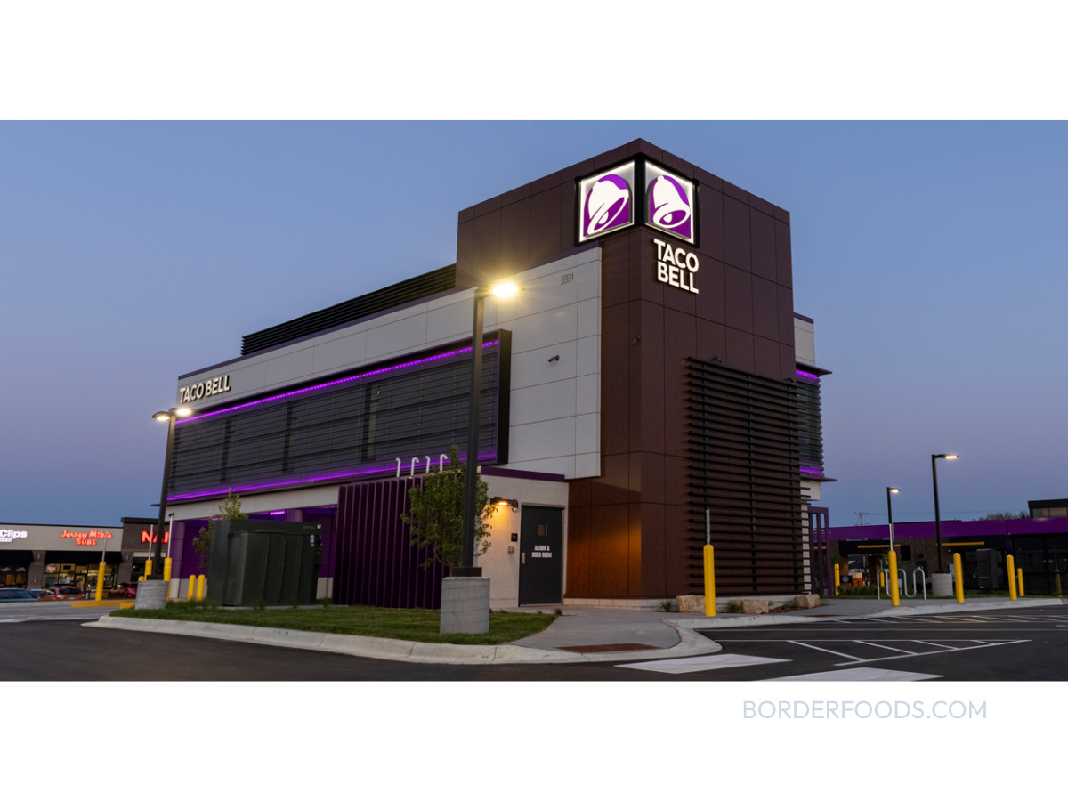
Among major U.S. fast food chains, Taco Bell owns the one logo that ignores the food completely. There is no product in it, and none of the red-and-yellow palette the rest of the category runs on. By system sales it now ranks as the fourth-largest fast food chain in the country, and it has become one of the industry's steadiest growth stories, taking market share across income brackets while rivals stall, with same-store sales climbing in a market where most chains struggled and where analysts now call its brand strength remarkably consistent.
The takeaway has nothing to do with tacos or bells. Sometimes the strongest brand move is to claim the space every competitor left empty, then hold it long enough that the space becomes yours.
For more logo breakdowns in the same vein, see our features on the Louis Vuitton monogram, the Lego wordmark, and the USMNT crest heading into the 2026 World Cup, or meet the most influential graphic designers of all time.
Our team ranks agencies worldwide to help you find a qualified partner. Visit our Agency Directory for the Top Logo Design Companies as well as: