Walmart Logo: Key Points
Let’s be honest—no one wakes up thinking about the Walmart logo.
But as someone who tracks branding systems the way most people track their step count, I couldn’t ignore what happened in early 2025.
After 17 years of leaving the logo design mostly untouched, Walmart rolled out a refreshed identity that, on the surface, looks... familiar.
And that’s exactly the point.
Here’s how a brand built on rollback signs and discount shelves ended up with one of the most digitally resilient identities in global retail.
- Walmart’s Origins: Built on Price, Shaped by Pragmatism
- How the Walmart Brand Evolved With Its Business Strategy
- Walmart Logo Evolution
- The Symbolism Behind Walmart’s Spark and Modern Identity
- Design Elements: Colors, Typography, and Simplicity in the Logo
- Walmart’s Logo Recognition and Global Brand Perception
- From ‘Always Low Prices’ to ‘Live Better’: The Slogan Story
- The Walmart Logo: A Legacy of Clarity and Consistency
- Walmart Logo: FAQs
Walmart’s Origins: Built on Price, Shaped by Pragmatism
The Walmart brand started in 1962 with a simple premise: cut costs, pass on the savings.
Sam Walton’s first store in Rogers, Arkansas, didn’t need a brand book. It needed a sign that said "discount" without saying a word.
This direct approach influenced the company’s early branding, which used practical, no-nonsense visuals that matched its retail strategy.
How the Walmart Brand Evolved With Its Business Strategy
As the business scaled through the 1970s and 1980s, Walmart’s identity expanded with it. From warehouse clubs to neighborhood markets, the brand served different customer needs.
This growth called for a visual identity that could stretch across store formats and marketing channels.
The evolution of the Walmart logo tracks closely with these milestones, shifting to meet new expectations while holding onto its original values.
Walmart Logo Evolution
Want to understand Walmart logo evolution from the ground up?
From early wordmarks to the now-familiar spark, these key milestones highlight why it remains one of the best eCommerce & retail logo designs in the industry.
1962–1964: The First Wordmark
A plain sans-serif wordmark. No flair, no emblem. Just the name on a storefront. Pure function.
1964–1967: The Hyphen and “Discount City”
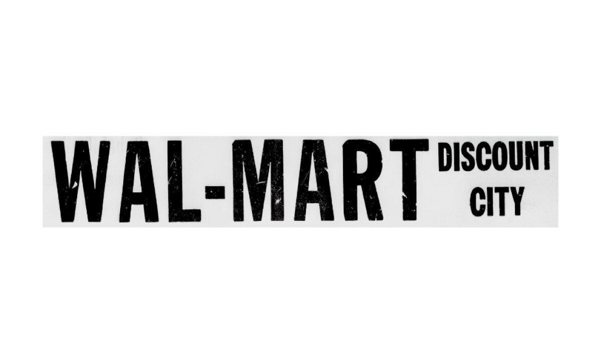
The hyphen shows up, connecting “Wal” and “Mart.” “Discount City” gets added underneath.
Multiple versions floated around, some boxed, some circular. None too polished.
1967–1968: Boxed Letter Design
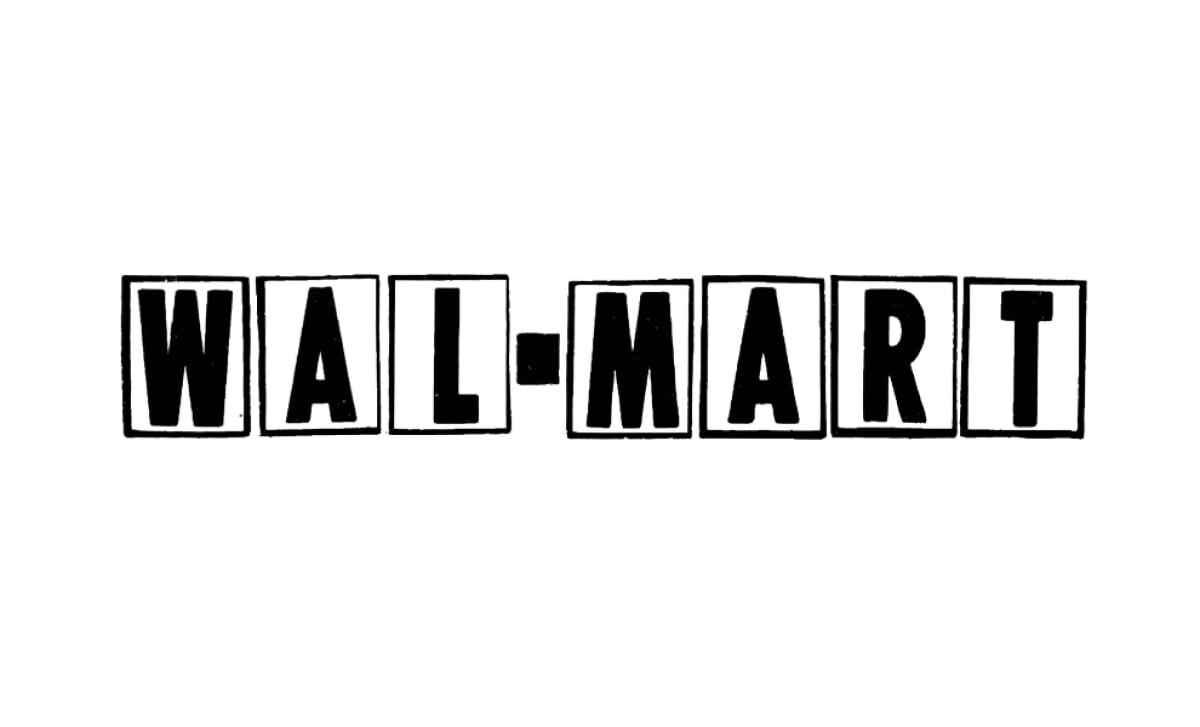
Boxed experiments begin. Each letter sits in its own black rectangle. Legible? Yes. Memorable? Not quite.
1968–1970: Uniform Box Refinement
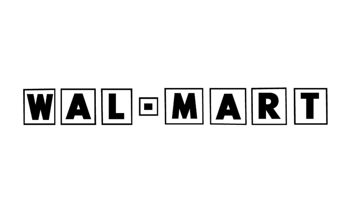
Boxes shrink and line up better. The hyphen gets its own square. This one at least looked intentional.
1970–1975: Reversed Color Scheme
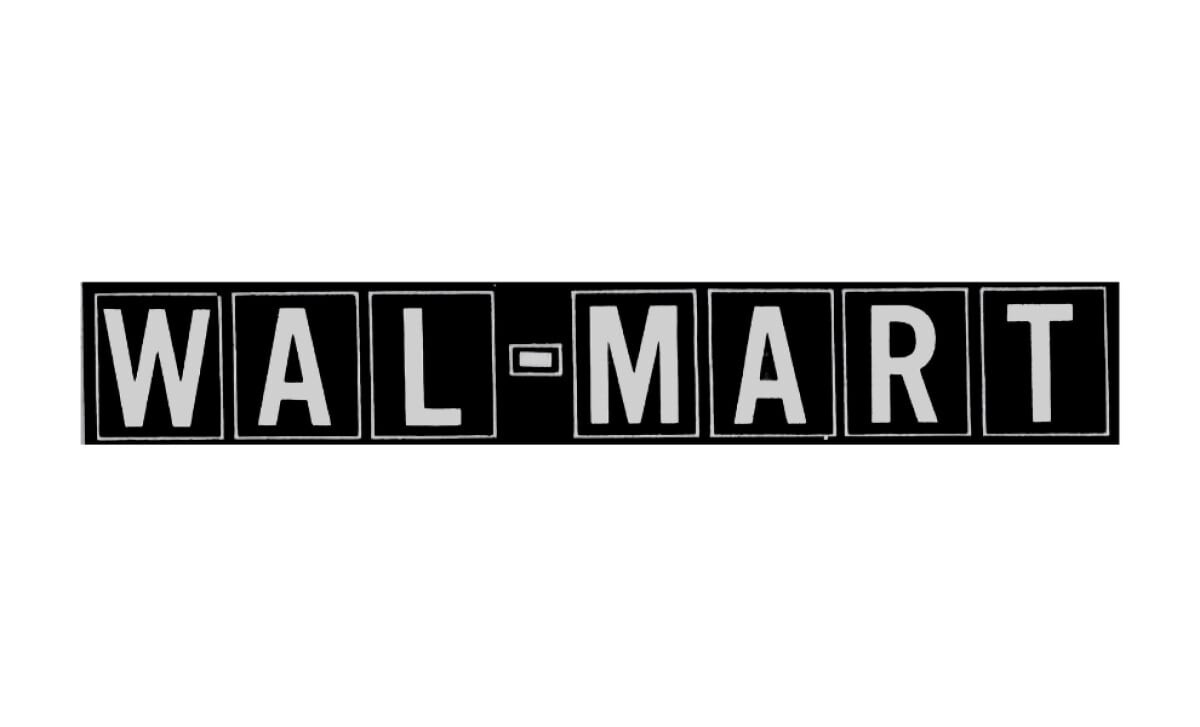
The boxes stay, but the colors flip. White boxes, black letters. Spacing improves. It’s cleaner but still stiff.
1975–1977: Western Typeface Introduced
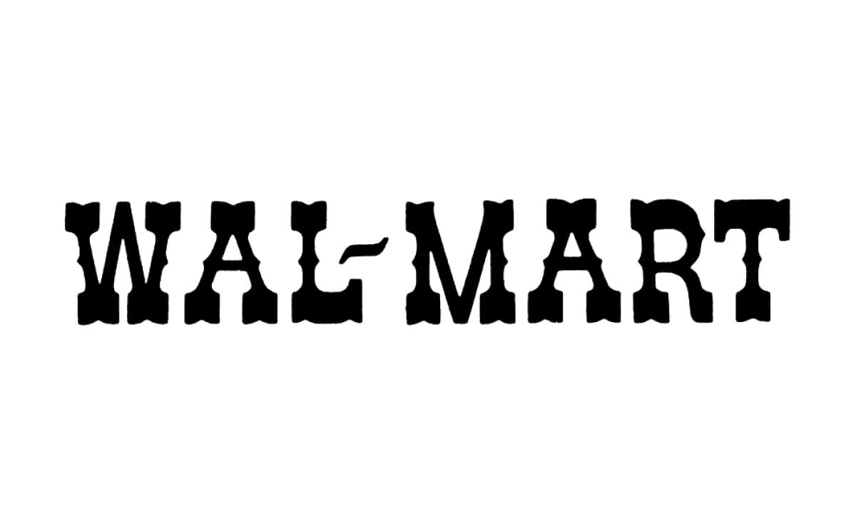
Out go the boxes. In comes a Western-inspired serif with a handmade vibe. It nods to Walmart’s Americana roots.
1977–1981: Blue Wordmark Emerges
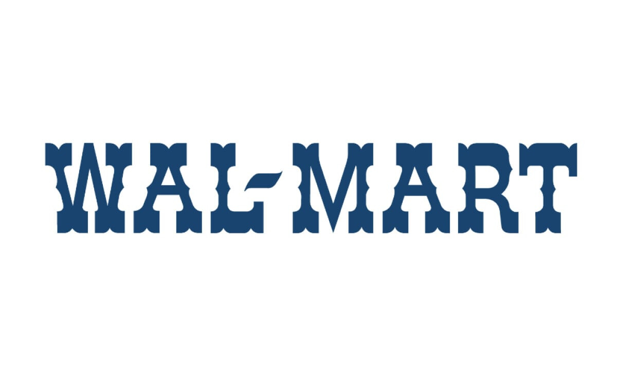
The font remains, but now it’s dark blue. A small change that introduces blue as a key brand color.
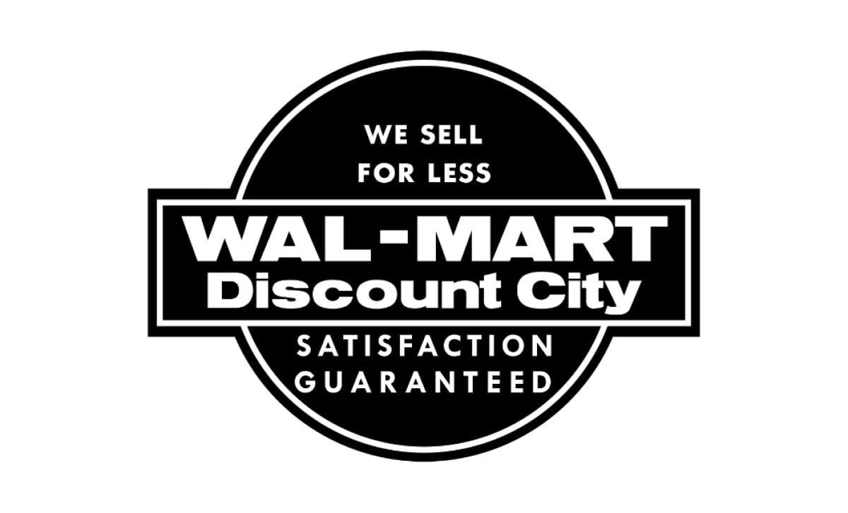
1981–1992: Boxed and Bold
Antique Olive Black takes over. The wordmark is boxed, bold, and shouting confidence. This is Walmart’s heavyweight era.
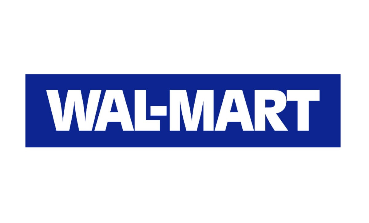
1992–2008: The Star Period
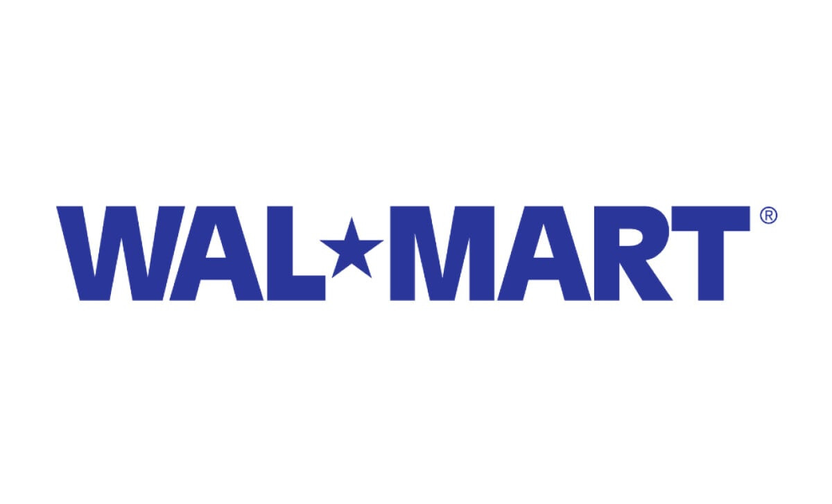
The star period. “Wal*Mart” drops the box and adds an asterisk. A symbolic shift that feels subtle but deliberate
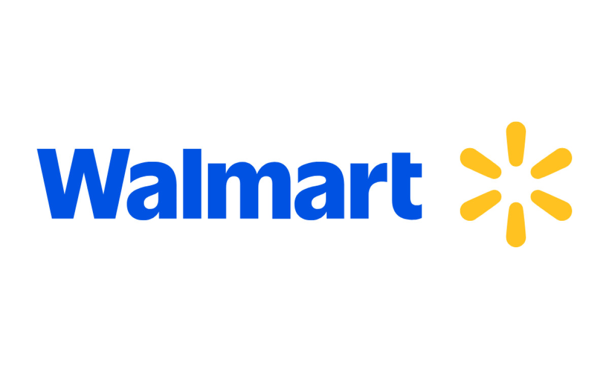
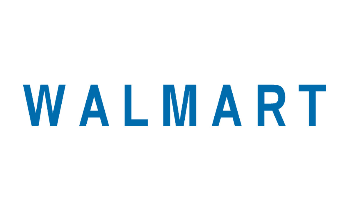
2008–2025: The Spark Arrives
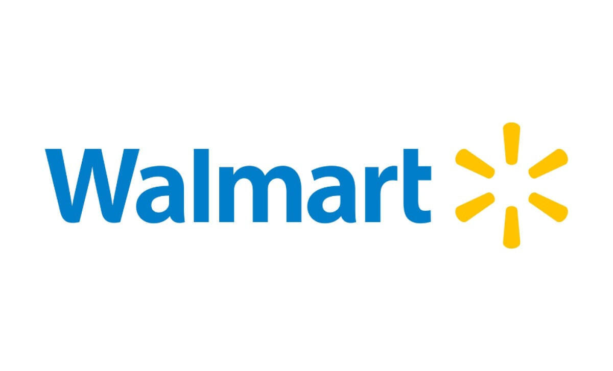
The spark lands. Walmart loses the hyphen, switches to a softer, mixed-case font, and introduces the yellow six-pronged icon. It’s approachable and everywhere, from trucks to app icons.
These versions, taken together, tell the story of Walmart logos over the years. They’re practical, scalable, and increasingly designed with emotional clarity.
2025: Refining a Legacy Logo
Walmart's first brand refresh since 2008 just droppedA bold and daring new direction pic.twitter.com/a8L24osGJX
— Morning Brew ☕️ (@MorningBrew) January 13, 2025Walmart’s 2025 logo update looked like a minor update, but as someone who dissects brand systems for a living, I can tell you—this one’s built for scale.
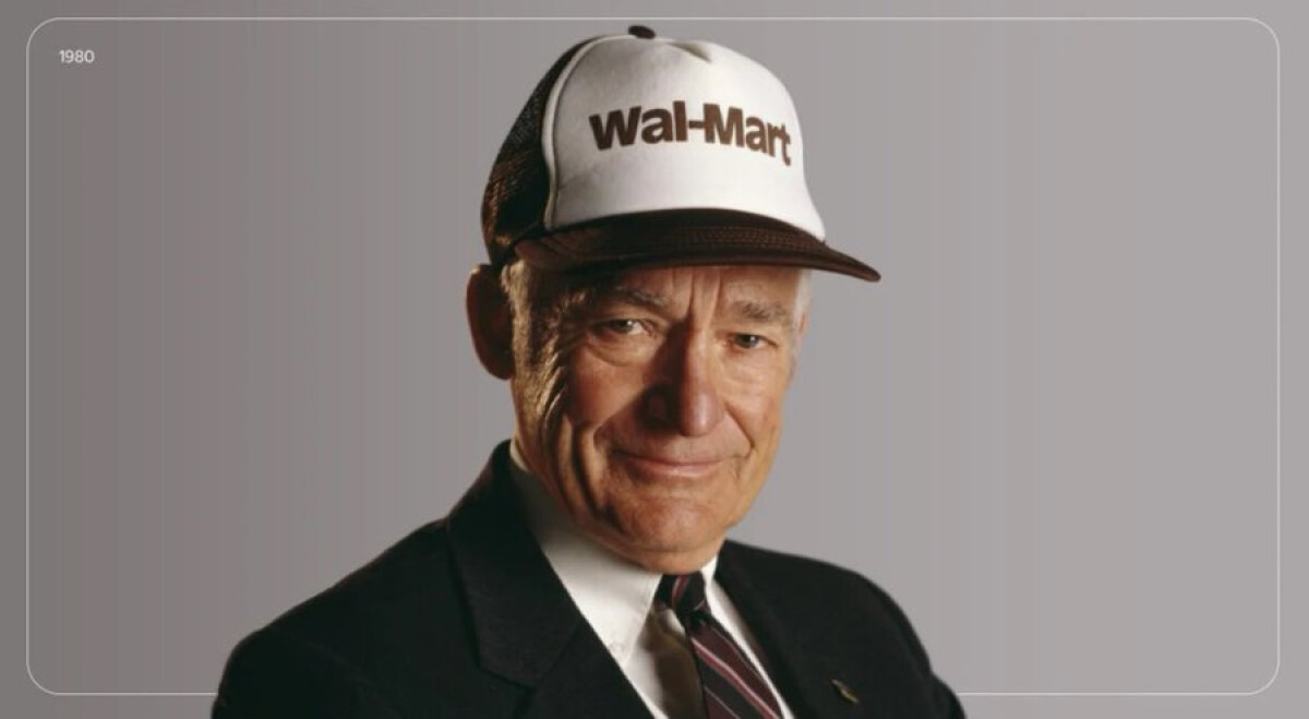
The wordmark now uses a custom typeface rooted in Antique Olive, tweaked to echo the hand-drawn lettering on Sam Walton’s trucker hat.
It’s not nostalgic for nostalgia’s sake. It’s a quiet nod to heritage, tuned for clarity across devices.
William White, Chief Marketing Officer for Walmart U.S., explained the intent of the redesign:
“While the look and feel of our brand is more contemporary, our refreshed brand identity reflects Walmart’s enduring commitment to both Sam’s principles and serving our customers however they need us.”
The spark? Still there, now with smoother curves and tighter spacing. It performs better in app icons and signage, and feels more like a flexible asset than a fixed badge.
This is what makes it a strong Walmart emblem in today’s digital-heavy landscape.
Color-wise, True Blue and Spark Yellow anchor the palette. New supporting tones have been added, but in one brand panel I watched, a strategist flagged the system as still feeling a bit boxed in.
They weren’t wrong. The palette doesn’t yet stretch far enough for a digital-first brand. It’s one area where the Walmart logo design could evolve further.
The Symbolism Behind Walmart’s Spark and Modern Identity
Let’s talk about the Walmart symbol.
When it debuted in 2008, the spark was clean geometry: six rays spaced at 60-degree intervals. It looked balanced, but a little cold.
Over time, people read more into it: some see Walmart’s six core values in each sparklet. Others see the original idea that sparked Sam Walton’s vision.
I see a versatile brand asset that rewards interpretation.
In 2025, the spark got some polish. Softer angles, better spacing, and more breathing room made it more readable across screens. Especially on small sizes, that polish matters.
Here’s how I break down its current form:
- Structure: Maintains rotational balance with smoother edges and refined spacing
- Function: Scales cleanly from packaging and signage to mobile apps and favicons
- Symbolism: Open to interpretation, but widely recognized as shorthand for reliability
This is one of the rare moments in modern branding where symbolism is just smartly sustained.
Design Elements: Colors, Typography, and Simplicity in the Logo
Let’s break down what works…and why:
- Color Palette: True Blue creates balance. Spark Yellow energizes. Bentonville Blue handles contrast in digital environments. I’ve found this combo holds its own in both high-exposure retail displays and UI frameworks.
- Typography: The wordmark’s updated typeface draws from Antique Olive but softens it. Wider characters help with legibility across digital and physical formats. It doesn’t shout, but it shows up strong.
- Symbol Design: The spark still leads. Softer edges and improved spacing between it and the wordmark give each room to breathe. This subtle spacing makes the whole mark feel more relaxed and confident.
- Adaptability: The system works across packaging, storefronts, media, and mobile. The icon doesn’t need the wordmark to be recognized…and that’s the mark of a mature identity system.
This redesign shows confidence through restraint. It refines what customers already trust, strengthening Walmart’s image of reliability and approachability through clear, deliberate design choices.
Walmart’s Logo Recognition and Global Brand Perception
Walmart’s logo isn’t flashy but steady. You see it on trucks, receipts, employee badges, and app icons. That kind of presence builds recognition without needing to say much. Familiarity becomes the signal.
Where competitors refresh every few years to chase attention, Walmart keeps the noise low.
Target leans into minimalism. Kroger softens with rounded edges and playful color. Walmart stays put. The identity holds because it doesn’t try too hard.
From ‘Always Low Prices’ to ‘Live Better’: The Slogan Story
Walmart’s current slogan, “Save Money. Live Better.”, was adopted in 2007 and still appears in-store and in advertising. Earlier slogans focused only on price.
This one adds a human benefit. It connects the act of saving money with the improvement of daily life.
The slogan draws from a 1992 speech by Sam Walton, in which he said lowering prices for families was the best way to make a positive difference.
This idea is reflected in the tone of the logo: approachable, open, and service-oriented.
The Walmart Logo: A Legacy of Clarity and Consistency
Walmart’s latest logo update doesn’t ask for applause. It fits. It looks right on screens, in stores, and on packaging. The refinements are there if you squint, but most won’t notice, and that’s the point.
If you’re thinking about brand systems for scale, take a long look at the evolution of the Walmart logo.
It’s not a redesign to get attention. It’s a long game, and it’s winning.
For retail and global consumer brands, strong identity design starts with clarity, recognition, and adaptability.
Planning a logo refresh that builds trust and longevity?
Our team ranks agencies that specialize in large-scale branding systems. Visit our Agency Directory to explore top firms in:
1. Top Branding Agencies2. Top Logo Design Companies3. Top Digital Marketing Agencies
You can also browse our Best Logo Designs section to see more examples of enduring and adaptable brand identities.
Walmart Logo: FAQs
1. Is the 2025 update a redesign or a refresh?
It’s a refresh. Walmart kept the core elements in place and focused on refinement. The wordmark now uses a custom typeface, and the spark symbol was redrawn with smoother curves and better spacing for digital use.
If you’ve followed the Walmart logo evolution over the years, this feels like a natural next step rather than a departure.
2. What does the spark symbol actually represent?
The company describes it as a beacon, something that guides people through the Walmart experience. Over time, it has picked up more meaning.
Some link the six points to Walmart’s values, like service and respect, while others see it as a reference to Sam Walton’s original spark of an idea.
The Walmart symbol works because it remains simple and recognizable across formats.
3. Why does the Walmart logo matter if it rarely changes?
Because that’s part of its strength. The Walmart logo stays consistent across stores, packaging, screens, and signage, which builds familiarity and trust.
For brand teams managing visual systems at scale, the evolution of the Walmart logo shows how small, thoughtful changes can support long-term recognition without losing what people already know.