
Nonprofit website design has become part of fundraising rather than a branding exercise. As donor bases shrink and giving becomes more concentrated, the website has to earn trust, explain impact, guide visitors to the right action, and help first-time donors stay connected.
In this guide we cover the nonprofit website best practices that matter most now, including clear paths for every audience, a frictionless donation flow, visible proof of impact, recurring giving that feels like membership, and a deliberate next step after the gift.
Each practice includes a real example and a framework for deciding when it is time to redesign.
Nonprofit Website Design: Key Findings
- Overall donor retention was 43.3%, but new-donor retention stayed flat. Converting a first gift into a second is the sector's biggest unsolved challenge.
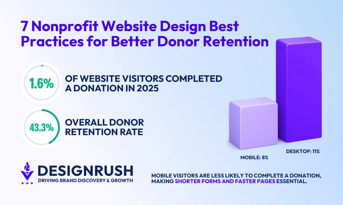
- Only 1.6% of nonprofit website visitors made a donation in 2025, so small points of friction carry real cost.
- Monthly revenue rose 12% in 2025 and made up 27% of all online revenue, while donor-advised fund revenue jumped 44%, which are channels a single Donate button ignores.
Nonprofit Websites Have Less Room for Friction After a 3.6% Donor Drop
Nonprofit website design now has a direct role in fundraising performance, donor retention, and discovery.
With donor counts down 3.6% in 2025, reported by Fundraising Effectiveness Project (FEP) and giving growth concentrated among major donors, nonprofits have less room for confusing navigation, weak donation paths, or buried impact proof.
The retention challenge adds more pressure.
FEP reported 43.3% overall donor retention, while new-donor retention remained flat, making post-gift pages, impact updates, recurring giving prompts, and follow-up journeys central to donor growth.
1. Design for Donors, Funders, Decision-Makers, and Activists
“Most nonprofit sites are built like brochures. They treat every visitor the same, with one homepage, one navigation, and one generic ‘Learn More’ or ‘Donate’ button,” says Roberta Camp-Albert, Business Development Manager at ForeFront Web.
“A site that actually drives action separates people by what they are there to do and gets them to it fast.”
- A foundation officer needs financials, program reports, and outcomes data within two clicks.
- An individual donor needs an emotional entry point and a fast donation path.
- A prospective monthly donor needs to understand what the organization’s membership or giving program includes
- Donor-advised fund supporters may need grant instructions, while activists may be looking for a petition, campaign update, or sign-up form.
This makes information architecture one of the most important nonprofit website design decisions. Each audience should be able to recognize its path without digging through unrelated content.
It also matters for revenue. M+R Benchmarks 2026 found that donor-advised fund revenue increased 44% in 2025. A nonprofit site without a visible DAF path may be missing a growing giving channel.
Pacific Environment Gives Clear Paths for Every Supporter
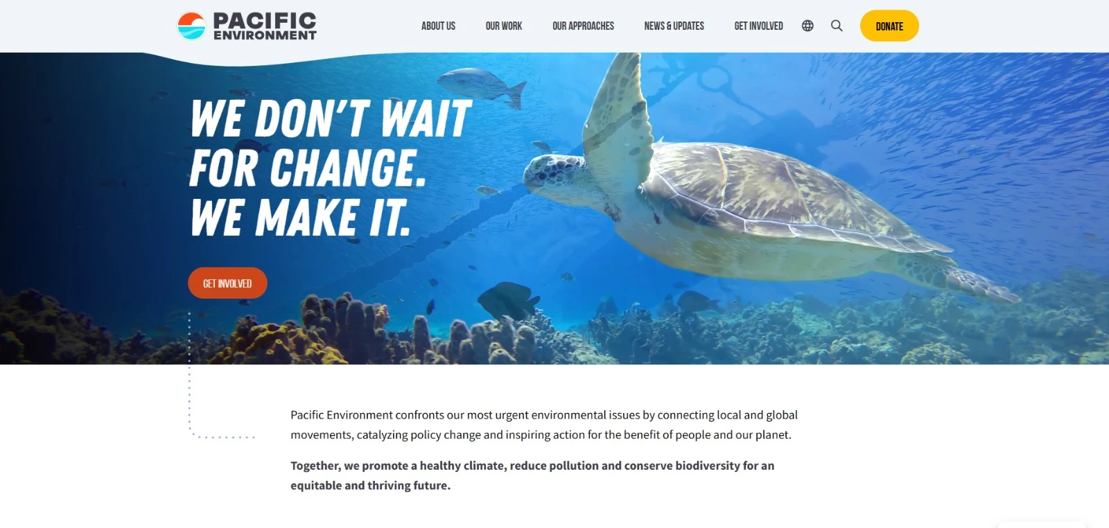
ForeFront Web began the Pacific Environment redesign with analytics, Search Console data, audience research, a content audit, and competitor analysis.
That research helped the team understand what funders, decision-makers, individual donors, and online supporters needed from the site before design work began.
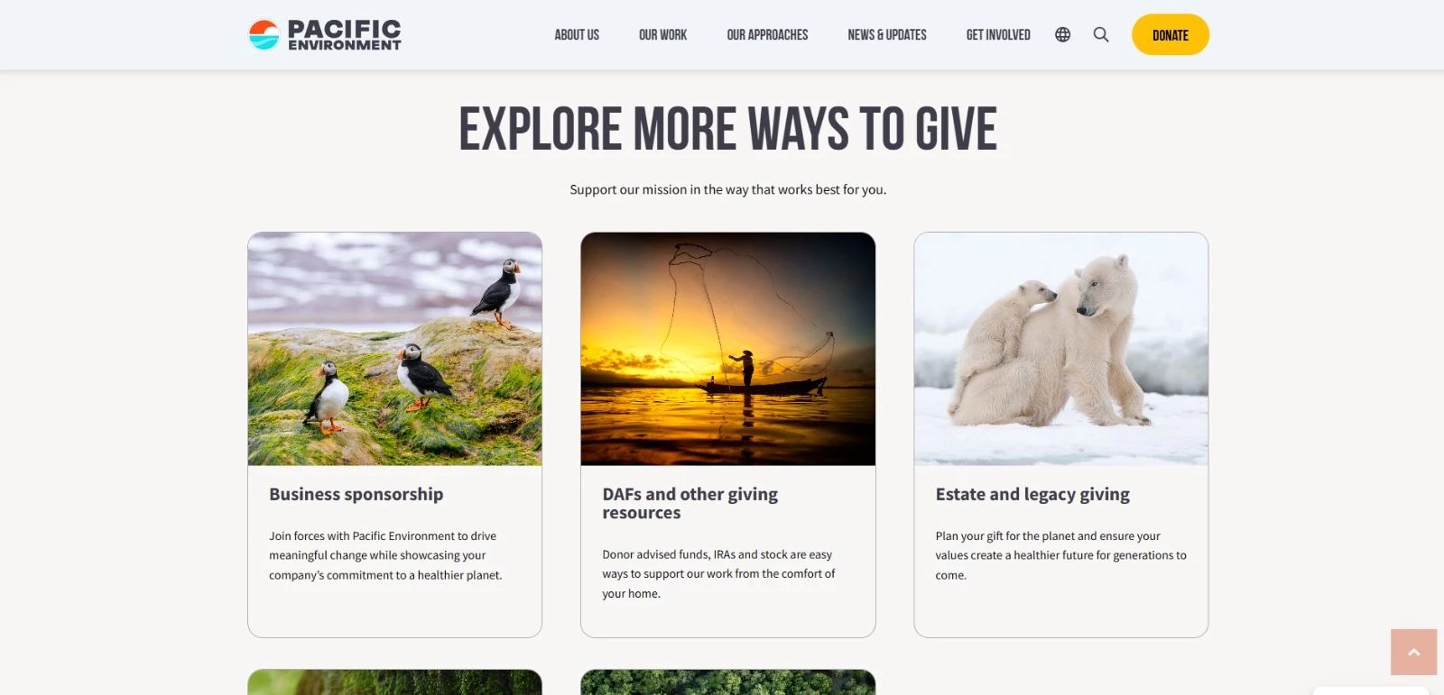
“The biggest change was pretty simple. We stopped assuming a funder, a decision-maker, and an individual donor all wanted the same thing when they landed on the site,” says Roberta Camp-Albert.
“Each one got a path built around what actually mattered to them, and the story of Pacific Environment’s work became easier to follow, whether someone was digging deep or just passing through.”
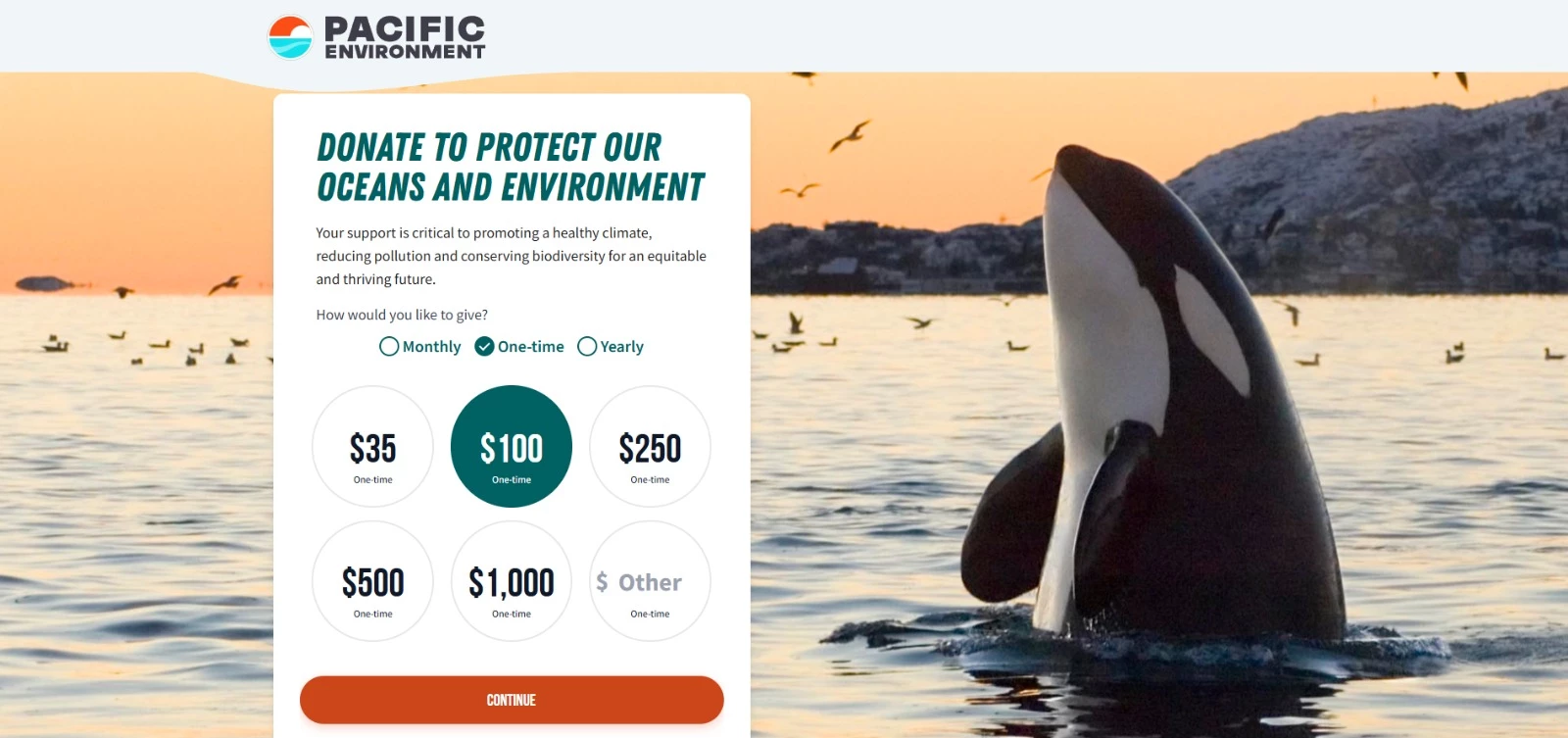
The approach earned Pacific Environment two 2026 Communicator Awards of Excellence, the program’s highest distinction, in the General Non-Profit and Website Redesign categories.
“For us, that recognition was a strong signal that we had gotten the structure right,” the ForeFront Web experts explain.
“It was not just a better-looking site, but one where funders, decision-makers, and everyday donors could each find what they came for and connect with the work in a way that made sense to them.”
2. Make the Mission Clear in Five Seconds
A first-time visitor should be able to answer these three questions within seconds: What does this organization do, can I trust it, and will my donation make a difference?
“Within five seconds, I should understand who you help and what changes because your nonprofit exists,” says Roberta Camp-Albert.
The homepage should support that answer with one strong impact figure, one real story, and a visible donation button.
Visitors who need more reassurance should also be able to reach financial reports, ratings, program results, and leadership information without digging through several pages.
If the mission, evidence, and next action are not immediately clear, visitors have little reason to keep exploring or give.
World Central Kitchen Explains Its Work Before Visitors Scroll
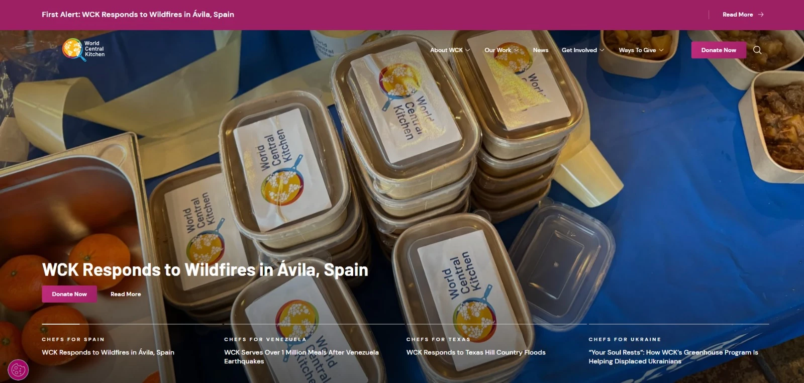
World Central Kitchen passes the five-second test because its homepage makes the organization’s role clear immediately.
The opening message explains that the nonprofit provides fresh meals on the frontlines of crises. A first-time visitor does not need to interpret abstract mission language or click into an About page to understand the work.
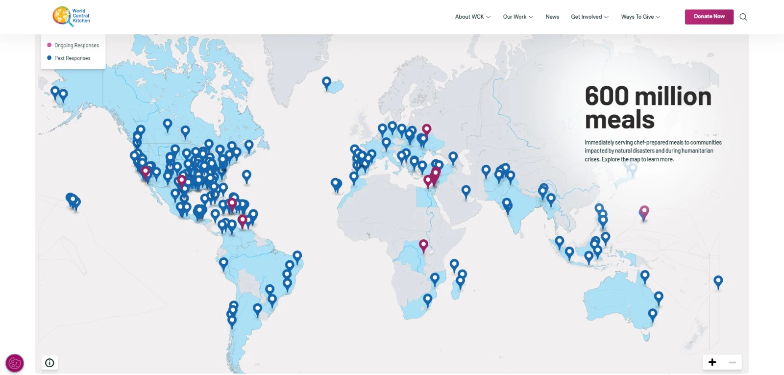
That clarity makes the rest of the site easier to navigate. Visitors immediately understand the cause, then can choose whether to donate, read about current responses, or learn more about the organization’s impact.
3. Remove Friction From the Donation Flow
A donation page should work like a product checkout. It needs clear choices, low friction, visible security, and enough trust signals to keep donors moving.
A strong donation flow makes it easy to choose the gift type, select an amount, pick a payment method, understand how donor information is protected, and complete the gift without second-guessing the process.
The smallest points of friction can affect completion.
M+R Benchmarks 2026 found that 11% of desktop users who reached a primary donation page completed a gift, compared with 8% of mobile users.
For nonprofits, that gap shows why donation pages need to be designed for speed, clarity, and mobile ease from the start.
Doctors Without Borders Makes Giving Secure, Flexible, and Easy to Complete
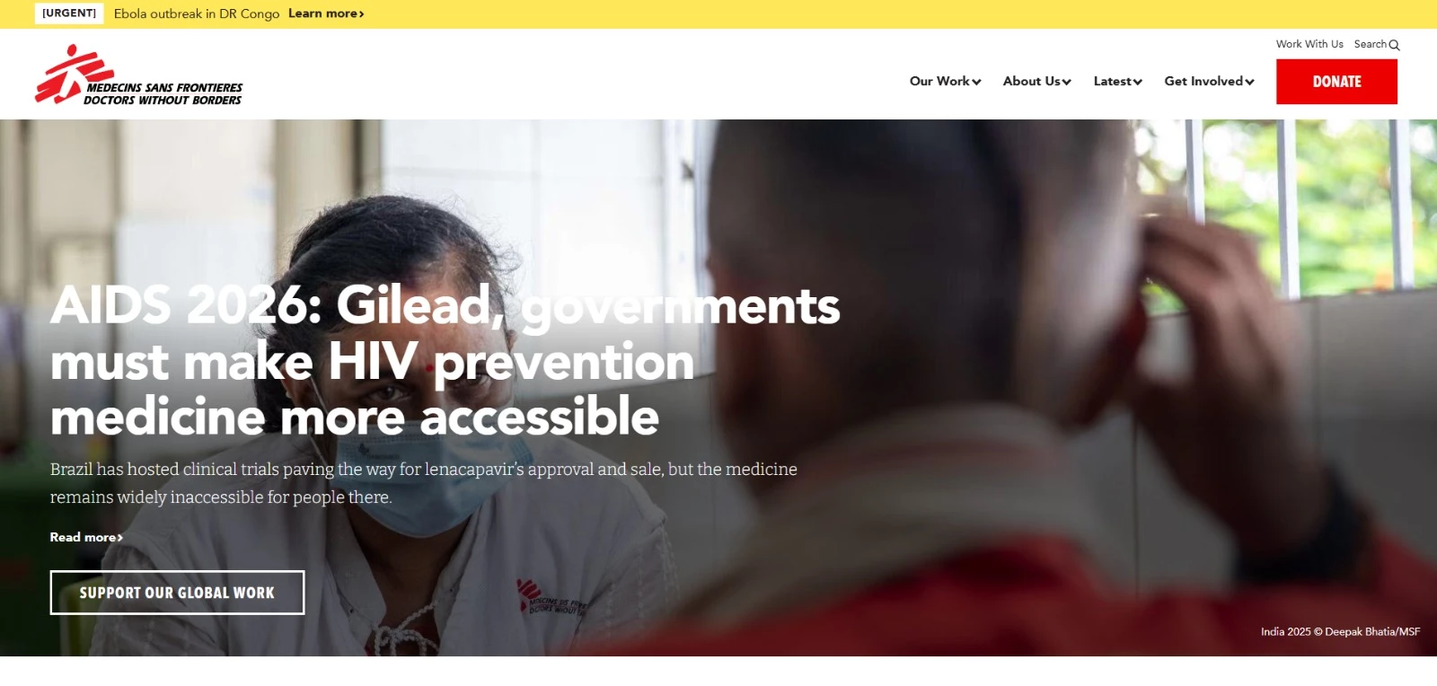
Doctors Without Borders keeps the donation process clear from the first screen.
The page opens with a thank-you message before asking for payment details. This makes the donor feel acknowledged before they start the form.
The giving options are easy to understand. Donors can choose between one-time and monthly gifts, then select the payment method that works best for them, including credit card, bank account, PayPal, and Apple Pay.
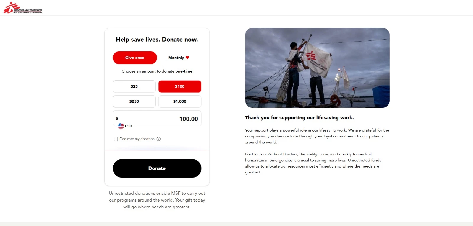
The page also addresses security directly. It states that donor information is protected with industry-standard SSL technology and displays the organization’s Charity Navigator four-star rating as a trust signal.
Every element supports completion: clear gift types, flexible payment options, visible security, and third-party credibility.
The page reduces hesitation at the exact point where donors are deciding whether to finish the gift.
4. Show Donors Where Their Money Goes
Donors should be able to see what their gift funds, how the organization uses money, and what proof supports the ask.
Broad impact claims are not enough on their own. The site needs concrete evidence through project details, cost breakdowns, impact reports, financials, updates, ratings, and transparency seals.
This is especially important for first-time donors. The Fundraising Effectiveness Project has continued to flag first-year conversion as a sector challenge. Impact proof helps address that gap by showing donors that their gift leads to a clear outcome.
Impact should not live only in an annual report but appear across the site and close to the moment of giving, where trust and confidence affect the next action.
Watsi Shows Donors the Cost Behind Each Patient’s Care
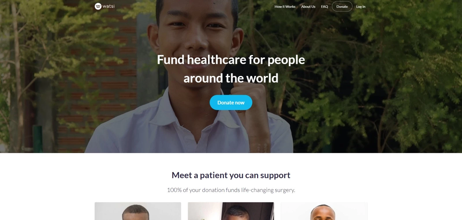
Watsi builds impact proof directly into the giving experience.
Each patient has a dedicated profile that explains the medical need, the planned treatment, the total cost, and the amount still needed. Donors can see exactly what their money helps fund before they give.
The site also makes the funding model clear. Watsi states that 100% of General Fund donations go to patient care, which removes ambiguity around where gifts are directed.
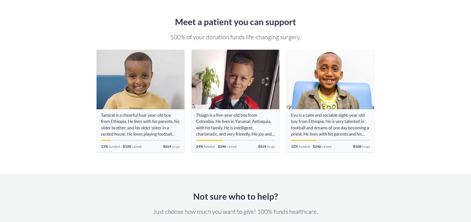
The site displays a GuideStar Platinum Seal of Transparency and a Charity Navigator four-star rating, giving donors third-party proof alongside the patient-level details.
5. Use Storytelling To Move Donors to Give
Lead with one person's story, not a big number. The identifiable victim effect describes how people tend to respond more to a specific individual than to an abstract group.
Give that story a before-and-after arc: the problem, what the gift paid for, what changed. Pair it with broader figures so readers see both the individual and the wider reach.
Video can deepen this on your homepage and donation page.
Short beneficiary stories, testimonials, and project updates put evidence right where people decide to give. Honest smartphone footage often reads as more personal and credible than a glossy corporate production, as long as the audio, framing, and message stay clear.
Keep impact out of the annual report alone. Show it across the site, especially near the donate button, where a visitor's confidence shapes what they do next.
Water.org Puts a Face and a Story Behind Every Gift
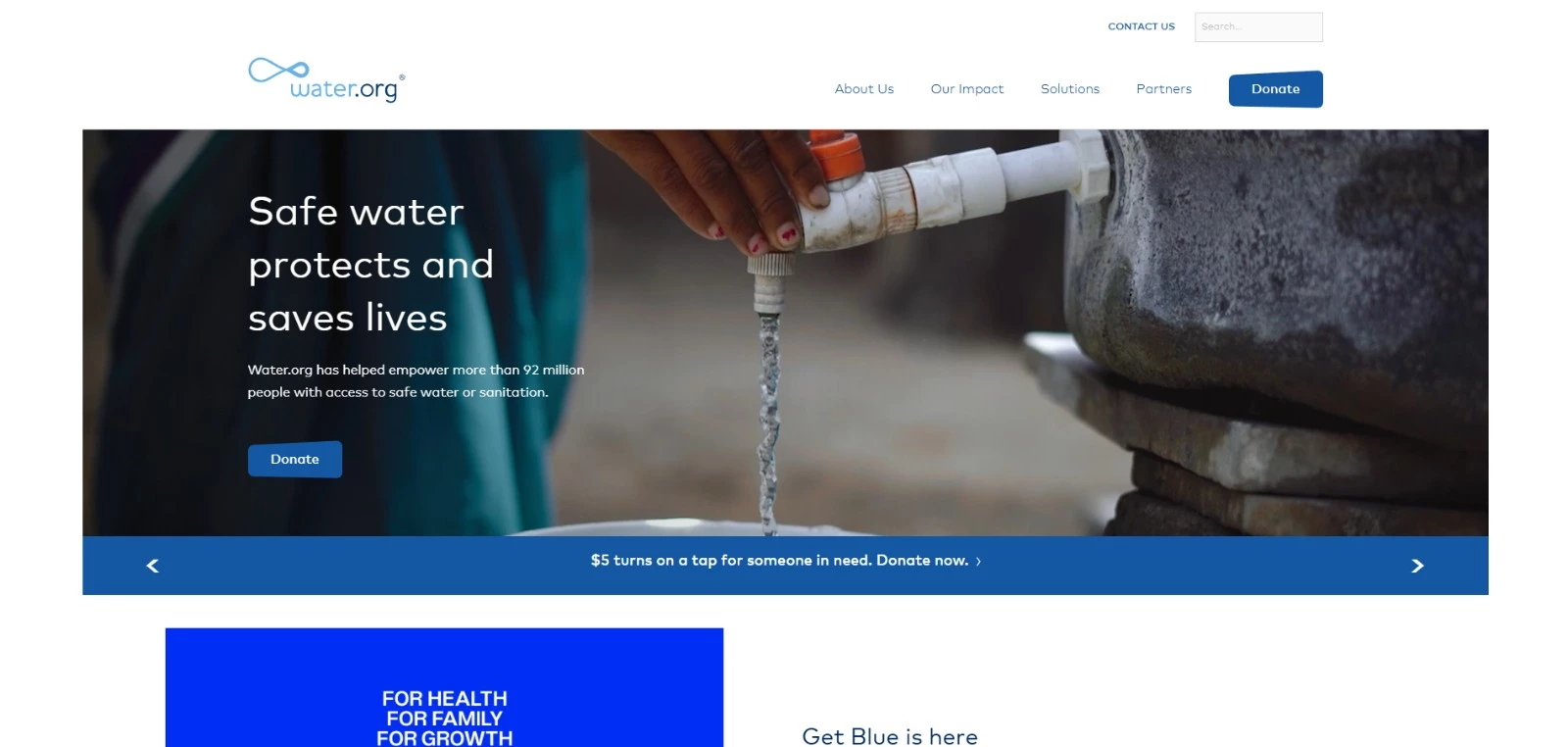
Water.org organizes its impact proof around individual people rather than aggregate figures.
Its Stories of Impact page leads with one person at a time, each with a name, a photo, and a short before-and-after arc.
Aucilene's entry, for instance, describes how her family once had to collect water from far away and every day felt like a battle, and how she now has safe water at home.
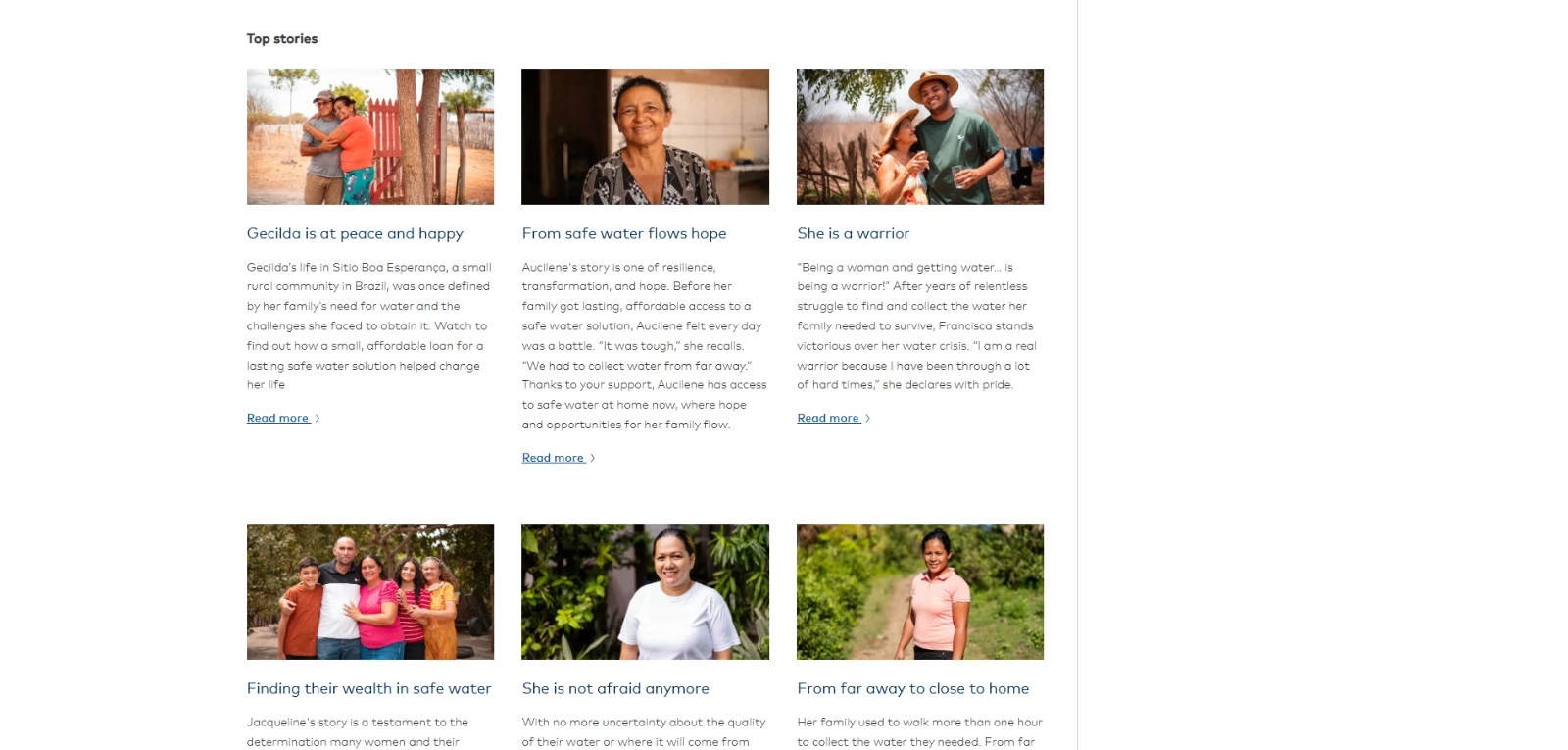
Carfel's says that her worries about where each day's water would come from have turned to comfort now that her family has lasting access at home.
The structure is consistent across profiles: the struggle, the change, the person's own words.
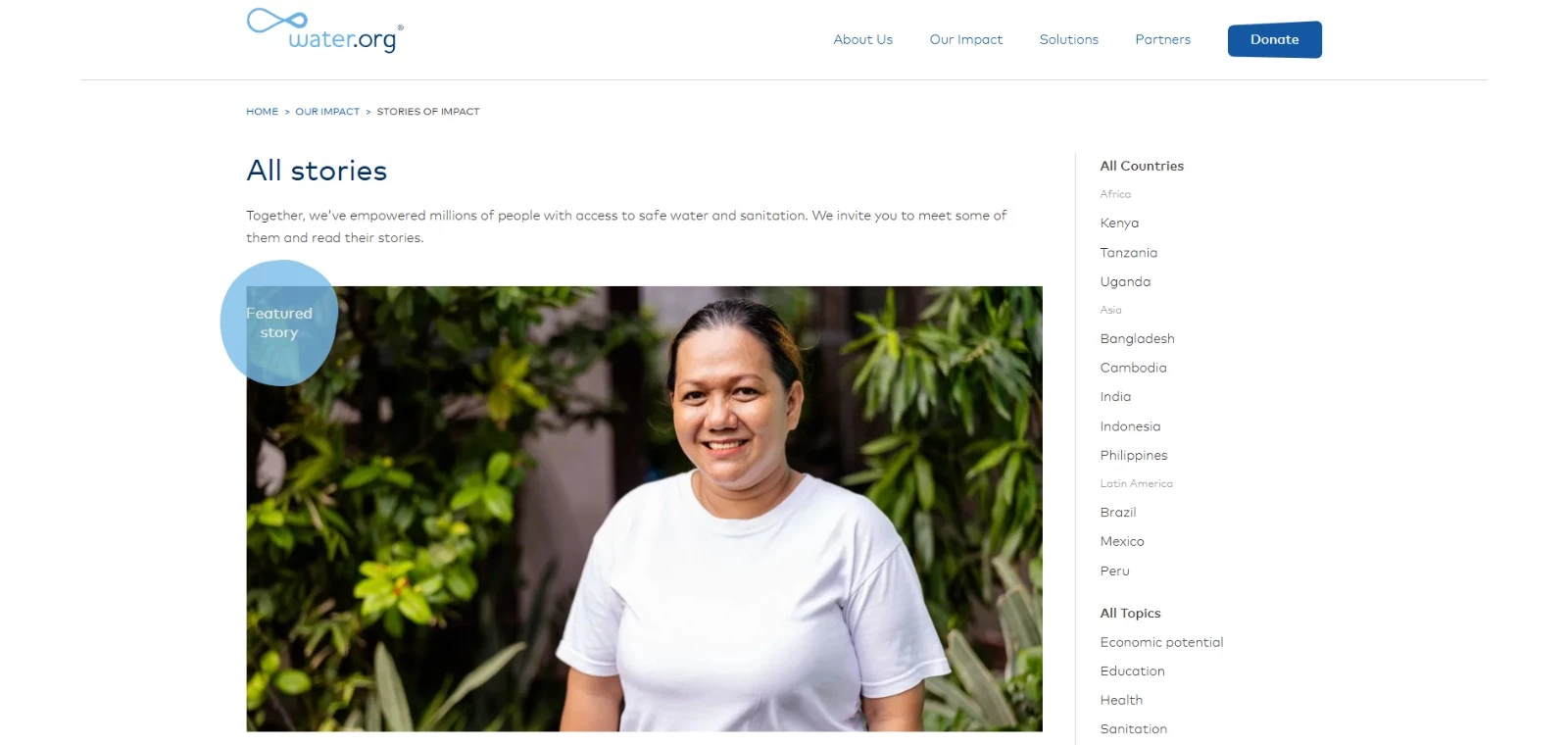
The page pairs written stories with video. A video stories section embeds beneficiary footage directly, and several entries, like Gecilda's, invite the visitor to watch how an affordable loan for a safe water solution changed her life.
Impact isn't quarantined in a report. The stories page closes with a direct prompt: "Together, we can empower more families with safe water" and a Donate button, and Donate appears in the main navigation on every page, so the proof and the ask sit close together.
6. Make Monthly Giving Feel Like Membership
People who choose monthly giving are making a longer-term commitment to the organization. The website should reflect that by giving the program a stronger identity than a standard donation option.
A strong recurring giving experience explains what monthly support makes possible, connects suggested amounts to tangible outcomes, and gives supporters a sense of belonging after they join.
M+R Benchmarks 2026 found that monthly revenue increased 12% in 2025 and accounted for 27% of online revenue. For nonprofits, that makes recurring giving one of the most important paths to design clearly.
charity: water Turns Monthly Giving Into a Donor Community
charity: water builds its monthly giving program around identity and continued engagement.
The program is branded as The Spring, giving monthly donors a named community to join. That makes the ask stronger than a standard monthly donation option because it gives supporters a defined role in the organization’s work.
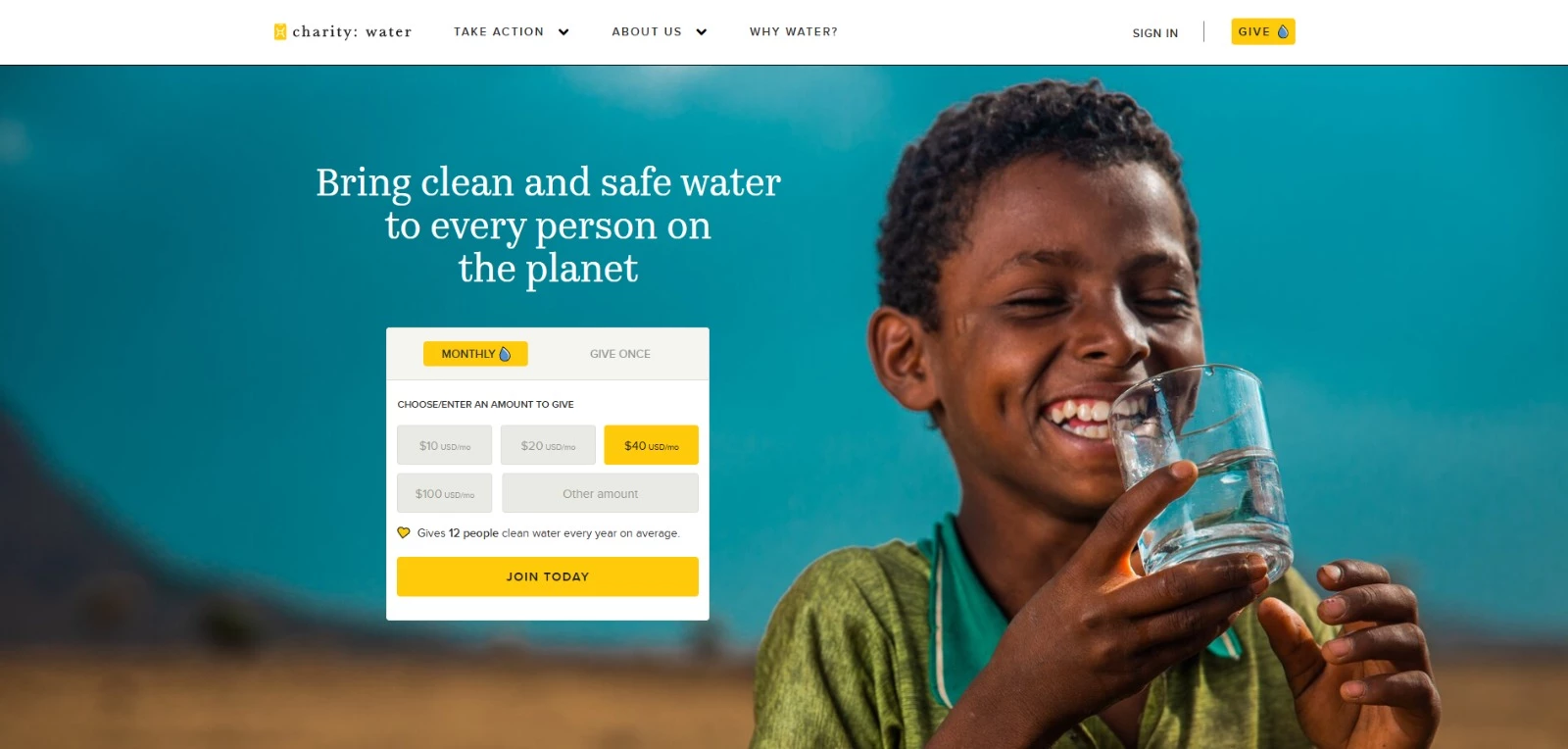
charity: water builds its monthly giving program around identity and continued engagement.
The program is branded as The Spring, giving monthly donors a named community to join. That makes the ask stronger than a standard monthly donation option because it gives supporters a defined role in the organization’s work.
The program also gives members a deeper experience through The Journey, a video series that shows how monthly giving supports clean water projects. This keeps donors connected after they sign up instead of limiting the relationship to receipts and payment updates.
The donation amounts are tied to tangible outcomes, so supporters can understand what their monthly gift helps make possible. The organization also reinforces trust through its stated 100% model, where public donations fund clean water projects.
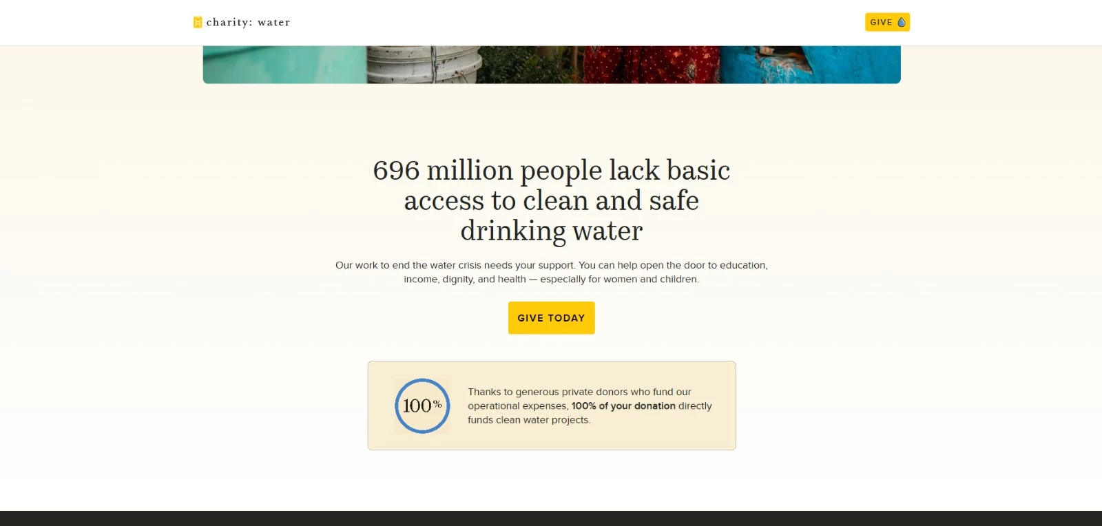
charity: water shows donors where completed projects are located and shares photos from the field, turning monthly giving into something donors can follow over time.
7. Design the Next Step After the Gift
Once someone gives, the website should confirm what happened, connect the gift to its potential impact, and begin building toward the next interaction.
“After the gift, use the thank-you page and email to start building toward that crucial second donation,” Roberta Camp-Albert recommends.
A dead-end receipt wastes the moment when the donor is most engaged. The post-gift flow can point them to a funded project update, invite them to share the campaign, join email updates, set up monthly giving, or take another relevant action.
The next step should be obvious, specific, and tied to the gift they just made.
The Fundraising Effectiveness Project’s 2025 findings identify first-to-second gift conversion as a major retention challenge. Its recommendations include timely stewardship, clear impact, and stronger first-time donor engagement.
Those are design decisions as much as fundraising decisions.
The thank-you page, confirmation email, donor account, and follow-up prompts should all help a new donor understand what happened, what their gift supports, and what they can do next.
Kiva Turns Repayment Into a Built-In Next Step
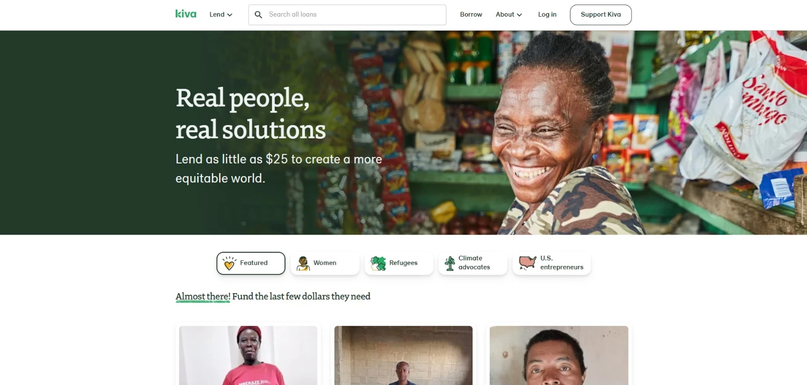
Kiva is a lending platform, so the repeat action is relending rather than re-donating. But the design principle still applies, and that means that every transaction leads to another clear action.
Supporters choose a specific borrower before lending. After the loan is funded, they can follow repayment activity and see funds return to their Kiva account.
That repayment creates the next step. Lenders can use the returned funds to support another borrower, turning one completed transaction into an ongoing cycle of engagement.
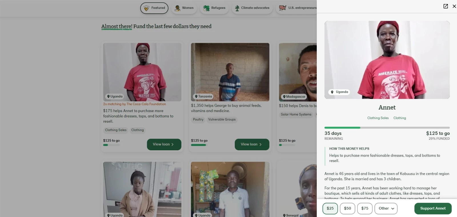
Kiva also supports the loop with transparency. Its finance page explains that 100% of loan funds go to local communities, while its borrower and partner information helps lenders understand how the model works and where risk exists.
The post-gift experience should confirm impact, build confidence, and give supporters an easy reason to come back.
Is It Time To Redesign Your Nonprofit Website?
No single issue automatically justifies a redesign, so look at how often problems occur, which visitors they affect, and whether your team can fix them within the current site.
1. Donation rates are falling while traffic remains steady.
M+R’s 2026 Benchmarks Study found that roughly 1.6% of nonprofit website visitors donated in 2025.
Compare your conversion rate over time and by traffic source. A sustained decline or repeated abandonment on the donation page suggests that visitors are interested but struggling to complete the process.
2. The donation form creates unnecessary work.
Long forms, required accounts, limited payment options, and confusing error messages give donors more opportunities to leave. The experience becomes even less reassuring when the form redirects to a third-party page that looks unrelated to the nonprofit’s website.
3. The relationship ends with the receipt.
The Fundraising Effectiveness Project identifies first-to-second gift conversion as an ongoing retention challenge.
A basic payment confirmation does little to encourage another gift. First-time donors should receive a clear thank-you, an explanation of what happens next, and a relevant way to stay involved.
4. Visitors cannot find the right way to give.
A single donation page may work for one-time gifts, but it does not address monthly giving, donor-advised funds, workplace giving, or major gifts.
M+R reported that DAF revenue rose 44% and monthly revenue increased 12% in 2025. Each option needs a clear path and enough information for the donor to proceed.
5. Mobile visitors complete fewer donations.
Check whether the mobile experience has slow pages, small buttons, crowded fields, or payment methods that require too much typing. M+R recorded a 48% increase in mobile revenue in 2025, making mobile performance an increasingly important part of online fundraising.
6. Your organization is becoming harder to find online.
M+R associated declining nonprofit organic search traffic in 2025 with the growth of AI Overviews and chatbot-based discovery.
Review whether your main program and impact pages still appear for relevant searches and whether they explain the organization’s work clearly enough to be understood by search engines and AI tools.
7. Analytics cannot show where donations are lost.
Experts at ForeFront Web recommend tracking donation-page views, form starts, payment steps, and completed gifts in GA4.
If visitors start the form but abandon it, examine its length, error messages, payment options, and mobile usability. If they never reach the form, the problem is more likely to sit with the mission explanation, impact proof, or donation CTA.
Redesign, Refresh, or Rebuild?
Websites have a life cycle, and you should plan for a redesign every three to five years, depending on how well the site was built and maintained, says Ventus Design Studio Founder Nicole Sauk.
Technology changes, design expectations shift, organizational goals evolve, and the website has to keep up. But not every issue calls for a full rebuild, which is the most expensive and disruptive option. Match the scope of work to the actual problem.
| If the problem is… | The fix is usually… | What it involves |
| Tired visuals, dated copy, or a weak donate button, but the structure and platform are sound | A refresh | Design and content updates and conversion tweaks on your existing system. |
| Confusing navigation, poor donor journeys, or a high-friction donation flow, but the platform still works | A partial redesign | New page templates, reworked navigation, and a rebuilt donation flow on the same CMS |
| An outdated or insecure platform, one your team can't maintain, or several deep problems at once | A full rebuild | A new platform and architecture, content migration, and fresh integrations |
The default move is to start with the smallest change that clears the signals you identified. Reserve a full rebuild for when the platform itself is the constraint, or when several structural problems overlap.
Otherwise you spend rebuild money on a refresh problem.

Our team ranks agencies worldwide to help you find a qualified partner. Visit our Agency Directory for the top web design companies, as well as:
- Best Website Designers NYC
- Top UI/UX Design Agencies
- Top Web Development Companies
- Top Branding Companies
- Top Logo Design Companies
Nonprofit Website Design FAQs
1. What makes a nonprofit website convert donors?
Conversion comes down to clarity, trust, and friction. A donor needs to understand who you are and why it matters within seconds, see proof that gifts produce real results, and reach a branded, mobile-friendly donation form that asks for as little as possible.
2. Why do first-time donors not come back and can a website fix it?
First-time donors lapse mostly because nothing happens after the gift. A website helps by designing the post-gift moment: a genuine thank-you and impact confirmation, an easy invitation to give monthly, and on-site impact updates that show the donor exactly what their gift did.
3. How many fields should a donation form have?
As few as possible, ideally only what's needed to process the gift and send a receipt: amount, name, email, and payment details.
Every extra field is another chance to abandon the form. Collect optional information like mailing address, phone number, or how someone heard about you after the donation, or not at all.
4. Should monthly giving be pre-selected?
Maybe, it's a lever worth testing, not a universal rule.
Defaulting to a monthly gift can lift recurring sign-ups, but a pre-selected monthly option can frustrate one-time donors if it isn't clearly labeled and easy to change. The right move is to A/B test it with your own audience and let your data decide.
5. Why is mobile donation conversion usually lower than desktop?
Mobile donors face more friction, as it involves small tap targets, long forms, slow page loads, and fiddly typing on a small screen. The fixes are practical: shorten the form, enable digital wallets like Apple Pay and Google Pay, speed up the page, and make buttons large and obvious.
6. How much does a nonprofit website redesign cost?
It depends on scope, not the size of your organization.
The price is driven by how many unique page templates you need, how much content must be written or migrated, whether the design is custom or built on an existing theme, and which integrations you require, like a donation platform, CRM, multilingual support, accessibility, and analytics.
A small site with complex needs can cost more than a large, simple one. Get the work scoped against your specific goals rather than a generic range.