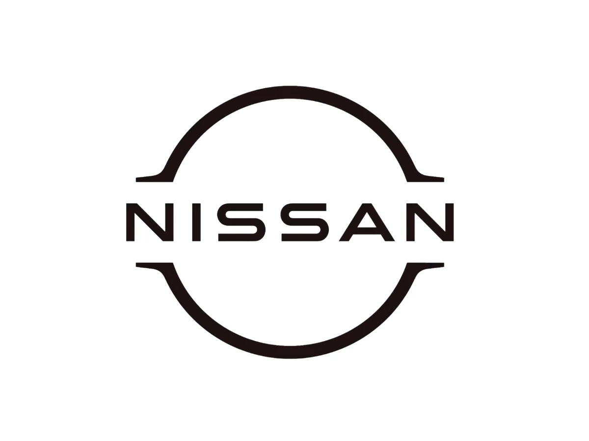

The Nissan logo you know today started as a light. Before it was a flat ring on a Rogue tailgate or an icon on your phone, it was 20 LEDs on the nose of an electric crossover, and the designers drew that glowing badge first. They worked every flat feature backward from a surface that had to glow: the thin stroke, the open gaps, the name sitting in the break. Most write-ups call that a flat-design trend; it started as a wiring problem.
The Short Version
- "Nissan" is a contraction of Nihon Sangyo (Japan Industries), the holding company behind the carmaker; the name first showed up as its abbreviation on the Tokyo Stock Exchange in the 1930s and became the company's name in 1934.
- The founding 1933 mark set the template still in use: a red circle for the rising sun behind a blue bar carrying NISSAN in white, borrowed from the Datsun emblem.
- For most of the 20th century the corporate logo and the badges bolted to the cars were two different things; the chrome circle-and-bar became the single mark on every model in 2001.
- The 2020 flat logo opened the circle into a thin ring and was drawn to be illuminated on electric cars, starting with the Ariya.
- Datsun, Nissan's old export name, has been shut down twice: retired by 1986, revived in 2013, and discontinued again in 2022.
1914–1934: Where The Names Came From
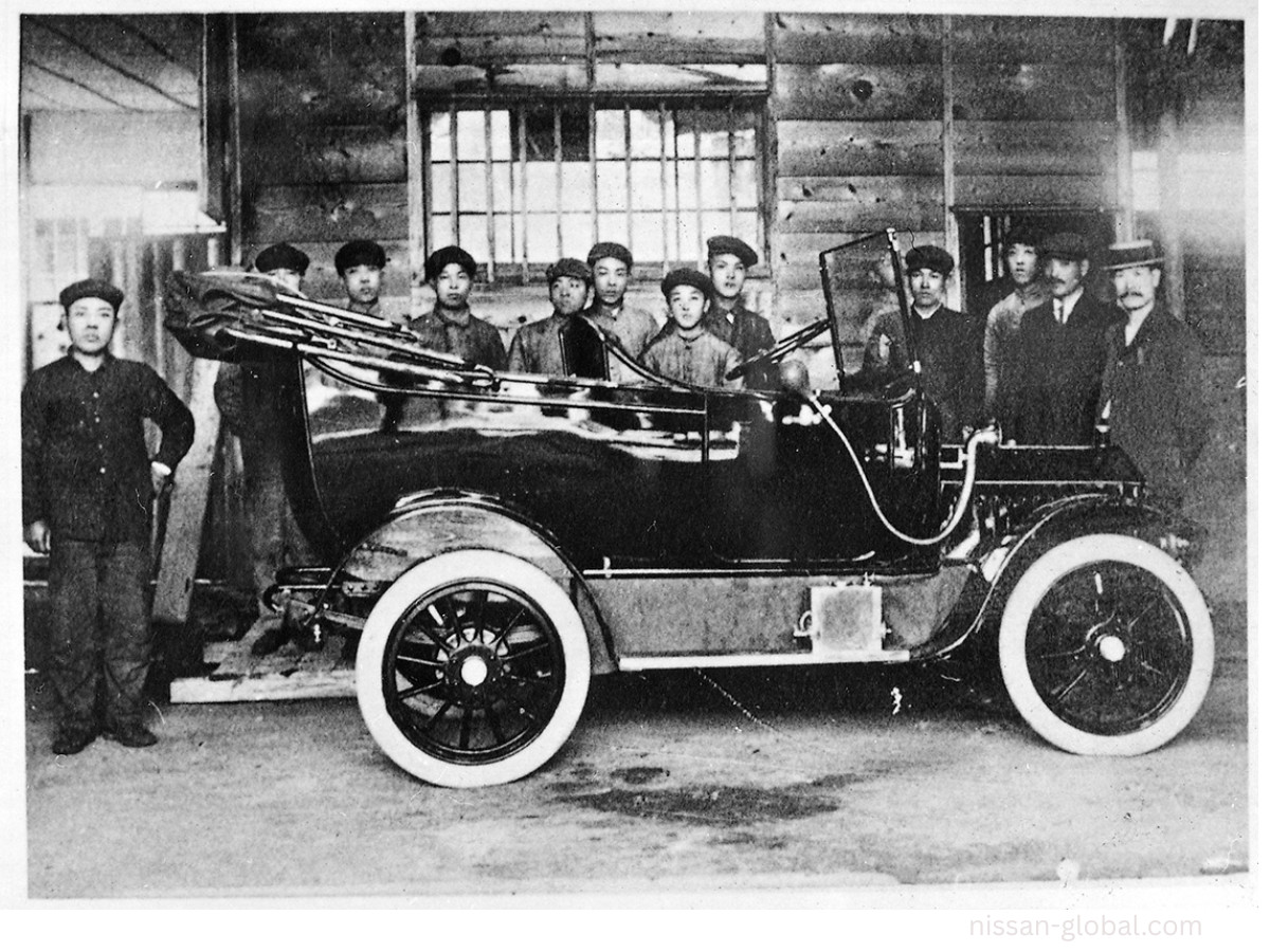
The story starts with a car called the DAT, built in 1914 by a Tokyo workshop and named for its three backers, Kenjiro Den, Rokuro Aoyama, and Meitaro Takeuchi. In 1931 the company gave its new small car a diminutive, the Datson, meaning "son of DAT."
The name soon shifted to Datsun, since "son" sounded like the Japanese word for loss, and "sun" tied the brand to the rising sun on the national flag. Nissan itself arrived in 1934, taken from Nihon Sangyo's stock-exchange shorthand.
1933: The Rising Sun Mark
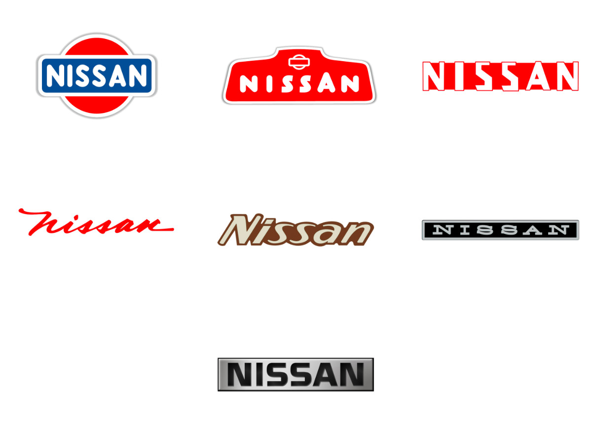
The first corporate logo, drawn in 1933, came straight from Datsun: NISSAN in white across a blue bar, set over a red disc that stood for the rising sun. The disc echoes the red sun of Japan's national flag, and it fits the name: in Japanese characters, Nissan reads as "sun product" or "birth of the sun." T
he blue bar lasted only to 1940, and the red disc went with it; from there the red-and-white wordmark carried the identity on its own through the 1960s.
Here is the part most logo histories miss. For decades the official corporate logo and the badge on the actual car were not the same object.
Look at Nissans from the 1950s through the 1980s and you find a shifting cast of wordmarks: formal capitals in the 1950s, italic scripts in the 1960s (the 1960 badge even dropped the capital N), then heavy metallic lettering in the status-conscious 1980s, often different from one model and one region to the next.
Through all of it the red disc itself never came back. When the circle returned at the end of the 1980s, it returned as a chrome ring, not a rising sun.
1988–2020: The Chrome Circle And Bar
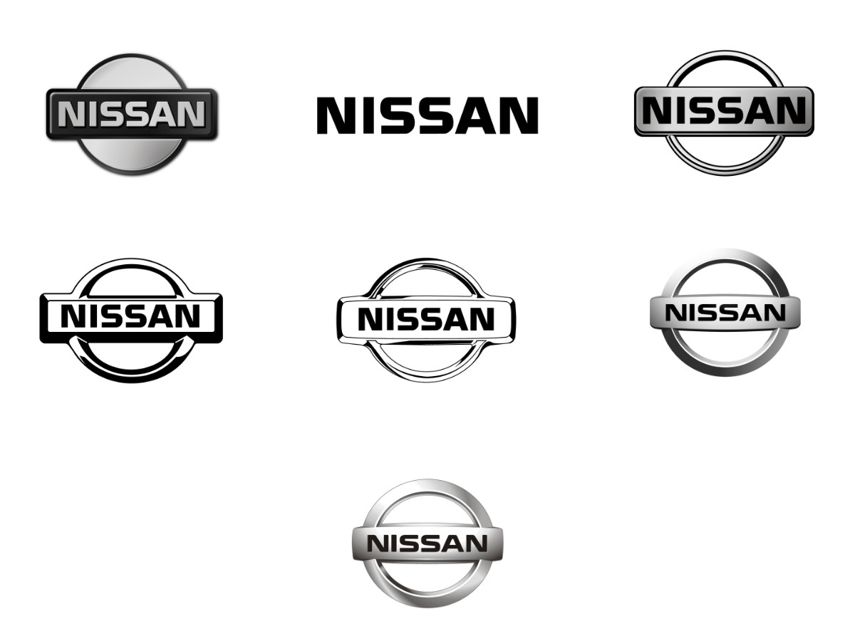
The circle came back at the end of the 1980s, this time as a chrome ring with a horizontal bar across the middle and NISSAN on the bar. Through the 1990s it ran in two forms: a flat black outline for print and a raised chrome emblem for the cars.
In 2001 Nissan fixed on the chrome version as a single mark for every model and ended the patchwork of different badges; it tightened the emblem again in 2012.
That badge was built as a physical object for a physical surface: a ring of bright metal bolted to a radiator grille, extruded in 3D with a highlight along the top and a shadow beneath, made to catch sunlight and headlights and throw back a reflection.
Nearly every carmaker did some version of this in the 2000s, and the shiny circle and bar is the Nissan most drivers today picture first.
2020: The Ring That Opens
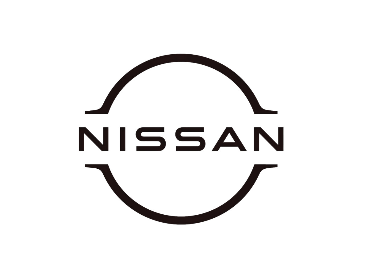
Then the powertrain changed, and the badge had to change with it. An electric car has no radiator, so it has no grille opening to bolt a chunk of chrome onto; the Ariya seals that space into a smooth panel, and the badge stops being a hood ornament and turns into a lit surface.
That single fact drives the 2020 redesign. Nissan drew a badge that had to glow on an electric car and let the flat 2D fall out of that decision. The powertrain reshaped the logo; flat-design fashion did not.
Nissan's team started in 3D, drawing the illuminated badge for electric models first, then flattening it into the 2D version used everywhere else.
The lit badge carries 20 LEDs, a count Nissan tied to the two decades since its 2001 redesign. Because the mark had to read cleanly when backlit, and pass the rules for lit parts on a car, the designers thickened the outline slightly so the shape held together under light.
Set the two marks side by side and the change is easy to name. The closed chrome ring becomes a thin, flat ring broken at the top and the bottom, and the wordmark drops into the lower break where the solid bar used to sit.
Gone are the 3D extrusion, the metallic gradient, the drop shadow, and the crossbar. What is left is a single flat color and a lot of empty space inside the ring.
That geometry is built for light. Backlighting sits in the stroke of a thin ring and glows as a clean outline, while the open gaps let the wordmark stay legible instead of drowning; a solid red disc lit from behind would read as a bright blob. The same openness helps at the other extreme.
Shrunk to a favicon or an app tile, the open ring and centered wordmark still hold, where the old filled disc would smear into a gray dot, and reversed to white on a dark screen the mark reads as two clean arcs around the name.
Flattening was not free. The chrome badge had real presence on a grille, a bright three-dimensional object that read as precision hardware; drop the metal and the shadow and you get something closer to an app icon than a hood ornament, lighter on screens and lighter on the car.
Nissan's designers framed the continuity through an old company maxim. As Tsutomu Matsuo, a deputy manager in Nissan's design department, put it: "If you have a strong, determined belief, it can even penetrate the sun."
Nissan was not alone in going flat. Toyota thinned its emblem for screens but kept the ovals, Ford held onto its blue oval, and Tesla had already cut its badge to a bare monogram, a shift you can trace across the year's best brand logos.
What separates Nissan is the cause. Most of those redesigns chased the screen; Nissan redrew the mark from the light out.
Datsun, Killed Twice
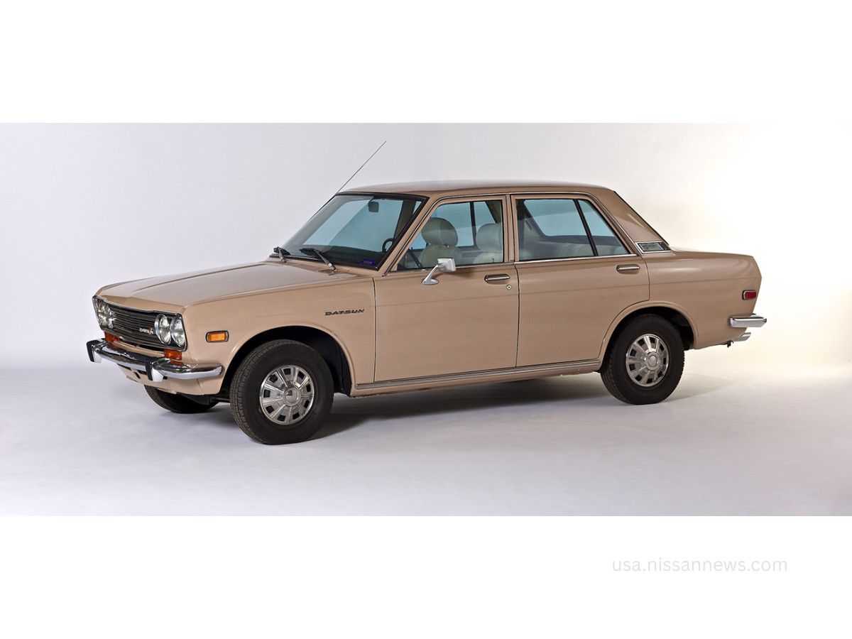
Datsun is the strangest thread in this whole history, because Nissan has run it as a second identity, killed it, revived it, and killed it again.
Through the postwar decades Datsun was Nissan's export name; the cars that built the brand's US reputation, the 510 and the early Z, wore Datsun badges rather than Nissan ones.
Nissan announced the switch to a single global name in the fall of 1981 and spent about five years and a reported half a billion dollars retiring Datsun, with dual-badged transitional cars along the way. By 1986 the name was gone from new vehicles.
Then in 2013 Nissan brought Datsun back, this time as a budget marque for emerging markets like India, Indonesia, and Russia. It never caught on.
Nissan began winding it down toward the end of the decade and discontinued Datsun for good in 2022. The nameplate had already died once.
The Z And GT-R Badges
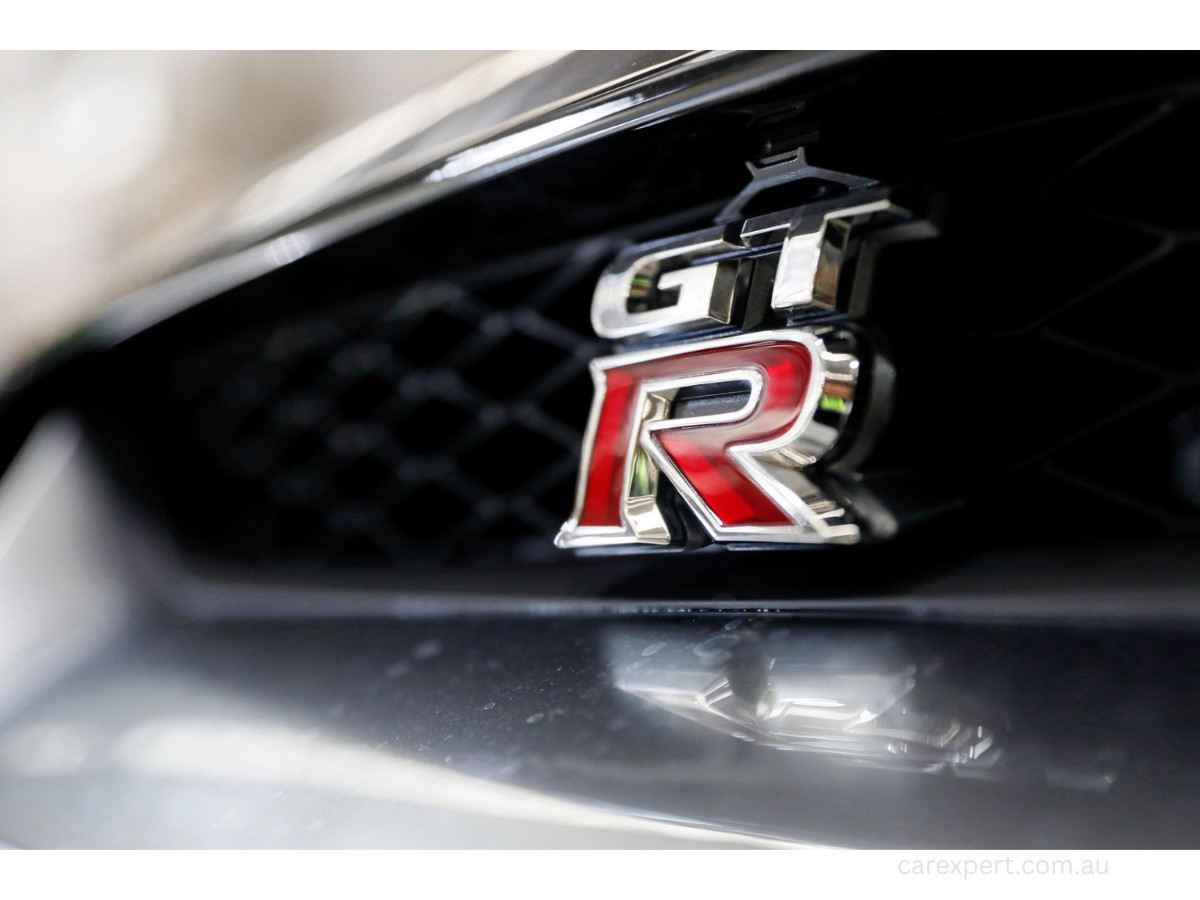
Two Nissan marks never needed the corporate logo to matter. The Z badge, born in 1969 on the Fairlady Z (sold in the States as the Datsun 240Z), and the GT-R badge, from that same year's Skyline GT-R and short for Gran Turismo Racer, each built a following of their own and rode out every rebrand above them.
Whatever sat on the grille, those two letters and that hyphenated tag kept their own meaning.
Verdict
The 2020 mark is the rare flat redesign with a real reason behind it. Nissan drew a badge that had to glow on an electric car and let the 2D version follow from the lit one.
Judged purely as a piece of design it gives up some of the weight the chrome had. Judged against its actual brief, a mark that works lit, printed, and shrunk to a phone icon, it does the job.
From the 1933 red disc to the chrome rings of the 2000s, the line holds: the badge keeps the sun and lets everything else follow the car it sits on. In 2020 it simply followed the car to a wall socket.
Our team ranks agencies worldwide to help you find a qualified partner. Visit our Agency Directory for the Top Logo Design Companies as well as: