Tesla has never been a brand that follows convention. Known for pushing boundaries in electric vehicles, energy solutions, and beyond, Tesla’s evolution reflects a company driven by vision, ambition, and bold risk-taking. Its logo transformation, from a traditional automotive badge to a minimalist, unmistakable symbol, mirrors its pursuit of a future defined by innovation and disruption.
Logo Design Details
Tesla’s logo transition from a shield-like badge to a clean, futuristic monogram reflects its ambition to transcend the traditional auto industry. The streamlined design better aligns with Tesla's position as a tech-driven innovator, setting it apart from legacy automakers.
The iconic "T" shape in Tesla’s logo is more than just an initial, it represents a cross-section of an electric motor, linking directly to the brand’s technical foundation and innovation ethos. This subtle, technical symbolism deepens the brand’s storytelling.
Check out how brand symbols shape recognition and explore their impact
Since its refinement, Tesla has remained fiercely consistent with its logo’s visual identity. This consistency (across cars, digital platforms, and energy products) has cemented instant recognition and fostered strong emotional loyalty among customers.
Tesla’s minimalist, meaning-rich automotive logo not only differentiates the brand visually but also contributes to its financial strength. Research from the Journal of Marketing Research shows that expressive logos can boost brand evaluations by up to 25%, directly influencing sales. By combining simplicity with symbolism, Tesla strengthens its brand equity and market dominance.
Logo Design Evolution
2003: The Birth of the Tesla Shield
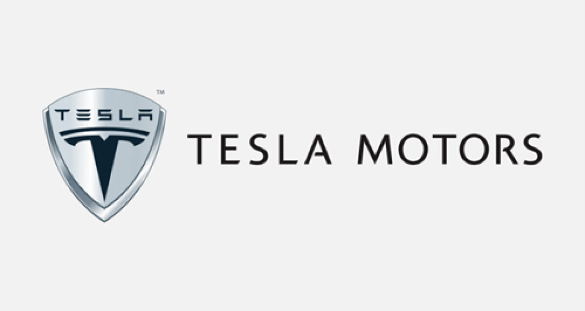
Tesla’s original logo, unveiled in 2003, featured a metallic shield design, symbolizing strength, tradition, and protection — common themes in the automotive world.
The stylized "T" appeared inside the shield, accompanied by the full “TESLA MOTORS” wordmark in a sleek sans-serif font. While polished and sophisticated, the early design leaned heavily on automotive branding conventions.
Explore how 35 iconic logos have defined and elevated brands worldwide.
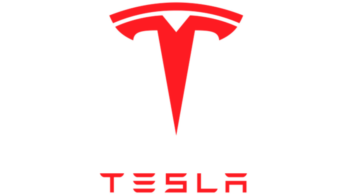
2017: A Futuristic Shift — Tesla Redefined
In 2017, Tesla removed the metallic shield and slimmed down its visual identity to focus purely on the stylized "T" and the word "TESLA."
The minimalist approach emphasized technological advancement, innovation, and a futuristic outlook. The clean, red background used today reflects energy, passion, and bold leadership in the transition to sustainable energy.
Tesla Logo: A Bold Symbol of Innovation and Defiance
Trading traditional automotive emblems for a stark, futuristic mark, Tesla signaled early on that it wasn’t interested in following industry norms. The stripped-back “T” is less about heritage and more about momentum — a visual shorthand for a brand built on ambition, disruption, and the relentless push toward a new energy future.