Over the decades, one of the most iconic and recognizable logos in automotive history has withstood the test of time — the Ford logo. It is a shining emblem from which most automotive branding professionals take inspiration.
Through its multiple rebrandings over its 100-year existence, from a simple black script font to its current three-dimensional design, each version emulates the brand's core identity: luxurious and polished.
Join us on a journey through time as we explore the evolution of one of America's oldest logos!
A Brief Introduction to the Ford Brand
The Ford Motor Company has been a staple of American culture for over a century. From the iconic Model T to the latest Mustang, generations of drivers have loved Ford's products. But who is Ford, and what does it do? Let's take a look at the brand story behind this iconic company.
Getting to Know Ford Motor Company
The Ford Motor Company was founded in June 1903 by Henry Ford and several other investors. Its first product was the four-cylinder Model A, which quickly became a hit with consumers. This success was quickly followed by the introduction of the legendary Model T in 1908, which sold over 15 million units worldwide before being discontinued in 1927.
Since then, Ford has continued to innovate and produce reliable and stylish vehicles. Today, they offer an extensive lineup of cars, trucks, SUVs, vans, crossovers, hybrids, and electric vehicles — all designed with their customer's needs in mind.Ford's Global Reach
Today, Ford is a household name worldwide. It has factories in Europe, South America, Asia, Africa, and Australia. It also operates numerous research centers, constantly developing new technologies to improve its products and stay ahead of competitors.
Along with producing passenger and commercial vehicles for everyday use, they also develop racing cars for both professional and recreational use. Their motorsport division plays a vital role in developing new technologies that can be applied to their production models and helping promote their brand globally through various racing series such as Formula One and NASCAR.
The Brand Mission
Ford's mission is "to be trusted worldwide by our customers, providing them with best-in-class services while contributing positively to society." This focus on trustworthiness reflects their dedication to producing reliable products that exceed consumer expectations while staying true to their roots as an American icon — something they have accomplished since day one in 1903.
Additionally, they are committed to driving progress through sustainable mobility solutions that reduce emissions while meeting customer needs. They introduced hybrid engines into their lineup and invested heavily in electric vehicle technology, such as the Mustang Mach-E crossover SUV.
Whether providing quality automobiles for everyday life or pushing forward cutting-edge technology — Ford strives to be trusted worldwide by providing customers with best-in-class services while positively contributing to society.
History of the Iconic Ford Logo Design
Ford Motor Company logo design has been integral to the brand's identity since its founding in 1903. Going through many iterations, all logo design specialists who tried to evolve it retained the brand creator's original signature. Quite literally! It has gone through several changes and evolutions to become the iconic representation it is today.
1903
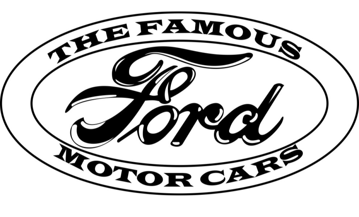
The 1903 Ford Logo Design was created by Henry Ford, the founder of the Ford Motor Company. It features a black-and-white oval with the words "Ford Motor Company" written in an elegant script font surrounding it. The oval design represents the reliability and strength of Ford's products.
1909
The 1909 Ford Logo Design was an updated version of the iconic oval shape introduced in 1903. The font used for "Ford" shifted from bold, serif-style typography to stylized cursive lettering. The oval shape was also simplified and became more abstract, yet it still conveyed the strength and reliability associated with the brand.
1976
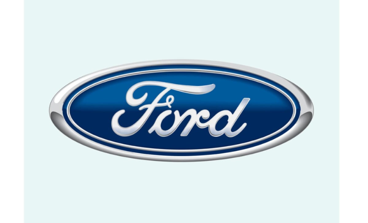
The 1976 Ford Logo Design was the closest version to what we know today. It featured an elongated oval with "Ford" written in a bold, cursive serif font. A navy blue backdrop graces the oval, adding a layer of distinction and vibrancy. Of course, a silver border finish highlights the logo design to add that dash of sophistication.
The Ford Logo Design Now - Effortlessly Timeless
The Ford logo is one of the most recognizable automotive logos in the world. Since its inception, the Ford Motor Company has continually evolved the blue oval Ford symbol to remain iconic and visible to customers.
As an instantly recognizable emblem for a household name, the Ford logo connects with the audience's emotions through its reliable, robust, and simultaneously modern image — just like the Voka logo design.
In recent years, Ford has refined its symbol, making it stand out on all digital channels and inspiring customers to trust what it stands for as a classic yet modern car manufacturer.
Through its journey of refinement to simplify its design for a more straightforward yet contemporary feel, every iteration of the Ford logo design is just as timeless and iconic as ever before. The most recent Ford logo we know today features a more enhanced shadow that renders a more metallic, classy finish. This recent iteration also aligns with the premium and high-tech nature of the automotive industry.
To this day, its iconic composition inspires branding experts to create logos that balance tradition with modernity.
Ford Logo Design Stays Strong with On-Brand Color Story
The Ford Motor Company logo design employs blue and silver, significantly impacting the company's branding since its foundation in 1903.
These bold, timeless colors make up the base for logo designs used consistently throughout Ford's history, no matter how new models or designs may change over time. The logo has always included variations of the two core hues (cobalt blue and silver), making different logo design variations on-brand regardless of the other details within each logo.
Now, let's quickly dive into how these brand colors effectively communicate the brand's messaging.
Blue evokes trust between customers and the brand. It creates a calming feeling that inspires dependability. Alongside this soothing hue are streaks of striking silver to signify Ford's commitment to creating high-end products.
By maintaining the same core color story, customers see a sense of reliability, stability, confidence, and strength through the brand. This highly recognizable aesthetic only helps to make customer loyalty and brand recognition even stronger. Take a look at our list of digital marketing agencies that can help you achieve your desired results.
Discover other colorful logo designs.
Tips on Creating a Successful Automotive Logo Design
Automotive logos are often iconic, recognizable, and timeless, making it challenging to create a unique and memorable one.
Automotive brands, like Ford, often have a rich history, so the logo must evoke a sense of heritage and tradition while also being modern and appealing to a contemporary audience.
But worry not! With the proper techniques and design principles, you can capture the essence of your brand by creating a logo that resonates with your audience. The Ford logo, among others, can be a great source of logo design inspiration. Here are some tips on how to develop a successful logo redesign or create a stunning automotive logo:
1. Go for a streamlined design
Automotive logos shine when they are simple and distinguishable. Take Ford, for example – it only features the brand name in a posh logotype, free from flashy visuals and outrageous icons. It's easy on the eyes but attention-grabbing!
The last thing you want is for your customers to get confused about what your logo is supposed to represent, especially when looking at it from a distance. A streamlined, minimalist design with just the right impact will make your logo memorable.
2. Use bold and eye-catching colors
Another tip for creating a car logo design is to use colors that immediately catch the eye. Intense colors make your logo pop and stand out from the competition. Think of Ford's royal blue, Toyota's bold red, or Ferrari's bright yellow.
When choosing colors for an automotive logo, consider the target audience. For example, a luxury car brand might use colors that convey sophistication and elegance, while a sports car brand might use brighter, more energetic colors.
3. Create a distinct symbol
Automotive brands often use a distinguishable mark as their emblem. Whether incorporated into the vehicle or used for other brand assets, a unique symbol makes your brand easily identifiable.
It can be an icon related to the automotive industry, such as tires, gears, and other car parts, for instant recall.
However, to avoid looking too generic, you can draw inspiration from your brand's history or heritage and turn it into an image. This can also be a unique character that represents your brand story.
4. Use classic and legible fonts
Notice how most automotive brands don't use funky, striking fonts and opt for simple, minimalist ones instead? That's because a) automotive brands often have a professional character, and b) the brand name must be easily read.
Choosing the right font for an automotive brand is also an added weight because it helps convey the brand image and values.
For example, a sleek, modern font may fit a luxury automotive brand, while a bold, futuristic font may be more suitable for a high-performance brand. Choosing the right font can help the brand establish its identity and make a lasting impression on the audience.
5. Add a premium touch
Each automotive brand offers something unique, but they all have one thing in common: their logos look superior and authoritative. That's because consumers in this niche want automotive brands with strong credibility.
Imagine you're buying your first car. Whether it's a high-end or entry-level choice, you'd want a reliable, top-of-the-line brand. It is, after all, a big purchase!
So, when designing an automotive logo, add a premium touch. From adding a glossy, metallic finish to integrating 3D effects for depth, there's always a way to elevate your logo's aesthetic!
Tried and Tested
Ford's logo has withstood the test of time – a design that will remain iconic for another century.
The bold and symbolic design makes it easily recognizable and memorable. It has also remained relatively unchanged for over 100 years, adding to its timeless appeal.
While the logo's look may change slightly over time, it always remains true to Ford's brand story and values. The colors of strength and nobility, the stylish Ford signature, and the oval frame represent the company's commitment to being a global brand.
These elements form an automotive logo marked with simplicity, uniqueness, and longevity.
If you want to create an automotive logo design that is as successful, partner with a creative agency that understands your company's story and can help you stay on brand!