Crumbl Cookies Logo Evolution
The Crumbl logo got quieter every time the brand got louder. A bitten cookie turned into a smiling chef, and the chef gave way to one thick lowercase word on a wash of pink. By 2023, Crumbl had even cut "cookies" from its own name and bet that pink and a six-letter word could do the talking. That bet made the brand easy to spot anywhere, and the 2026 slump shows exactly where a logo's reach runs out.
What To Know
- Cousins Jason McGowan and Sawyer Hemsley opened the first Crumbl store in Logan, Utah, in the fall of 2017.
- The early Crumbl Cookies logo moved from a bitten cookie to Bakerhead, a chef whose hat ends in a bitten cookie, by 2018.
- Crumbl grew from 55 stores in 2019 to more than 950 by late 2023 under that same chef logo.
- On Nov. 28, 2023, Crumbl dropped Bakerhead and the word "cookies" for a heavy black wordmark on its own Pantone pink.
- Average sales per store fell from a 2022 peak of $1.84 million to $1.14 million in 2025, and the founders announced in May 2026 they would step back.
Verdict: the Crumbl logo history shows subtraction gave Crumbl one of the most recognizable looks in food retail, but a sharper identity couldn't restart a product cycle that had slowed.
2017 To 2018: A One-Cookie Shop And A Chef
Crumbl began as a single chocolate chip cookie in a rented space in Logan, Utah. The first store opened in the fall of 2017 on month-to-month rent, a second followed in Orem in January 2018, and franchising began a month after that.
The first mark drew the product itself. A thin black circle formed the cookie, a scalloped bite broke the outline at the upper right, and two tiny crumbs floated beside the bite above a light, evenly spaced lowercase "crumbl."
By 2018, a character had taken over. Bakerhead was a chef's toque drawn in one even outline, with its right-hand puff turned into a bitten cookie, two eyes peeking from under the hat band, and a smile hanging below a long brim line.
The name also split in two. "Crumbl" turned heavy and rounded, with a final "l" curling right at the baseline, and "cookies" sat underneath in a thin, widely spaced sans serif. No public record we found names who drew the original cookie mark or Bakerhead.
2018 To 2021: The Box Becomes The Brand
The packaging soon did more work than the logo. Hemsley and his classmates designed the oblong four-pack pink box in 2018, and the shade traces back to a pink Cadillac owned by his childhood neighbor.
That same year, Crumbl launched its own mobile app. By 2021, the brand was posting its new menu every Sunday across Instagram, TikTok, and Twitter, and fan flavor reviews under #crumbl had drawn 155 million views.
Everything in this stretch was built for a phone screen. In 2020, the chef logo picked up a badge version, with Bakerhead set in white inside a solid black circle, a shape sized for app icons and profile pictures.
2021 To 2023: Growth On The Old Identity
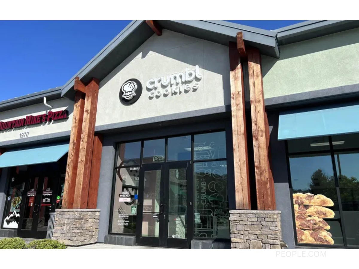
Here's the part most redesign stories skip. Crumbl's fastest growth happened under the chef logo, with the chain going from 55 stores in 2019 to 327 by 2021 and past 950 by late 2023.
Store sales peaked under that logo too. Franchise disclosure documents put average sales per store at $1.7 million in 2021 and $1.84 million in 2022, the highest figure in Crumbl's history.
In other words, the Crumbl Cookies logo with the chef and the two-line wordmark rode the whole climb, and the redesign arrived after that climb, as an update to a brand people already knew.
2023 To 2024: The Year Crumbl Dropped Cookies
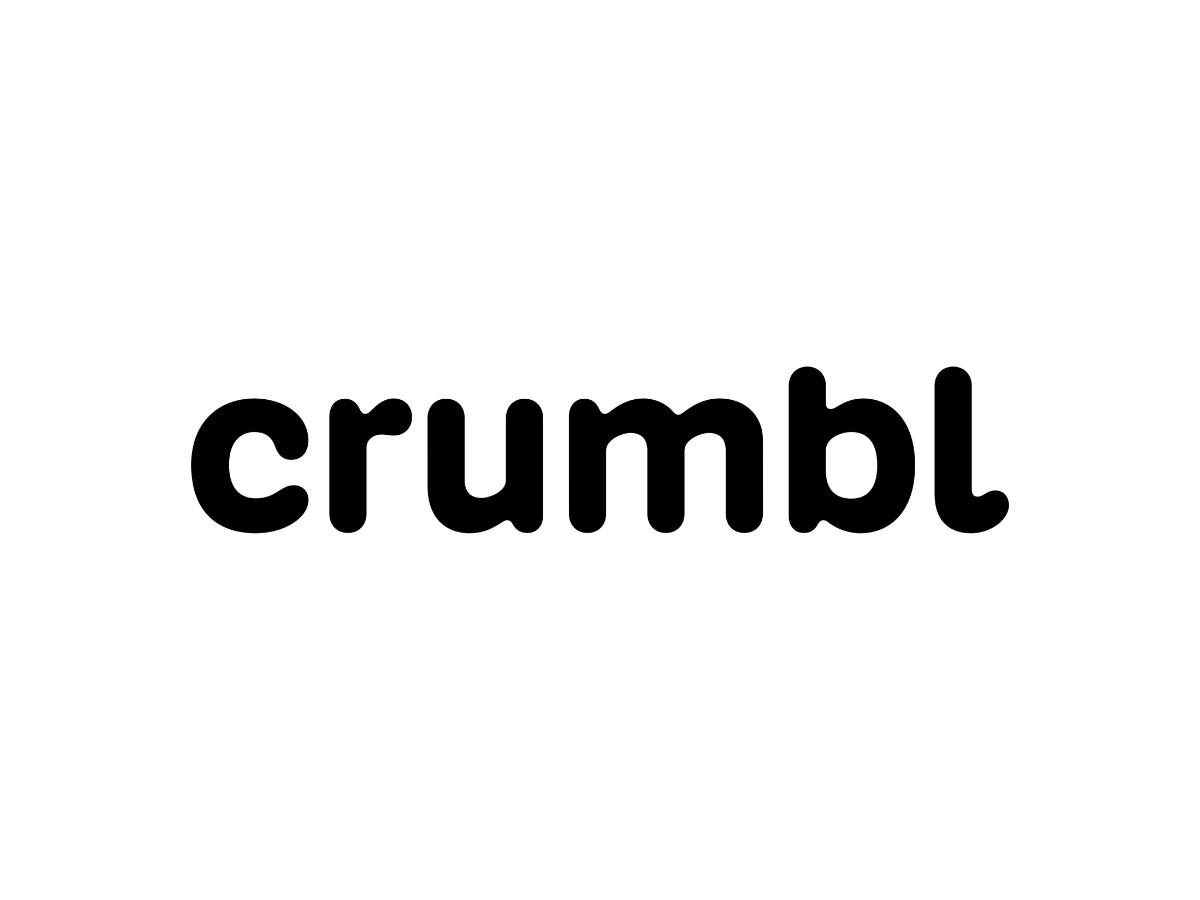
Crumbl unveiled its refresh on Nov. 28, 2023. The new logo does away with Bakerhead and the word "cookies," leaving "crumbl" in black over Pantone Crumbl Pink, a shade the company developed with Pantone earlier that year.
Turner Duckworth led the identity, and lettering designer Alec Tear helped redraw the logotype. The new letters keep the softness of the 2018 wordmark, curled "l" included, but the strokes run so thick that the counters of the "u," "m," and "b" shrink to narrow slots.
The wordmark also grew into a type system. It was extended into a variable typeface built with German foundry Kilotype, and in motion the letters stretch and melt from plain text into fat display lettering.
Illustration replaced the mascot. BUCK drew the "Crumblverse," a cast of characters in thick black linework and flat color, while the pink box carried forward unchanged.
The wordmark is black, hex #000000 (CMYK 0, 0, 0, 100). Crumbl has not published hex or CMYK values for Pantone Crumbl Pink, so the only official reference for that shade is the Pantone name itself.
The switch started on screens. Crumbl swapped its app icon and social profile picture to a black "C" on pink, and some fans noticed fast, with one asking where the little chef went.
Hemsley framed the change as a refresh. He called it "not a complete rebrand," describing the work as improvements built on the foundation Crumbl already had.
2024 To 2026: What A Logo Can't Fix

The years after the refresh tested the product more than the look. Average sales per store fell to $1.16 million in 2023, recovered in 2024, then slid to $1.14 million in 2025, franchise disclosure documents show.
New products didn't reverse the trend. McGowan pitched dirty sodas to franchisees in July 2025 as a 20% sales lift, and he later told them an August 2026 Soda Week was the worst week in company history.
Leadership changed next. On May 11, 2026, McGowan and Hemsley announced they would step back from the CEO and chief brand officer roles and stay on as directors, with McGowan as chairman.
By the fall, at least 57 stores had closed in 2026. McGowan took the blame in front of franchisees: "It's my fault where we are today," and the chain still counted more than 1,000 locations.
Through all of it, the identity kept doing its narrow job. The pink box and black wordmark stayed easy to spot in a feed, and the harder question of what to put inside the box sat with the menu.
What The Evolution Teaches
Crumbl's run offers food and beverage brands a clear case study, with lessons that cut both ways. Here are four worth keeping.
Drop The Explaining Word Once The Name Can Stand Alone
Crumbl cut "cookies" after six years and nearly 1,000 stores, when the name already meant cookies to its audience. The Starbucks logo dropped its name in 2011 on the same logic, and the McDonald's logo leans on the arches alone.
Own A Color And A Shape Before You Retire A Mascot
Bakerhead could leave because the pink box and the color were already doing his job. Brands that own a color, like the Coca-Cola logo with its red, can lose a character without losing recognition.
Build A System, Then Cut The Logo
The 2023 wordmark works because a typeface, illustration set, and motion style came with it. A lone mark struggles to stretch from app icons to billboards, which is why the KFC logo and Wendy's logo lean on full brand systems too.
Recognition And Demand Are Separate Jobs
A distinctive identity gets you noticed, and keeping people coming back is the menu's job. Crumbl's 2025 and 2026 numbers moved with its products while its look held steady, a split worth remembering before any redesign.
For more on how restaurant marks change over time, read our Taco Bell logo breakdown and Pepsi logo history, browse the latest logo design trends, or compare logo design agencies for your own rebrand.
Quick Answers
When Did Crumbl Change Its Logo?
Crumbl unveiled its current logo on Nov. 28, 2023, and it swapped the Bakerhead chef and the word "cookies" for a single wordmark. The earlier marks, a bitten cookie and then Bakerhead, date to 2017 and 2018.
Who Designed The Crumbl Logo?
Turner Duckworth led the 2023 identity, with Alec Tear helping redraw the logotype and BUCK creating the illustrations. No public record we found credits the designer of the original 2017 and 2018 marks.
What Font Does Crumbl Use?
Crumbl uses Crumbl Sans, a custom variable typeface extended from the 2023 logotype. German type foundry Kilotype worked with Turner Duckworth to build it.
Why Is Crumbl Pink?
Hemsley chose pink for the original box in 2018, inspired by a neighbor's pink Cadillac. In 2023, Crumbl turned that shade into its own Pantone color, Pantone Crumbl Pink.
Our team ranks agencies worldwide to help you find a qualified partner. Visit our Agency Directory for the Top Logo Design Companies as well as: