Last updated: 27/06/2024
Chances are the last time you craved a perfect cup of coffee, the image that popped into your mind was a familiar green circle with a captivating siren at its center — the iconic Starbucks logo.
But what led to this distinctive design and how has it become such an iconic representation of the coffee giant? We have contacted our design team to uncover the origins and evolution of the Starbucks logo to discover how, despite numerous updates, it has retained its core character and become a beloved emblem of our favorite coffeehouse.
A Brief Introduction to the Starbucks Brand
Starbucks stands as a cultural icon with a rich legacy spanning over four decades. From its iconic coffee blends to its innovative café experiences, Starbucks has shaped the global coffee culture. But what exactly is Starbucks, and what sets it apart?
Getting To Know the Starbucks Company
In 1971, Starbucks' founders collaborated with artist Terry Heckler to establish a brand. Initially, they wanted it to be "Pequod," inspired by the ship in "Moby-Dick" but Heckler objected, questioning the appeal of a cup of "Pee-kwod." Heckler then stumbled upon the name "Starbo" while researching the names of mining camps on Mt. Rainier. This discovery led them back to Moby Dick and the name "Starbuck," the first mate on the Pequod.
This world-famous brand now is primarily known for its wide variety of coffee beverages, including hot and cold brews, espresso-based drinks like lattes and cappuccinos, and signature Frappuccinos. They also offer teas, pastries, sandwiches, and other food items. Additionally, Starbucks sells packaged coffee beans, instant coffee, and bottled beverages in grocery stores.
Today, Starbucks has become the world's largest coffeehouse chain, with over 32,000 stores in 80 countries. It has successfully established itself as a global brand synonymous with coffee culture.
Additionally, this company consistently innovated to stay ahead of the curve. This includes new beverages like the Pumpkin Spice Latte as well as expanding into mobile ordering and payment technology with its app. They have also focused on sustainability initiatives like reusable cups and ethically sourced coffee beans.
Starbucks Global Reach
Starbucks has made significant strides in expanding its global presence, with a strong focus on tailoring its offerings to local tastes while maintaining a consistent global brand. Starbucks also operates with a significant presence outside the United States, including over 20,000 stores outside of its founding country.
Starbucks has a presence in more than 80 countries, with a diverse range of markets and cultures. This global reach allows the company to adapt its offerings to regional preferences, making it feel like a local coffeehouse no matter where you are. In some countries, Starbucks has become an integral part of daily life.
For example, in China, the company has expanded massively since 2019 and is now operating over 6,500+ stores in 250 cities. Furthermore, Starbucks is poised for significant growth in emerging markets like India, Southeast Asia, and Latin America.
These achievements demonstrate Starbucks' ability to successfully expand globally while maintaining its commitment to local tastes and cultural relevance.
The Brand Mission
At the heart of Starbucks' global success lies its mission to inspire and nurture the human spirit, one person, one cup, and one neighborhood at a time. This mission is reflected in the Starbucks logo, which has become synonymous with high-quality coffee and a welcoming atmosphere.
The brand's commitment to quality and customer satisfaction is evident in every aspect of its operations, from sourcing the finest coffee beans to providing exceptional customer service. By staying true to its brand mission, Starbucks has built a loyal customer base and established itself as a leader in the global coffee industry.
The Starbucks Iconic Symbol Is Almost as Famous as the Brand Itself
Starbucks is an American coffee company founded in 1971. This Seattle-based brand is known for its strong coffee, holiday cups and expertise in the industry. It’s one of the biggest coffee retailers in the United States and across the globe. Whether consumers are looking for a cold, refreshing sweet treat or a strong cup of joe, they can get their fix at Starbucks.
This brand began gaining traction in the 1980s, growing slowly but steadily. It started opening locations in the continental US and Canada in the 80s. In the 90s, this coffee chain opened its first California store. And in 1996, the first non-North American store was opened in Tokyo, Japan.
Starbucks is an iconic brand with classic storefronts across the world. Wherever you are, whatever you’re in the mood for, it’s likely that you’ll be able to get your fix at a nearby Starbucks store. You’d be hard-pressed to find someone that hasn’t heard the name Starbucks or enjoyed a Starbucks beverage.
Starbucks is constantly in the news — from controversial packaging decisions to the brand’s commitment to being revolutionary, inclusive and diverse. The brand is modern, fresh and bubbly — coming up with playful and innovative new concoctions and engaging audiences through its intuitive app.
You can spot a Starbucks from a mile away — that’s due in part to its consistent branding, marketing materials, but most importantly, its logo. That alluring mermaid is a shining beacon of hope to all early morning commuters out there. It’s a symbol of strength, authenticity and leadership.
The Evolution of the Starbucks Logo
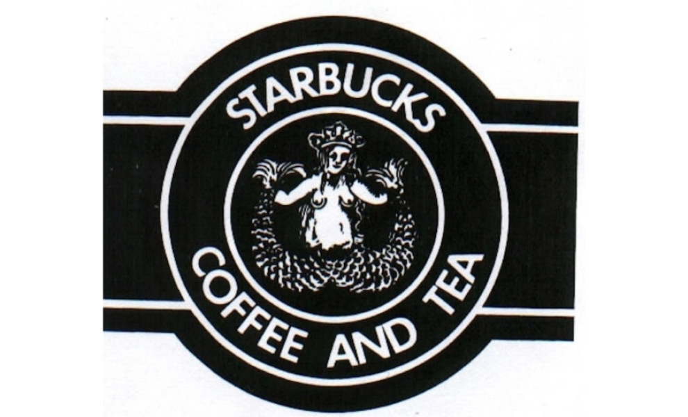
The original look of the logo is different than that of today. It has always held within it the iconic mermaid, and it always held the circular, seal-like shape. But in the beginning, this black/brown logo design looked much older and outdated than it does now.
The illustrated mermaid sitting inside is on full display -- from her head to her tail. It's extremely detailed, but small and graphic. Surrounding this is the brand's name, in addition to the moniker of "coffee and tea." Check out our article on the best coffee and tea packaging designs.
It's a simple logo, with the twin-tailed mermaid surrounded by two circles in a bullseye-like design. The original creators of the brand wanted an aquatic, whimsical and mythological vibe to the brand so they went with this siren illustration to captivate and engage.
The Starbucks Logo Uses Creative Illustrations and Iconic Coloring To Keep the Brand Fresh
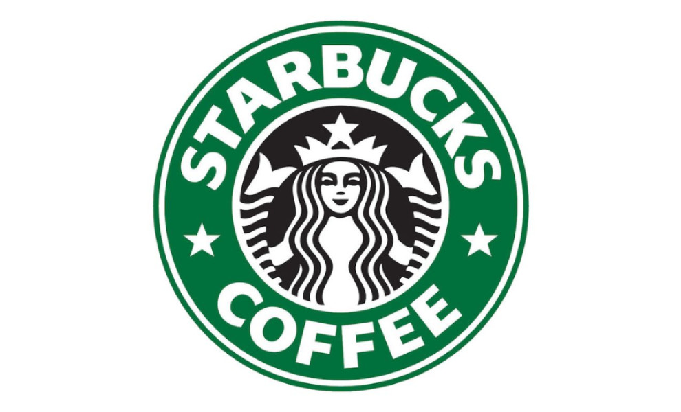
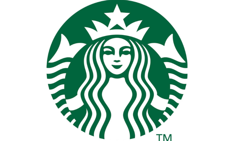
As the brand grew, the logo changed. It went from a detailed, graphic, and almost hand-drawn image of a mermaid within the circular design, to one that was more modern, hip, and fresh. The design went from drawn out, to a simple, clean display.
The imagery began to focus more on the face of the mermaid herself. And now, you can see she is smiling, with her hair flowing around her and her tail coming up to frame her face in a beautiful and majestic way. The color scheme of the logo also changed. It went from black, brown and white to green, white and black.
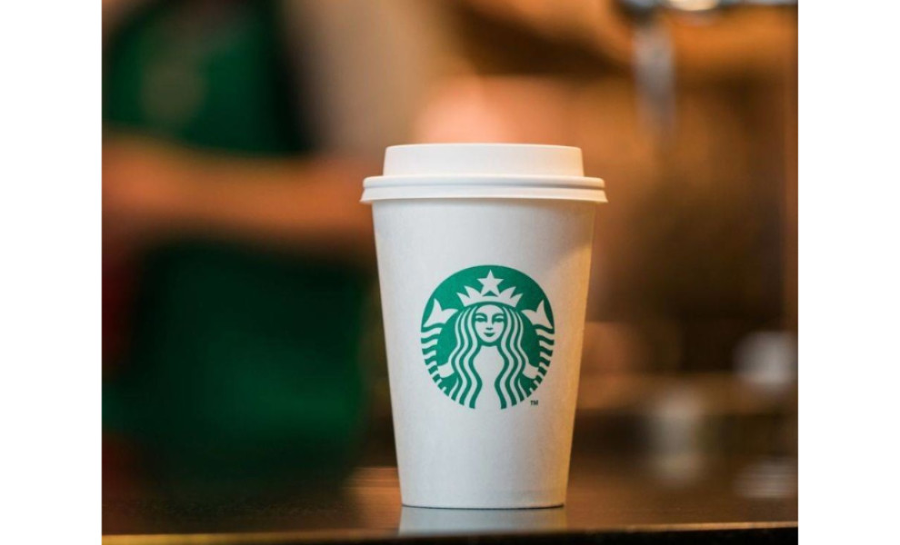
In its full form, this logo is still a bullseye with the brand name sitting around the inner illustration. But in its simplest, responsive form, all that is visible is this iconic, illustrated mermaid in white against the recognizable green background.
The current logo is bright, eye-catching, and fresh. There's a liveliness and playful edge to this design that's extremely creative, simple, and fun. Also, you see this logo everywhere — on awnings, merchandise, and in marketing materials.
This logo has become a symbol of a brand that's committed to living in the future and paving the way for brands and individuals to live their best lives. The brand takes its identity seriously, and it cares about its customers and their experience. This logo exemplifies dedication and appreciation.
Starbucks’ Logo Design Is Clean, Fun and Instantly Recognizable
The Starbucks logo is one of the most iconic logos in the food and beverage industry. It's bright, simple and clean. It's fun, playful and engaging. The logo has come a long way since its first creation in the 1970s. It has gone from old, outdated, and antique to fresh, sophisticated, and lively.
From the iconic green coloring to the beautifully crafted illustration, this logo shines. And the iconic mermaid is a whimsical and high-spirited image that ties this logo back to Starbucks and its humble roots.
This logo design is full of innovative design elements that have joined forces to create a symbol that brings smiles to faces across the globe. Discover more best coffee place logo designs.