Pepsi's logo has undergone numerous redesigns throughout its history, including a few complete overhauls. Allow us to lead you through its evolution — from a red cursive script to the minimalistic "Pepsi Globe", which became an inspiration for professional logo designers worldwide.
Origins of the Pepsi Logo (1898–1940)

Before Pepsi became a global brand, it began as “Brad’s Drink” in 1893, created by Caleb Bradham. Early visual branding from this period is not well documented, and many representations remain speculative.
The first verifiable identity appeared in 1898, when the drink was renamed Pepsi-Cola and introduced with a red script wordmark.

In the early 1900s, the Pepsi logo evolved through refinements rather than major changes. The 1903 version used elaborate, looping letterforms, while later updates improved spacing and readability. These designs closely resembled Coca-Cola’s script, positioning Pepsi within a familiar visual category.

Design historians often point to this similarity as a reflection of direct rivalry, with both brands competing for recognition in the growing soft drink market.
The Bottle Cap and Globe Era (1950s–1960s)

Pepsi’s first major visual shift came in the mid-20th century, as consumer culture and advertising evolved after World War II. During the 1940s, the brand introduced a red, white, and blue bottle cap, using patriotic cues to stand apart from competitors and moving toward a more structured identity.

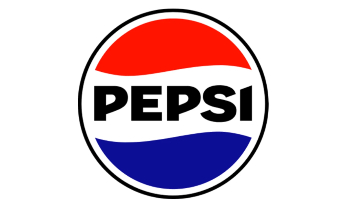
By the 1960s, Pepsi moved away from script typography. The brand dropped “Cola” and adopted a bold, uppercase sans-serif wordmark, reflecting a shift toward modernism and youth appeal. This aligned with broader design trends that favored clarity over ornamentation.
The circular bottle cap format also laid the foundation for what would later become the Pepsi Globe, a scalable and adaptable design system that worked effectively across packaging and advertising.
Check out more impressive logo redesigns here.
The Pepsi Globe and Global Branding (1969–2000s)

The introduction of the Pepsi Globe in 1969 marked a key shift in the brand’s identity. The bottle cap was simplified into a red, white, and blue sphere that could stand on its own, allowing the symbol to function without the wordmark and supporting Pepsi’s move toward a global presence.
In the decades that followed, the Pepsi logo adapted to changes in technology and culture.

By 1991, the wordmark was separated from the globe, giving the symbol more prominence. In the late 1990s and early 2000s, the brand introduced gradients, highlights, and three-dimensional effects, reflecting the rise of digital design while keeping the core structure intact.

These changes added visual depth but also introduced complexity, which later became a limitation as branding shifted toward minimalism.
The Arnell Redesign (2008)

In 2008, Pepsi introduced one of its most debated redesigns, developed by Arnell Group. The update replaced the symmetrical globe with an asymmetrical “smile” wave and introduced a lowercase sans-serif wordmark, reflecting a shift toward digital-first aesthetics.
The project included a detailed internal document, often called the “BREATHTAKING” strategy, which referenced geometry, proportion, and Renaissance art. The redesign cost over $1 million and drew wide attention across the design community.
Fast Company called it “one of the most ridiculous things ever perpetrated by somebody calling himself a designer.” Despite the controversy, Pepsi retained the mark for 14 years — the longest run of any single Globe iteration since 1969.
Reactions were mixed. Some saw a move toward cleaner, minimal form, while others viewed it as disconnected from Pepsi’s visual history. The 2008 logo highlights the risk of major change when it moves too far from familiar brand cues.
The Modern Pepsi Identity (2023–Present)
")
In 2023, PepsiCo introduced a new logo that marked a return to its design roots while addressing modern branding needs. The updated identity features a bold uppercase wordmark placed inside the globe, referencing the 1970s and 1980s designs.
The redesign introduced an enhanced color palette with stronger contrast and the introduction of black elements to support Pepsi Zero Sugar branding.
According to PepsiCo’s official redesign case study, the new identity was designed to be both “timely and timeless,” balancing heritage with contemporary relevance. Additional coverage highlights that the redesign emphasizes high-contrast visuals and improved legibility across digital platforms.
The update reflects a broader shift in branding, where companies revisit earlier identities to reinforce recognition while adapting for mobile, digital, and global use.
Design Analysis: What the Pepsi Logo Teaches Us
1. Colour Consistency Strengthens Brand Memory
Pepsi’s blue, introduced in 1951, has become one of the brand’s most consistent assets. It has outlasted changes in logo shape and typography, staying recognizable across decades of updates.
Colour registers faster than form. People often recognize a brand through its palette before reading a wordmark. Pepsi’s long-term use of blue reinforces that recognition each time the globe appears in a new setting.
2. Circular Logos Scale Across Packaging Systems
The Pepsi globe shows how a simple shape can work across formats. The circular design maintains its original shape on different products, which include cans, cups, app icons, and large-scale signage.
It also avoids directional limits. Unlike a wordmark, it doesn’t rely on left-to-right reading, which helps it work across markets and placements. That consistency, maintained for over 70 years, has made the globe one of the most recognizable abstract marks in global branding.
3. Evolution Must Preserve Equity
The 2008 Arnell redesign worked in use, yet its rationale distanced the mark from Pepsi’s history. People don’t connect with abstract explanations. They respond to familiar forms that carry meaning over time.
The 2023 update brings that connection back. The design shows how continuity through time enables transformation by extending the original 1987 globe design with new type and color elements.
4. The Challenger Brand Framework
Pepsi’s branding changes established an obvious brand identity. The brand uses new products to demonstrate its relevance to cultural developments, which show its dedication to maintaining its historical traditions. Coca-Cola takes the opposite path, using consistency to reinforce heritage and authority.
Both approaches work when applied with discipline. The key is knowing which stance your brand holds before making design decisions.


-preview-webp.webp)