The Coca Cola Logo: Key Points
- Consistent Logo Strategy = Global Brand Value: By maintaining its original Spencerian script for over 139 years, Coca-Cola has built one of the most recognized logos worldwide — contributing to its $106 billion global brand valuation and $47 billion annual revenue as of 2024.
- Color Consistency Drives Instant Brand Recall: Coca-Cola’s strict control over its signature red hue taps into System 1 thinking, the brain’s automatic response system, proving that precise color management accelerates consumer trust and recognition.
- Digital Campaigns Boost Consumer Engagement: Coca-Cola’s 2022 FIFA “Believing is Magic” campaign delivered 28 million product label scans (up 400%) and engaged 5 million consumers via its branded digital Fan Zone, reinforcing the ROI of logo-led, localized digital experiences.
- Ownable Packaging Structures Deliver Long-Term Value: Coca-Cola’s century-old contour bottle has evolved without losing its form, showing that recognizable packaging shapes can adapt across trends while retaining consumer loyalty — a strategy agencies can replicate for durable brand equity.
- Typography as Differentiation: While most brands adopt minimalist sans-serifs, Coca-Cola’s ornate Spencerian script remains distinctive and memorable.
You don’t build a $106 billion brand selling sugar water. You build it by owning a visual identity so ingrained, it transcends language, trends, and geography. From a name handwritten by a bookkeeper to a script recognized in over 200 countries, the Coca-Cola logo isn’t just familiar; it’s foundational. This is how design, not just flavor, turned a local tonic into a global symbol.
Rushing and don't have the time to read? Listen instead.
Coca-Cola’s logo strategy decoded — design equity, color psychology, and global ROI in under 15 minutes.
A Brief History of Coca-Cola
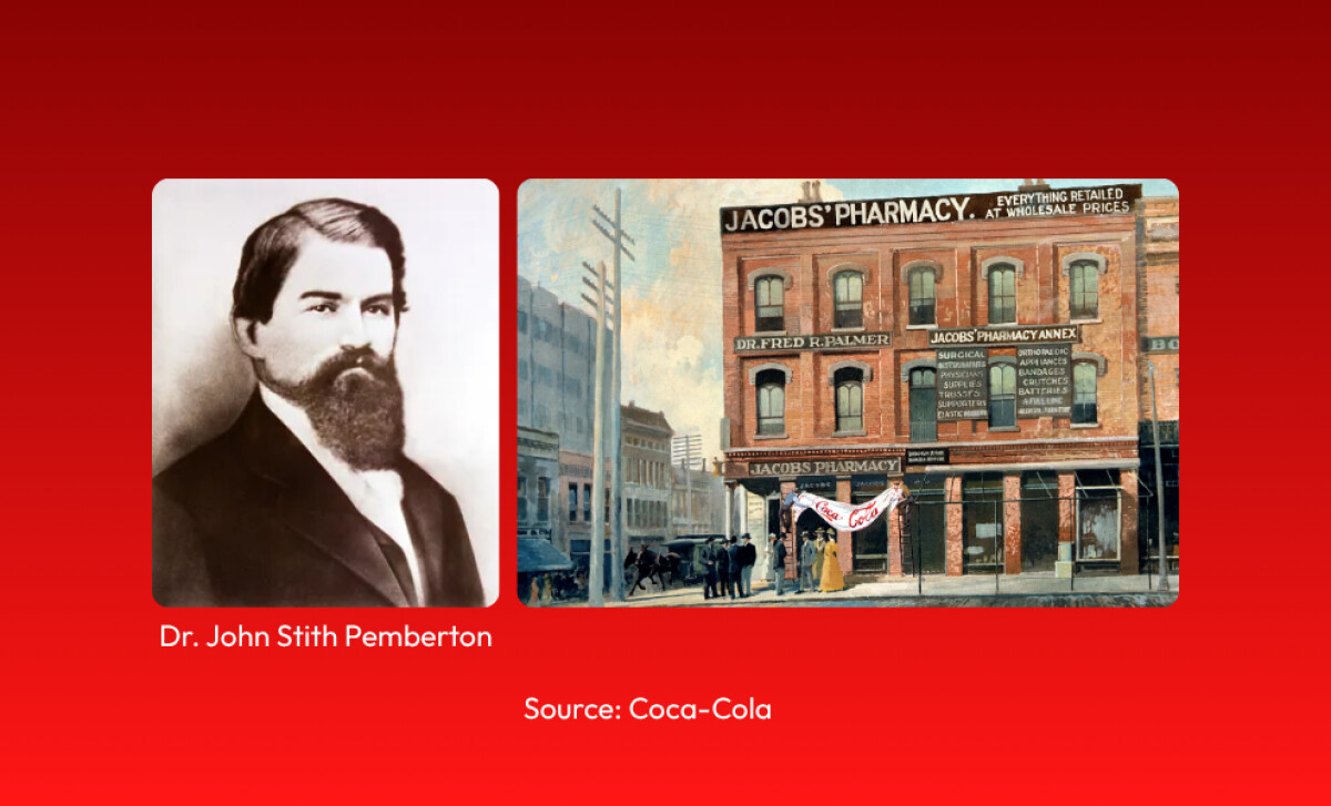
Coca-Cola was invented in 1886 by pharmacist Dr. John S. Pemberton in Atlanta, Georgia, originally marketed as a medicinal tonic containing coca leaf extract and kola nut.
But it was his bookkeeper, Frank M. Robinson, who named the drink and crafted its iconic logo, believing the two “C”s would stand out in advertising.
He handwrote the brand name in the distinctive Spencerian script that still defines it today. Early branding efforts included painted awnings and the first newspaper ads in The Atlanta Journal, inviting locals to try the “new and popular soda fountain drink.”
In its first year, Coca-Cola averaged just nine servings a day, which shows that iconic brands often start small.
The formula was later reformulated without cocaine, and the brand was purchased by businessman Asa Candler, who spearheaded its mass production and aggressive national advertising.
By the 1920s, Coca-Cola had become a household name across the U.S. and began expanding internationally, laying the foundation for what would become the world’s most recognized beverage brand.
What the Coca-Cola Logo Represents
Source: The Globalization of Coca-ColaThe Coca-Cola logo goes beyond typography, it operates as a core brand asset. It represents:
- Stability: While rival brands cycle through rebrands, Coca-Cola’s logo reinforces trust and continuity across generations.
- Heritage and Authenticity: The script evokes a sense of handcrafted tradition and Americana that’s hard to replicate.
- Global Unity: In over 200 countries, the logo reads the same even when transliterated into local scripts (like Arabic or Thai) helping build universal brand recall.
Its longevity also disproves a common myth: that logos need to evolve every few years to stay relevant. Coca-Cola’s timeless design has outperformed trend-driven visual identities.
Coca-Cola’s Iconic Red: Color Palette & Brand Psychology
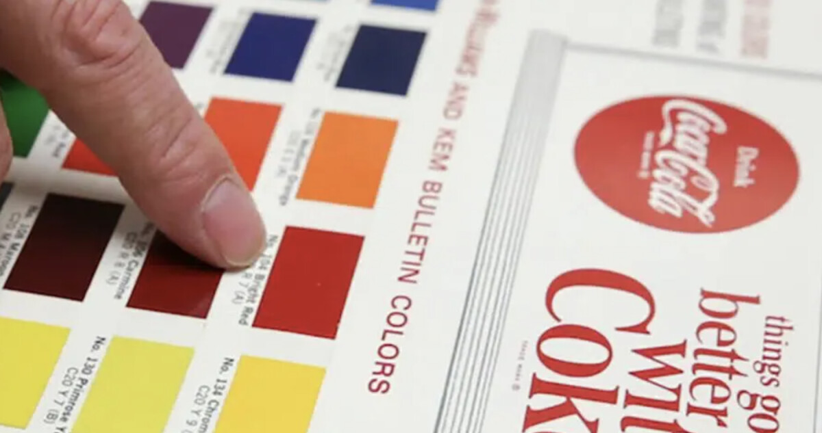
Coca-Cola didn’t always use red and white. Initially, bottles were unbranded or embossed with the wordmark in clear glass. The switch to red began in the 1920s to help tax agents differentiate Coca-Cola from alcohol during Prohibition.
By the 1950s, red had become the core brand color, both for psychological and practical reasons. Red stimulates appetite and evokes excitement and energy—an ideal emotional trigger for an impulse product like soda.
In fact, color is so integral to Coca-Cola’s visual strategy that the brand developed its own proprietary hue: Coca-Cola Red (Pantone 484), a move mirrored by other giants like Tiffany & Co. and UPS.
Why Coca-Cola’s Font Still Stands Out
Frank Mason Robinson’s choice of Spencerian script wasn’t accidental. In the 1880s, it symbolized sophistication and professionalism. Today, that same script has taken on new meaning: it represents legacy, charm, and uniqueness.
While many logos today rely on geometric sans-serifs for digital clarity, Coca-Cola’s wordmark remains rooted in hand-drawn tradition—and that contrast is part of its power.
The logo’s flourishes and curvature help it perform well in both static and animated formats. It adapts to motion graphics, neon signage, and AI-driven personalization without losing legibility or personality.
A published study on logo recall found that distinctive, stylized typography boosts memorability, highlighting custom type as a key asset in long-term brand value.
How the Coca-Cola Logo Has Evolved Since 1886
1886–1900: The Birth of an Icon
Coca-Cola experimented with multiple logotypes in its infancy, from a stark serifed wordmark (1886) to swirling early script variations by 1889.
The 1887 version marks the debut of Frank M. Robinson’s now-famous Spencerian script. Robinson believed the two “C”s would stand out in advertising, a theory that proved prescient.
Business Impact: Though early designs varied, the introduction of the script logo established the foundation for a visual identity that would go on to generate brand equity for over a century. At this time, the brand sold just nine drinks per day, proving iconic branding often starts modestly.
1900–1940: Refinement and Standardization
As Coca-Cola expanded nationally, the logo was cleaned up and standardized across various touchpoints: bottles, signage, and magazine ads.
While minor flourishes were adjusted, the core script remained untouched. By the 1930s, the now-familiar red began appearing more frequently, aligning with festive marketing efforts and increasing brand visibility.
Business Impact: Brand consistency helped Coca-Cola scale nationally, becoming a dominant name in soda fountains and corner stores. Early investments in visual standardization laid the groundwork for mass advertising success in the 20th century.
1950–1969: The Red Disc and Visual Codification
The 1950s marked a visual turning point. As part of a global packaging strategy, Coca-Cola introduced the red disc (also known as the “button” sign), pairing the logo with a bright red circle to help it stand out in store displays and roadside signs.
Business Impact: The visual assets helped Coca-Cola dominate physical retail environments and set a global template for brand execution. This period saw Coca-Cola cement its association with Christmas, Santa Claus, and postwar American optimism.
April 1985 – July 1985: The (Short-lived) "New Coke" Era
Facing declining market share (Pepsi had overtaken Coke in supermarkets by the early 1980s) and amid plateauing cola category sales, Coca‑Cola leadership under CEO Roberto Goizueta made the bold decision to modernize.
On April 23, 1985, the company introduced "New Coke" alongside a new, bold chunky slab-serif “Coke” logo aimed at revitalizing the brand’s youth appeal and signaling that no element was sacred in pursuit of growth
The rebrand triggered immediate and intense backlash. Approximately 1,500 consumer hotline calls per day surged from a usual 400, and protests and media attention escalated quickly.
Just 79 days later, the company reinstated the original Spencerian logo, now tagged “Classic,” on July 11, 1985.
“When senior leadership made the decision to change the formula, they underestimated the deep psychological attachment people had to Coca‑Cola. We heard consumer stories about how Coke was with them on their first date, or during World War II. An elderly lady famously told Don Keough that he had taken away her memories. New Coke taught us that we were custodians of more than a product, and I think we became a better company because of this lesson."
- Phil Mooney, Former Chief Archivist (Coca-Cola)
Impact on ROI and Brand Equity
The return of “Coca‑Cola Classic” didn’t just restore sales; it delivered a substantial rebound.
Sales of Classic surged past both New Coke and Pepsi, reversing lost share and reinforcing emotional loyalty. The episode elevated Coca‑Cola’s brand in consumers’ eyes and placed it back atop the cola market
“When we announced to bring original Coke back, it was like flipping a switch. Everyone wanted to know where they could buy it. From a consumer affairs standpoint, New Coke raised the visibility of the public’s power because people suddenly realized they could call and that we would listen.”
- Lynn Henkel, Former Manager of Consumer Affairs (Coca Cola)
Legacy Lessons for Brands & Agencies
- Emotional attachment matters: Even superior taste can't overcome deep-seated brand bonds.
- Risk equals opportunity & crisis: The short-lived New Coke, though a flop, demonstrated the company’s capacity to take strategic risks and respond decisively. Roberto C. Goizueta (Chairman and CEO of The Coca-Cola Company from 1981 to 1997) later called it an “intelligent risk”.
- Typographic identity restoration: Reinstating the original Spencerian script reaffirmed consistency and trust, underscoring the logos’ power beyond aesthetics.
1987–2000: Wave Devices and Contour Bottles
To keep up with shifting design trends, Coca-Cola introduced “Dynamic Ribbon Device” (1969) and other curved elements to its packaging and marketing, creating a sense of movement and energy around the static script logo.
These additions didn’t replace the original wordmark but complemented it.
The 1990s focused on minimalism and global brand cohesion. All logo usage had to comply with the Brand Standards Manual, ensuring consistency across Coca-Cola’s 200+ markets.
2003 – Today: Back to the Core
Coca-Cola’s 2003 “Coke Red” campaign stripped away visual noise and put the original script front and center. Today, the logo appears in multiple variations: white-on-red, red-on-white, and even clear overlays for modern packaging.
Despite digital shifts, Coca-Cola has remained loyal to Robinson’s 1886 creation. The brand’s current design strategy is rooted in visual equity, leveraging decades of recognition instead of constant reinvention.
"We don't want to be trendy. We want to be timeless,"said James Sommerville, Coca-Cola’s former VP of Global Design, in a 2016 interview.
How Coca-Cola’s Logo Has Shaped Its Ads & Packaging
From glass contour bottles to limited-edition cans and AR filters, Coca-Cola’s logo has remained central to every touchpoint.
- Packaging Consistency: Coca‑Cola has maintained precise control over its red hue across all packaging formats since the early 20th century, underscoring how precise color management reinforces brand identity.According to research on dual-process theory, color is primarily processed by the brain’s fast, intuitive “System 1,” which influences snap judgments and brand recognition before logic kicks in. For agencies and brand owners, that means consistent color isn’t just aesthetic; it’s a shortcut to consumer trust.
- Ad Effectiveness: During the Coca-Cola® “Believing is Magic” FIFA World Cup 2022 campaign, the brand leaned into its iconic logo while creating digital-first, localized experiences across 41 markets. This strategy led to over 28 million label scans, a 400% increase from the 2018 campaign, and drove engagement from approximately 5 million consumers via the Coca-Cola Fan Zone platform.
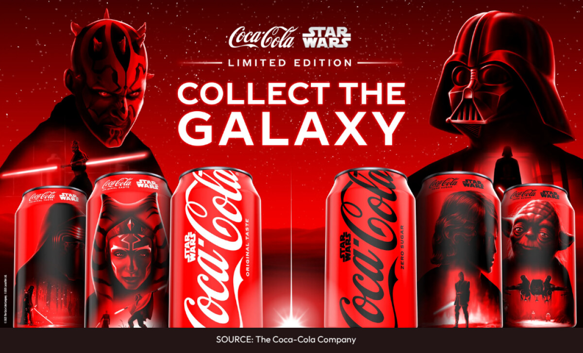
- Merchandising Impact: Branded apparel and collectibles featuring the wordmark have become a multimillion-dollar licensing segment, proof that the logo’s visual equity extends beyond beverages.
Packaging Insight: Iconic structural design can be a long-term brand asset when treated as a flexible framework, not a fixed relic.
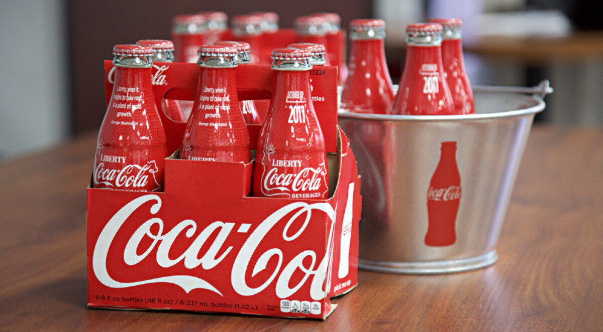
Coca-Cola’s contour bottle proves that maintaining a recognizable form while allowing for subtle updates enables brands to stay relevant across decades without losing consumer trust.
Agencies should guide clients to invest in ownable shapes that evolve with culture, rather than chasing short-lived packaging trends.
Coca‑Cola’s Cultural Impact
Coca‑Cola has shaped global culture and leveraged that influence into business dominance:
- Global Recognition & Market Share: Coca‑Cola controls roughly 46% of the U.S. carbonated soft drink market, with 2.2 billion servings consumed daily in 200+ countries
- Strategic Sponsorships Drive Visibility: Coca‑Cola’s long-term commitment (≈ €100 million/year) to Olympic sponsorship and World Cup activations reinforces cultural associations and brand equity worldwide.
- Localized Engagement Yields Results: Campaigns like 2023–24’s FIFA activations (“A Recipe for Magic” and Fan Zone) and the revival of the “Share a Coke” campaign (expanding personalization to Gen Z with QR integration) have deepened consumer connection and boosted sales.
- Cultural Symbolism Supports Business Resilience: From wartime bottling operations to “cocacolonization,” Coke has become a symbol of comfort, nostalgia, and Americana, its cultural standing helping maintain consumer loyalty even amid global boycotts.
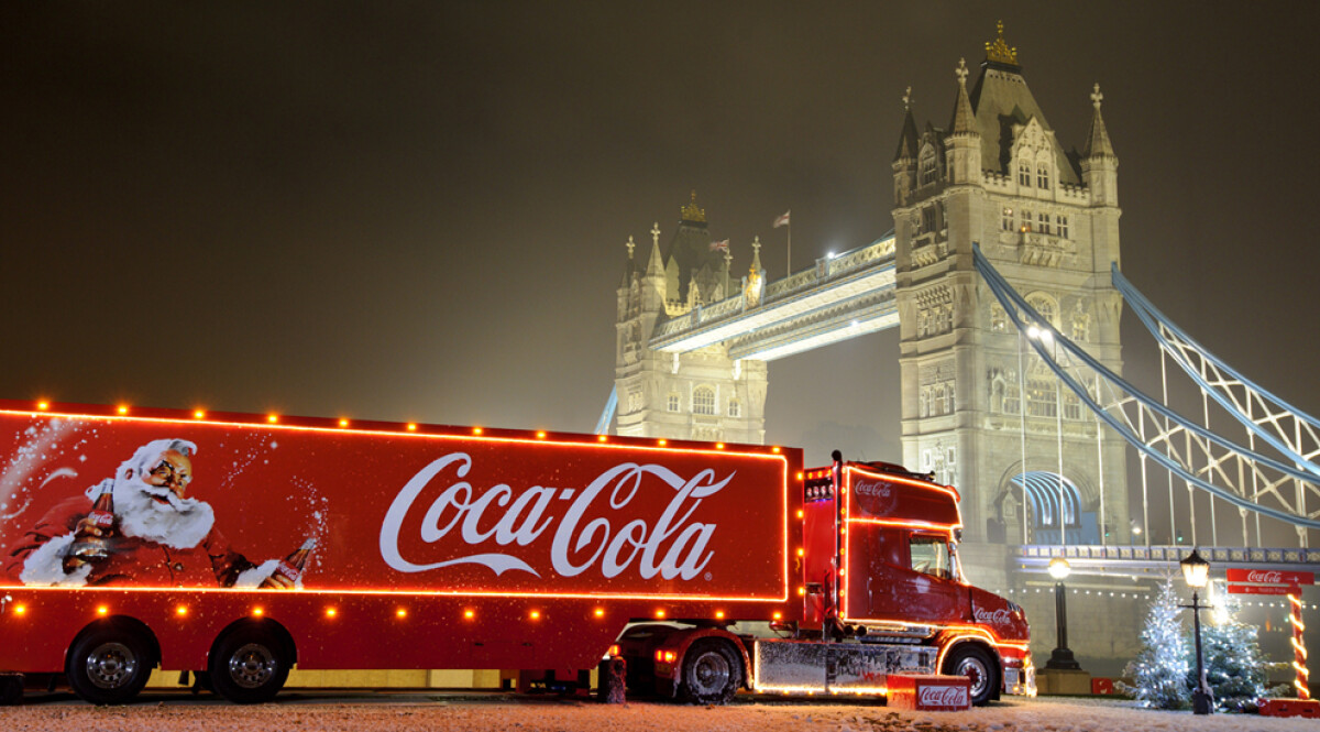
- Pop Culture & Emotional Resonance: The brand has embedded itself in holiday traditions (Santa campaigns since 1931), music (“I’d Like to Buy the World a Coke”), sports (Olympics sponsorship since 1928), and more. Today, its annual marketing spend exceeds $4 billion, with an estimated 140–150 million followers across major platforms coming from 120 million in 2023, a testament to earned attention.
What Brands and Agencies Can Learn from Coca-Cola’s Logo Strategy
You don’t build a nearly $47 billion annual revenue business, or a logo that’s endured for 139 years, by accident.
Coca‑Cola’s iconic Spencerian script and exclusive red palette aren’t just design choices; they’re proven growth engines, helping the brand capture pricing power, drive 9–11 % price/mix growth in 2024, and secure its spot as a $106 billion brand globally.
And here’s what you can learn (and apply) from this legacy brand:
- Design Consistency Pays Off: Coca-Cola’s decision to preserve its logo for over a century has helped it dominate shelf space, grow brand trust, and lead in unaided recall across global markets.
- Own Your Color: Red isn't just a color. It’s Coca-Cola’s visual shorthand for emotion and brand memory. Defining and protecting a proprietary color can elevate long-term brand recognition.
- Typographic Identity Matters: A hand-drawn script may feel nostalgic, but it also signals brand confidence. In a sea of clean sans-serif logos, distinct typography is a competitive asset.
The Coca-Cola Logo: When Design Is Strategy, Logos Become Legacy
Coca-Cola’s logo didn’t become iconic by chasing trends. It did so by anchoring every brand decision to design consistency, emotional resonance, and cultural relevance.
From its handwritten script to proprietary red and contour packaging, every visual element works in tandem to tell the same story, generation after generation.
For legacy-driven brands in food, beverage, and global retail, timeless impact starts with a design partner who understands the compounding power of consistency and cultural memory.
Looking to build a logo that becomes your brand’s most valuable asset?
Our team ranks agencies worldwide to help you find the ideal creative partner. Visit our Agency Directory to explore top firms in:
You can also browse our Best Logo Designs section for more brand identities that stand the test of time.