
In 1950, Dr Pepper fired a period. The little dot had ridden after "Dr" for 65 years, from drugstore labels to brick-wall signs. Then the brand tipped its name into a bold new italic, and the story goes that "Dr." suddenly read as "Di:". The letters stayed, the dot got the boot, and the Dr Pepper logo has never taken it back.
The Short Version
- Dr Pepper dates to 1885 at Morrison's Old Corner Drug Store in Waco, Texas, one year before Coca-Cola. That date belongs to the drink, since the current logo arrived in 2015.
- The Dr Pepper logo history runs through about 18 distinct versions, so it reads best in eras.
- The "Drink a Bite to Eat at 10, 2, and 4" slogan put a clock dial on ads, bottles, and cans from 1927 into the 1970s.
- The period after "Dr" came off in 1950 along with new lettering, and legibility is the documented reason.
- The claim that a slanted "Dr." read as "Di:" was in print by 1989 and fits the letter shapes, but no company or museum record we found spells it out.
Verdict: the period drop is real and well dated, the legibility motive holds up, and the "Di:" detail is a strong story still waiting for its paper trail.
The Pharmacy Origins: A Drink Called A Waco
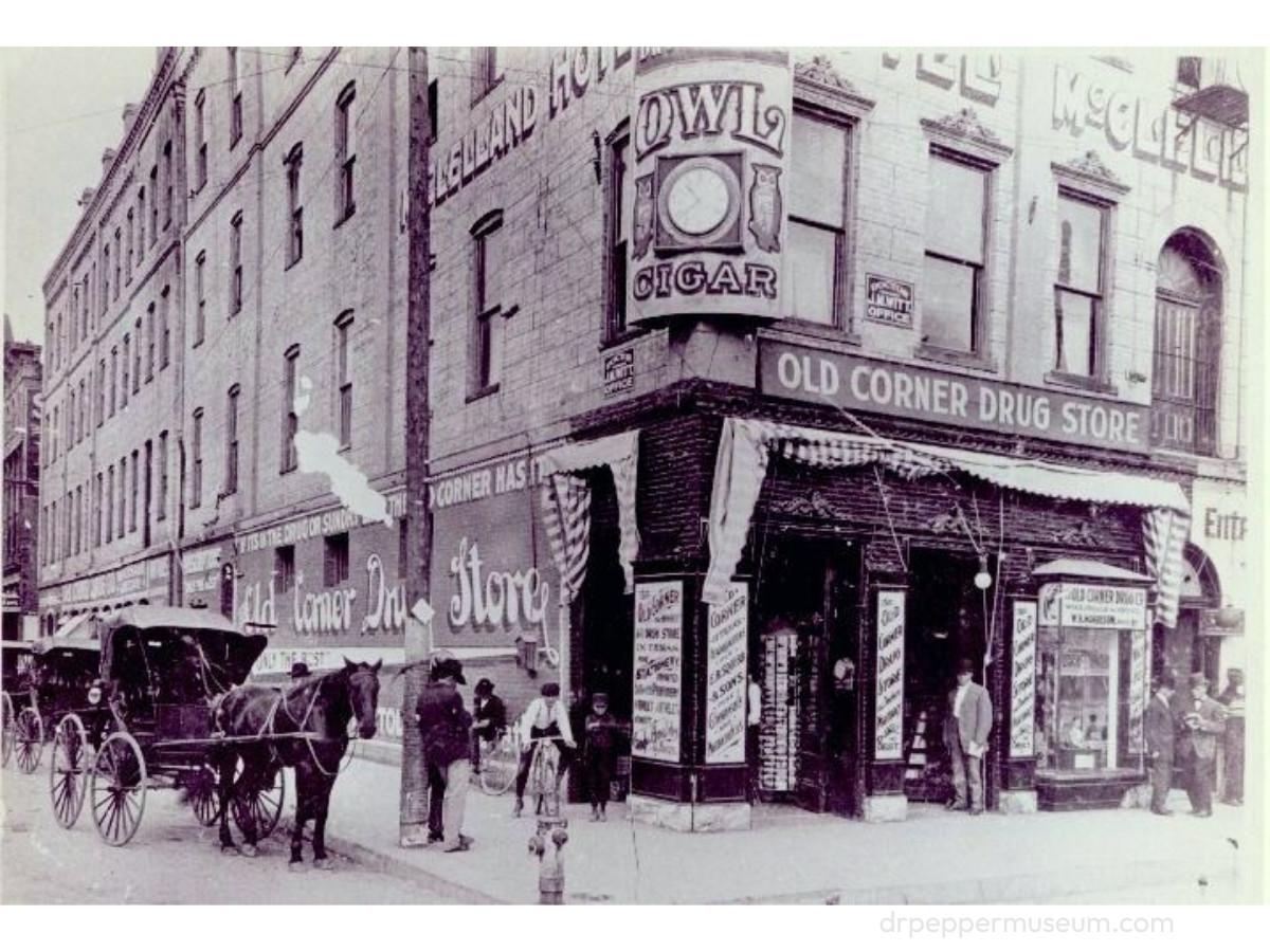
Dr Pepper started as a fountain drink in a Texas drugstore. Charles Alderton, a young pharmacist at Morrison's Old Corner Drug Store, wanted a drink that tasted the way the store smelled, with all its fruit syrups in the air.
Customers first ordered it by asking for a "Waco," and Store owner Wade Morrison gave it the name Dr. Pepper, period included, and in 1891 he and beverage chemist Robert Lazenby formed a bottling company to keep up with demand.
That 1885 date matters for one comparison. The drink is one year older than Coca-Cola, but the mark on today's can is only about a decade old.
Where The Name Came From
Nobody knows. More than a dozen origin stories float around Waco and Virginia, and none has been confirmed, so the fair move is to lay them side by side.
The most repeated account points to Dr. Charles T. Pepper of Rural Retreat, Virginia. Morrison supposedly worked for him and named the drink as a thank-you, but census records place young Morrison in Christiansburg, about 40 miles away, with no trace of that job.
A second version turns it into a love story. Morrison named the drink to win over Pepper's daughter, the tale goes, though historians point out she was about eight years old when he settled in Waco.
A third account keeps Virginia and swaps the doctor. The same census research turned up a different Dr. Pepper living near Morrison in Christiansburg, with a daughter close to Morrison's age.
The fourth needs no real doctor at all. Patent medicines of the era often put "Dr." in the name to suggest health, and a soda born behind a pharmacy counter fits that habit. Each story has a case, and none has a document behind it.
1885 To 1923: Drugstore Script
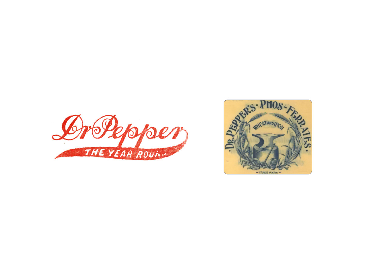
For its first decades, the name ran in a joined hand script. The 1885 mark set "Dr Pepper" in red script with looping capitals, and a long swash under the name carried the words "The Year Round."
From 1891 to 1906, a second mark ran beside the script and looked nothing like a soda logo. "Dr. Pepper's Phos-Ferrates" arched in serif capitals around an anvil framed by wheat stalks, with "Wheat and Iron" above it, the look of a tonic label on a pharmacy shelf.
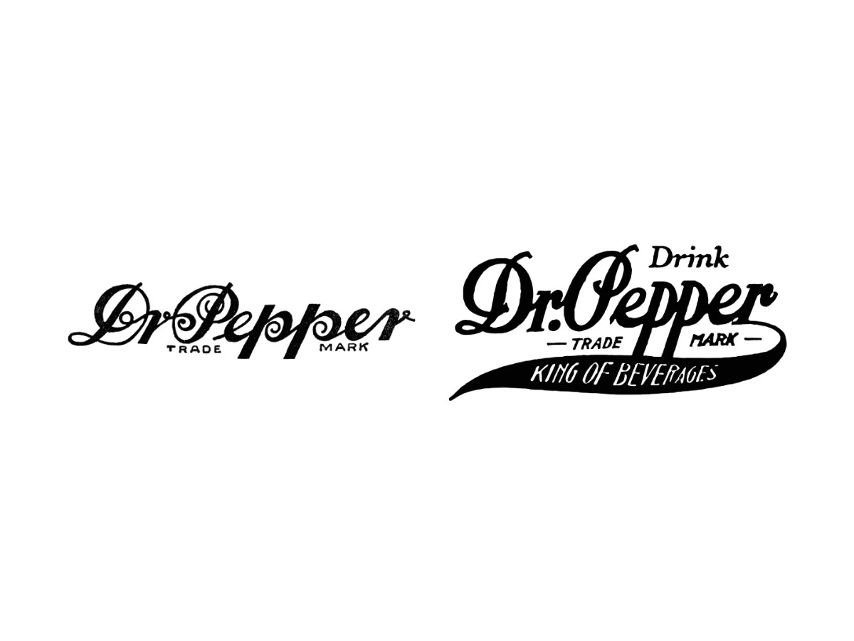
The 1906 version turned the script black and set "Trade Mark" beneath it. The long descenders of the two p's in "Pepper" dropped between those words and split them apart.
In 1911, the period became hard to miss. "Dr. Pepper" sat under a small "Drink," and a thick swash tail under the name carried "King of Beverages," the slogan the brand ran in the early 1910s.
1923 To 1950: Good For Life And A Logo That Told Time
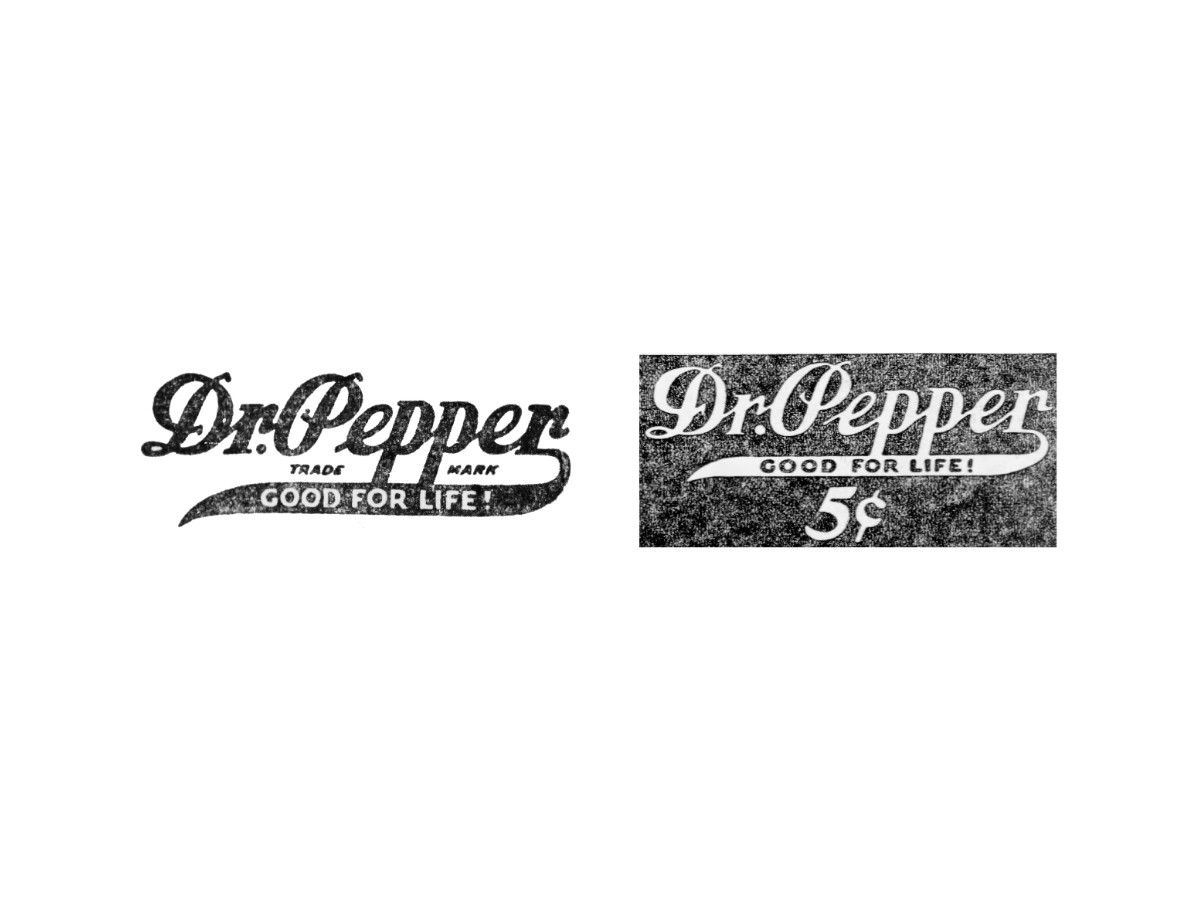
In 1923, the swash dropped "King of Beverages" and picked up "Good for Life!" The script grew heavier and rougher at the edges, with "Trade Mark" still tucked under the name.
The 1920s also added a face. "Old Doc," a country doctor in a top hat and monocle, became the trademark character and stayed into the 1930s.
In 1927, the brand added something stranger. Most logos tell you who made something, but the 10-2-4 mark told you when to drink it.
The idea came from company chairman J.B. O'Hara, who believed a sugary soft drink was food in liquid form. A Columbia University study by Walter H. Eddy reported energy dips at 10:30 a.m., 2:30 p.m., and 4:30 p.m., and the brand wanted to own those three moments.
The company held an internal contest with a $25 prize. Earl Racey won it with the line that became "Drink a Bite to Eat at 10, 2, and 4," and the numbers soon jumped from ad copy into a mark of their own.
The graphic was a clock dial built around three numerals. The 10, 2, and 4 sat where they fall on a real clock face, and the brand name often ran inside the dial, so the mark worked as a small schedule you carried in your hand.
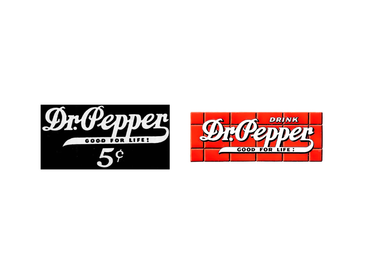
The dial never replaced the main wordmark. It ran beside the script as a second badge, and the script kept changing around it: white on a dark panel with a 5-cent price in the late 1920s and 1930s, then white on a red brick-wall panel under the word "Drink" from 1941.
The slogan paid off hardest during World War II. Sugar was rationed for its use in explosives, and O'Hara took the Eddy study to the rationing board to argue that soft drinks kept workers going, which helped bottlers win a sugar quota.
Through all of it, the period after "Dr" stayed on most pieces, though not all of them. The clock would outlast it by more than 20 years and hold its spot on bottles and cans into the 1970s.
1950 To 1958: The Dr Pepper Logo Loses Its Period
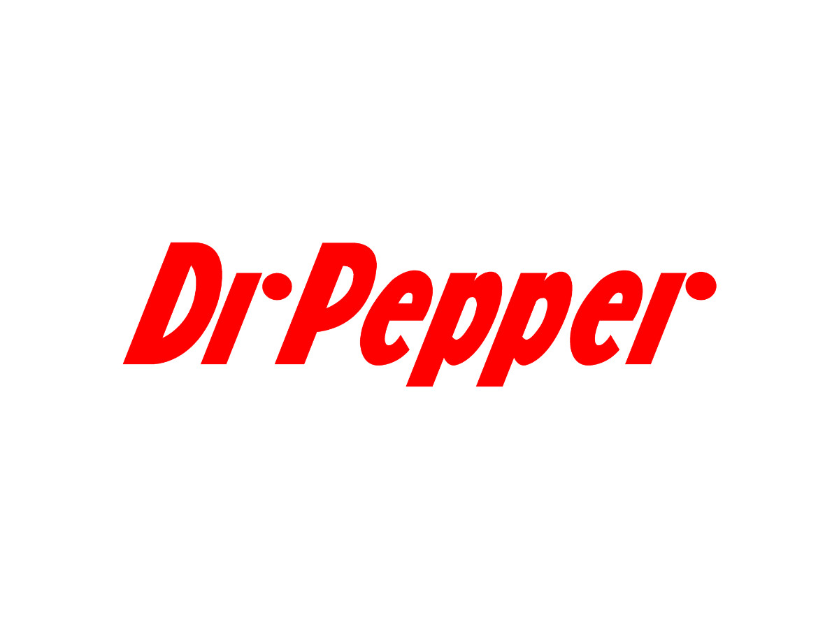
Start with what the record supports. In 1950, a redesign of the lettering replaced the old trademark, and the period left with it.
The reason on record is legibility. The brand itself has said the move made the name easier to read on the smaller bottles of the day, and by 2001 the "Di:" version had become a staple of Texas soda trivia.
The 1950 mark dropped the script for a heavy red sans serif with a hard forward lean and no frame. Its lowercase r has two parts: a slanted stroke and a separate round dot where the arm of the letter would curve, and the r at the end of "Pepper" is built the same way.
Now add a period and watch what happens. The r's dot sits near the top of the lowercase letters, and the period sits on the baseline, down and to the right.
The slant does the rest. Tipping the letters forward pushes every top edge to the right, which carries the r's dot out over the period, so the two dots stack into something close to a colon.
What remains is a D, a lone stroke, and two dots in a column. Read fast, that string becomes "Di:" with the stroke playing the i, the same reading that circulated in print by 1989.
The finished mark hints at the problem. Even without a period, the r's dot floats in the gap after "Dr," right where a period would sit, so one more dot would have crowded the space.
Treat the "Di:" reading as the strongest explanation on the table. It fits the lettering and the dates, but no Dr Pepper or museum document we could locate describes the problem in those words.
A second version of the story skips the slant entirely. In this telling, the serif of the new r itself looked like a period, so a real period beside it doubled up and confused the name.
A third claim says the company wanted distance from medical associations. Nothing in the record supports it, and it doesn't explain why the dot vanished the same year the font changed.
All three versions agree on the choice the company made. It kept the new letters and cut the punctuation, and a grammar mark lost to a typeface for the next 75 years.
1958 To 1984: The Oval Years
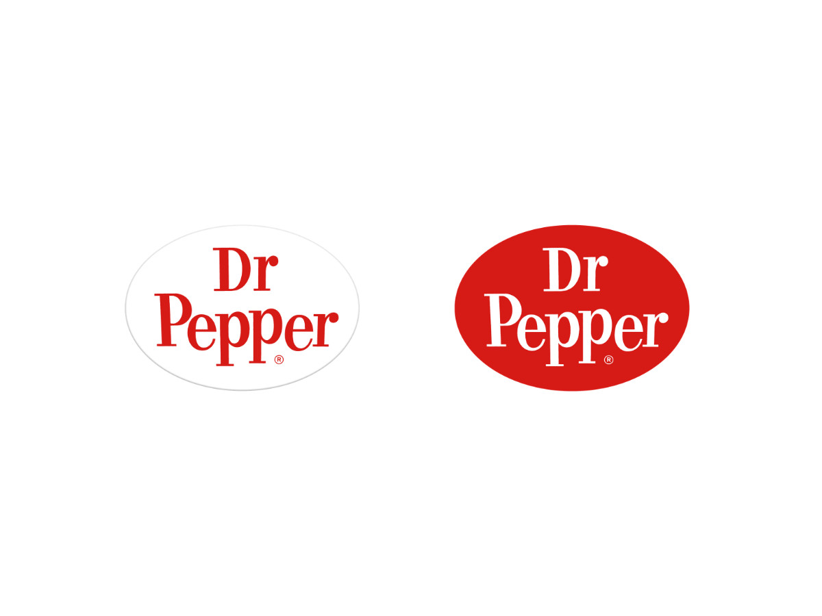
The slanted sans lasted eight years. In 1958, the name stood up straight: a red upright serif stacked "Dr" over "Pepper" inside a white oval, during the brand's "friendly Pepper-Upper" era.
The oval then changed color twice. A 1960 version reversed the lettering to white on a red oval, and a 1967 version set white letters on a dark red oval with a gray rim.
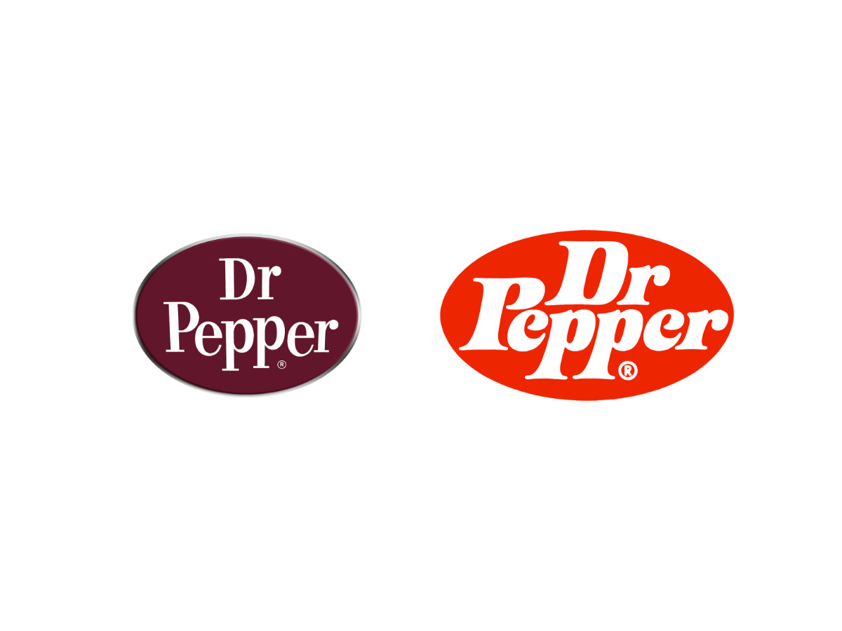
In 1971, a redrawn wordmark arrived, first on Sugar Free Dr Pepper and then across the line. It packed heavy white serif letters into a red-orange oval, tucked "Dr" above "Pepper," and let a giant P anchor the stack.
Six years later, "Be a Pepper" turned the brand into a song-and-dance ad campaign. The 10-2-4 clock disappeared from packaging during the same decade, after nearly 50 years on duty.
The numbers never fully left. They live on in throwback cans and in the 10-2-4 Collectors' Club, which has gathered in Waco since 1983.
1984 To 1997: The Oval Drops Away
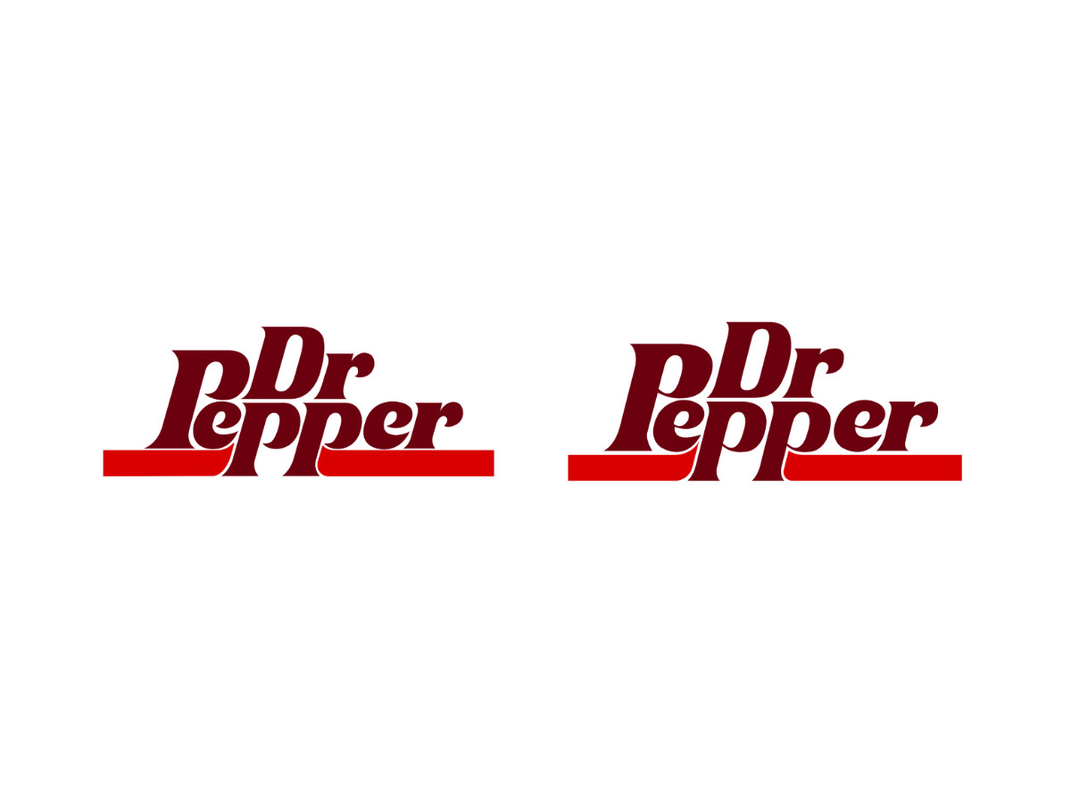
The oval left in 1984. The new mark set the name in dark red with "Dr" nested over the start of "epper," so the big P anchored both words.
A red bar ran under the name, and the p descenders cut down through it. A 1990 update kept the layout and deepened the color.
1997 To 2015: The Name Starts Climbing
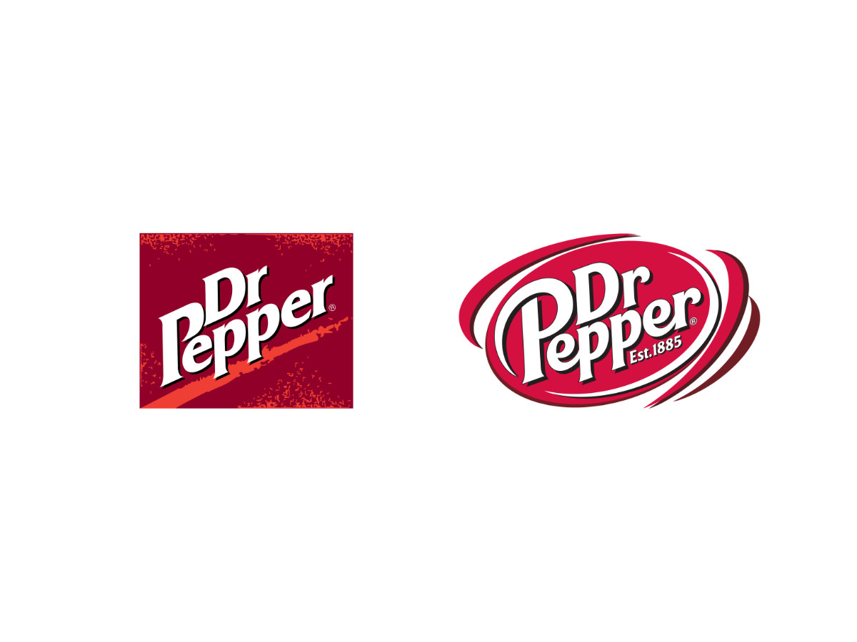
In 1997, the lettering turned white and climbed on a diagonal. The name sat on a dark red square crossed by a rough red streak that ran with the angle of the words.
In 2005, the square gave way to a red oval. White letters rose across it at the same angle, curved arcs wrapped the oval to suggest motion, and "Est. 1885" joined the name for the first time.
2015 To Today: The Current Dr Pepper Logo
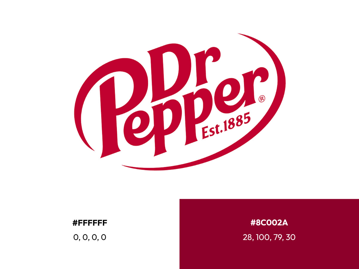
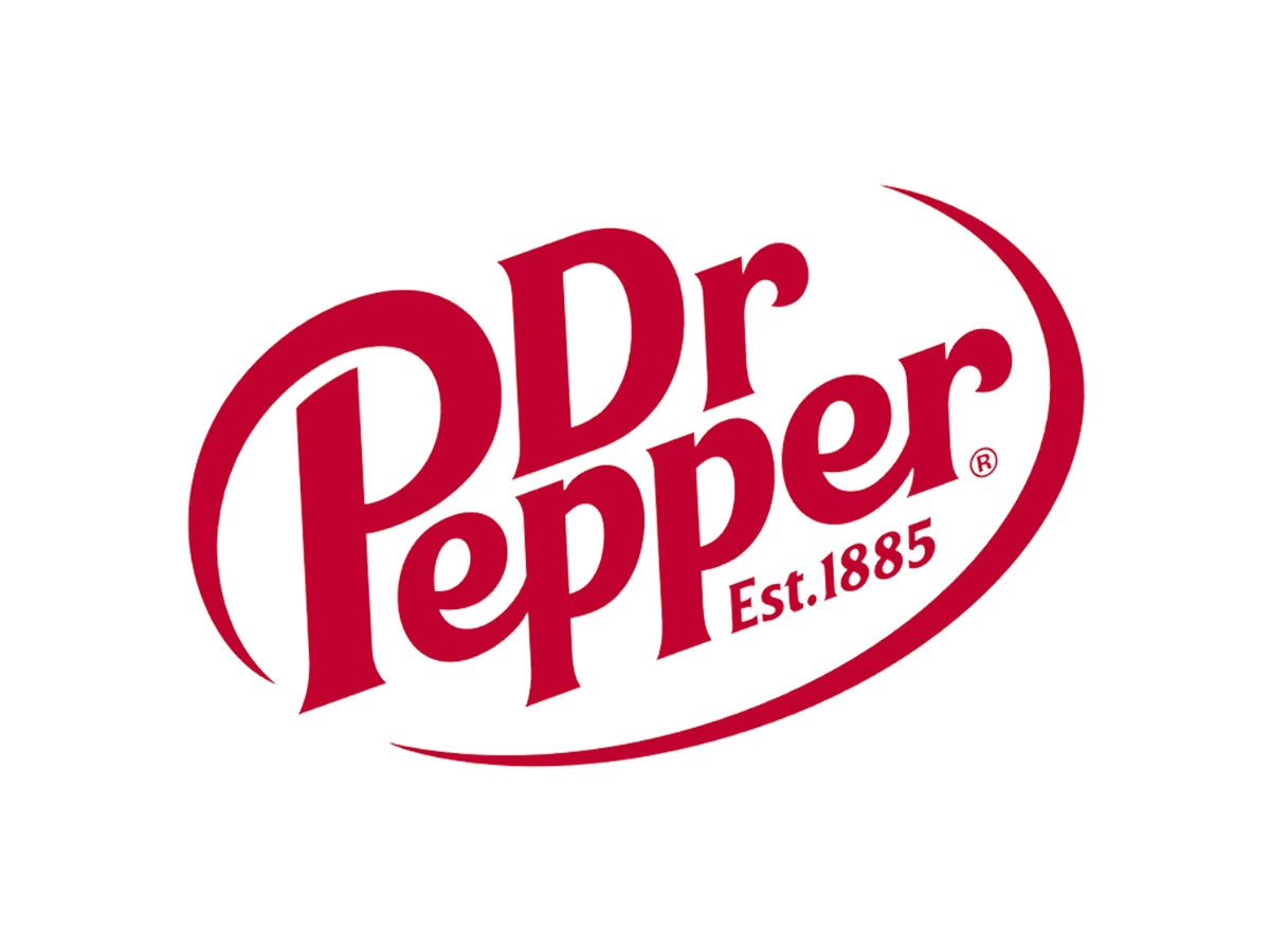
The 2015 update flipped the colors. Dark red letters now sit on white, the tail of the P sweeps around the left side, and a separate arc on the right closes the loop into an oval with "Est. 1885" tucked under the name.
The dark red is commonly matched to hex #8C002A (CMYK 28, 100, 79, 30). White fills the field at hex #FFFFFF (CMYK 0, 0, 0, 0).
The 1950 italic is long gone, but the name still climbs to the right on its rising baseline. The gap after "Dr" is still there too, so today's Dr Pepper logo carries a fix from 75 years ago.
Older Than Coke, Restless With Its Logo
Coca-Cola went the other way. Bookkeeper Frank Robinson wrote its name in Spencerian script in 1886, and the Coca-Cola logo has seen only slight changes to that hand in more than a century.
Dr Pepper, the older drink, has the far less stable mark. Its logos and slogans change so often that collectors date merchandise by decade from the lettering alone, a pattern closer to the restless Pepsi logo history than to Coke's.
Here's a reasonable read on why. Coke's script was the product's signature from year one, while Dr Pepper sold itself through campaigns (the clock, the Pepper-Upper, Be a Pepper), and each new campaign brought its own lettering.
Other long-running marks show what the alternative looks like. The Chicago Bears have kept their wishbone C since 1962, and the Wendy's logo kept one portrait through every redraw, while Dr Pepper kept little beyond its dark red and its missing dot.
Verdict
The best-documented moment in Dr Pepper logo history is also its smallest. A new typeface arrived in 1950, the period made the name harder to read, and the company dropped the punctuation instead of the letters.
The "Di:" detail may be exactly right, and the letter shapes back it up. Until someone turns up a 1950 memo, read it as the likeliest explanation on record.
For more brand marks shaped by small decisions, browse the latest logo design trends, compare the KFC logo and Taco Bell logo, or find logo design agencies and top US logo design companies for your own project.

Our team ranks agencies worldwide to help you find a qualified partner. Visit our Agency Directory for the Top Logo Design Companies as well as: