Duolingo Logo Design
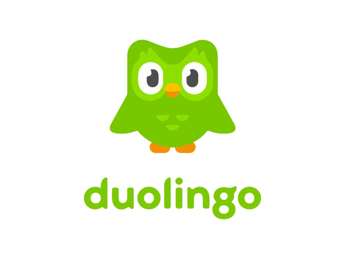
The Duolingo logo pairs a Feather Green wordmark in custom Feather Bold type with Duo, a green owl that designers assemble from circles, semicircles, and pill shapes. That simple geometry lets one mascot run app icons, push alerts, widgets, and viral stunts while his silhouette stays intact.
Duo has faked his own death on TikTok and stalked your lock screen at 11 p.m. Those stunts grab the clicks, and the vector work underneath keeps every one of them on brand.
This editorial breaks down the shape grid and type rules behind the Duolingo branding strategy. You will also see which moves logo design agencies can lift for client mascots.
What To Know
- Duolingo's first logo, in 2010, paired a taupe owl with a two-tone wordmark, and the letters "duo" formed the owl's eyes and beak.
- The in-house team redrew Duo in January 2019 from semicircle wings and pill-shaped feet so animators could pose him faster.
- Johnson Banks and type studio Fontsmith built the Feather Bold logotype later in 2019 from Duo's feather shapes.
- Feather Green (#58CC02, CMYK 58, 0, 96, 0) comes straight from the mascot and leads every touchpoint.
- Mascot-led UI can lift retention, though B2B teams should limit how much guilt the character carries.
How The Duolingo Logo Defines Gamified UI Design
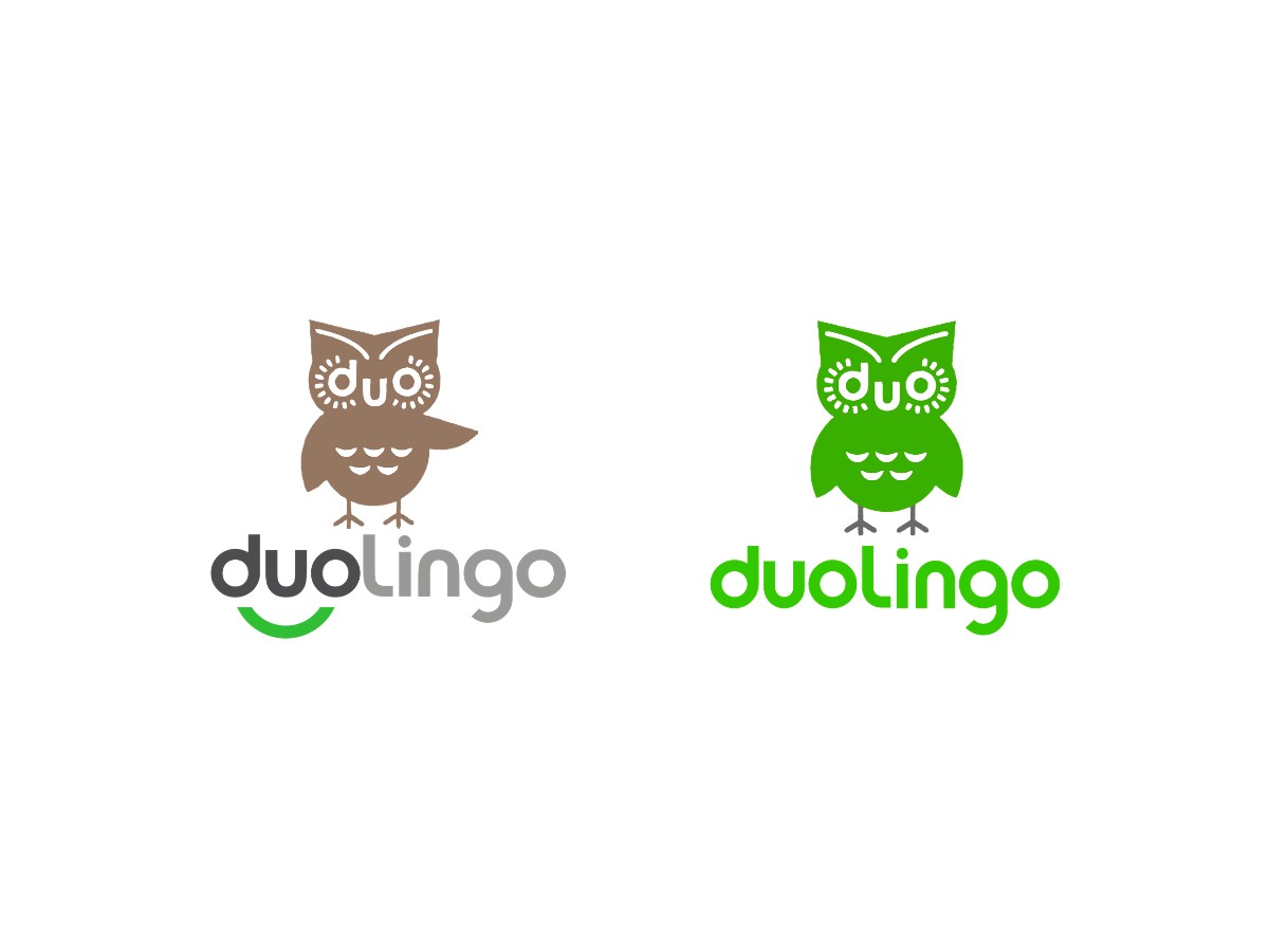
The Duolingo logo moved from a taupe 2010 owl and two-tone wordmark to a 2019 identity where the owl dictates the letterforms. Each redraw cut detail until Duo could play a game character inside lessons, streaks, and leaderboards.
2010 To 2011: What Did The First Duolingo Logo Look Like?
The first Duolingo logo appeared during the 2010 beta. A taupe owl stood above the name, and its face spelled "duo": the "d" and "o" formed eyes ringed with short white rays, while the "u" sat between them as a beak.
Below the bird, a charcoal "duo" sat over an arched green underline that curved like a smile, while "lingo" ran in light gray. Scalloped white marks on the belly and one raised wing gave the owl a waving pose.
2011 To 2012: When Did The Duolingo Owl Turn Green?
The 2011 refresh kept the lettered face and turned the whole owl green. The raised wing dropped back to the bird's side, and the wordmark went solid green without the smile.
2012 To 2013: How Did The 3D Redraw Change Duo?
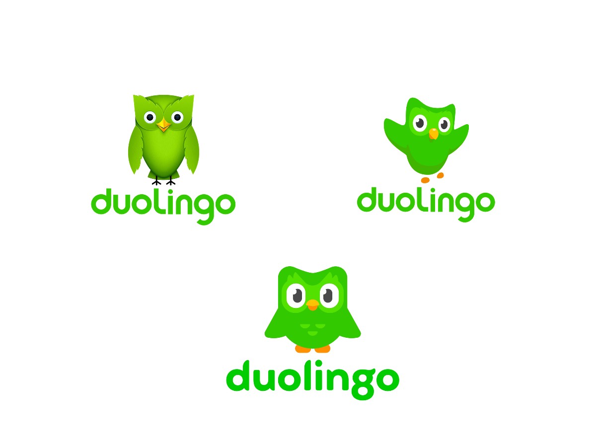
A 2012 redraw swapped the letters for real eyes, a yellow beak, feathered wing edges, and a 3D body in green gradients. Thin black legs held up the rounder bird, though the soft shading blurs at icon size.
2013 To 2019: Why Did Duolingo Flatten Its Owl?
Art lead Greg Hartman spent months reworking the silhouette for a 2013 cross-platform redesign. His team sketched daily, moved approved shapes into vector drafts, and gave Duo flat greens and a slight quarter-turn. The new owl leaped mid-air with raised wings, an orange beak, orange feet, and large eyes set in lighter green patches.
Hartman's rule from that project still applies to any mascot: if the outer shape fails, no interior detail can rescue it.
2019 To Today: Who Designed The Current Duolingo Logo?
The current Duo came out of two 2019 projects. In January, the in-house team rebuilt him from semicircle wings and pill-shaped feet and adopted a rounder, friendlier shape language so illustration and animation could keep pace with new products.
In September, Johnson Banks delivered the brand system and a logotype that borrowed those same shapes. Founder Michael Johnson described the starting point as a plan to "draw their logo based on the shapes in their mascot." The Feather Bold wordmark replaced the earlier rounded sans, and a chunky, front-facing Duo with wings at his sides, orange feet, and small chest feather marks became the standard pose.
If you plan a similar refresh, the order matters. Branding agencies that fix the character first and the type second save a full round of revisions.
Vector Fundamentals: Why Chaotic Mascot Logo Designs Need Rigid Grids
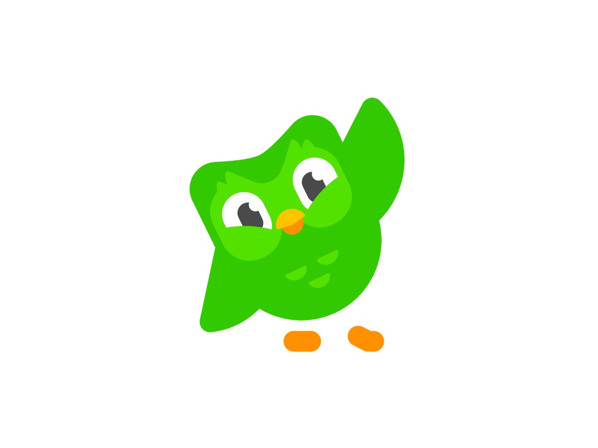
Duo can look smug, panicked, or furious because his body uses a short list of fixed shapes: a rounded torso, semicircle wings, pill-shaped feet, and large eye discs. Designers swap the eyes and pose, and the outline stays recognizable at every size.
Hartman has called Duo "basically a chicken nugget with a face." The joke doubles as a spec. Fewer outer shapes give you a cleaner silhouette, and a clean silhouette reads on a tiny home-screen icon as well as a billboard.
The 2013 redraw had already dropped the 2012 gradients, and the 2019 version kept every fill flat. Feather Green exports cleanly to SVG, and animators get fewer layers to rig.
Duolingo's character guidelines put the proportions in writing. Noses use one or two rounded rectangles, hands stay as circles, and the arm socket hides behind the torso. The same page warns that extra shapes complicate the silhouette.
A fixed base lets the team push expression hard. The 2023 home screen widget cycles Duo through moods that track your streak, and he grows more desperate as midnight nears.
Even the 25 later widget illustrations, from a buff Duo to a skeleton, still read as Duo because the outline holds.
Any mascot logo design analysis should start at that layer. Count the base shapes, then fill the outline solid black and check that you still know who it is. Graphic design firms that hand over a construction sheet with the mascot make life easier for animation and video production teams later. For more mascot logo designs that rely on simple geometry, browse these standout mascot visuals or the full best logo designs gallery.
Typographic Synchronicity: Marrying Mascot Shapes To The Duolingo Brand Font
Duolingo sets its logo and headlines in Feather Bold, a custom display face that Fontsmith drew with Johnson Banks. The letters borrow Duo's feather tips and eyebrow flick, while DIN Next Rounded handles body copy and interface text on small screens.
Before 2019, the owl sat next to a stock rounded sans. Johnson said the company had never found "a viable way to write the word Duolingo next to their mascot."
Fontsmith design director Phil Garnham worked the shape of an owl's wing into each letterform. Pointed terminals echo feather tips, and the double-story "spectacle g" ends in a curl that mirrors Duo's raised brows.
Display type carries personality, but a full lesson in Feather Bold would tire your eyes. Duolingo gives paragraphs, buttons, and prompts to DIN Next Rounded, whose open shapes and soft ends stay readable at small sizes.
That split turns the Duolingo branding strategy into a working rule for brand typography. Feather Bold shows up where you should feel something, and DIN Next Rounded shows up where you need to read something.
Scaling Ecosystems: The Duolingo Branding Strategy In Action
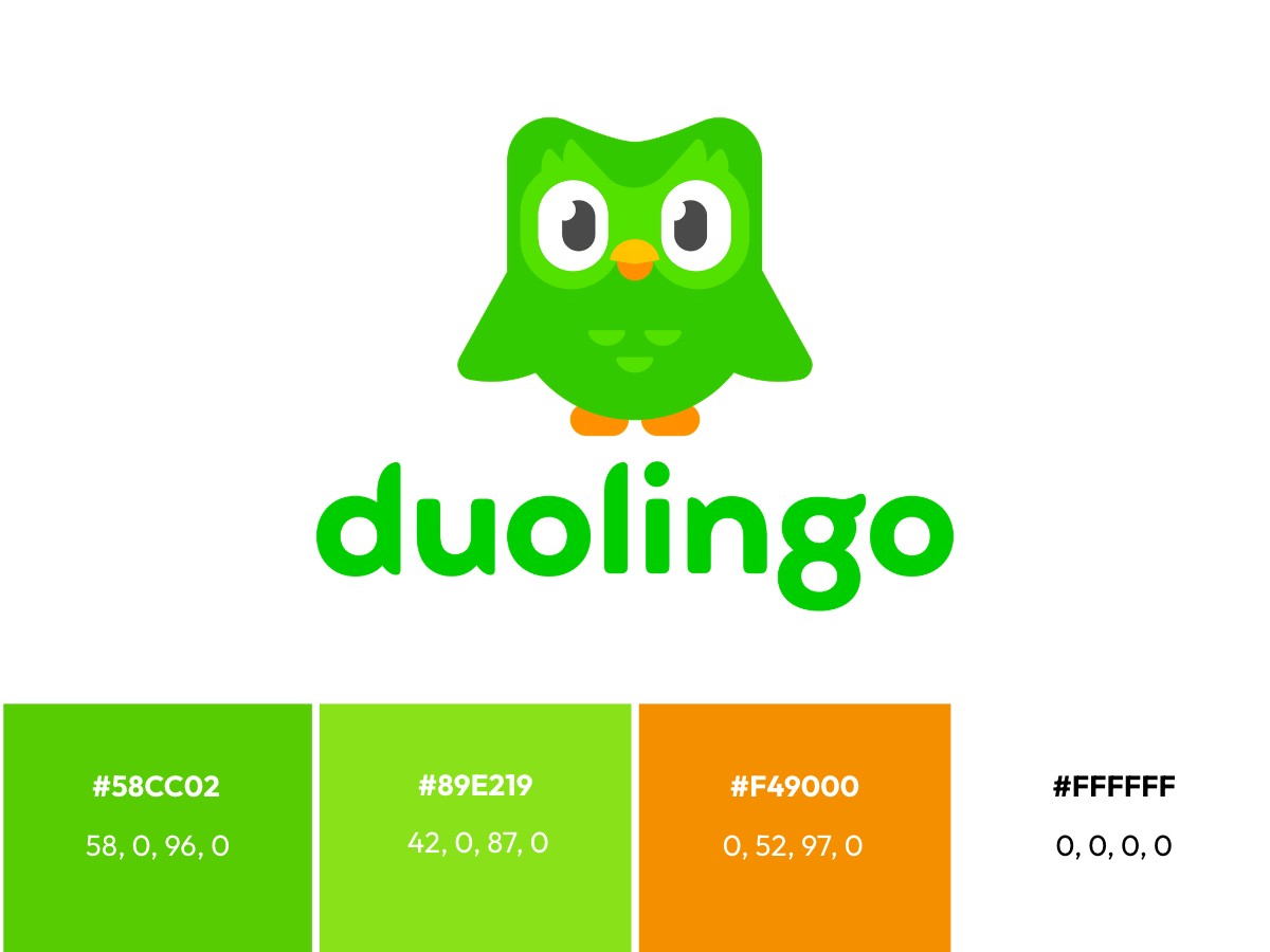
The Duolingo branding strategy scales through a single color and a single character. Feather Green #58CC02 (CMYK 58, 0, 96, 0) comes straight from Duo, and the brand color rules tell designers to lean toward green whenever a choice is unclear.
The rest of the present logo pulls from the same mascot palette. Mask Green #89E219 (CMYK 42, 0, 87, 0) lights up the face mask, and Snow #FFFFFF (CMYK 0, 0, 0, 0) forms the eyes. Orange #F49000 (CMYK 0, 52, 97, 0) colors the lower beak and feet.
Traditional corporate UI relies on an abstract logotype, muted palettes that play it safe, clinical error copy, and a rigid style guide. Duolingo flips each one: a rigged mascot leads, Feather Green saturates every screen, Duo meets missed lessons with guilt and humor, and modular vector parts let the team react fast on social.
Secondary colors such as Macaw blue #1CB0F6 (CMYK 81, 2, 6, 0) support feedback states and illustrations, a pattern common in app color schemes that pair one hero hue with functional accents. Feather Green stays dominant, so a Duolingo ad reads as Duolingo before you spot the owl. You can pull the logo files and palette from public brand asset libraries.
Social media puts the most stress on the system, since every brand there competes for scarce attention. Duolingo's TikTok passed 16 million followers by early 2025, and the "death of Duo" stunt swapped the app icon for an owl with crossed-out eyes.
That stunt worked because only the eyes changed. A social media marketing agency can copy the method: lock the silhouette, then let one feature carry the story.
Product data supports the playful approach. Sessions rose about 5% after the illustration-led 2019 app redesign, and widget users showed stronger retention even after Duolingo controlled for prior commitment.
The Designer's Verdict: Can Mascot-Driven UI Work For B2B And SaaS?
Mascot-driven UI can work for B2B and SaaS when the character covers onboarding, empty states, and progress, and stays away from billing, security, and data loss. Guilt-based nudges suit a free habit app far better than software your client's finance team pays for.
Retention is the strongest argument. Half of Duolingo's widget users hold streaks of six months or longer, a habit loop most SaaS teams would love to copy.
Tone is the biggest risk. A sulking owl feels funny when you skip Spanish practice, and far less funny when a payroll run fails at 2 a.m. Treat each character state like any other UI component, with written rules on where it may appear.
Production cost is the second trap. Duolingo keeps an in-house design studio to draw new Duo states, so smaller teams should budget for a fixed construction sheet and a capped expression library before launch.
Our verdict: borrow the geometry before you borrow the humor. A UI/UX design agency or product design team can build mascot rules into your interface first. Once the shapes hold up, mobile app design companies can layer in personality one screen at a time.
Quick Answers
What Does The Duolingo Logo Mean?
The Duolingo logo stands for friendly, steady progress. Duo the owl points to wisdom and learning, Feather Green signals growth, and the feather-tipped Feather Bold letters tie the name back to the mascot so both read as one brand.
Who Designed The Duolingo Logo?
Johnson Banks designed the current Duolingo logotype in 2019, and type studio Fontsmith drew the Feather Bold letters. Duolingo's in-house team, with art director Greg Hartman leading illustration, redrew Duo the owl earlier that same year.
When Did The Duolingo Logo Change?
The Duolingo logo changed in 2011, 2012, 2013, and 2019. The taupe 2010 owl turned green in 2011, 2012 added real eyes and 3D gradients, 2013 flattened Duo into a jumping pose, and 2019 brought the rounded, front-facing owl and the Feather Bold wordmark in use today.
What Font Does Duolingo Use?
Duolingo uses Feather Bold, a custom rounded display typeface, for its logo and headlines. Body text and interface copy run in DIN Next Rounded, a rounded sans serif that reads easily on phone screens.
Our team ranks agencies worldwide to help you find a qualified partner. Visit our Agency Directory for the Top Logo Design Companies as well as: