The perfect color scheme is critical for creating a mobile app that feels intuitive, engaging, and aligned with your brand.
We’ll cover everything you need to know about picking colors effectively — from understanding emotional triggers to ensuring accessibility. You’ll also learn techniques that keep users engaged so that you may better voice your preferences to your app development team.
How to Choose Colors for Mobile App Design
Here are a few critical factors to consider when selecting colors to create the best app design:
- Learn about color psychology
- Use complementary colors to create contrast
- Build a brand-consistent color story
- Create a clear visual hierarchy for easy navigation
- Craft a well-balanced color palette
- Use bold accents to highlight key elements
- Create engagement with color
- Ensure accessibility with thoughtful color choices
- Incorporate gradients and shading for depth
- Follow standard color coding
- Be consistent throughout the app
- Test your color palette
1. Learn About Color Psychology

Different colors evoke emotions and behaviors. For example, cool colors like blue and green can help create a calming effect and relax users. Meanwhile, warm colors like red and orange create excitement and draw attention. Thus, use colors that may help stir your users' emotions or behaviors.
2. Use Complementary Colors to Create Contrast
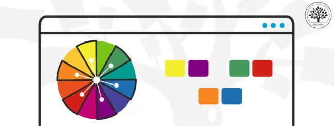
Create visual clarity and emphasize essential elements by pairing complementary colors. Doing so will create visual contrast to help your users intuitively navigate your app, guiding them to valuable call-to-action buttons and features while maintaining aesthetic balance in your design.
For example, if your app is targeting young women in their 20s, consider using vibrant colors such as pink, yellow, and green. Then, you can use complementary colors like blue and purple to create contrast. Color chart apps are readily available if you’re having a hard time choosing the colors to use in your app designs.
3. Build a Brand-Consistent Color Story

When choosing the right app colors, consider whether you have an existing branding palette before creating one that works best for your application. Having a color scheme consistent with your brand ideals and personality is a key characteristic that most of the best Android and iOS app designs have.
For example, if your brand already uses a deep shade of purple, you might adapt it to suit an app targeting young professionals better by incorporating a lighter, pastel variation of the same hue. This approach allows you to remain true to your brand identity while introducing a fresh, modern touch that resonates with your target audience, balancing creativity with brand consistency.
4. Create a Clear Visual Hierarchy for Easy Navigation

Using different shades of colors throughout the app will help users quickly identify elements based on their importance within the interface hierarchy. Some designs use colors without differentiating the shades, which can confuse users. Thus, separating colors by hierarchy can help you create a user-friendly and appealing app design.
Here's a good starting point: use a darker color for the main navigation, slightly lighter shades for menus and buttons, and the lightest colors for text. This way, you can indicate which items are more important than others.
5. Craft a Well-Balanced Color Palette

Here are the several types of colors you may choose from when crafting a color theme for your app:
- Primary Colors: These colors are the foundation of an app's branding and identity. For example, Facebook uses white and blue for instant recognition.
- Secondary Colors: These are accent colors sparingly used for specific elements like buttons or icons.
- Neutral Tones: Designers opt for these colors in background elements or text where it may not be desirable to have too much color.
- Complementary Colors: Choosing colors from opposite sides of the color wheel creates contrast and draws attention. A worthy example is Waze, which uses blue with complementary orange accents for various in-app icons and features.
6. Use Bold Accents to Highlight Key Elements

Once you have created a color palette, you need to find a way to use it effectively in your design. First, you can incorporate bold, contrasting colors to draw attention to primary actions or functional elements. For instance, placing a bright yellow CTA button against a muted background ensures it stands out immediately.
7. Create Engagement with Color

Your app should encourage users to interact naturally with the interface through strategically placed hues. For example, red and orange are often associated with urgency or excitement, so they can be used for elements that need to stand out and draw attention. On the other hand, black and white are the clearest hues, so they are usually employed in text to maximize readability.
8. Ensure Accessibility with Thoughtful Color Choices

It's essential to ensure that color is used in an accessible way that meets the needs of all users. For example, if you use a dark background for your text, add enough contrast between the colors so that anyone with low vision can read it easily.
While you aim to have the best app design in terms of the color scheme, you should not forget the comfort and approachability of the users when they use the app. So, test your color palette by using specific accessibility tools to ensure that everyone can navigate the app comfortably, regardless of visual ability.
9. Incorporate Gradients and Shading for Depth

Use gradients and shading to create subtle depth and vibrancy to objects on-screen. For instance, gradients can enhance icons or buttons, making them more dynamic without being overwhelming. Apps like Messenger use gradients effectively in their icons and interfaces, which add a sense of motion and energy.
10. Follow Standard Color Coding

Follow standard color-coding practices to make it easier for users to identify specific elements quickly, such as a red delete button or green accept button. Changing the colors for specific commands can be confusing. If you change the red delete button to green, or vice versa, it will take users longer to recognize the control and its purpose.
11. Be Consistent Throughout the App

Use the same colors consistently across the interface to build a cohesive user experience. Repeating colors for menus, buttons, and navigation elements helps users feel oriented and navigate the app more intuitively. Moreover, a unified color scheme reinforces branding and makes the app feel polished and professional.
Take the Root App, for example. Its consistent use of a lively green color scheme across all screens not only strengthens its brand identity but also makes navigation a breeze. The uniform buttons and text formats build a friendly, familiar user environment that enhances the app's overall usability and charm.
12. Test Your Color Palette
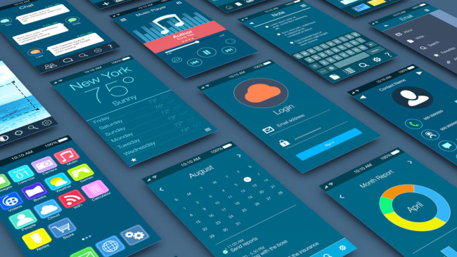
Finally, ensure you test your color palette with real users to guarantee it is easy to understand and use. Ask them to identify specific elements or complete tasks quickly using the colors you've chosen. This way, you can be sure that app’s colors are intuitive and easy to use.

Color Trends To Follow for App Design in 2026
Now that we have discussed all the basics in choosing your app design color palette, here are some trends you should watch out for in 2026.
1. Bright Color Palette

A vibrant color palette captures attention and elevates user experience. Not only do they make the interface lively, but they also help guide users’ focus to key functionalities. This strategy can make the app more memorable and enhance brand recognition.
For instance, the Examarly app uses a vivid orange color scheme well. This draws users in and creates a warm, energetic atmosphere that encourages active learning and interaction. The consistent use of bright colors across different elements and screens ensures a cohesive and visually appealing interface!
2. Duotone Colors
-content.jpg)
Duotone colors (also known as split-tone) are two tones that blend to create something unique. They are usually two pastel or primary colors used separately but work together when combined.
The popular music streaming app Spotify is an excellent example of this, as it uses shades of green and black for its icon. Be sure to use colors that complement each other.
3. Bold Color Combinations
-content.jpg)
Pushing the boundaries with bold, unexpected color combinations can differentiate your app from others in the market.
For example, Layer Z utilizes a striking blend of purple and pink hues laid over a deep blue. This bold color strategy makes the logo pop and gives the brand a modern, dynamic look. The vibrant, contrasting colors instantly communicate creativity and innovation through its visual identity.
People are often afraid to use bright colors but strategically using them can be an incredible way to grab attention.
4. Earth Tones
-content.jpg)
Natural hues are getting popular for creating a calm, soothing atmosphere within apps and providing an organic feel that connects users to nature.
The My Earth app exemplifies this by using earth tones throughout its interface to cultivate a serene and grounding user experience. Greens and browns reinforce environmental themes and enhance user comfort. Such a natural color palette establishes a direct affinity between the user and the app’s focus on ecological awareness.
5. Gradients
-content.jpg)
The use of gradients has steadily increased over the past few years, and this trend is here to stay. This approach can add depth and dimension to app elements without overwhelming the user.
App Design Examples With Trending Color Schemes
Explore these A+ app designs that apply the best practices of color usage to enhance functionality and visual appeal!
1. HYPE App
Board games are making a big comeback, moving from dusty basements to the center of fun social gatherings. The HYPE app is right there to help board game fans find each other and organize meetups easily!
What really makes HYPE pop is its clever use of bright colors. The app greets users with a beautiful gradient that shifts from a lively sunset orange to a soft pink, capturing the fun and warmth of game nights. The design isn't just pretty; it's smart, using distinct colors for different event categories to make finding your way around the app a breeze.
But there's more to HYPE than good looks. It’s packed with features that make it super user-friendly. From a simple sign-in process to an intuitive interface, HYPE lets you jump right into planning or finding your next game night without any hassle.
The clean layout and fun icons keep everything light and easy. This way, you’re having fun every step of the way, whether you’re a boardgame buff or just looking for a good time.
2. Corner App
Setting goals got a major upgrade with the Corner app, designed to bring a fresh twist to the classic task of achieving personal and professional milestones. Created by Nick Pugliese, Corner is a vibrant community where accountability meets ambition!
Its standout use of a vivid green color effectively symbolizes growth and renewal. This choice of color reinforces the app’s core mission of personal development and community support.
The clean, user-friendly interface is dotted with white and light grey accents that make the green really pop, so every goal you set stands out visually and feels uplifting to pursue.
Beyond its striking design, Corner is all about building a community where everyone’s goals are intertwined. It adds a layer of accountability that’s often missing when you’re doing it alone. The app cleverly uses this communal aspect to encourage users to set goals and engage with others’ aspirations — a shared journey towards personal growth.
3. Cascade App
Giving back is now a swipe and tap away with the Cascade app, beautifully designed by Piccolo to turn the act of donation into a visually soothing and user-friendly experience.
The first thing you'll notice about Cascade is its captivating color palette of cool blues and soft purples. These shades evoke a sense of calm and trust — perfect for an app that deals with personal contributions.
Each screen blends these serene shades with playful “clay” visuals that guide you through the app. This design choice makes the process of finding and supporting causes you care about straightforward and stress-free.
Cascade's functionality is as impressive as its design. From setting up your account to choosing a cause, everything is streamlined. The app categorizes charitable causes to help you pinpoint your interests, and it offers suggestions for organizations that could use your support.
It’s all about empowering you to make a difference effortlessly, one donation at a time!
4. Gaia
Gaia's interface is a lush, deep green that instantly draws you into a world of gardening possibilities. The app cleverly uses augmented reality to let you visualize how different plants and flowers will look in your space before you ever make a purchase.
Imagine pointing your phone at a patch of soil and seeing a cluster of English Lavender or Tawny Daylilies bloom on your screen — it's like having a magic garden wand in your pocket!
But Gaia is more than just a pretty face. It’s a powerful tool for both budding and seasoned gardeners. You can scan any plant in your yard to instantly learn about its needs and health, turning every user into a plant whisperer.
Need to diagnose a wilting rose or find the perfect spot for a new fern? Gaia’s got you. Plus, with an in-depth floral encyclopedia right at your fingertips, you’ll not only know the names of the plants but also their stories, care tips, and the best ways to help them thrive. Gardening with Gaia is truly a green thumb’s dream come true.
5. SwypeBuy
SwypeBuy is where convenience meets style in a seamless blend of bold design and user-friendly functionality. This app offers an online shopping experience that’s as thrilling as it is straightforward.
The app’s design stands out with its striking color palette of red, orange, and blue. Each color is chosen not just for its visual appeal but also for the emotions it evokes: red for excitement, orange for enthusiasm, and blue for trust.
This combination grabs your attention and guides you through the shopping process with an energetic yet trustworthy vibe. The colors work together to create a sense of urgency, making you feel like you’re snagging the best deals every time you tap.
SwypeBuy’s interface is all about making the shopping experience as smooth as possible. Navigation is a breeze, with clearly marked categories and an intuitive layout that lets new users feel like pros in minutes. Plus, the non-mandatory signup option means you can jump right into buying your favorites without the hassle of account creation.
Choosing App Colors Takeaways
Considering color trends and the basics discussed in this article, you will effectively choose a color scheme for your app that will create an engaging user experience and differentiate your product from competitors.
Selecting the right colors for your palette involves considering branding identity, accessibility options, platform consistency, readability, and user demographics.

